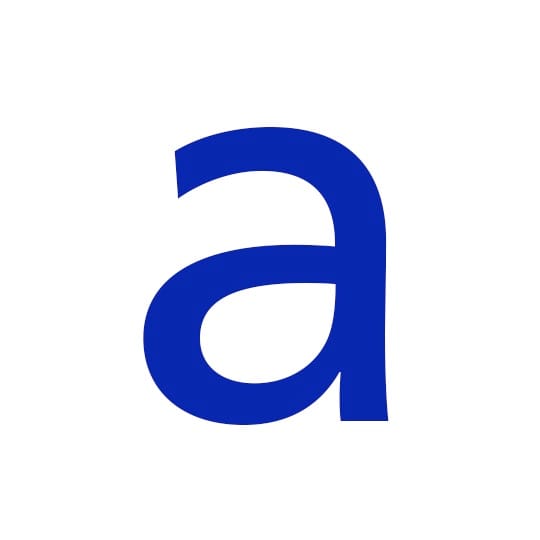
Ever since reading Type, Sign, Symbol, Adrian Frutiger’s treatment of the letter ‘a’ has stuck with type specialist Nadine Chahine. Here she explains the power of lowercase ‘a’ in Frutiger’s eponymous typeface. The problem of good design is that it teaches your eyes to see, and once that happens, you cannot ‘unsee’ again. The first book on type design that I read was Type, Sign, Symbol by Adrian Frutiger. A wonderful book full of illustrations and drawings, it had a graphic showing an overlay of different versions of the letter ‘a’ with the argument that letters are conventional in design and share their basic skeleton across typefaces. Though now I know that statement to be only partially true, it stamped the visual of the many versions of ‘a’ that Adrian Frutiger had drawn in my mind to the point that any other ‘a’ looks strange in comparison.
Many years later, I joined Linotype and this graphic came back as the topic of a conversation with our managing director, Bruno Steinert. He said, and I paraphrase, “It’s not that there is only one kind of ‘a’ but rather that Adrian Frutiger drew only one style of ‘a’.” It’s true and it is not a criticism. The ‘a’ that one sees in Frutiger, Univers, Avenir, and other designs of his, is gorgeous. Here is why.
Look at the ‘a’ in Frutiger: the design is simple, non-fussy, highly legible and very stable. It does not call attention to itself, and yet it evokes all the right feelings. It is solid, respectable, trustworthy, friendly and professional all in one. And one thing that stands out is the rounded bowl shape that feels as if it has a small puff of air inside. Once you notice that, and get to appreciate it, every other kind of ‘a’ starts to look deflated in comparison.
arabictype.com
Nadine Chahine
…is an award-winning Lebanese type designer working as the Arabic specialist at Monotype. Her research focus is on legibility studies for Arabic, Latin, and most recently, Chinese, and her typeface Koufiya was the first to include simultaneously designed matching Arabic and Latin parts.
Adrian Frutiger
As well as the font that takes his own name, this well-respected type designer is responsible for expansions of Univers, as well as the Avenir, Serifa and Egyptienne typefaces. Frutiger was created for the Charles de Gaulle International Airport - it had to be legible both from long distances and from an angle. Now in his late eighties, Frutiger was awarded the European Design Award in 2009.
December 19, 2014 2 minutes read
Grade A
Ever since reading Type, Sign, Symbol, Adrian Frutiger’s treatment of ‘a’ has stuck with type specialist Nadine Chahine. Here she explains the power of lowercase ‘a’ in Frutiger’s eponymous typeface.

