
London's Barnbrook studio compounds its reputation for politically engaged design with the identity for the Victoria and Albert Museum’s much anticipated summer exhibition.
Can you explain what the original brief you were presented with was and whether its parameters shifted during the course of the work, either due to the studio or the client’s expectations.
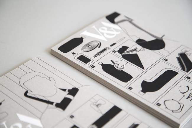
We were originally asked to design the book that would accompany the exhibition. This later extended to the exhibition design and the marketing campaign. It’s not common to be able to have full creative control over the various aspects of an exhibition project, but we were lucky enough to be asked to do so. Since various departments deal with each aspect of the exhibition, we had three different briefs to respond to. Rather than deal with them separately, we took this rare opportunity to produce one coherent visual look that would encompass all three aspects. We set out the themes and ideas we wanted to communicate, and later explored how each one of those could be visualised in its relevant medium.

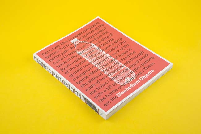
Can you expand on the choice of Doctrine as the typeface used both across the exhibition and in the book that accompanies the exhibition? What was the story behind the face's original development and how does that translate into its application here?
The subject matter required a suitably disobedient typeface, which came in the form of Doctrine. Doctrine is inspired by the ‘branding' of Air Koryo, North Korea’s state airline, and the peculiar part political philosophy/part corporate branding conceptual mix inspired the development of the typeface. Choosing Doctrine is intended to be in the same spirit of subverting everyday objects to perform disobedient functions. Furthermore, Doctrine’s alternate characters provided us with a ‘second voice’, that of the activist, artist and maker, one that spoke alongside the museum’s voice.
The design of the book uses typography in an assertive, even oppositional way (for example, the black quotation boxes that run perpendicular to the body copy). What was the impetus behind this? Was it perhaps a desire to allow the book's design to standup against the robustness of the content?
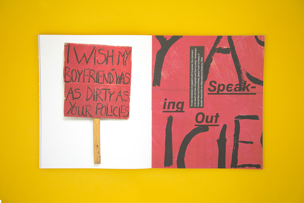
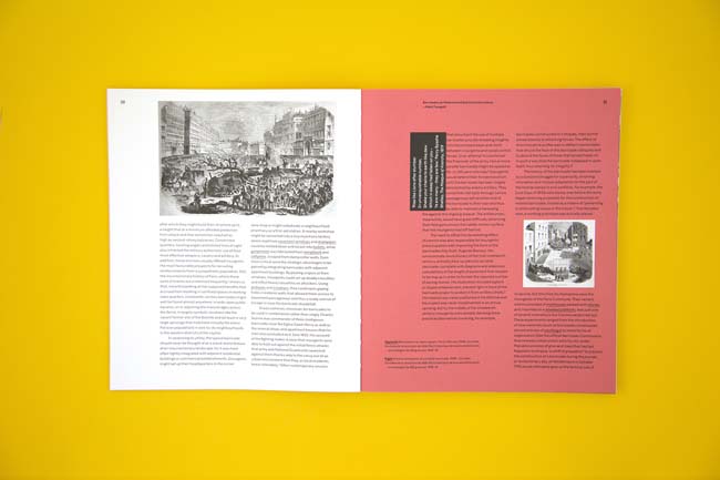
The book is far from being a regular exhibition catalogue. It is mainly constituted of six rich essays that deal with the various themes highlighted in the exhibition. Although the essays are deeply insightful, we felt there was a need to introduce breaks among the text-heavy content. We had a collection of quotes made by notable figures from the world of political protest and activism that we incorporated within the text. Rather than have them sit quietly on the page, we made them push into the text in order to interrupt the reader’s flow. They break the silence and speak to you directly and loudly. It is not meant to detract from the content, rather than reinforce what it’s trying to say.
The type of imagery employed in both the publication and the exhibition is fractious in terms of the relationship between the events depicted, which may be traumatic or ideologically polarising, and the interpretations certain forms of framing and editorial treatment can place upon them. Were you conscious of a need for the design not to aggrandise, cinematise or criticise specific images and ideas, or is feigned neutrality something that you would reject as infeasible or even unethical?
It is not really a matter of neutrality rather than the need to understand each object’s history and be respectful towards it. Instead of developing a minimally ‘neutral’ design, we decided to celebrate the multiplicity of voices being heard in the exhibition space. The curators were resolute in giving the makers, activists and artists a voice that sits at the same level as theirs. In addition to that, we had meetings with various activist groups at every stage of the project development to discuss their response to the design we were developing. For those reasons we decided that the everyday object and the production process that transforms it from mundane to disobedient should become the central focus, rather than highlighting one cause or struggle over another.
This exhibition is characterised by the diversity of the exhibits, both in the range of the media used as well as the subject matter. How did your design work to synthesise these different elements into an approachable whole?
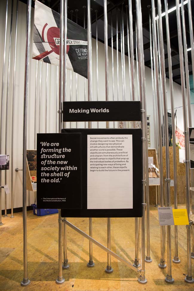
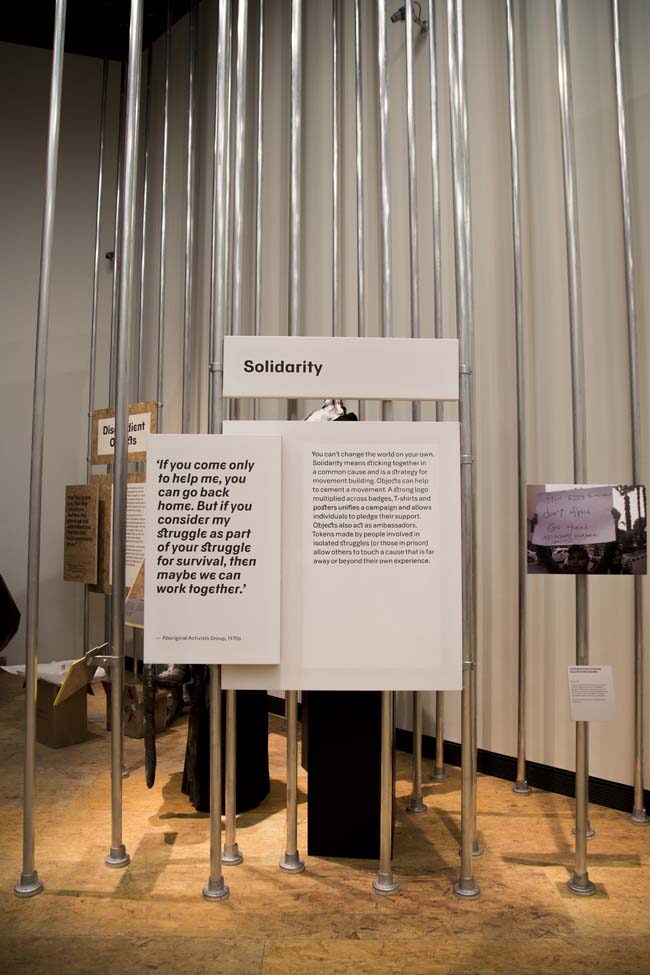
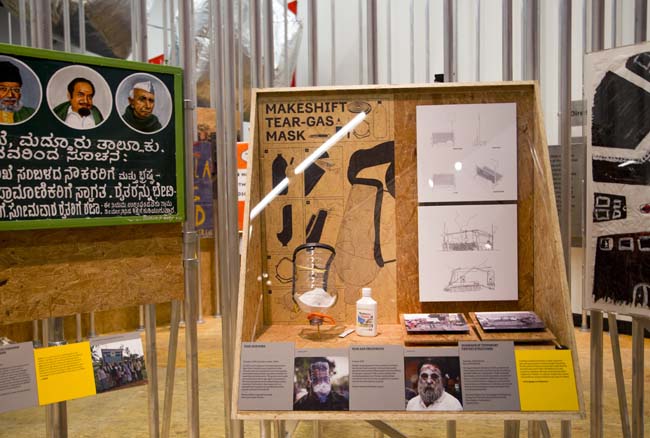
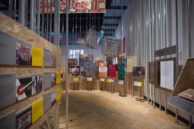
One of the main themes behind this exhibition is to look into these everyday objects as carefully designed items. This means looking at the production process, materials and tools used. The section panels of each ‘theme’ used a unique material inspired by the objects included in that section. For example, the ‘Solidarity’ panel was printed on cardboard, as used on the several placards on display, while the ‘Direct Action’ panel was printed on Stainless Steel, as used in the various blockade and lock-on items. The materials vary, but they are all cheap, accessible and mundane. We tried using the available material to their best potential, as the designers did with each one of their objects. Line Lund (the V&A’s 3D designer) proposed making the entire exhibition space out of OSB board as it’s a cheap material used in the process of building. We then printed all of the exhibition graphics directly on the OSB board, which helped bring the materials together intro a coherent whole.
One of the greatest difficulties with the works on display in Disobedient Objects would seem to be their contingency on contexts (physical/political/cultural) external partly to each other and especially to the museum itself. Whilst all objects within a design museum exist in something of a vacuum by necessity of their inclusion, that distance seems particularly keen here. Was part of your role to recontextualise this this work in such a way that it would again become comprehensible despite that distance?
It was important to present the context of each object, while keeping in mind that visitors have a short attention span and wouldn’t be encouraged to engage with long pieces of text next to each object. After several discussions between the curators, the 3D designer, the activists/artists themselves and us, we decides to introduce the maker’s statement. This came in the form of a bright yellow label that would sit next to the curator’s grey label. It was a statement made by makers themselves speaking about the history, reason and process of making the object. Although brief, it provides an alternative voice to that of the museums, which we don’t usually we see.
What aspects of this commission particularly attracted the studio to the job and, conversely, what do you believe there was in your creative ethos and experience that made you the standout candidate to handle an exhibition of this nature?
The studio has a long history of politically and socially engaged design, so we were naturally excited at the prospect of working on this project. We were also interested in how this exhibition requestions and advances the general understanding of what activism, activist art, and design are. We have also had a fantastic run of successful collaborations with the V&A, which might be a further reason for choosing us.
Were there any new techniques or unfamiliar challenges that the studio engaged with whilst working on this exhibition?
There were several actually. The entrance of the Porter Gallery, where the exhibition is held, was a big challenge with a set of seven metre-high doors that are pretty dominating. The curators wanted to create a representation of a barricade to open the show, as a defining moment in the history of disobedient objects. The doors seemed to be a barricade of their own, so we installed a large-scale vinyl graphic of barricades in different points of history directly on the doors. We were quite unsure about the outcome with the massive scale of the artwork in relation to material, but it worked out beautifully in the end. We also produced the title of exhibition using cable-tie lettering that was fixed on a ‘crowd-control’ fence that is fixed to the ceiling of the entrance, which was fun to do.
Finally, we took full advantage of the improving possibilities of digital printing with the wide choices of printable materials and the use of white ink. All of the exhibition graphics were directly printed on OSB board that became one of the main aspects of the space, which would have not been possible just a few years ago.
The exhibition is primarily concerned with antiauthoritarianism in design: did your own work for the exhibition explicitly reference that language in graphic design that has emerged through or else been co-opted by protest movements and radical politics?
In the beginning of the process, we naturally looked at visual references among the material we were dealing with, but we were adamant not to use a ‘protest aesthetic’. The objects on show come from various geographic locations and have varied visual and cultural references, so the way to bring them together was to develop a design that can communicate the essence and energy of what protest, activism and disobedience represent. The design is meant to be bold, clear, honest and informational.
barnbrook.net


