Writer Jonathan P. Watts tells us how the visual economy of grime thrives on good will and pirated copies of Photoshop.

Increasingly, on YouTube channels narrowcasting grime, the lifestyles, opinions and grievances of MCs are played out for the digital SLR’s ever-present gaze (long passed are the days of degraded mobile phone ‘hood videos’). Enthusiasm, free production software and broadband are the preconditions of such viral video content. Earlier this summer, in one such video, the MC Chronik was asked by Lordie, owner of grimereport.tv, why so many nerds like grime recently. ‘Don’t disrespect the nerds,’ Chronik replies, smoking a joint in his kitchen, ‘I grew up disrespecting the nerds and I am sorry from the bottom of my heart. What you need the nerds for is if your iPhone is broken.’ Grime, they conclude, has always had its nerds.
Nerds have made their contribution to grime’s visual culture in the form of mixtape and album artwork. The rise of non-professional artwork is a phenomena coincident with the internet. In grime’s early years the expense of pressing vinyl often meant that 12” records were produced in limited runs, white labelled, perhaps rubber stamped with a title and mobile phone number, and packaged in a white card sleeve. (Unmarked white labels are magical objects, ducking data tagged circulation, occasioning the physical labour of loading and listening, only then with a limited number of plays.) While production budgets for wealthier record labels might employ a photographer and graphic designer, you get the sense that many mixtapes, often speedily produced and distributed, rely upon a friend of a friend finishing a BTEC in graphic design, or a YouTube-tutored amateur on pirated Photoshop. The results are varied, from the sophisticated to the fantastical.
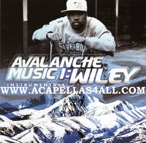
One notch colder than ‘cool’, ice has a long history in American hip hop and rap. Wiley’s early ‘eskimo beat’, shortened to eski beat, combined iciness with the force of an avalanche to produce a defining sound of grime: the sonic, textual and visual equivalent of a frozen flow. Instrumentals on Avalanche Music 1, with titles such as ‘Igloo’, ‘Ice Cream Man’ and ‘Ice Rink’, are characterised by their crackling, crisp beats and tubular bass. And then there is the cover of Avalanche Music: A snow-capped mountain range blocks the lower third of the image, fading into a black and white portrait of Wiley hunched over a Raleigh Chopper. The smooth typeface of the album title, accented by sharp flicks, is frozen into an icy capsicle, its matter preserved in cryogenic suspension for later generations of grime producers, such as Slackk and Mr Mitch, to develop new strains.
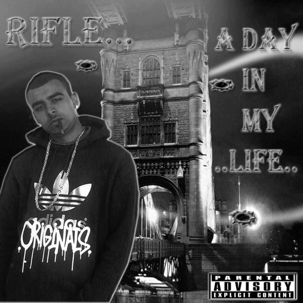
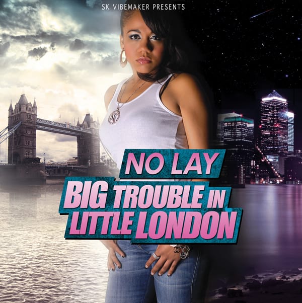
In Dizzee Rascal’s He’s Just A Rascal music video the MC performs to a camera atop a pleasure cruiser wending the Thames’ flow, beginning at Tower Bridge, following the tide west towards the London Eye, before returning to Canary Wharf in East London—grime’s Mecca. An equivalence is implied between the iconic spectacle of the Bridge, also a gateway into the East, and the MC. It is not surprising that the bridge has provided a backdrop for many mix tape covers. No Lay’s Big Trouble in Little London and Rifle’s A Day in My Life are exemplary. In the former, the MC No Lay bisects the image: to the left a high dynamic range image of the bridge beneath louring skies and to the right 1 Canada Square—a sleepless capitalist obelisk, Thatcher’s Cock—under night fall. The pink lights cast across the Thames rhymes with the ironic femininity of the mix’s pink typeface. In the latter, Rifle’s black and white cover photo is pierced with bullet holes. Blurred lights on the bridge, caused by long exposure, lend a haunted feel, as if the crudely lassoed figure in the foreground is not Rifle himself, but some ghastly apparition.
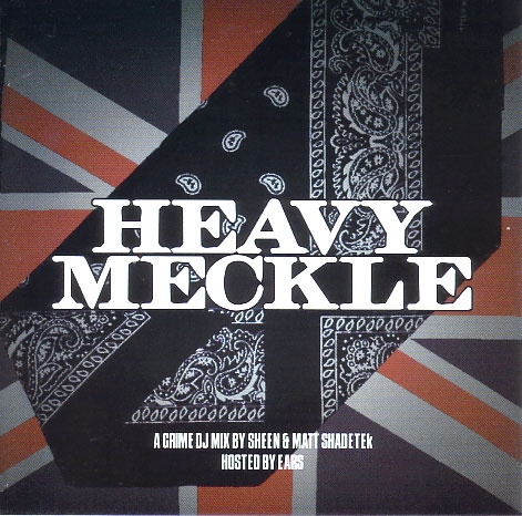
The MC Sway’s track London is the definitive celebration of grime as a singularly British phenomenon, addressing the social realities of a country he insists is not all ‘Oliver Twist and Mary Poppins’. Early on Sway, of West African descent, covered his face with a Union Jack bandana—a mock-thuggish celebratory assertion of multicultural black Britishness. Around the time of Sway’s debut This is My Demo, somewhat below the radar Sheen and Matt Shadetek released the extraordinary mixtape Heavy Meckle. Its cover design is simple and elegant: a Union Jack is partially covered by a black bandana at forty-five degrees. The title, Heavy Meckle, is rendered in a sturdy, squat typeface. Beneath, a legible uppercase font unambiguously states the content. If a gang is an organisation, here it gathers in unity while maintaing its diversity.
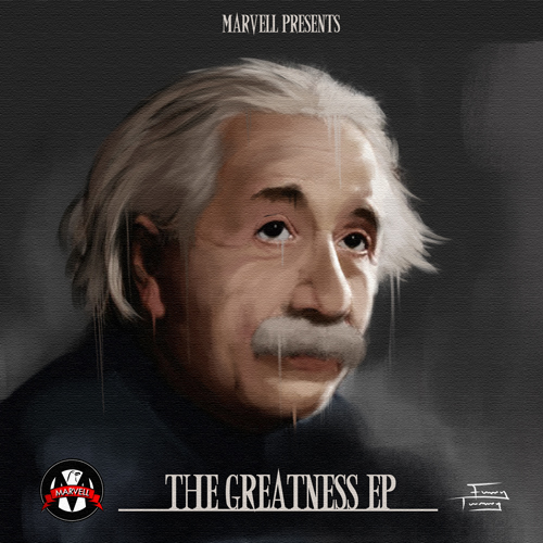
Marvell’s The Greatness EP features a painting of Albert Einstein on the cover, get it?
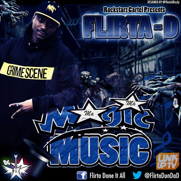
The designer of Flirta-D’s recent mixtape Ma Ma Magic Music includes his twitter ID on the top right of the cover. At the bottom right is both Flirta’s Twitter and Facebook IDs. Surrounding these are logos for promotional companies supporting the release. The mix’s title is rendered in the iconic font of U.S. basketball team Orlando Magic. Flirta occupies the left side of the frame, seemingly oblivious to the dozens of flesh eating zombies closing in on him on the bus. This is the networked cover, in which digital IDs are commensurate with imagery. The designer, Grizzly, is an MC and producer himself. The title for his forthcoming EP Back on my Grime pastiches the typography of Robert Zemeckis’ Back to the Future. ‘Grizzly,’ the designer’s website states, ‘was an A* student in Art & Design in school and college and he uses the skilled gained with Adobe Photoshop, to design all his own Mixtape/Album covers and designed several for other artists.’

