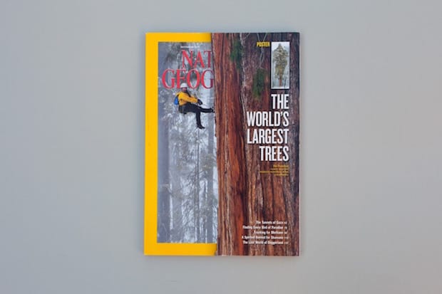
With a giant sequoia tree that nudges the magazine’s trademark yellow border, this National Geographic cover paints a dramatic picture of the grandeur of nature and shows the effectiveness of breaking your design guidelines, Another Escape’s Jody Daunton explains.
One Christmas my grandparents bought me a subscription to the National Geographic. At the time, as an aspiring documentary photographer, I welcomed this celebration of nature and the people who sought to understand it, conserve it and revel in its beauty. The magazine’s values and interests both complimented and informed my own, and it sparked a curiosity in me: a desire to explore the world. I think that this early exposure to such powerful and visually beautiful print media, with an emphasis on incredible storytelling, really helped plant the seed for Another Escape.
Having remained a subscriber, it is the cover of the 2012 December issue, The World’s Largest Trees, that stands out to me. The design decisions and epic photography tie together to make a bold statement and paint a dramatic picture of the grandeur of nature. Breaking the bounds of the cover’s iconic yellow frame border is a photograph of a giant sequoia tree with a tree-climbing scientist making the ascent to the top – the equivalent altitude of a twenty-storey building. This tree is so-say the second largest ever-recorded; at 247ft tall and with nearly two billion leaves, its name is President. It is a testament to the sheer size of this Sequoia as to why National Geographic chose to break their universally recognised branding – their yellow frame border. It displays a trust in their readers to not only recognise the magazine despite this, but also to understand the reasons why. The result: a bold and beautiful cover that captivates the reader and entices them in.
The interplay between the cover image and the epic five-page foldout poster worked well: it allowed the reader to better experience the awesomeness of the tree without being confined to the small space of the cover. The 126-image compilation of the poster really could only have worked in print: there was no confinement of screen size or unnecessary scrolling; in one glance the reader could see the relative size of the tree in detail and begin to imagine these trees up close.
National Geographic
ran a similar cover in October 2009,The Tallest Trees issue. Again, the team made very similar design decisions, with the large tree trunk dissecting the iconic yellow border. It was for this earlier issue that Michael Nichols’ developed his innovative rigging techniques for the photography found both on the cover and inside The World’s Largest Trees issue.
Something that National Geographic continues to be fantastic at is feeding the imagination: they take their readers on a journey to places that they may otherwise never experience. More than that, they offer valuable insights into the quirks and eccentricities of our world. Through science, history, anthropology and geography, we are offered a glimpse of the world through fascinating perspectives. Before the digital age publications like National Geographic were necessary portals of paramount importance to expose these worlds to those unfamiliar with them and inspire new generations of explorers, scientists, conservationists and humanitarians.
jodydaunton.co.uk
anotherescape.com
Another Escape
This Bristol-based magazine combines a deep love for the inspiration gleamed from the natural world with a respect for creativity and craftspeople. Its calm, pared-back design is complemented with awe-inspiring photography of impressive landscapes and makers at work. Its fourth (and current) issue is themed around the night and involves contributors going on a meteorite hunt with Ralph P. Harvey and Katie Joy, interviewing marine biologist David Grube and discovering the producers making music for the crime-thriller genre.
National Geographic
This American magazine has been published continuously since its first issue in 1888 – it has a global circulation of 6.8 million per month. The magazine’s first full-colour photograph, A Flower Garden in Ghent, was published in the July 1914 issue and in 2006 it opened an international photography competition.

