
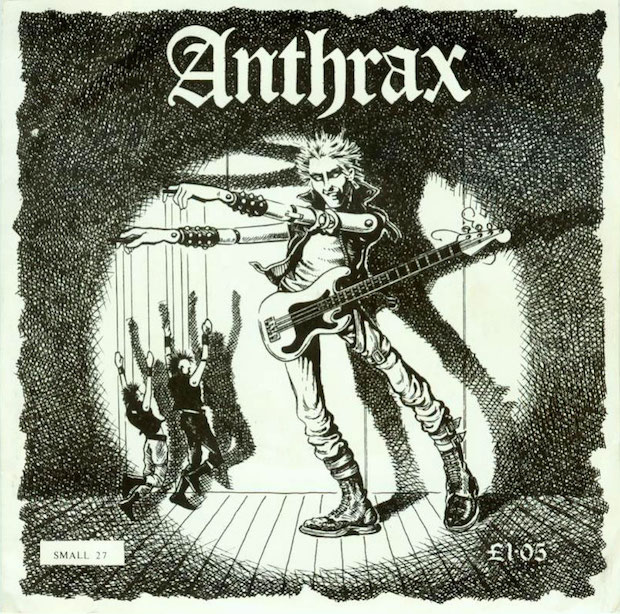
As iconic British anarcho-punk band Part 1 reissue 1985 LP Pictures of Pain, Mat Colegate takes an in-depth look at the graphic design behind the genre, from Crass’ monochrome collages to Nick Blinko’s meticulously detailed scrawlings.
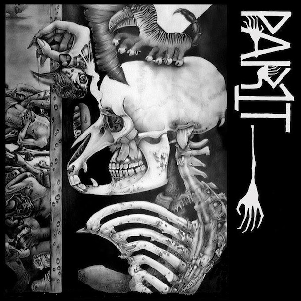
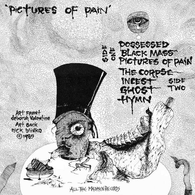
Last month, British anarcho-punk legends Part 1 reissued their long unavailable LP, 1985's Pictures of Pain, on vinyl. Beautifully printed on thick-stock card and adorned with a gorgeously morbid front cover by Deborah Valentine, a back cover by British outsider artist Nick Blinko (of the band Rudimentary Peni) and a lyric booklet festooned with the fevered imaginings of Part 1 member Mark Ferelli, one look at the album is enough to tell you that anarcho-punk – a musical movement famed for its crudity and commitment to raw power and impact – was extremely vibrant when it came to visual representation.
Much like the abrasive energy of the music it sought to portray, the artwork that covers the record sleeves, T-shirts and flyers that sprung up around the anarcho-punk scene in the late 70s and early 80s contains a perhaps surprising level of depth and variety. From Blinko's Lovecraft-inspired scrawlings on the sleeves of Rudimentary Peni's albums, to Discharge's crude cut-and-paste portrayals of the atrocities of war, to the mothers-of-them-all, Crass, and their incalculably influential monochromatic mixtures of situationist-inspired slogans, Dada-esque collage and anarchist philosophy, anarcho-punk was a scene that understood the power of the image to affect the world around it. With the music it formed an unstoppable package of anger, aggression and dark, pessimistic humour that was aimed squarely at the horrors of the early 80s both at home and abroad and that continues to influence generations of musicians and artists over three decades later.
Born in the wreckage that followed the punk movement's capitulation to the forces of capital and eventual mutation into politically neutered 'new wave', anarcho-punk sought a return to first generation punk's aggressive confrontation of pressing social issues. Police aggression, animal cruelty, war mongering and the ever-present threat of nuclear annihilation were all grist to the mill of this new breed. The music was similarly back to basics, favouring stripped down and untutored musicianship, hectoring monotonal vocals and a commitment to getting as much down on tape as could be achieved in a short space of time. The artwork that housed the records was similarly no-frills in impact. Nearly always black and white, often photocopied and hand folded together, its basic and primitive appearance reflects the movement's commitment to getting the message across as quickly and effectively as possible.
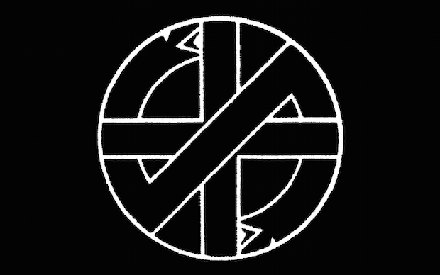
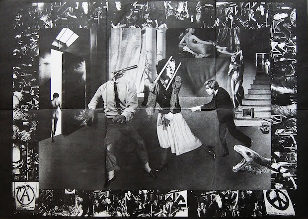
The band who can perhaps take the most credit for inspiring this aesthetic philosophy were Crass, formed in 1977 and one of the first bands to fully espouse – and live – an anarchistic lifestyle. The band's music was a world away from polished new wave, featuring near indecipherable lyrics, rat-a-tat biscuit-tin drumming and rudimentary hammered guitars, as well as more experimental, noise-based interludes. But the artwork, by the band's Gee Vaucher, served to unify their disparate whole. Inspired the by Situationist images of the late 60s, Vaucher created a style of agit-graphic that united collage, stencilled typography and overt sloganeering. Her black and white images featured grotesque detournements of politicians, celebrities and military imagery to humorous and frequently scatological effect, and served to carry on a tradition of humour in political collage that goes all the way back to John Heartfield. It is Vaucher's work that had the most effect on the art that packaged the many myriad of bands that followed Crass's example, but it is the band's logo – designed by former art student and graphic designer Dave King – that has gone on to be the most reproduced image of the whole era, appearing on posters, tattooed on people's bodies, and, somewhat paradoxically, in a diamanté version on a t-shirt modelled by David Beckham. King's simple, elegant logo – influenced by a book he owned on Japanese family crests, as well as the Celtic crosses he saw near his childhood home – depicts a cross being obscured by a serpent eating its own tail and is a perfect visual representation of Crass's critique of society.
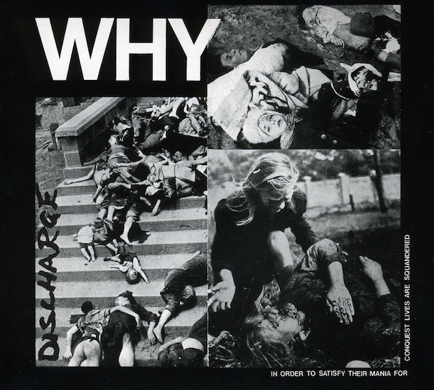
Crass’ commitment to confrontation was taken to a near artless extreme by Discharge whose collage work (produced for the most part by the band themselves) had a crudity of an entirely different sort to that of art school-educated Vaucher. Take the sleeve of their 1981 album Why; images of massacred bodies are crudely shoved together to form a square, the plain simplicity of the (unpunctuated) title and the band's scrawled logo are the only other factors. It's a punch in the face. All the humour of Crass's approach to provocation is tossed aside in favour of harsh fact, in a way that has more in common with the kind of shock tactics used by charities trying to make us donate money to war-torn countries than a band trying to make us buy records. This basic approach nonetheless proved extremely influential. Afterwards bands seemingly competed over who could provide the most shocking cover imagery, in a way that reflected the outer edges of the anarcho scene eventually morphing towards the extremity of grindcore as the decade drew on.
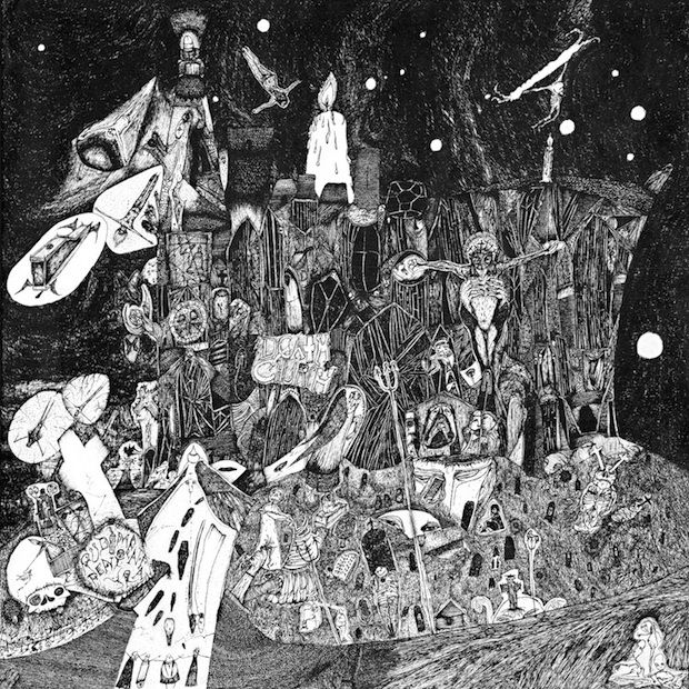
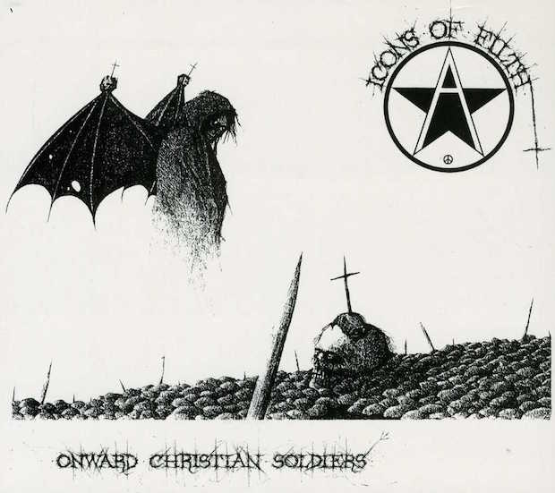
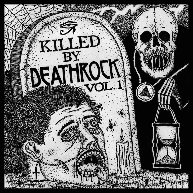
A world away from Discharge in intent but united by a similar bewilderment and fury, Nick Blinko's artwork for his band Rudimentary Peni represents a uniquely terrifying personal vision that has more in common with Hieronymus Bosch and H.R. Giger than any more overtly political art. Though there is debate as to whether Peni were an anarcho-punk group at all – with a strong case to be made that they're more in line with a particularly serrated type of goth, or 'death rock’. Their signing to Crass' label and Blinko's commitment to producing all the band's artwork himself, as well as more superficially their commitment to black and white art, serves to place them in the margins of the genre. Blinko's phantasmagorical menagerie of grinning skulled foetuses, severed heads and speeding hearses has roots in symbolist painters such as Odilon Redon and the work of Antonin Artaud during his incarceration at Rodez asylum (indeed Blinko was allegedly similarly incarcerated under the mental health act for a time). But it's his drawing style, fanatically detailed and gleefully grotesque, that gives his work such lurid distinction. Indeed, drawing is another factor that unites a lot of the artwork that surrounded the anarcho-punk scene. What could be swifter and cheaper and more immediate than taking pen to paper? For example, the cover of Icons Of Filth's Onward Christian Soldiers by friend of the band Squeal (who has claims on having invented the scratchy style of calligraphy that so many groups have copied since) is phenomenally detailed and beautifully restrained, with the vast blocks of plain white that make up the majority of the cover forcing the illustration and the band's logo into powerful contrast.
For a genre characterised by its commitment to ferocity and engagement with the moment, anarcho-punk has proved a surprisingly resilient influence on whole generations of bands and designers. Its characteristic building blocks of collage, drawing and commitment to monochromatic colour schemes are a simple visual language to pick up and expand upon, and artists like New York's Alexander Heir are taking its original language and melding it with outside influences to create strange new hybrids. But if there's one thing the above should make clear, it's that the artwork that surrounded the original bands in the early 80s was anything but limited, and that a commitment to energetic expression on tight means is a galvanising force on a par with anger itself.