
Enticing book Strange Plants has appeared from new indie publisher Zioxla, designed by Folch Studio. We interviewed Zioxla founder Zio Baritaux and Folch designer Josep Roman Barri about the project.
Zio Baritaux, Zioxla
What made you leap into the challenging world of independent publishing?
I’ve been working in print for years. I was the managing editor of Swindle magazine, have worked on a dozen-or-so books on art and culture, and created a magazine for a brand, among other things. I’d done pretty much every job that goes into making a magazine or a book, except for actually publishing a book myself. It just seemed like the logical next step.
Why the plant theme for your first book?
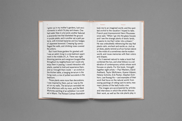
My biggest inspiration was my mother and her gardens. When I was growing up, one had water lilies in a koi pond, another featured a jacaranda tree that blanketed the ground in purple petals, and in another sat a petit parterre, with trimmed topiaries and low hedges of Japanese boxwood. But I didn’t really appreciate these gardens until I was an adult, living in an apartment in L.A. with no outdoor space or plants to call my own. There were plants throughout the neighbourhood — like night-blooming jasmine and overgrown bougainvillea — but it wasn’t the same. I wanted to experience them. So I brought plants inside my apartment — a hanging terrarium, a potted cactus, and so on. These plants brought back memories and inspired me, just like the art I had hanging on the walls. So it seemed natural to create a book that combined the two.
What has been the biggest challenge of putting Strange Plants together?
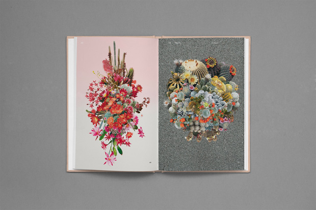
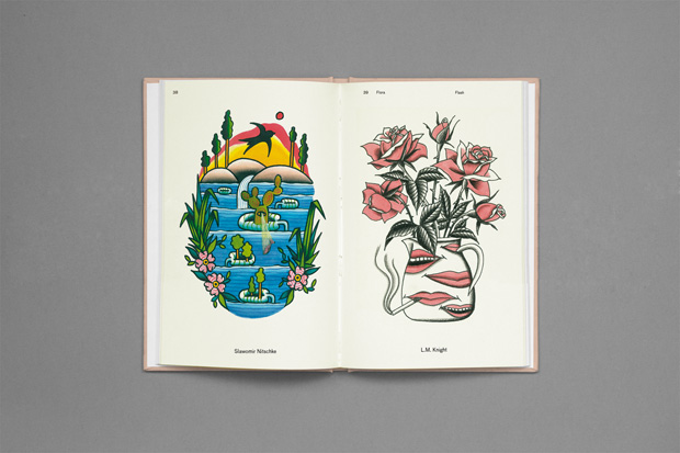
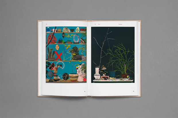
I think the biggest challenge was limiting the content/number of artists in the book. I wanted the book to feel intimate, and also, for practical reasons, I wanted to keep it to a certain length, so this meant I had to put a cap on the number of artists involved, and select the group carefully.
I selected artists for the book whose work I thought was genuine. I also made selections based on how an artist experienced plants and the instinctive and unique ways they represented them in their work. I thought about how each artist’s work interacted with the other works in the book. And I made a curated selection that fit together in a cohesive manner but also made sure things were varied enough to appeal to different people.
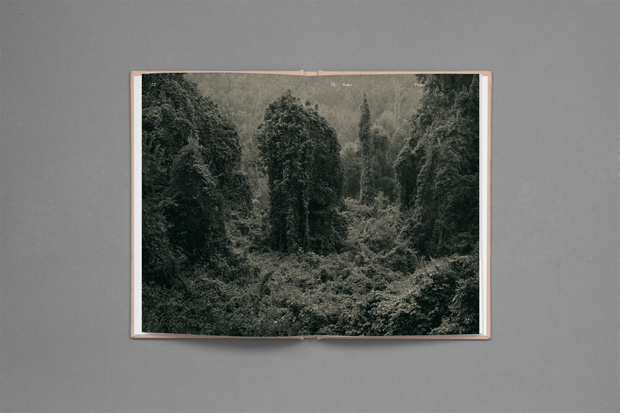
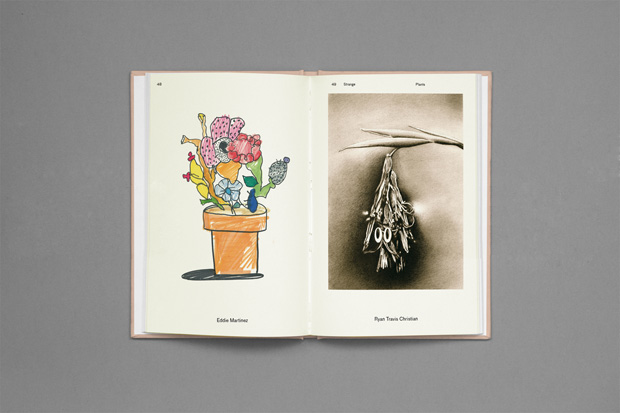
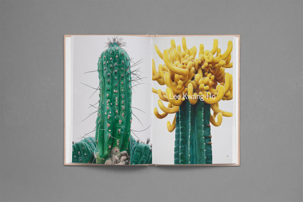
For example, I asked Paul Wackers, who paints semi-representational still lifes, and Helene Schmitz, who takes eerie photos of the kudzu vine. One works with spray enamel and acrylic, and the other an eight-by-ten large-format camera.
And the greatest truimph?
There were so many triumphs in this book. Each time an artist said that they would participate, it felt like a triumph. It was also very unexpected to be contacted by The New York Times T Magazine, and it was amazing to be reviewed by them. And, to have the book available in stores I love, like Art Catalogues at the Los Angeles County Museum of Art, the Hammer Museum store, Mohawk General Store, Tenoversix, Working Title, Restored, Colette and Bookmarc, among others. But I think the best feeling of all is when you go to the printer and see the book for the first time. Albert (Folch) met me there, and we got to experience the book for the first time together. It’s an amazing experience to hold it in your hands for the first time.
Can you share a little about the book's design? How did you create the unique cover idea?
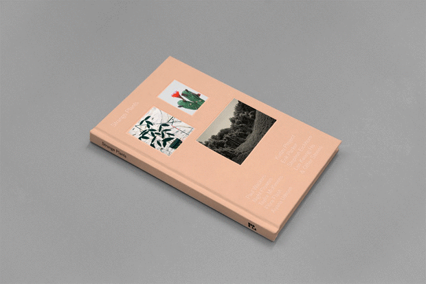
The book was designed by the wonderful Folch Studio in Barcelona. When I provided them with all the content for the book, we discussed the concept and ideas for the design. One of the features in the book was supposed to mimic a vintage book of botanical illustrations, and this is where the ideas for the overall design came from. The design was meant to be delicate, and present the images and words as living forms, in a clean and modern way.
Folch designed the cover with both "strange" and "plants" in mind. To emphasise the strangeness, the cover arrives with a blank surface, which is definitely unusual for a book. To emphasise plants, and inspire the feeling of pressing flowers inside a book, the cover images come as matte paper adhesives, which can be found as soon as the reader opens the book. It is the reader’s choice if they want to leave the cover blank, or add one, two or all three images.
I couldn’t have been happier working with Folch on this book. I’ve worked on a dozen or so books in the past, but this was by far the smoothest experience I’ve had. Plus, everyone at Folch is so nice and we had a good time when we weren’t working too. I even went with one of the designers to get tattooed by FUZI UVTPK, who is one of the artists in the book. So it was a positive experience from beginning to end, and one I would love to do again.
Josep Roman Barri, Folch Studio
How did your relationship as designers for Zioxla come about? Zio contacted the studio through a book she found, specifically a book showing the research involved in the artistic work of Ángela Palacios. Being the designer in charge was a pleasure; the process was very progressive and enjoyable, as she has worked on other publications, she is an efficient person who works day-to-day without creating any delays. Always in a constructive way, the book progressed without any interruptions. Considering that our proposal was strongly supported by the concept of the object itself, we needed to prepare a real mock-up that fit the final design, allowing her to preview the final book with high detail. That means we needed to have a couple of meetings in Barcelona, and thanks to mails and some calls, three months later, we end up at the printer checking the final part of the project, the printing process, where we tried to get the best quality in terms of production and colour reproduction.
What were the particular challenges of the brief for Strange Plants?
After a few emails with questions and doubts we developed the briefing, so it wasn't a strict or closed brief. The first meeting with the content was really pleasant and surprising, there was so much high-quality material for the book, so the difficult part was to find a language that allowed all the variety of content (photography, illustration, flash tattoo drawings, etc.) come together in a book. We were finally inspired by the old and classic way of illustrating books of flora, by sticking real leaves and branches into the interior pages of the book, that thanks to the pressure of the book itself, they become flat and bonded to the paper. This concept was also reproduced on the cover, where you could decide your own cover by the use of stickers.
Tell us about the different processes, cover, paper stocks and typefaces used through the book...
We thought that in this kind of publication, where plants are the focus of the content, details were very necessary, so we tried to pay a lot of attention to details in terms of production and choice of materials. We wanted to create a neutral design with a rich intention in it; that's why the object itself is so blank in the exterior and so rich in the interior. By the use of low-relief, and no images in the cover (at first sight), we wanted to create a mysterious object of desire, something that pushes you to discover the interior world of the book. For the layout design, we wanted to play with just one typeface across the book, letting us play with letters as if they were a living form, recalling the unpredictable emergence and growth of plants. So we chose a typeface created by type designer Christian Schwartz, based on a 19th century German typeface called Grotesk, which has the charisma and personality we wanted — a neutral but sinuous look with some organic and curved details that fit the concept of the design.
Strange Plants, published by Zioxla
Designed by Folch Studio
$30
Available from international bookshops