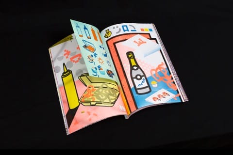
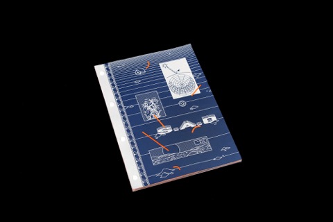
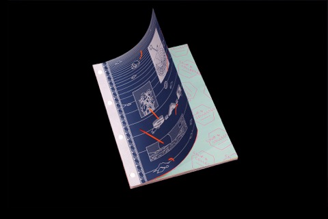
Studio Calm & Collected tasked thirty creatives to create artwork to combat seasonal affective disorder. The result is an audacious, acid-hued book that can’t help but bring a smile to your face.
What inspired you to work on a project that addressed seasonal affective disorder?
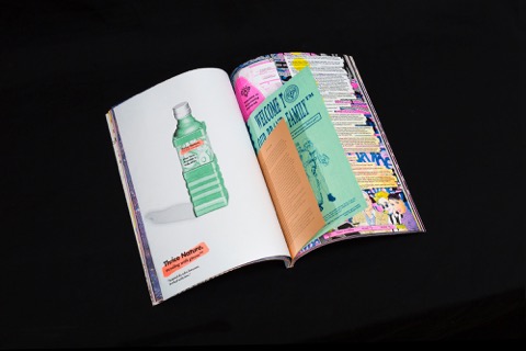
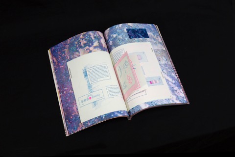
We tried to to generate a large and original body of work comprised of smaller projects and inserts which fall under the umbrella theme of S.A.D; but without mentioning Seasonal Affective Disorder. Through this publication we’ve effectively flipped the acronym S.A.D to be a kind of irreverent, brand buzzword – now more recognisable and attached to an outrageous aesthetic and colour palette than any sense of mental health issue. The point being to tackle the problem by not directly acknowledging or dwelling upon it, but by providing a distraction for the sufferer. S.A.D was also a great winter distraction for us this year. We were all far too busy to stop and feel low, it carried us right into spring 2015 which was a bonus.
How did you select the artists that you invited to work on the book?
We invited artists to work with us on S.A.D from our immediate circle of friends and collaborators. We’ve organised similar collaborative book projects to this before, so we have a group of practitioners we see as being in the ‘extended Studio C&C contributor loop’. However, as we got further down the line and could see the potential for the book expanding in front of us, it felt as though S.A.D needed even more contributors and content in order to do the project justice. We eventually rested on thirty external practitioners plus the three of us in the studio.

What was the initial brief you gave to contributors?
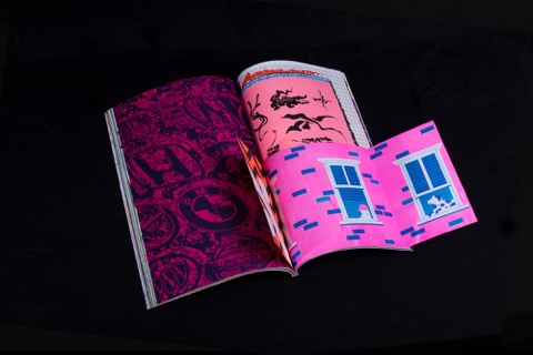
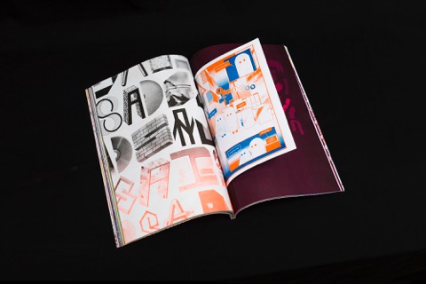
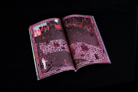
We asked them to design colourful and provoking artwork, with an emphasis on collaboration, that drew upon their experience of S.A.D. In some cases this took the shape of motivational images, others fed upon more negative experiences to make very honest work and some took a pretty factual, removed stance.
The range of work is so broad, from comics and posters to laboratory reports and fake council planning notices. Tell us a little bit about a few of your highlights.
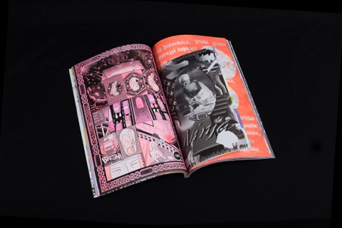
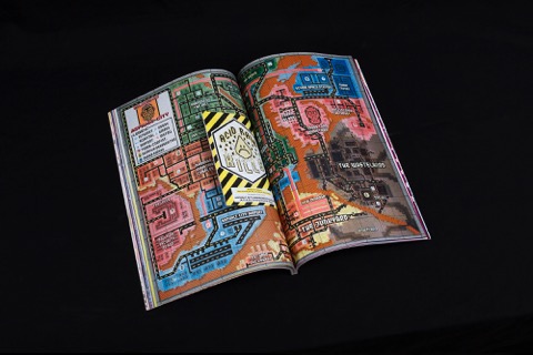
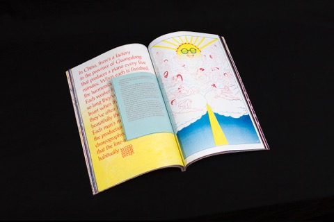
The roster of contributing artists and designers for S.A.D is a pretty eclectic mixture, plus we encouraged everyone to be as outrageous, ambitious and provocative with their work as possible. There are a few projects which particularly excited us in the studio, the sense of humour conveyed in Orron Fearon’s design always gets a big vote of enthusiasm. There’s strong and quite classic illustrative flair in the pages of Laura Callaghan and Joseph P Kelly’s comics, or Cei Willis’ comic represents a slightly edgier nihilistic side we enjoy equally. We are finding comics an increasingly fascinating vehicle to convey ideas and introduce subjects. Andrew Osman's typographic featurette printed on 'Cosmo Pink' stock is easily a highlight. And as you mentioned it was also great to be able to publish scientific research, Liz and Eliot’s section in the book looks beautiful as well as being informative.
Did any of the work you got back surprise you?
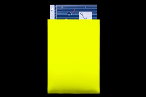
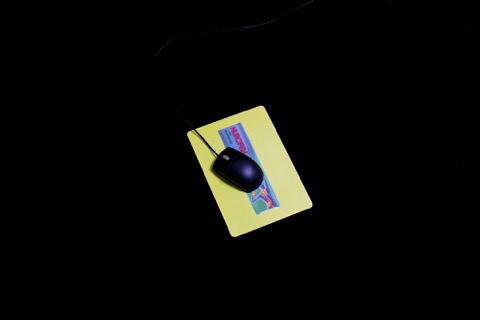
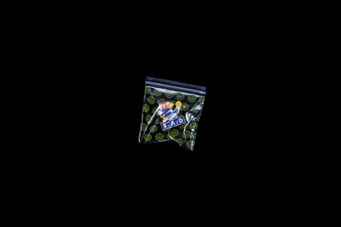
Callum Copley's vitamin D supplement tabs on blotter paper are exactly the kind of thing we wanted in the book, but hadn’t actually planned for. That was a good surprise. So was Oskar Proctor's mouse mat, which threw the spotlight on Nurofen packaging. Again, that fit the bill of exactly the kind of bizarre content we wanted but couldn’t have expected when we started out. As editors of the book we love the idea that a photographer would submit work on an original print-on-demand object rather than just a gloss page insert. It makes great use of easily available print options and nods at the disposable nature of corporate promotional gimmicks and the tacky aesthetic attached.
The content uses a lot of re-appropriation of ideas and imagery which we’re pleased about. Overall the book has quite an irreverent and subversive tone; a number of the artists who work in fairly restrictive creative roles used the opportunity of a non-profit project to publish ideas they wouldn’t be able to do under different circumstances.
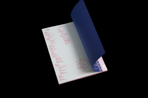
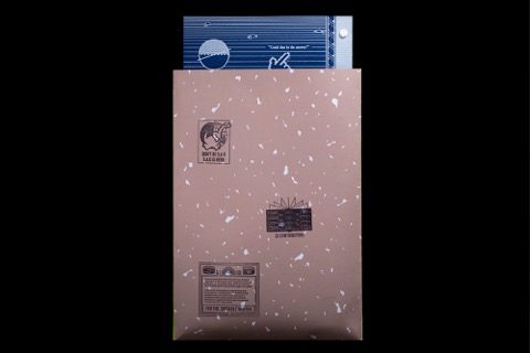
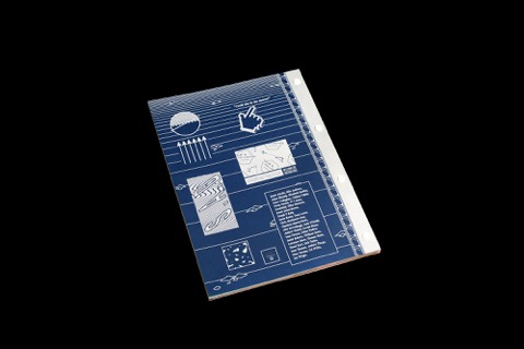
Talk us through the printing process, it must have been a huge feat.
We worked closely with the great technicians at Ditto Press to produce the book. They were extremely helpful and accommodating. Creating a handmade book in small but equally ambitious edition with so many pages was definitely a big challenge. As expected, lots went wrong and everything ran over schedule. The project was definitely a labour of love.
What has been the response to the book?
From what we gather, the response to S.A.D has been pretty positive. We just aimed to design a book which would be of interest to us, that’s the only real yardstick you can use. Our aim was to publish and draw a circle around what we felt illustration was and meant in 2015; using the book as a time-stamped document of contemporary themes and ideas. Anthologies can at times feel quite jolty or disconnected when you read through them, so we also tried to avoid that happening in this case. It would be acknowledgement enough if the ideas in S.A.D strike a chord with artists in the London scene. It’s interesting attempting to contribute to popular culture or feel like you’ve added something which goes in the collective melting pot.
studiocalmandcollected.com

