Lifestyle and travel magazine Cereal has won devotees for its muted style and original photography. We caught up with creative director Rich Stapleton to talk about the magazine’s first city guide, which launched at London Design Festival last week.
What was the thinking behind diversifying into city guides?
Travel has always been a bit part of the magazine. With Cereal we look at a city in a very different way to how you would get with a usual travel feature or a travel guide. We look at topics in a deeper way, it's more about the culture or an overview of the city rather than telling you what restaurant to go to. Our approach to travel would be articles on language or architecture. The travel guides came as a separate arm. We had requests from people asking where they should go when they visited a city. So we launched Guided, a series of online guides, to address that side of things and give a curated snapshot of our favourite places. Combined with the magazine it would give a holistic view of a city.
Was it difficult translating the look and feel of Cereal to Guided?
When we were travelling for Cereal, we always went to places and we would Instagram, Tweet and capture those places so we already had the vision of what we wanted it to look like. For volume four of the magazine, we transitioned into complete travel and lifestyle from just food and travel, and the guides came very organically from that transition. We launched the ten online guides initially and then we've been adding one approximately every month since.
How does the design for new printed guide differ from the magazine?
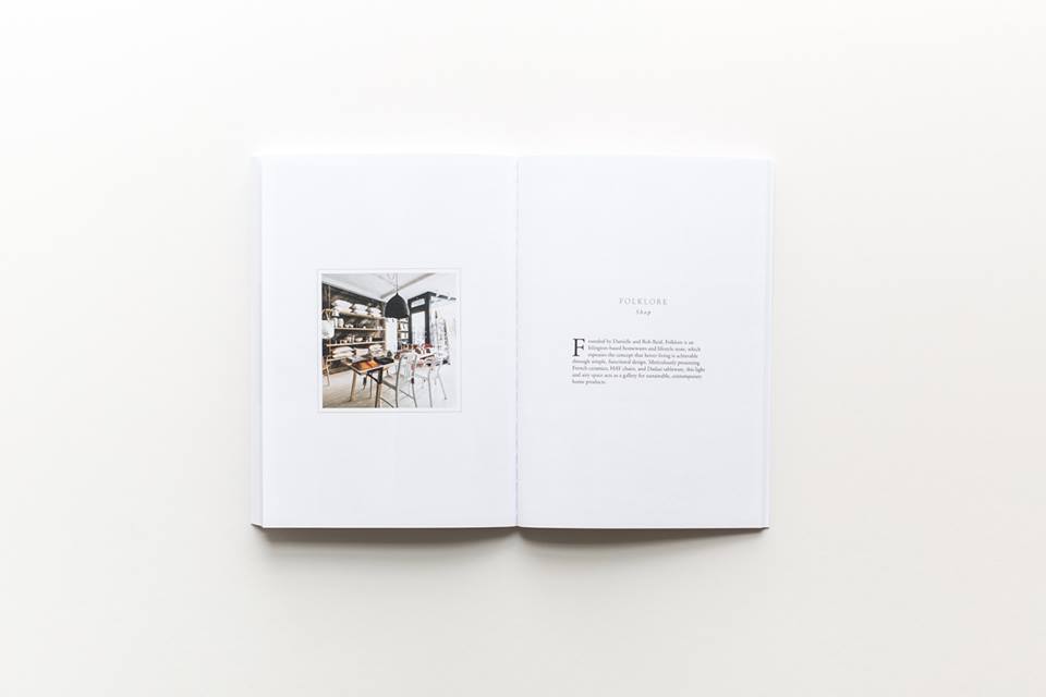
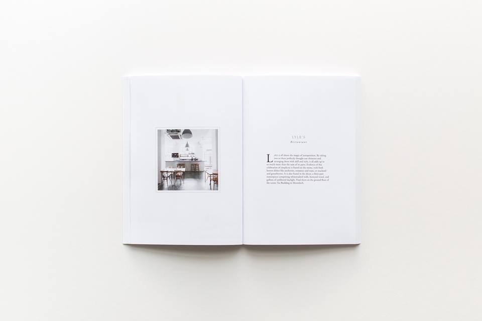
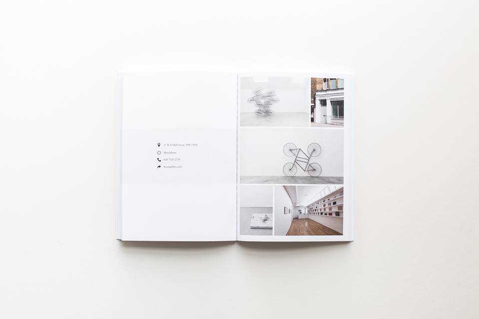
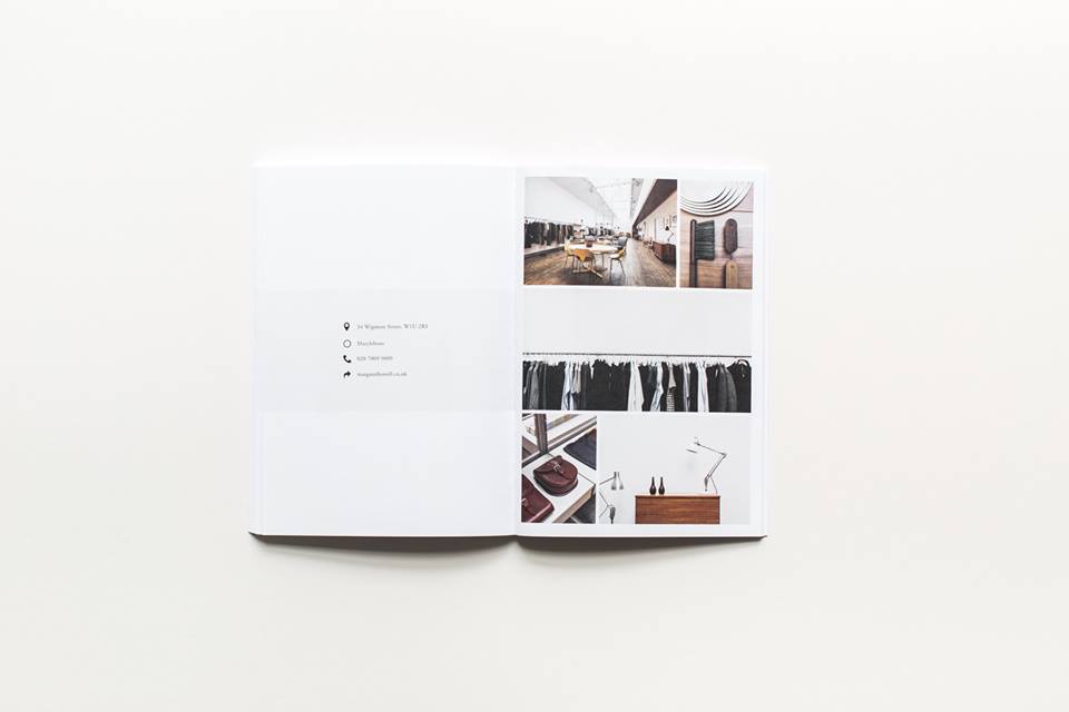
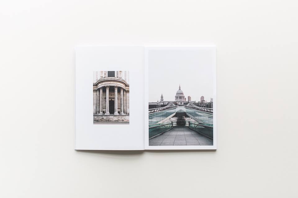
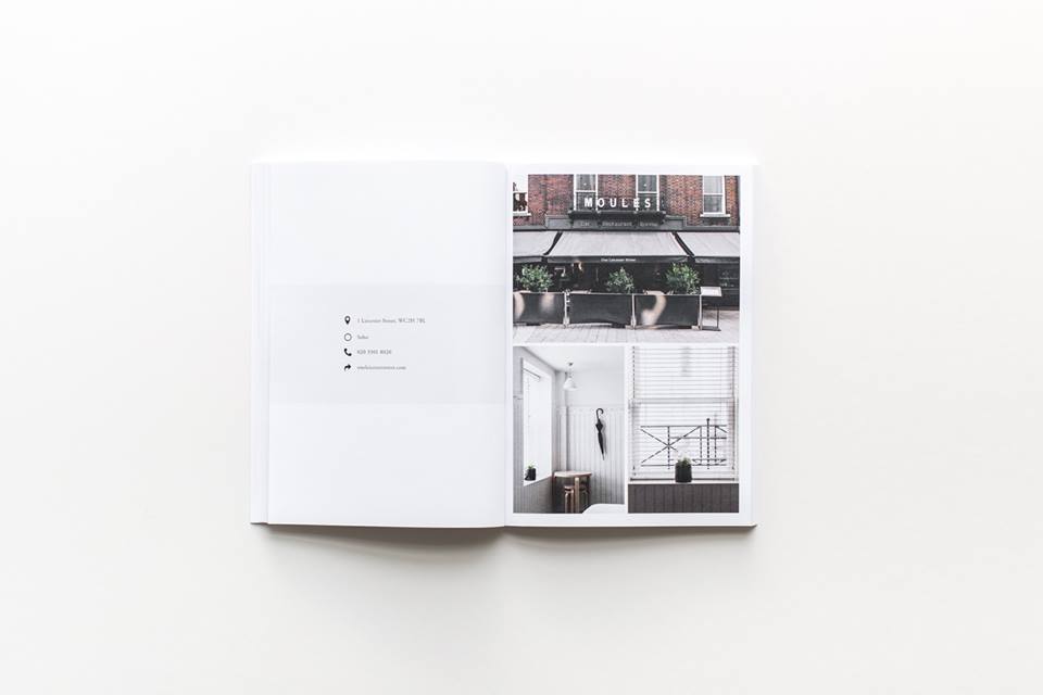
It follows the art direction of the online guides much more. Although it has a similar feel to Cereal, it has its own identity, set of fonts and colour palette. You can see it stands completely separately. As with Guided, the printed London edition is mainly image-led, with only the essential information in very short captions. It allows people to discover the place themselves in their own time. As with Cereal the design is very pared-back, classic and has a neutral colour palette. I think if people like the design of Cereal, they'll like that of the guide.
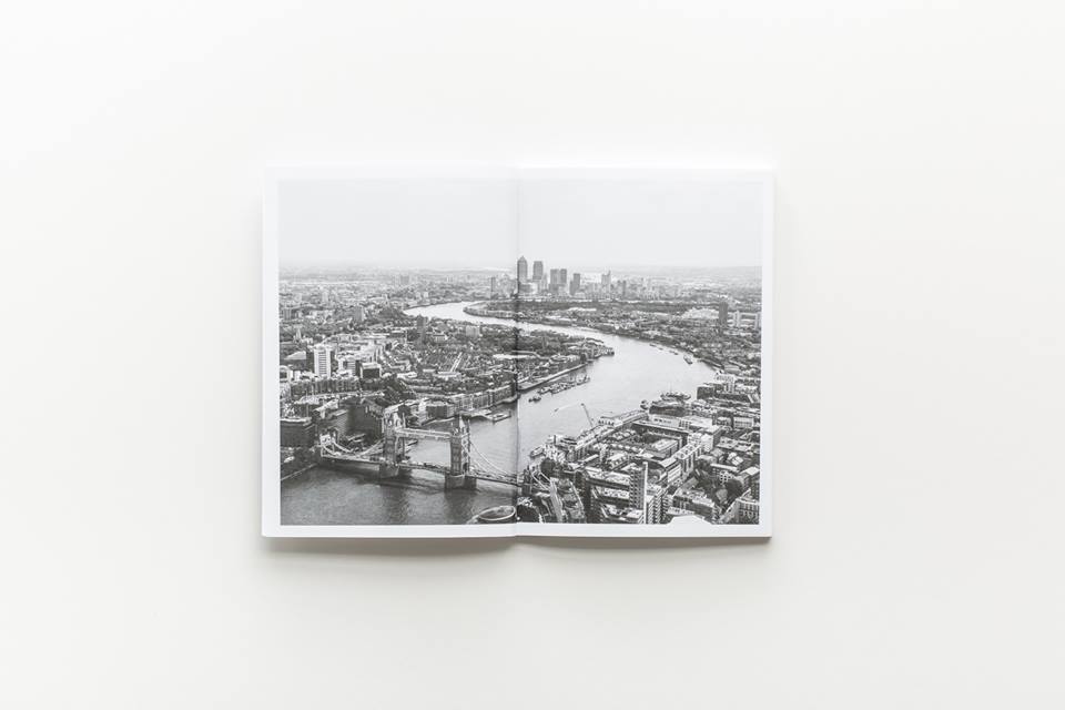
Tell me about the distinctive photography style.
With Guided all the photography that we use is original for that guide. One thing that we were very adamant about was not using press photography, which is quite challenging. In the London guide there are twenty venues. We used freelance photographer Adrienne Pitts for some shots and then everything else was done in-house by myself. We wanted to keep everything within a certain look and style.
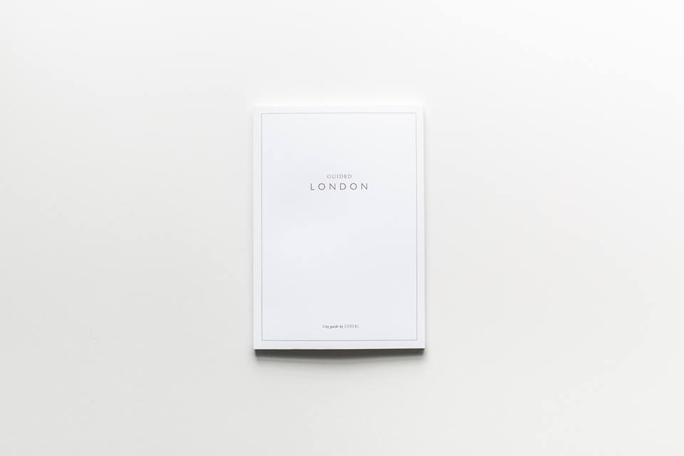
Does the London guide use any unusual materials or processes?
It's printed entirely on uncoated paper, including the cover. It's on much rougher stock that our physical magazine. We debossed the cover as well. It has a really different feel, it's a lot more tactile. It's a very classic approach. We were inspired by Penguin Classics and their timeless design. The size of the guide is perhaps a little bigger than people might expect – it's A5, so it won't fit in your pocket. That's purely because we wanted to show the photos off at a bigger size.
Is the London guide intended to be part of series?
Yes, absolutely. After London, we will produce printed guides to other major cities as well starting with New York and Paris.
guidedbycereal.com
readcereal.com