
The authors of a new book about Concrete Poetry in the digital age share some landmark examples of work where word and image collide with powerful effect....
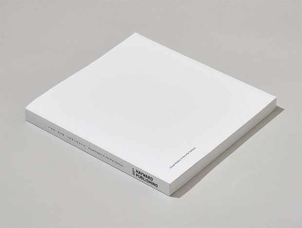
It is not often that book designers get away with proposing an all-white cover for a book, then manage to get it approved by the client and complete the feat by pulling off a pristine, snowy expanse of cover on the bookshop shelves. So we were amazed and impressed when The New Concrete landed at Graft HQ. We were not surprised to see that the book design is by the skilled team of Robert Boon and Alberto Hernandez at Inventory Studio. The form of the book, with its deliciously sparse, embossed cover and subtly nuanced typographic style, perfectly carries the theme of poetic collisions between word and image.
We invited the book's authors Victoria Bean and Chris McCabe to select some of the key works featured in the book and explain what makes them so important and interesting...
Cecilie Bjørgås Jordheim
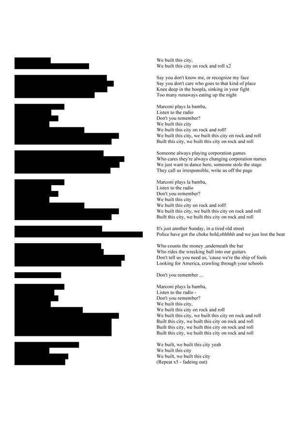
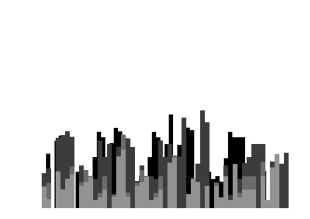
Cecilie Bjørgås Jordheim’s We Built This City doesn't just take the great modernist trope of turning popular culture on its head so much as on its side. The artist took the lyrics to Starship’s 1985 songs blocked each line with black, then turned this new structure 90 degrees to the left to create a skyline: the city structure that the poem is about. As the artist says "In this way We Built This City has built a city". This is one of the pieces in The New Concrete in which the visual poem ends up with very little text in the foreground but has been created through a re-appropriation of a specific piece of text. There is a wonderful tension in the piece between its abstraction and sheer sense of fun which reminds us of James Joyce's internal monologue in Ulysses which captures Leopold Bloom singing hits of the day such as "those lovely seaside girls". This is conceptual language art that brings a smile.
Daniel Lehan
Daniel Lehan brings a fresh performative approach to his visual poetry. We were fascinated by this sequence Daniel had shown us in which typewriter poems had been destroyed in the process of their creation by the typewriter textblocks. We were particularly excited by the broken bits which had become detached from the poems. What resulted from this was the most exciting half hour at a photocopier, standing with Daniel, as we assembled the bits into new visual poem configurations. We see these pieces as somehow marking a turning point in the typewriter poem, suggesting a future of experimentation in which the classic page poem will be both eroded and exploded into new dimensions.
After the launch of the book at the Whitechapel Gallery we herded together the remaining poets, artists and audience members into the cobbled alley (making way for the passing Jack the Ripper tours) for Daniel to perform a poem involving visual signifiers and fire.
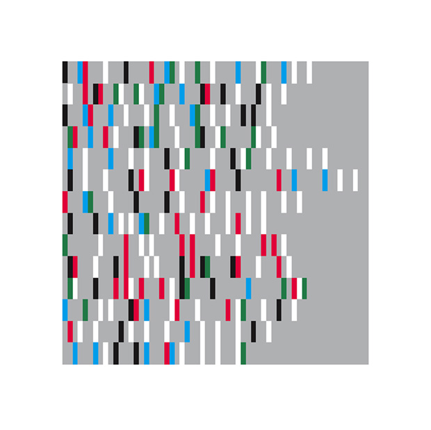
Christian Bök
Christian Bök's poem Of Yellow takes Rimbaud's poem Voyelles at its word. In the original poem Rimbaud has attributed a colour to each vowel: A Black, E white, I red, U green, O blue. Rimbaud’s poem was passed around the avant-garde literary scene in Paris of 1871, distributed hand-to-hand, creating rumours that Rimbaud had discovered the synaesthetic mysteries of language As if the poet had gone out on the astral plane with the five vowels, returning with their colour coded logic. Bök's piece takes that possible hidden meaning and updates it through digital, suggesting the hidden structure behind Rimbaud's poem, revealing the colour behind each letter as they appeared on the page in the original poem. This poem was used as the front cover of Christian Bök’s best-selling book Eunoia which creates many other univocalisms (poems that use just one vowel). As a visual piece, these slim bullions of red, blue, green, white and black, are an invitation to see the world as Rimbaud did, through a systematic derangement of the senses.
Henri Chopin
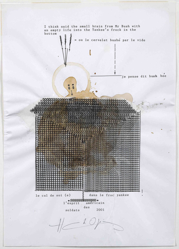
We chose one of Henri Chopin’s dactylopoemes from a series of five works all titled Bush and dated August 2001. The work feels prescient: created in the weeks before the September 11th, and three months before George Bush launched Operation Enduring Freedom in Afghanistan - the coffee stains are like dried blood and hint at the conflict that was to come. His work is both funny and furious, and you get a sense of this fury in the way that he’s pounded the keys on the typewriter to get the depth and layering of the patterns around the coffee stains.
As a young man in Paris during the Second World War he was sent to a forced labour camp in Czecholslovakia. Before escaping, his earliest preserved works were poems written during this internment. William Burroughs called him an “inner space explorer”.
Chopin was also a true polymath: a concrete poet known for his experimental sound poetry, a painter, graphic artist and designer, typographer, filmmaker, broadcaster, arts promoter and an independent publisher: his review OU, was a major forum for concrete and audio poetry until 1974.
John Furnival
We first came across John Furnival’s work in one Ron King’s plan chests at Circle Press. It was an intricate hand lettered print called The Fall Of The Tower Of Babel.
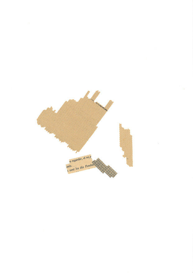
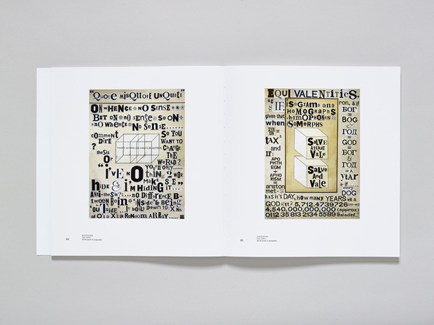
When we went to John’s house to choose his more recent work for The New Concrete, we chose Huit Coins, which is still referred to as a work in progress even though it has looked resolved at any stage we came across it.
Made of off-cuts from previous projects, these two images act like an archive: he’s separated each letter and cut them into tight squares the same way letterforms sit within the original hot metal blocks of type. Each separate bit of paper shows its age by how yellow it is, and the overall typography is reminiscent of the kind used in ransom notes, a mixture of upper and lower case, bold, small. It’s discordant but works together. We liked how he’s restricted the poetry to the available letters he’s got in the studio, the humour in his writing, ("If every dog has its day how many years will a god get?") and the way the Dingbats look like snow. The work’s spontaneous even though you know the painstaking process it takes to line up the type like this.
Hansjörg Mayer
Haroldo de Campos, came up with the word typoet to describe Hansjörg Mayer “as a man who eats reality with types and reinvents reality through types, reality being for him texts”.
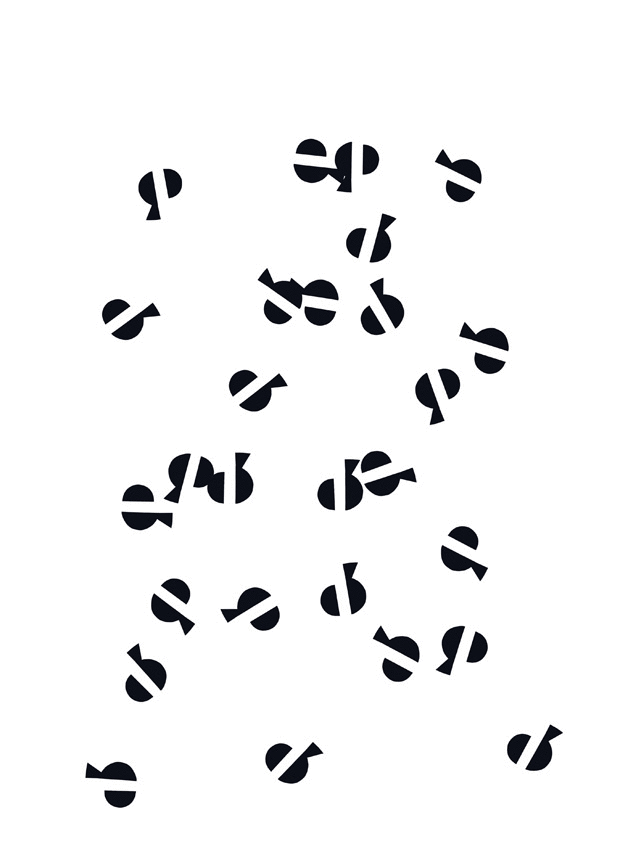
A central figure in the original concrete poetry movement Hansjörg is best known for his Typoems, Typoactions and the Alphabets which first appeared in 1961 in a series called the First Alphabet. He began the Last Alphabet in 1968 but was too busy publishing and lecturing at the time to complete it. Having resumed work on it in the past couple of years we chose the letter e and its negative space “the full and reduced letter” for the The New Concrete and although it’s no longer printed on a letterpress press it still has a sense of seamless continuation from the previous letters.
His publishing house, Edition Hansjörg Mayer has published several of the original concrete poetry anthologies, as well as the futura series: a set of large folded broadsheets that featured the major experimental writers in Europe, North America and South America in the ‘60s, including Dietor Roth and Ian Hamilton Finlay.
The New Concrete: Visual Poetry in the 21st Century
Edited by Victoria Bean and Chris McCabe, essay by Kenneth Goldsmith
Published by Hayward Publishing