
Letterform Live returned last week with an evening devoted to David Bowie. It was was a night of reminiscence, nostalgia and a fitting typographic tribute to the great man himself. Theo Inglis reports…
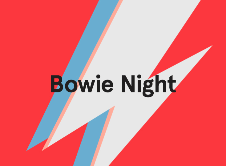
Last Wednesday night saw the first in the next series of Grafik Letterform Live events in partnership with Monotype and the ISTD, hosted by Protein Studios in Shoreditch. Each of our four speakers spoke for roughly ten minutes to a sold-out audience, each using a different letterform as their starting point. The theme for the night, and the link between the four different letters, was musical superstar and all-round creative genius David Bowie, who sadly died earlier this year. The Bowie theme gave the opportunity for some personal reminiscing, nostalgia and celebration of the great man’s life and work, as well as insight into working with Bowie from two of our speakers who were lucky enough to collaborate with him on creative projects.
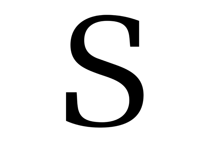
Kicking off the night was Julian Morey, who joined Peter Saville Associates straight after graduating from Central Saint Martins. He now works as a freelance designer for clients across a wide range of disciplines, juggling this with running his own digital typeface foundry Club-21. Julian’s chosen letterform was an ‘S’ from Hermann Zapf’s 1952 typeface Melior, by far the most obscure Bowie link of the night, yet an extremely interesting one none the less…
In 1976 David Bowie starred in Nicolas Roeg’s cult sci-fi film The Man Who Fell to Earth. His character is a humanoid alien who has travelled here in search of water to take back to his own dehydrated and dying planet. But Julian’s choice comes from a scene in which Bowie’s character doesn’t actually appear; it does. however feature the cover of an album that his character has recorded called The Visitor. Julian also pointed out that interestingly in the background of the record store setting there is a display for Bowie’s Young Americans album, so the real David Bowie features in a film where Bowie is in fact not Bowie, but an alien from outer space. A self-referentially meta touch rather than a chance accident.
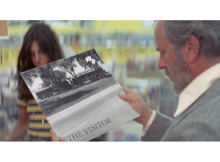
Back to the fictional record cover in question, Julian appreciates its design for being much better than it needed to be. Although he was quick to point out that from personal experience record execs would never go for something with the title not in the top third of the sleeve. Following a bit of design detective work Morey identified the font as Melior, and even figured out that the ambiguous image was of a specific locomotive train – the Santa Fe 2926. Julian also pointed out that the character looking at the record was wearing the world’s first digital watch – the Hamilton Pulsar P2, also seen in the Bond film Live and Let Die. Both the watch and design of the record sleeve are exactly the sort of ‘considered choice’ that the films designer Brian Eatwell deserves credit for.
—
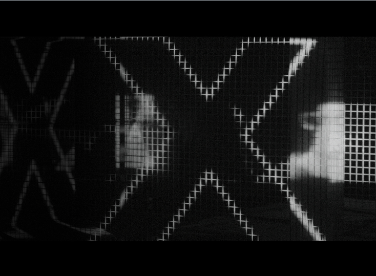
Up next was Tom Hingston, the founder of Hingston Studio whose work spans print, moving image and digital, primarily for clients in fashion, music and film. Tom’s choice of letterform was an intriguing, and slightly mysterious, black and white ‘X’ from one of the projects he worked on for David Bowie
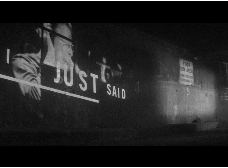
In late 2014 Tom received an email from David Bowie asking if he would like to work on promo videos for two of his upcoming songs. The first of these turned out to be Sue (Or In A Season Of Crime), which was the lead single from his compilation album Nothing Has Changed and later featured on his final album Blackstar (or should that be ★ ? More on that later…). Tom of course said yes, and then received footage of Bowie recording the track with an orchestra in a New York studio. The finished version of the song came to him three days later. The style and mood of the music lead to Hingston immediately thinking of the shadowy monotone cinematography of Film Noir and the distinctive typography of their opening credits. So he set about creating an “opening title sequence style video” using the footage from the recording studio and the songs lyrics, in which typographic compositions of specific lines of the song follow the soundtrack, moving in harmony with it.