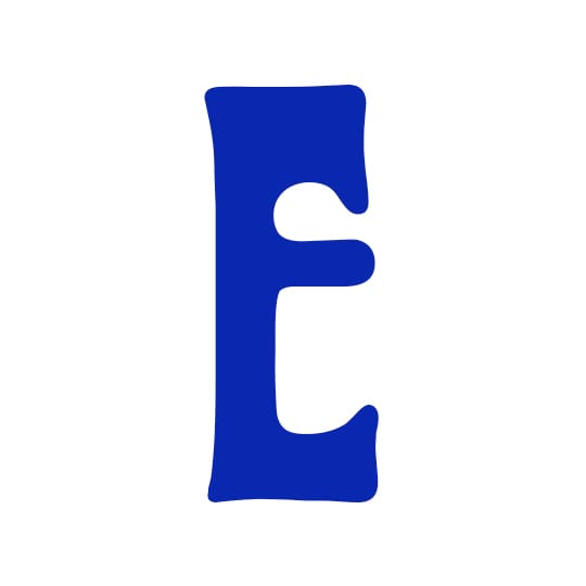
An intriguing combination of high art and kitsch, Hermann Hoffmann's curvaceous Art Nouveau-inspired Herold Reklameschrift is a typeface which lies very close to Miles Newlyn's heart. It feels as if Herold Reklameschrift has always been a part of me, distilled from the sum of my experience, even when I had none. I cannot recall discovering it, so perhaps it discovered me, seduced me before my child mind had separated itself from the world.
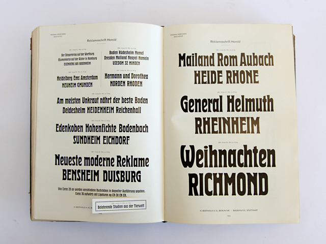
You could say we're close, we share a lot. We're not timeless or universal, and we're not easily known either. Defined by the stretch and pull between opposites; the burst of life that is spring and the dark peace of winter, high art and kitsch, the sacred and profane. For reasons unknown to me this typeface inspires self-reflection. Herold Reklameschrift was designed in 1901 by Hermann Hoffman, then head of the print room at the Berthold AG type foundry. It is an example of Art Nouveau or Jugendstil, an arts movement that in Germany was predominantly graphic and typified by organic typography. It is also very similar in proportion and texture to blackletter, and may have been designed to combine harmoniously with that style since both blackletter and roman were being used equally in Germany at this time.
Less than a year ago I began designing a revival of Herold with Elena Schneider, a type design with whom I'd collaborated previously and through which we'd built the trust necessary for such a personal project. There are several good digitisations of the original, but I wanted to completely modernise it. 'Modernise' often means little more than the removal of archaic or quirky details - that 'modernise' can mean 'sanitise' is a sad indictment of our times, so why try?
Unlike Herold Reklameschrift (Reklameschrift means advertising type), our revival may have no commercial application. So if there's a reason to have done it, it has something to do with time. Hermann Hoffmann was the same age as I when he designed it - 'me' 115 years ago. That we know so little about Hoffmann helps. What could Elena and I hope for? Only that we wouldn't sanitise it, that there was something that we could bring to it, that the revival of this former self wouldn't be a zombie and that today has something to offer that is as good as the past. I think we succeeded, and I'm planning to revisit the typeface again in 2131.
textpref.com
Image below showing H. Berthold AG Type Specimen book (1913), courtesy of :nike – see more of his collection of type specimens here.
Miles Newlyn…
…had his first three typefaces released through Emigré, and then designed a set of six typefaces for the legendary David Carson. Miles has worked with many of the big names in branding, including Wolf Olins, Interbrand and Venture Three. He has created what have been described as “some of the most conversation-provoking logos in the public eye,” for a raft of high-profile clients including Sky, Unilever, Three Mobile, Landrover and EE.
Art Nouveau…
…has its roots in Paris at the Maison de L'Art Nouveau, a gallery owned by the German art dealer, Siegfried Bing. The German term ‘Jugenstil’ comes from the Munich-based magazine Jugend, which helped promote the style of art first displayed at the Paris gallery and then subsequently at various trade fairs, most notably the 1900 Exposition Universelle.


