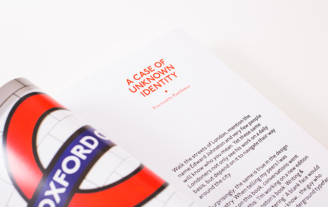
On the centenary of Johnston Sans, Paul Felton has created this very handsome new edition of Edward Johnston's classic text Writing & Illuminating & Lettering – we caught up with Paul to find out more about this labour of love for new imprint D&B books.
Can you tell us how the project first came about? Is it a book which you’ve admired for a long time?
The project is a joint project between myself and David Dunn, who has recently set up his own publishers called D&B Books. I worked on his brand identity a little while ago, then David moved just down the road from where I was living in London and we shared a great little local pub, so this project and partnership – like many other good ones before it – was formed in the pub.
David had been approaching particular people to see if they would be interested in writing a book for him to publish, but was hitting a brick wall, possibly because D&B was still very much in it’s infancy with no back catalogue to prove his credentials. So he decided to change tact and look for existing content that we could re-package and re-publish. He ran a list of possible titles past me in the pub and as soon as I heard Edward Johnston’s name I jumped on it. Not only did I love Johnston Sans, but I knew its 100th birthday was just around the corner, so a great thing to tie a new edition in to.
I have to admit, I knew of Writing & Illuminating & Lettering, but only by name – the initial draw for me was EJ and Johnston Sans. I’m hugely passionate about typography and Johnston is one of my favourite typefaces and one I've never tired of. It had always been a bit of a bugbear for me how EJ’s name wasn’t generally held in the same regard as other design greats. Many people, including a lot of designers don’t even know his name, yet he is responsible for two of the most iconic, recognisable pieces of design in the UK, if not the World. Also not many people knew of his amazing calligraphy and lettering work, so this provided a chance to hopefully give him some much deserved time in the limelight again.
How long has it taken from when you first had the idea to when the book was printed?
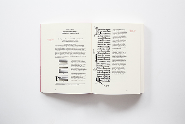
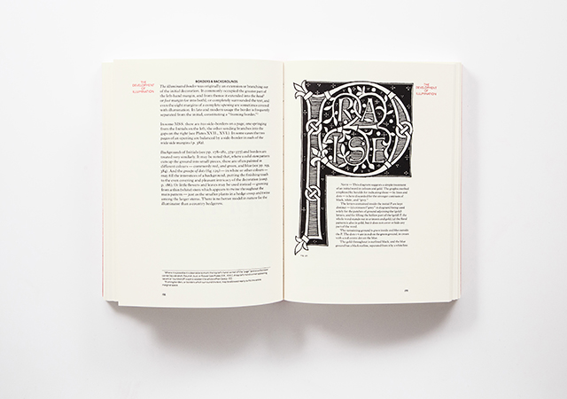
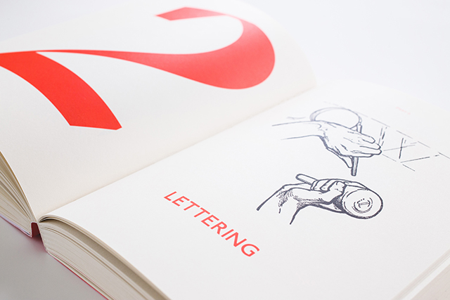
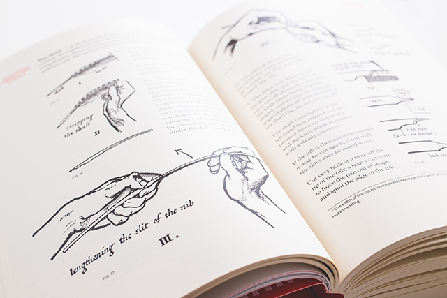
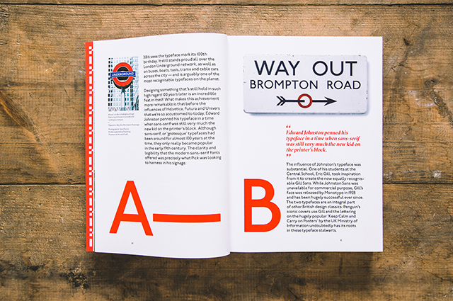
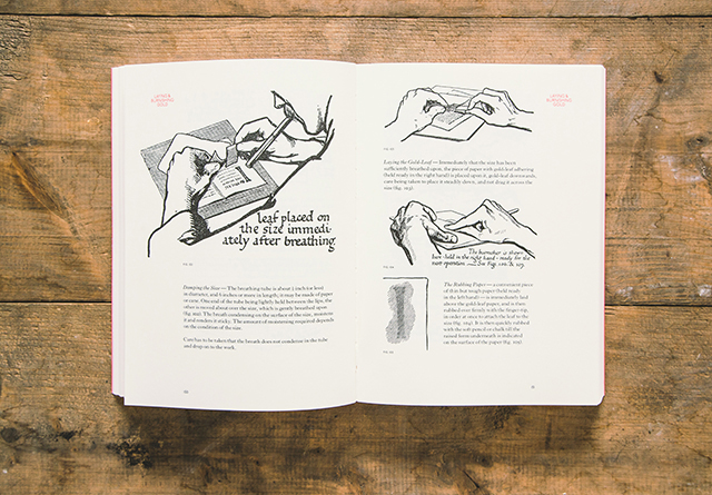
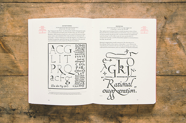
All in all the project took twelve months to complete – when I started working on the book I was freelancing, so it was very much done in and around the day job. The design and layout came together fairly quickly, but it was a very labour intensive book, there were around 250 engravings that all needed scanning from the original book and then cleaning up and retouching. We changed the format and layout which meant that every page reference and all the indexing needed re-doing, and for a 500 page book that was no small task. A lot of research went into the project too – I was really keen to add in some additional biographical content upfront so we could include some imagery of Johnston’s calligraphy, him teaching and of course the Underground typeface and roundel.
How did you go about getting hold of permission to reprint the book?
The content for the book was actually out of copyright and in the public domain so we were able to obtain the content and re-package it relatively easily, which was another huge draw. We got in touch with the Edward Johnson Foundation and also EJ’s grandson, Andrew Johnston, to inform them what we were doing and share initial layout work with them and they were hugely helpful throughout the project. Speaking to Andrew about his Grandfather was a great insight into not just his output, but the man himself. You can really see how his journey through life influenced his work. One of the staggering things for me, at first, was that the same person who created this incredibly ornate calligraphy, also designed the clean sans-serif typeface we’re so used to seeing on our daily commute around the capital. The parallels though start to become clear once you research into EJ’s teachings about broad nib calligraphy and the origins of things like the unique diamond tittles of Johnston become apparent.
In terms of layout, typography, paper, format etc, what have you changed and what have you kept the same?
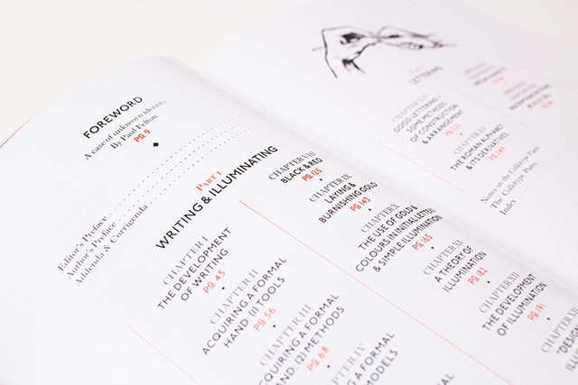
We ended up changing a fair bit in the end, over the last 100 years the book had being re-published numerous times but just as facsimiles and the technical restraints of producing a book in 1906 obviously meant that there were some creases to iron out. The main task of the layout was re-ordering the information so it was much easier to digest and reference relevant diagrams and illustrations. In the original you’d often get an illustrated example a few pages away from the text it referred to.
We also changed the size of the book itself. It’s intended use is as a manual for calligraphy, one to be constantly referenced, so I felt a larger size and soft cover would allow it to be used more easily as a manual, the pages open wider and have more space surrounding the content to make it a bit easier to work alongside.
The structural layout was tweaked, although I based all the grids and margins on the guidance set out by EJ in the book. I was really pleased with the interior layout once I applied the girds detailed in the book. The layout felt to me a lot like Johnston Sans in some respects – very simple and clean but with some characterful quirks. It’s not a layout I would have chosen if I was starting from scratch, but I really like that, it took me in a different direction to what I would normally feel comfortable with.
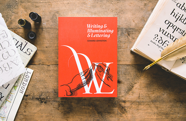
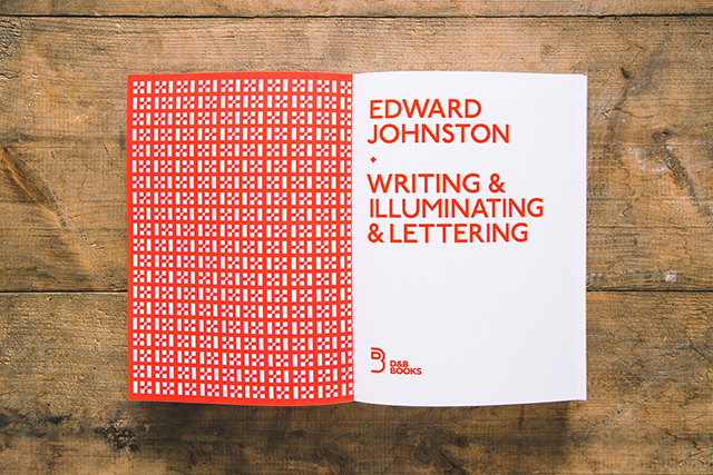
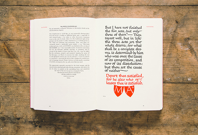
Paper-wise I opted for a nice toothy ivory paper by Fedrigoni for the book as it felt like a nice nod to the antiquity of the original and I loved the look of the woodcuts on an off-white stock.
One typeface was a given; it had to be Johnston Sans (the P22 version, as the original isn’t commercially available). The other two I deliberated over quite a bit. The text font I arrived on through my research, I was over at St Brides and the curator showed me some copies of The Imprint magazine that EJ worked on with Francis Ernest Jackson, J. H. Mason and Gerard Meynell – it turns out a serif font, called Imprint, was created for this magazine and was available on My Fonts. So I opted for that as the text face, aside from the nice link back to EJ it was a lovely serif complete with non-aligning numerals which I was keen to use. I also wanted a final display face, and something that demonstrated how EJ’s legacy was still alive today. I happened upon a face called Sectra by Swiss foundry Grilli. I loved the look of it, and reading about it I discovered it was based on broad nib calligraphy – the technique for which EJ was a pioneer. This for me was a perfect fit, a contemporary foundry creating a face inspired by the techniques of EJ a hundred years before.
What are the particular challenges involved in reimagining such a well-known and well respected book
Our main aim behind republishing this book was to, in some way, mimic what EJ did for calligraphy at the turn of the 20th century. His work and teaching completely re-vitalised calligraphy and lettering and opened up the craft to a whole new generation of scribes. We wanted to take W&I&L and re-vitalise the design to make it more accessible to a new generation of calligraphers today. However, getting the balance right of modernisation vs respecting the original was a big challenge. I had to reign myself back a few times when things went a bit too contemporary and clashed with the content.
Do you think the book is still relevant to audiences one hundred years on? And do you think that Mr Johnston would approve?
I was pleasantly surprised when I first read the book at how relevant the content still is today and the way it's written, on the whole, doesn’t feel like it was written 100 years ago. Johnston seems to have an enviable knack of creating work that remains relevant and accessible throughout generations.
Calligraphy and hand lettering has had another real renaissance in the past few years, possibly as a bit of a reaction to everything becoming more and more digital based these days. You only need look at Seb Lester’s Instagram following to see just how popular it’s become. From lettering artists I have spoken to, nowadays it’s very much a self taught skill as there simply aren’t many lettering courses around, so I think this new edition of W&I&L can actually play a really important role in acting as a manual to help educate and inform this new breed of lettering artists.
As to whether EJ would approve – I know he was a very difficult man to please, but as teacher and an inspiration to young designers, calligraphers and lettering artists like Eric Gill and many of the greats, I’m sure he’d be happy in the knowledge that his book was living on and continuing to inspire 100 years later.
How are your pen skills?
Ha, let’s say they're a ‘work in progress’. I have bought some pens and have been practising – adhering to the principles in W&I&L have certainly improved my technique a fair amount, but much more practice required I think.
Have you hatched any plans for your next book yet?
Myself and David certainly have an eye out for what’s next. The premise behind D&B is to publish books on art, design and music with an emphasis on great content and beautiful production, so it’ll be much more of a quality over quantity approach. We’ve took a lot of learnings from this book and certainly keen to push on to the next book – maybe a one with less woodcuts in for the next one though.
Purchase a copy of the book direct from D&B books here:
dandbbooks.co.uk and see more of Paul's work at paulfelton.co.uk