
In today's Covershot, James Jones remembers the great Storm Thorgerson who, with his cohorts at Hipgnosis, created a stunning series of LP covers for Pink Floyd which blew this designer's impressionable teenage mind. It took longer than my Dad would've liked for me to come round to Pink Floyd’s music, but their work did have another effect on me at an early age.
It introduced me to the collaboration between the band and Hipgnosis, and in turn to the endless possibilities of design and the world – and more importantly the imagination – of designer Storm Thorgerson.
Looking back, I'm still amazed at the confidence and boldness each image portrays.
Even in my teens, the lack of any form of typography on the album sleeves intrigued me. I later found out that the record label weren't as impressed... but you can get away with it if you're friends of (and employed by) the band.
It was the late Nineties. I'd finally worn down my parents to get the new iMac Bondi Blue and so I spent the next year or so scanning pretty much everything I could get my hands on and covering my wall with printouts. And my main inspiration was the work of Hipgnosis.
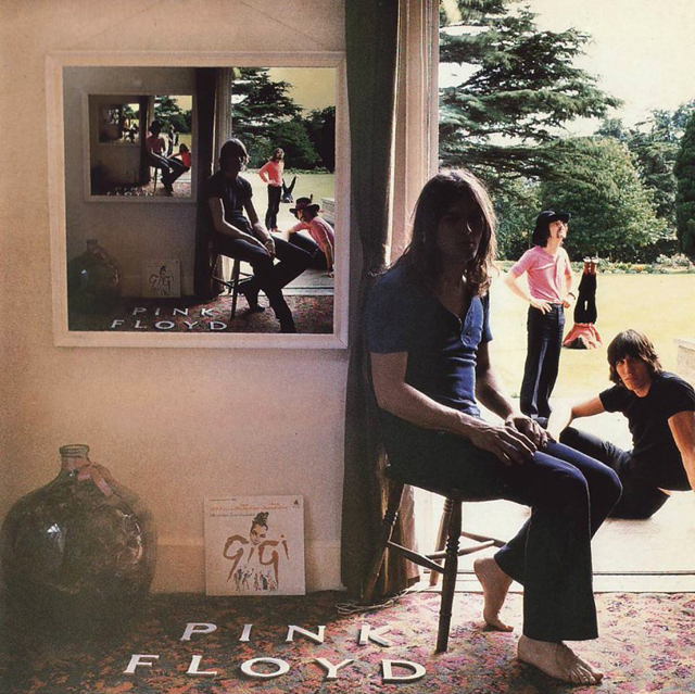
I'd spend hours looking at Ummagumma (and later the album Echoes which 'echoed' the same idea), thinking about the various shots and setups involved. I'd scan in and alter each 'layer' of the image. Flipping characters and changing colours, trying to work myself into the mindset of Storm Thorgerson. And cursing my own common Welsh name in comparison.
The audacious simplicity of the cow on Atom Heart Mother. A reaction to the psychedelic space rock imagery associated with similar bands. Wanting something plain on the cover and inspired by Andy Warhol's famous ‘cow wallpaper’, Storm simply drove out into a rural area near Potters Bar and photographed the first cow he saw.
Simple.
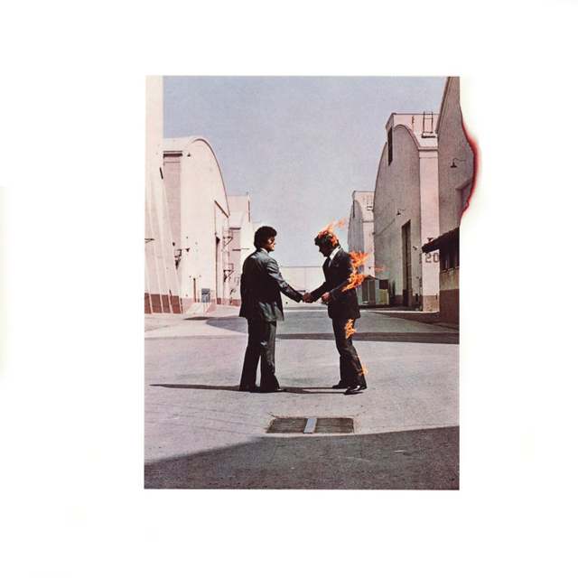
The detail in Wish You Were Here which sees the photograph also set alight.
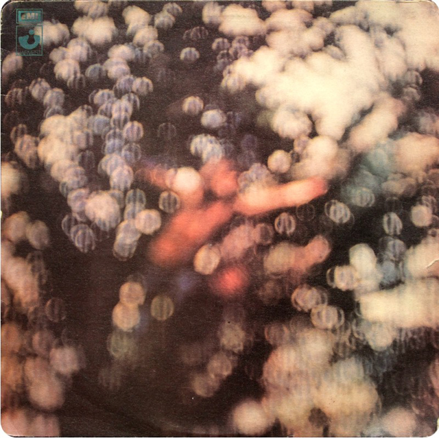
The distorted imagery of Obscured by Clouds.
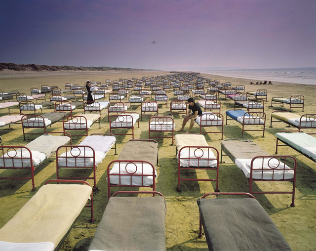
The endless 'sea' of beds portrayed on A Momentary Lapse of Reason. Pre-Photoshop days meant that 700 beds were trekked over three hours from London to Devon, painstakingly placed in line to portray the image used on the final cover.
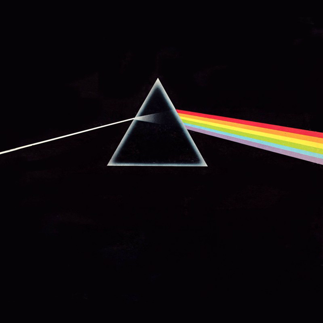
And of course the graphic simplicity of The Dark Side of the Moon. Which really does speak for itself.
What links all of these great album covers, and why I chose them, is the idea behind each one. That vehicle used to portray the idea, which bonds design and music with such style and individuality. The compositions and the playfulness which entices and calls out to the viewer.
You can see the hours of thought and time taken with each piece, and how the constant bending and re-writing of the rules lead to refreshing and original visual outcomes.
While I never knew I'd end up working as a book designer, these covers helped me realise that the design world was the one for me.
And I'm still on the lookout for my own ‘cow moment’ everyday.
Take a look at some of James' cover designs here: jamespauljones.tumblr.com
James Jones is…
…Art Director for Oneworld Publications, IPG Trade Publisher of the Year and Winner of the Man Booker Prize 2015, and an award-winning freelance art director and designer working with publishers around the world. Highlights of his ten-year career so far include the cover of Keith Richard’s autobiography Life while working for The Orion Publishing Group, co-founding the popular CMYK blog at Vintage, Penguin Random House, and working across a variety of titles there as a senior designer, from a re-launch of the James Bond novels to international prize-winner Laurent Binet’s HHhH. James was named as one of the Bookseller’s 2014 Rising Stars, its annual list of the best and brightest young talent in publishing.
The Dark Side of the Moon…
…differs from many of Pink Floyd's LP covers in that it features a more simple graphic, rather than photographic, approach. Thorgerson recalled a conversation with the Floyd's keyboard player Rick Wright about the cover artwork, where Wright insisted “Storm, let’s have a cool graphic, not one of your tatty [figurative] pictures…” When the designer told him that he did images, not 'cool graphics,' the keyboard player simply retorted, “Why don’t you try to see it as a challenge?” It would seem that the gauntlet had been well and truly thrown-down, and hence what is often voted the best LP of all time has a suitably memorable cover.


