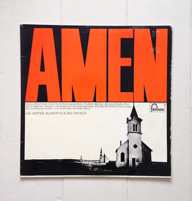
We’ll probably never know the designer behind this powerful cover to Dr Jester Hairston’s collection of spirituals. Designer Mark Neil Balson marvels in its mystery and assesses its impact. Amen is not just any spiritual album, at least that’s what the cover is telling us. Its dramatic type size and contrast speak volumes about the potential within. Is Jester Hairston a dark, troubled man or just edgy beyond his time? When a cover is this good the contents can only disappoint and sometimes the mystery is better than the truth. You see, I don’t own a copy of this glorious bit of design and I don’t know who designed it.
My introduction to this cover, fittingly, came from designer Matt Willey who does own a copy (pictured). Matt could easily place this work along side much of his own portfolio and no one would question it. The fact that this cover can seem both of its era and completely contemporary at the same time is, for me, thrilling. After all isn’t part of being a designer the will to create things that fulfill not only their immediate purpose but also instil lust over as much time as possible? There’s a purity to this kind of work. The reduction of elements and bold choices help it show so much intention that one can’t help but admire the designers clearheaded courage. It’s a seemingly impossible shame then that the designer remains unknown.
Released in 1965, Amen comes after the lasting genius of Reid Miles’ Blue Note work and right in the middle of the tight darkness of Willy Fleckhaus’ Twen. Yes, I know that’s quite the leap but it helps me get my head around how this singular design can encompass so much of what I feel is important in design. Based on my personal feelings, it’s very easy then to draw the line through to Mr. Willey, Simon Esterson, Pablo Martín and Vince Frost, who all work with the same expressive clarity that makes this album cover so special. It makes such a random discovery all the more reassuring that great design inspiration has and will always be out there, we just need to scour through vintage shops (or the internet) to find it.
So, does this cover contain a simple formula for greatness? It’s impossible to know what struggles may have led to such a clear execution but the few things we do know make the work anything but straightforward. For starters, that capital M and it’s custom middle section only contribute to the loudness of the ‘AMEN’ as if it’s being shouted from the top of the church. This notion further emphasised by the perfect alignment of the steeple with the type above, giving a direct link between the two elements. The italic song titles and credits illustrate choral voices within the layout. And what to make of the three contrasting churches in diminishing alignment? Your guess is as good as mine.
Amen.
markneilbalson.com
Mark Neil Balson
…is a multidisciplinary designer currently working in Palma de Mallorca at Atlas with Astrid Stravo and Pablo Martin. Balson’s speciality is editorial design – he’s recently worked on Elephant Magazine’s redesign with the Atlas team (you can read more from Elephant here), and has applied his measured, thoughtful style to the likes of Momentum magazine, Interfaces Magazine and identity work for the wonderfully named photographer No Secrets Between Sailors.
Jester Hairston
This composer and songwriter was regarded as one of the foremost experts on African-American spirituals and choral music. Born in North Carolina, his grandparents had been slaves. His early talent in music led him to Tufts University and then to New York’s Juilliard School, one of the best music schools in the US. His early career involved arranging choral work for the movies, before starting a 30-year collaboration with Russian composer Dimitri Tiomkin, which involved composing spirituals and other pieces of music for Hollywood. He even starred in a number of films including To Kill a Mocking Bird (1662), In the Heat of the Night (1967) and Being John Malkovich (1999).
November 6, 2014 3 minutes read
Holy Grail
We’ll probably never know the designer behind this powerful cover to Dr Jester Hairston’s collection of spirituals. Designer Mark Neil Balson marvels in its mystery and assesses its impact.
