
As Modern Design Review hits the newsstands, we speak to Graphic Thought Facility's Paul Neale, one of the design team who made it a reality.
Can you begin by describing the project in basic terms?
Modern Design Review is a new design magazine. Its emphasis is on furniture and product design practice and theory relayed through creative storytelling. Graphic Thought Facility designed the first issue, which launched this April.
How did the project originally come about?
The magazine is the brainchild of Laura Houseley, the publisher and Editor-in-Chief. As a journalist, editor and consultant specialising in contemporary design, Laura had recognised that there was a space for a new kind of design magazine; it was an idea that had been in her head for sometime before she first came to talk to GTF in 2011 about the project.
What was the original brief and did it change at all?
There was no written brief, though at the beginning of the design process there was of course plenty of discussion. Laura and the design team (Robbie Mahoney, Fabio Schmieder and myself) would bring along examples of past publications that had some kind of relevance to what we wanted to achieve. It transpired that we had a lot of the same stuff on our individual bookshelves. Talking about these publications was a good way to hone down the visual language of MDR. After these conversations we made a series of mock-ups using place-holder content to define the magazine's architecture and typography. We commissioned Housestyle (Richard Dawson and Dave Farey) to create the magazine’s headline serif and sans-serif fonts. When the real content for Issue 1 started to arrive in December 2013 we were pleasantly surprised to find that the hypothetical structures basically worked and little further adjustment was necessary.
During this time we were also finding out how the working relationship with the editor would actually operate. Laura had a clear plan of the main features that would appear in the first issue; as the content developed its interpretation/treatment became an evolving dialogue between editor and designers. The addition of further mini-features threw up new needs. This required a working process that actually reminded me of the series of one-day projects that I used to get set at art school.
Did this project present any particular challenges, and if so how were these overcome?
Templates and style sheets were needed to provide a structure. But it was necessary that the structure must flex to allow the features to be approached individually in order to optimise the unique opportunity offered by each story. In a way the magazine is a series of ideas daisy-chained together. Individual features could exploit this freedom as long as the overview — what comes before and what comes after — was maintained.
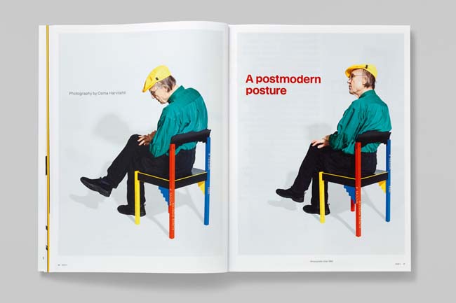
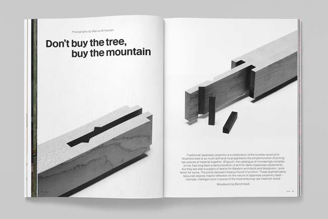
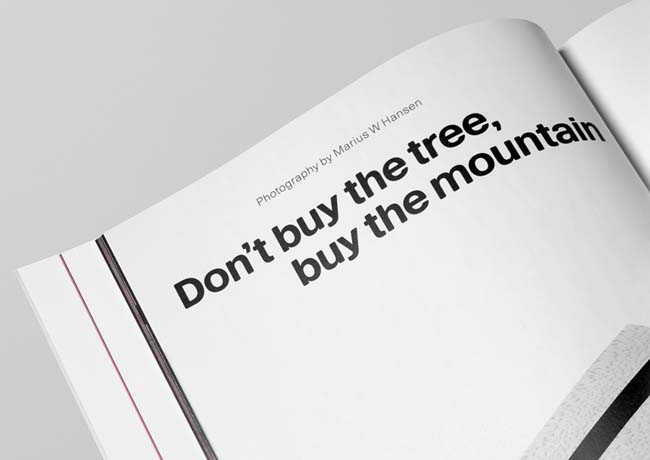
Launching an independent magazine with a tiny team meant the budget was very tight. There were many photographers involved: Scheltens & Abbenes, Marius Hansen, Osma Harvilahti, Angus Mill, Angela Moore, Kalle Sanner and Matthew Donaldson. Their support and resourcefulness was critically important. Issue 1 needed to be a strong statement of intent: both editorially and design-wise. We needed to take a long-term view from the beginning. That's why MDR's bespoke fonts had to be in place.
What do you think has worked particularly well?
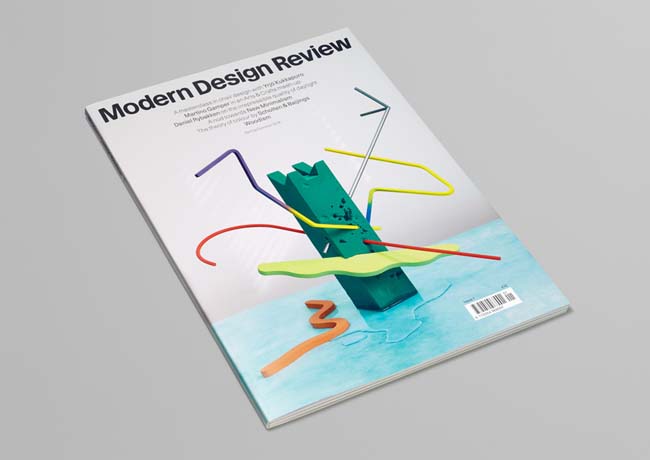
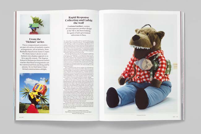
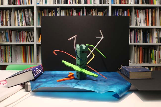
This was the first expression of MDR's jacket concept (using photographic still-life to convey the issue's key features). Referencing the Japanese art of Ikebana described inside the magazine, fragments from the various features were composed around a flower-arrangers foam brick. Encouragingly, the image came together with relative ease.
What was the client's feedback?
When the first boxes of finished magazines arrived, Laura called to say how excited she was. After such a long birth, being finally confronted with the a real object means there is no longer any need to imagine. That moment invites an objective gut-response. We were very pleased to hear that she was still enthused.
A couple of weeks later, we sat down together and deconstructed the magazine: what worked well, what could be improved upon. I like this aspect of working on a magazine. There will be a next issue and that means an opportunity to make adjustments and develop ideas further. We're all fired up for Issue 2.
graphicthoughtfacility.com
moderndesignreview.com


