
Build’s creative director Michael C. Place gives us a guided tour of the new identity for The Stow Brothers, a straight-talking firm of estate agents that aims to be different.
Can you begin by describing the project in basic terms?
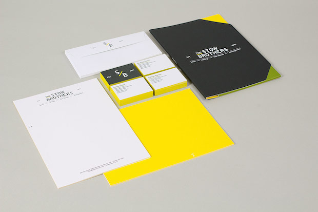
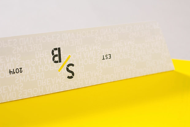
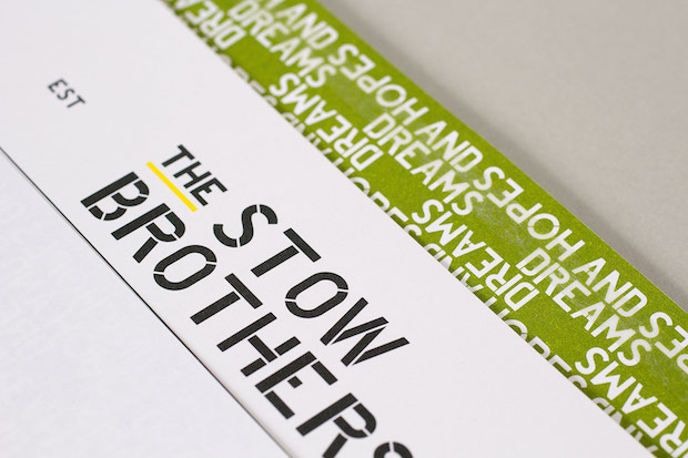
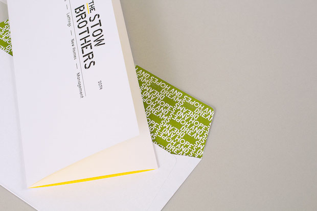
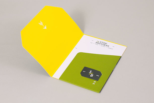
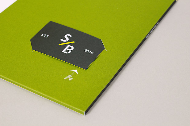
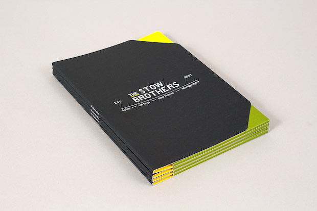
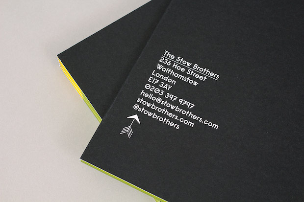
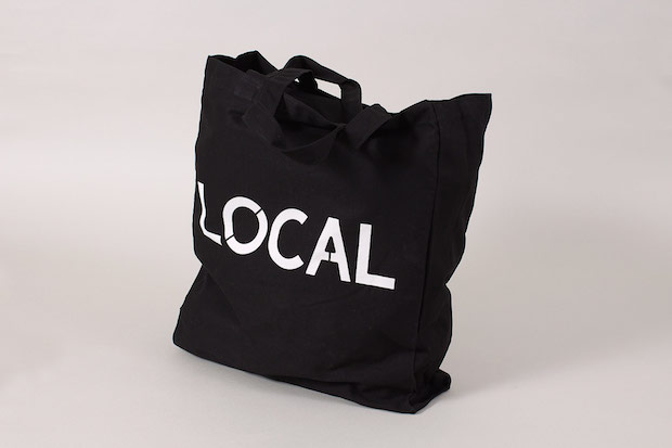
Brand identity (including interior design) for The Stow Brothers, a new Walthamstow-based estate agent.
How did the project originally come about?
We got a message on our studio answerphone from a guy called Kenny saying that they were a new estate agents and wanted to talk to us about their branding. We thought they were probably time-wasters (and typical estate agents) but when we met them they were great. They genuinely wanted to do something different, and this sold (pun intended) it for us. We started the project in December 2013 and finished it in June this year.
What was the original brief and did it change at all?
We didn't get a written brief but we met with the guys quite a lot and talked about the project. The only real direction from them was to make them look different. There are a lot of estate agents in Walthamstow, the majority look shockingly bad. Andrew Goad (one of The Stow Brothers) had worked at another local estate agents for a long time so he wanted to be very different from them. Andrew and Kenny (and yes, they are actually brothers) are not your archetypal estate agents. They don't wear pointy shoes and shiny polyester suits, they are really genuine and nice people.
Did this project present any particular challenges, and if so how were these overcome?
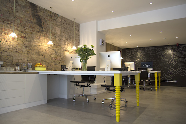
It's the first bit of local work – our studio is two minutes away from their office. We really wanted to make it as good as it could be for the guys, after all we will be walking past their shop and their 'For sale’ boards pretty much every day. The biggest challenge was that this was our first project where we also designed the interior. Nicky really learned on the job – it was her first go at interiors, she was very interested in this aspect and did an amazing job. I guess another challenge really for us was to not go too crazy as they didn't want to alienate too many people that could be potential clients. But at the same time Walthamstow is going through a lot of changes, gentrification has arrived at our doorstep, so they needed to also look modern and professional for to attract all the new people buying in the borough.
What do you think has worked particularly well?
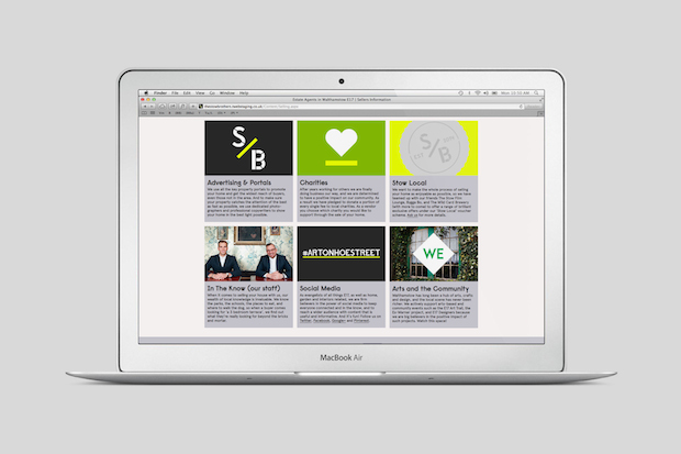
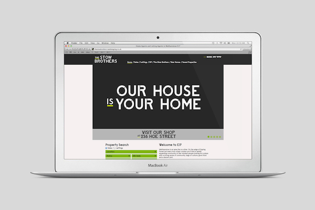
The whole project. The integration of all aspects of the brand work really well, from the core identity to the interior and all the print to the website and direct mail – it all works beautifully. It looks very different for this sector. It’s a confident fresh brand, and we can walk past their office and sold boards with pride.
Did this project involve sourcing any new materials or using any new processes?
We got to use scaffolding boards and polished concrete, that's a first for us. One interesting aspect of the project was the fact we got to work with a local historian. We came up with the idea very early on to draw some of Walthamstow’s many unique landmark buildings and we backed that up with historical information on those buildings – these formed the first piece of direct mail.
What was the client's feedback?
It's been really great. Kenny gave a really nice speech at their opening party – he said if the office interior had been left to them they would have had a fussball table and carpet on the floor.
Technical spec.
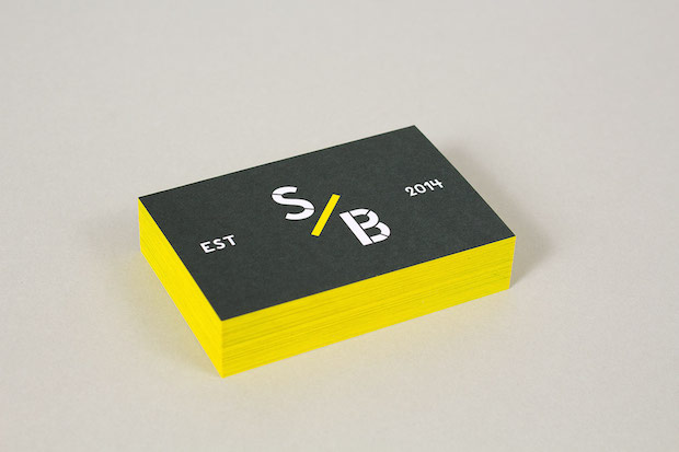
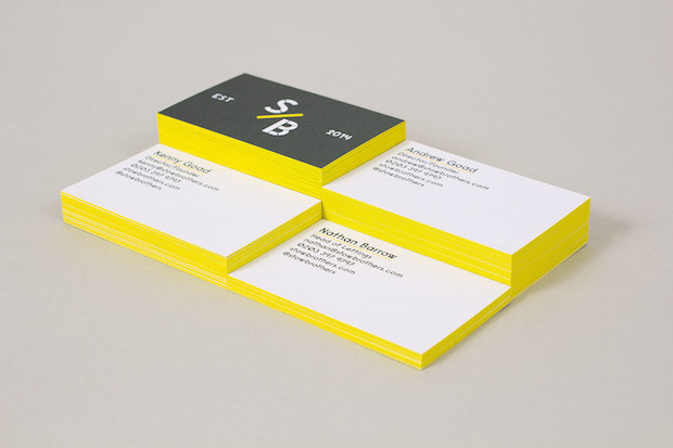
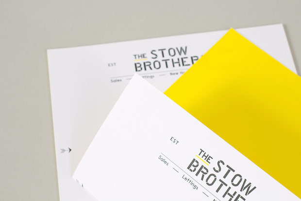
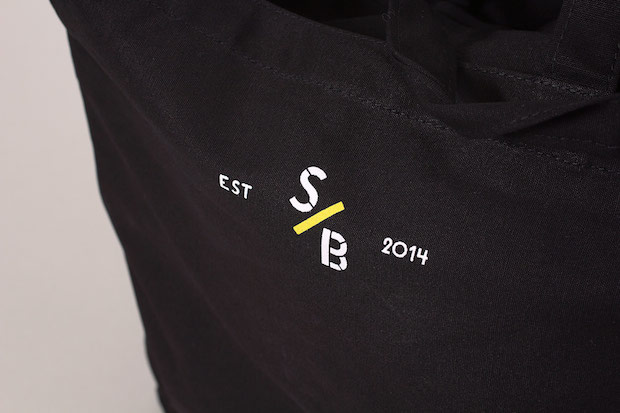
Typefaces: Custom type x 2, Raisonné and Apercu Regular. Materials: (Print) Munken Polar (various weights) Processes: Litho print, colour-edged cards, screen printed boards.
wearebuild.com
stowbrothers.com


