
An Idiosyncratic A to Z of the Human Condition is a fascinating new exhibition at The Wellcome Collection in London. Here designer Lucienne Roberts describes how she created an alphabet through which to showcase the weird and wonderful objects from Henry Wellcome’s extensive collection, describing everything from test tube babies to phantom limb syndrome.
Can you begin by describing the project in basic terms?
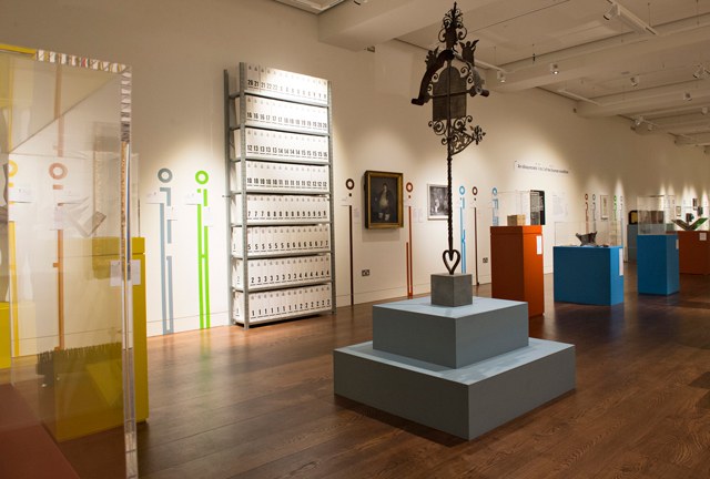
The exhibition was conceived to showcase one of the new Wellcome Collection galleries before its official opening this Autumn. Put together with great energy and at speed, the show uses existing cases and plinths to display an extremely diverse set of objects from Henry Wellcome’s extraordinary collection – alongside newly designed systems to display the results of audience activities, also themed around the A to Z.
How did the project originally come about?
We have worked with the Wellcome before, as has external curator Danielle Olsen – but never together. It was she who suggested that we’d make a good team. We were delighted. We do lots of exhibition design and a good relationship with the curator is key as it’s our job, in part to interpret the curatorial vision. Putting together this show was a very collaborative process. There was mutual respect, which in my experience always leads to the best results.
What was the original brief and did it change at all?
From the outset it was clear that the graphics had to play a pivotal role in helping visitors understand the structure of the show, and give this rich but disparate display visual coherence. Colour and graphics were the primary method of tying these various elements together.
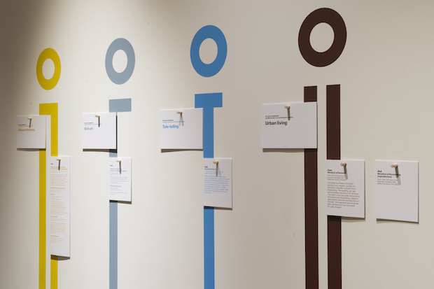
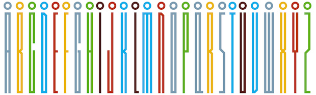
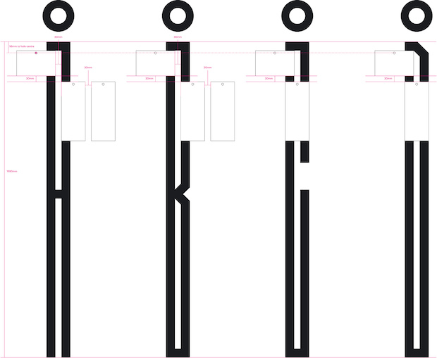
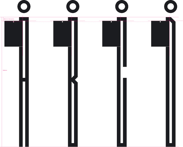
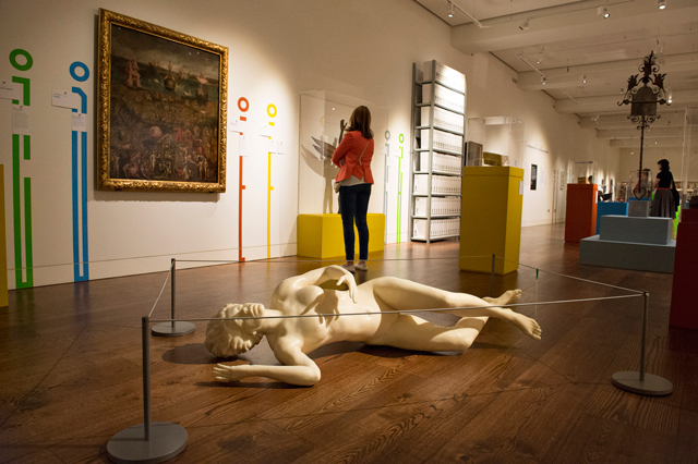
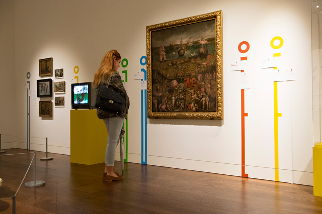
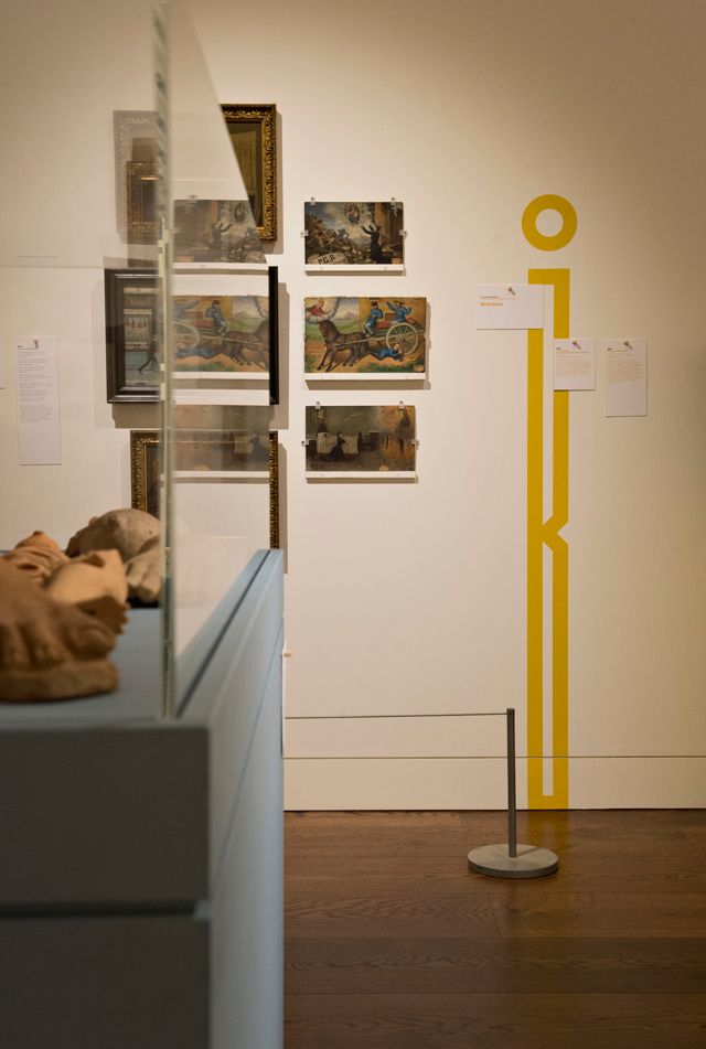
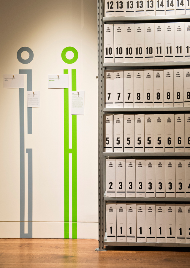
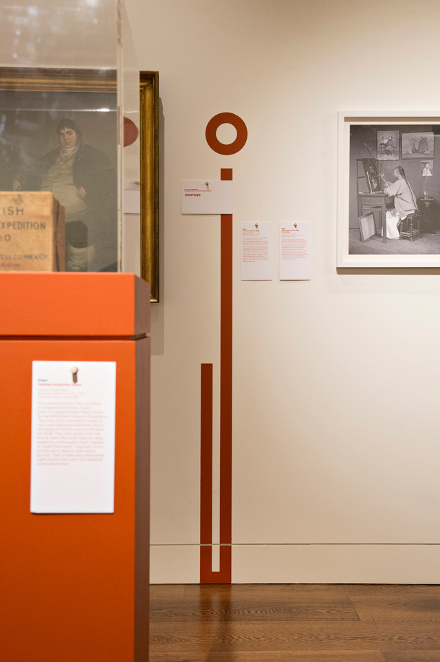
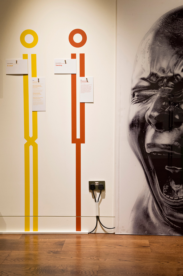
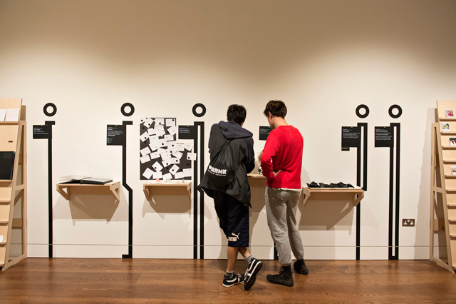
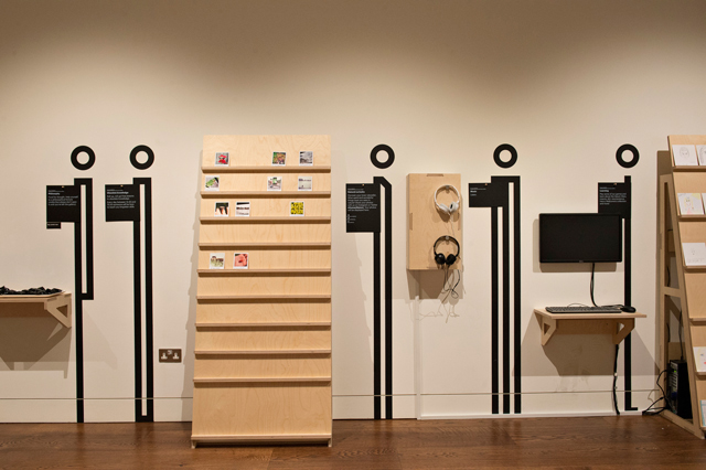
Reflecting the human condition of the title, a full alphabet of human height bespoke letters was painted on both of the gallery’s longest walls. One in a colour scheme based on eye colour, the other in black. These highly abstract letterforms, each crowned by an open circle, playfully reference the incongruity of the human form, inviting a second glance as their double meaning becomes apparent.
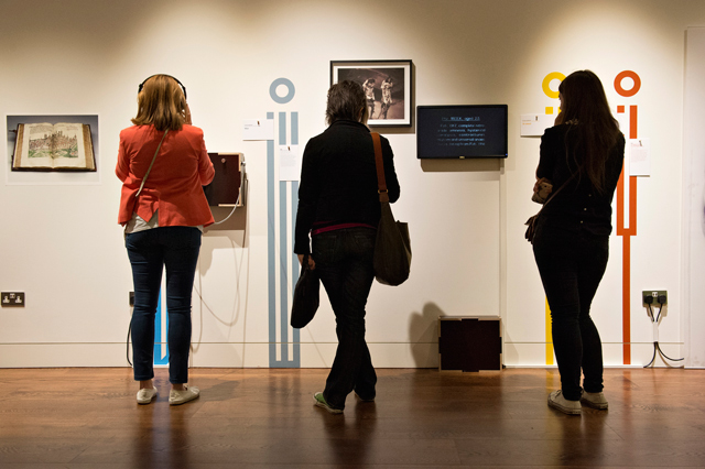
The strongly coloured letters, alongside the matching colours of the object label texts, act as a coding system with the nearby painted plinths. The large black letters opposite, alongside the corresponding black and white instructional labels and display mechanisms made out of unfinished ply, make for an obvious contrast and introduce visitors to the participatory wall.
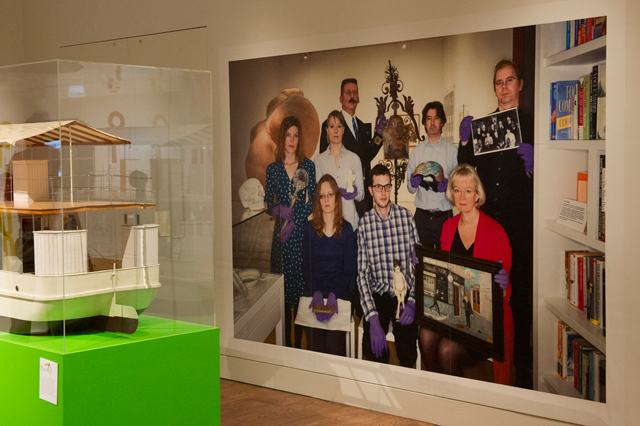
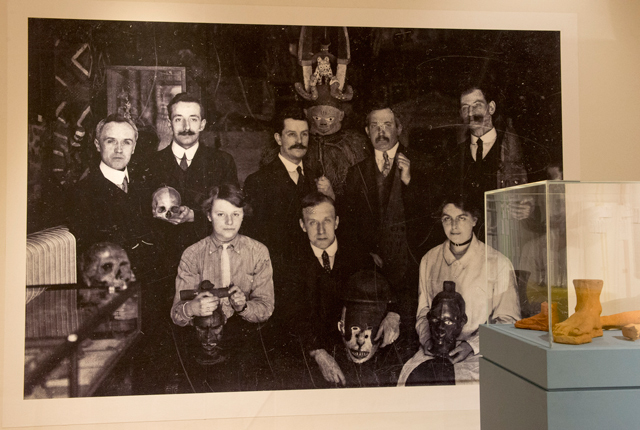
All information texts, captions and labels hang from pegs on the wall and are repeated on the plinths while the intimate nature of the show is reinforced in two actual size photographs that speak to each other across the gallery space. Wallpapered on the short end walls and acting as a ‘then’ and ‘now’, each shows a group portrait of people employed by the Wellcome Collection. They proudly hold their favourite object from its vast and highly engaging archive, reminding us that we all share in the experience that it so cleverly seeks to explore.
Did this project present any particular challenges, and if so how were these overcome?
From the decision to put this exhibition on to its opening was an unusually short period of time. Many of the design and production decisions were made in response to this – but with constraints come inventiveness so we felt liberated having to think on our feet.
We had to develop eye-catching devices to help the visitor quickly understand the overarching concept and then engage with its content on a variety of levels. Given my typographic bent, no project could be more enticing than an exhibition based around the alphabet. It was a gift… and one that so obviously required super-graphic navigation too, so that was even better.
The interactive wall required Danielle to come up with often low-tech methods to capture visitor responses. These had to be presented in a highly accessible but nevertheless instructional way. We used the same graphic language as developed for the object display but by only using black and white for the interactive wall it is noticeably different to its counterpart opposite.
What do you think has worked particularly well?
I am very pleased with our alphabet. We struggled with this initially… wanting the forms to reference the ‘humans’ of the title both in terms of scale and overall construction, but in a way that made them also read as intriguing abstracted shapes. The letters were drawn using a very simple rectilinear grid. Adding the open circle above each letter made all the difference. Suddenly each letter had character (in all senses). The grid gave us a framework for the sizes and placement of all the object labels and other explanatory texts. From our perspective the system worked well, both aesthetically and practically, and once fixed freed us up in many ways.
The client's feedback was very positive. The show works on so many levels. It’s playful, touching, educative… and the feeling seems to be that the approach to the graphics reinforces this multiple messaging.
Did this project involve sourcing any new materials or using any new processes?
We are great fans of good old-fashioned paint, particularly for large letterforms. Large areas of vinyl looks exactly what it is – sticky back plastic… and the colour-ranges are limited too. For this project, that celebrates so much of what is unique about us all, we were keen that the large alphabets were painted by hand. That said, our contractors used stencils this time, although we have employed signwriters in the past. There was some anxiety that the wall’s surface might cause problems. We have tried this method before and found that paint has spread under the stencil… not a pretty sight. All went well this time though.
Technical spec
Alongside our bespoke alphabet we used Commercial Type’s Graphik. My preference usually is to signal difference in hierarchy by weight alone but this time we used bold throughout in a variety of sizes. The large letters were stencil-painted directly on the walls. All labels were printed direct to media on GF Smith 700gsm Colorplan board and hang from wooden dowel drilled into the walls. The large photographs are printed in strips wallpapered to the walls.
luciennerobertsplus.com
wellcomecollection.org
Credits
Curator: Danielle Olsen
Graphic design: LucienneRoberts+
Project management: Luke Currall
Photographs: Richard Hubert Smith


