Some jobs are bigger than others, such as: how do you brand the world's most beloved city? Mirko Ilić tells us why he admires Milton Glaser’s big heart. The most universally-known, contemporary, non-corporate logo is probably the smiley face, originally designed by Harvey Ball. This nonverbal and globally recognised symbol has been revived by the advent of social media which has undoubtedly secured its place as the most ubiquitous of its type.
Number two must surely be “I ♥ NY” by Milton Glaser, which is unexpected because it is attached to a specific place, has a specific purpose, and is in a specific language - English.
Glaser originally designed this in 1975 for the New York State Department of Commerce to encourage tourism and raise residents’ spirits. Today, almost everywhere you go in the world, someone has used it to advertise for something, from “I ♥ My Matatu” in Kenya to “I ♥ Potholes” in India. Why did this logo strike such a chord with people? It is best explained by Glaser, who believes that communicating through puzzles activates the problem-solving impulse of the brain, therefore causing it to stick in people’s mind better. In the case of “I ♥ NY” the viewer solves the simple puzzle: I, a complete word in itself; the heart, a symbol for a feeling; and NY, initials for a place. I will note one more reason why this logo succeeds is because of its great, red heart in the middle. The colour red and heart shape elicit certain universal emotions, regardless of the culture we come from.
What is also quite extraordinary about this logo is that most logos of such importance, like the logo for a state, are the results of extensive research, focus groups, branding strategies, and presentations of hundreds of iterations. This process is both time-consuming and extremely costly.
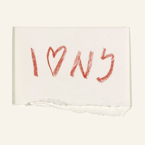
Milton Glaser made a single sketch of the logo on a folded piece of paper (which is now in the permanent collection at the Museum of Modern Art), got it approved, made a final version and gave it as a gift to the state of New York – totally unorthodox for corporate business.
Thirty-eight years later, New York State is still profiting hundreds of millions of dollars yearly from royalties by allowing vendors to use this logo on advertising merchandise.
www.mirkoilicdesign.com
Image: I (Heart) NY concept sketch, Milton Glaser, Ink and tape on paper envelope, 1976, © Museum of Modern Art
Digital Smile
Depending on your disposition, Shigetaka Kurita is the man to thank/curse for making the world a more charming/irritating place. He’s responsible for creating emoji, the pat ideograms or ‘smileys’ first popularised in Japanese electronic messaging services and web forums. Back in 1995, pagers were still the rage and market leading telecommunications manufacturer NTT Docomo was working on i-mode, or what would become the first widely used mobile internet protocol. Email was also just entering the public consciousness, but the form struggled to convey the intricacies of emotional tone that are central to the Japanese language. Kurita realised that if he created a pictorial language that could fit within the twele-by-twelve pixel parameters, it would provided an enhanced level of emotional expressiveness (as well as a unique hook for customers).
I ♥ Money
The “I ♥” logo has proved incredibly versatile over its life time, fitting into a diverse set of contexts, and this is perhaps key to explaining why it has become so lucrative. It currently makes around $30 million a year through associated merchandising sales. The logo is itself now something of an autonomous brand, with recent licensing growth spurts in the far east and in Europe. Of course, Glaser produced the logo for free, working pro bono for the state of New York, and has received absolutely no direct financial advantage from his design. It wasn’t even copyrighted for the first decade of its use, as the intention was for the city and its inhabitants to use it freely to advertise their city.
April 8, 2014 3 minutes read
I ♥ NY
Some jobs are bigger than others, such as: how do you brand the world's most beloved city? Mirko Ilić tells us why he admires Milton Glaser’s big heart.

