
Warwick University’s new logo is the latest identity to create a social-media storm, and in this case it's with good reason, as the logo looks to make the university appear ever more like a business.
It feels like barely a week goes by at the moment without some new logo creating a social media uproar. The true extent of the indignation is often hard to calculate – social media encourages those who don’t really have an opinion to cast one – but what is clear is that, as Michael Beirut has called it, graphic design truly is now a spectator sport. Looking at the scorecards then of recent fixtures we can see that the university identity is a particularly fertile area for re-brand outrage. After the University of California was famously forced to back down on its rebrand, we have seen recent controversies in Britain surrounding new identities for the University of the Arts London and, in the last two months alone, University for the Creative Arts, Loughborough University and Warwick University. One of these controversial logos particularly stands out for special criticism though: Warwick’s new identity doesn’t work on multiple levels – aesthetic, conceptual, moral – exposing a worrying truth about British universities.
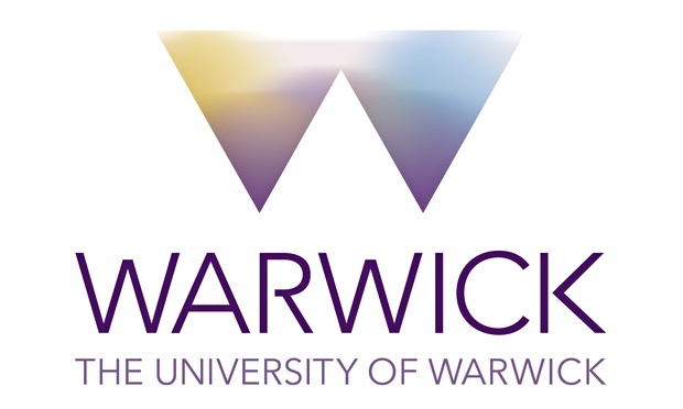
If we look at the logo in isolation from its intended context for a moment – something that should perhaps not be done normally – it is evidently not easy on the eye. What appears to be a custom-made logotype, with its ‘R’ where the bowl fails to rejoin the stem of the letter, is awkward and inelegant; the ‘W’ above, with it’s multi-colour gradient, isn’t well executed either: both lack subtlety and the colours in the ‘W’ look like paints carelessly getting mixed together on a palette. The forms of both letters and mark are unsympathetic and crude.
Removing the logo from its artificial isolation, it must be questioned which particular audience the design is aimed at. Potential students, potential staff? This isn’t a logo that screams academic respectability, and neither does it say anything positive about the culture, history or environment of Warwick. Michael Beirut has claimed that everyone wants to go to Harvard, “so best not to remind the that they don't”. I would counter this by saying that not everyone wants to go to Harvard, or Oxbridge – it's that no-one wants to go to a second-rate corporate entity for university, and that’s precisely what this logo looks like it belongs too. The visual language being employed is that of corporate communications and the marketing guru’s misunderstanding: this is a business to business logo, not a business to customer logo – let alone a logo that conveys what should be the true nature of the relationship, public institution to citizen. Anyone who attended Warwick will not doubt that a business to business logo was an intentional outcome – Warwick’s tie-ups with corporate entities like KPMG are in evidence on advertising and sponsorship throughout the campus.
The corporate nature of the logo is what is perhaps most objectionable, alongside the reported £80,000 cost for what is a questionable piece of work. Some Warwick students in favour of the logo rightly comment that the university is a modern one and should avoid seals and shields which pastiche older universities and relate to notions of aristocracy – but the dichotomy is false. Only precedent and lack of imagination has created a situation where a university logo must either be ‘old fashioned’ or corporate. Warwick is a modern university – its students still deserve is a logo with integrity. The mid-twentieth century in which Warwick was built and opened was a radical and progressive time, the new logo does not present this view of Warwick to the world. In fact it portrays a worryingly accurate impression of the direction Warwick is currently heading in – and this is the one way the logo could be seen as successful: in its brutal honesty. This confused, expensive, business to business logo is the one the current management at Warwick were always going to get. It’s the logo of a university whose Vice Chancellor describes police being invited onto campus and proceeding to use CS spray on students as an “unnecessarily challenging situation”, it’s the logo of a university that is creating a subsidiary commercial franchise to outsource the employment of precarious teaching staff, who will have fewer employment rights.
A logo or identity isn't an inherently corporate thing, as craftsman have used identifying signs since at least the middle ages. What makes this identity truly corporate in the worst sense of the word are the high fees being paid to and by business people who don't know what they're doing for what is clearly a second rate product. The reason this particular rebranding exercise is so important is because it exposes the nature of the corporatisation of contemporary universities better than anything has managed to do so far. In creating something quite so ugly, cheap-looking and inappropriate, it also manages to foreshadow the negative effects this market-led approach is having on our universities.