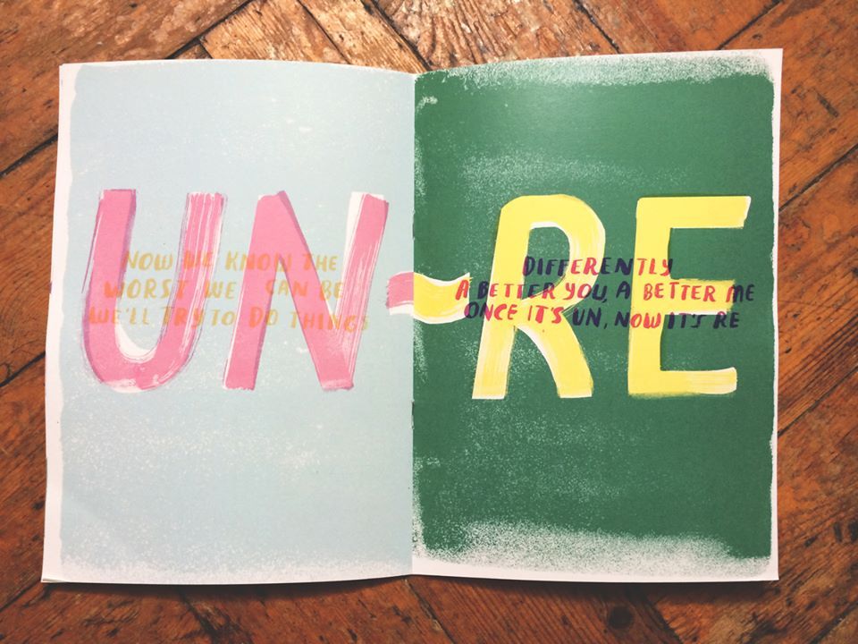
With its playful use of printing techniques and DIY aesthetic, we're big fans of Kit Records' artwork. Grafik caught up with co-founder Richard Greenan to discuss the London label's visual direction.

Tell me a little bit about Kit Records.
I set up Kit with the artist Sarah Tanat-Jones in early 2013. It began life as a place to archive my NTS Radio show, along with sporadic music writing and illustration. I soon realised it was a great way of extracting interviews and guest mixes from some of my favourite artists. That summer we threw ourselves into organising gigs and getting some tapes pressed, in a somewhat haphazard fashion. It grew steadily from there. Kit seems to have a life of its own now.
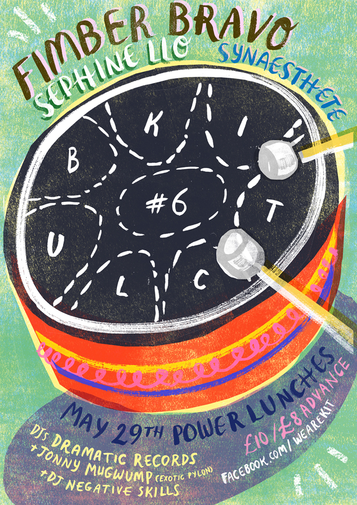
How would you describe your approach to design as a label?
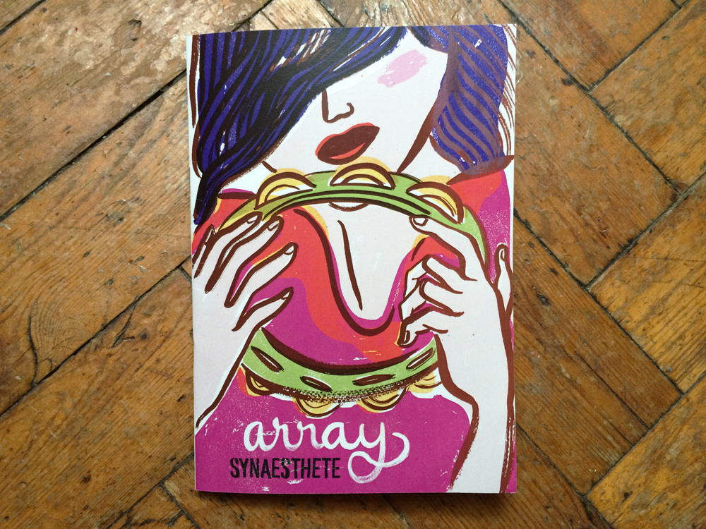
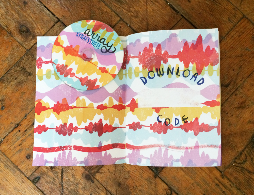
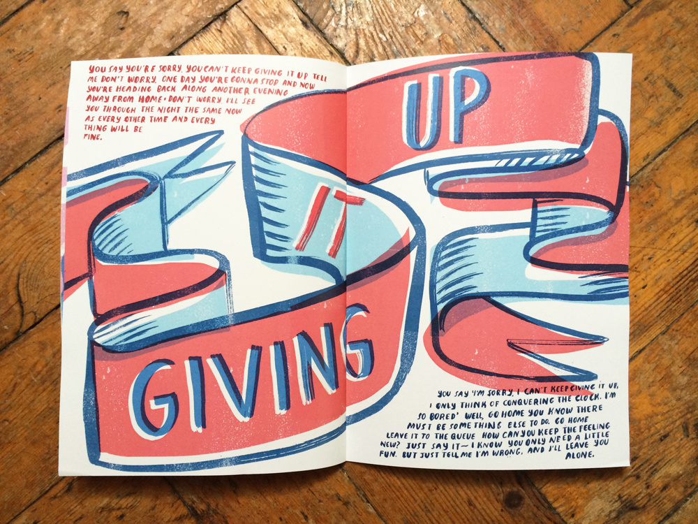
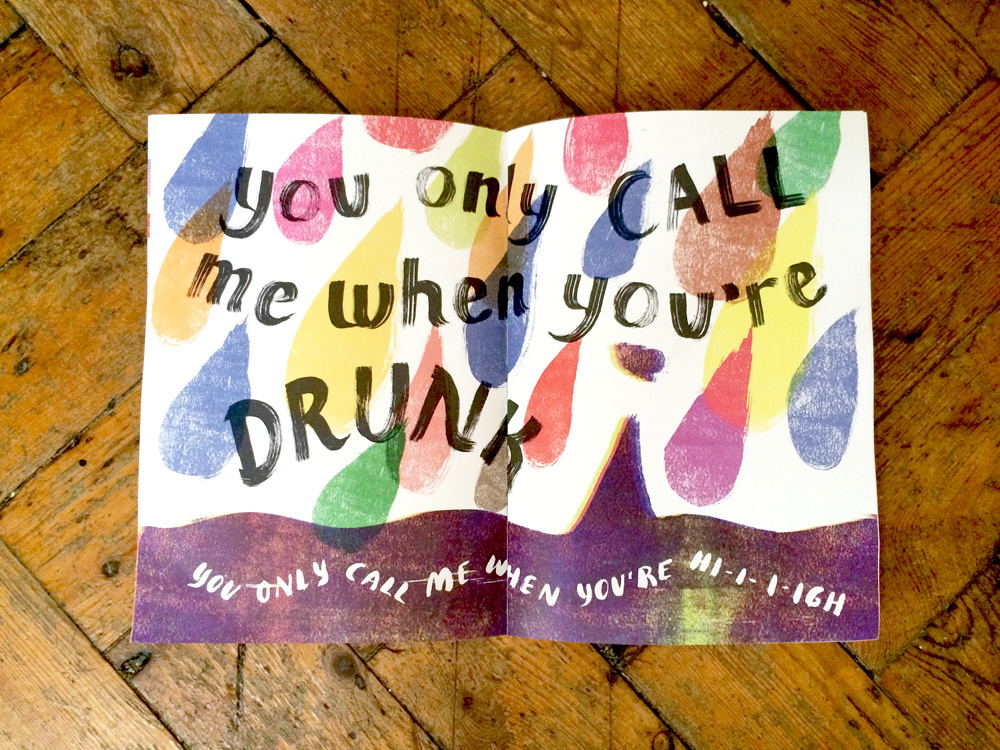
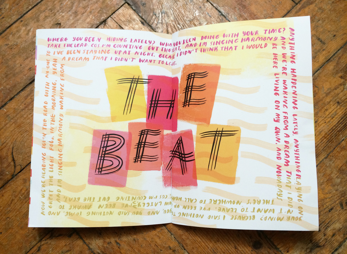
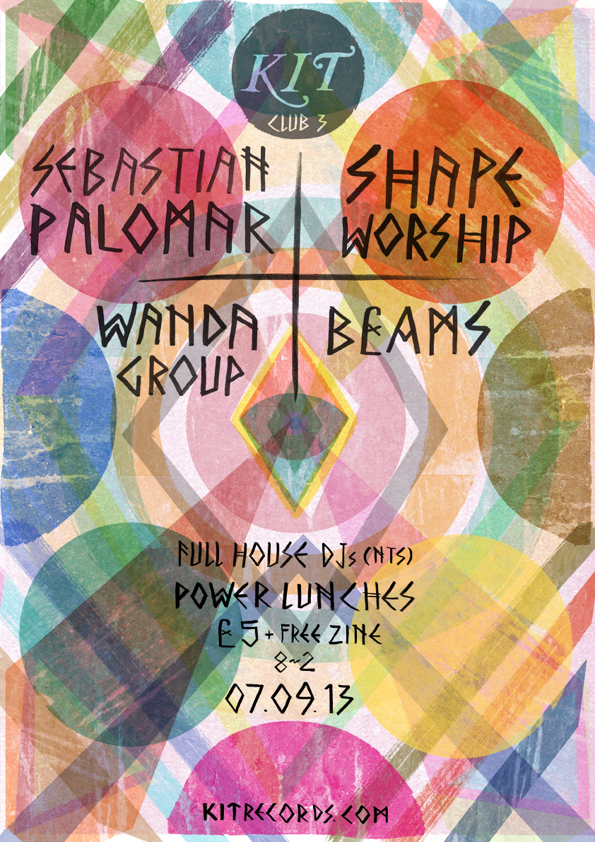
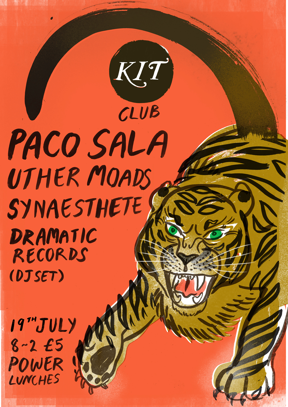
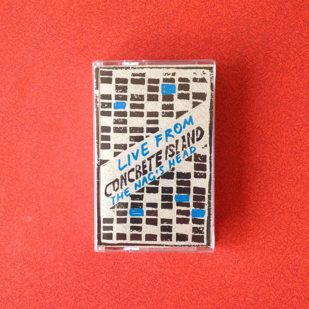
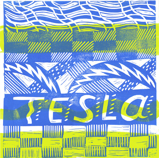
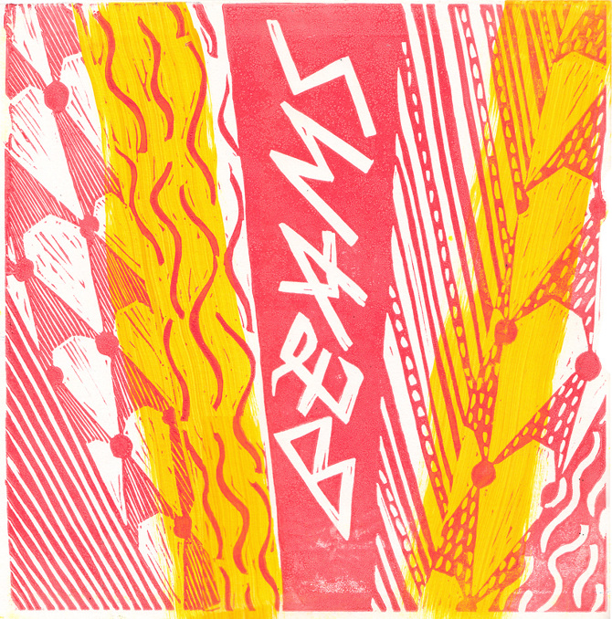
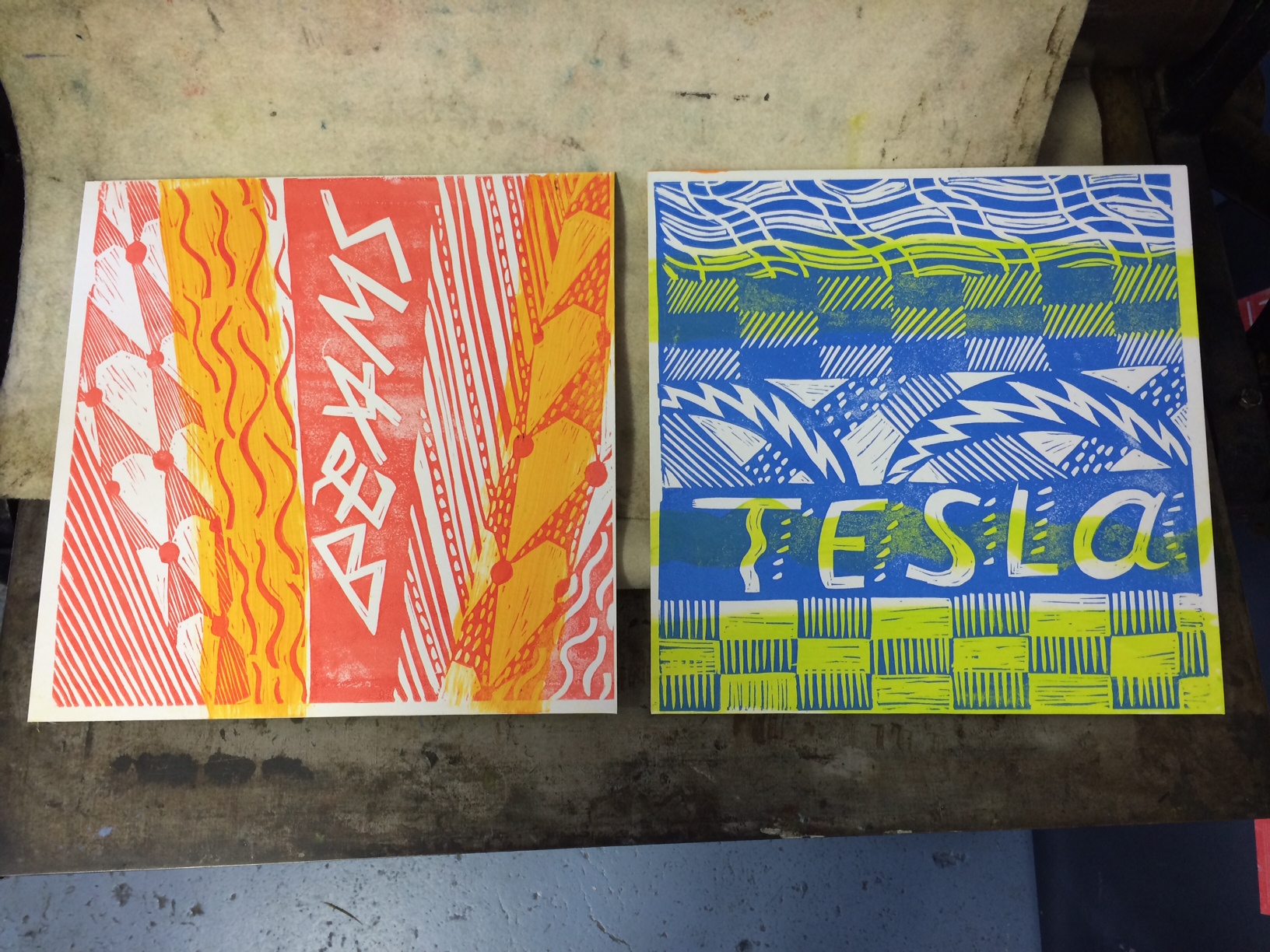
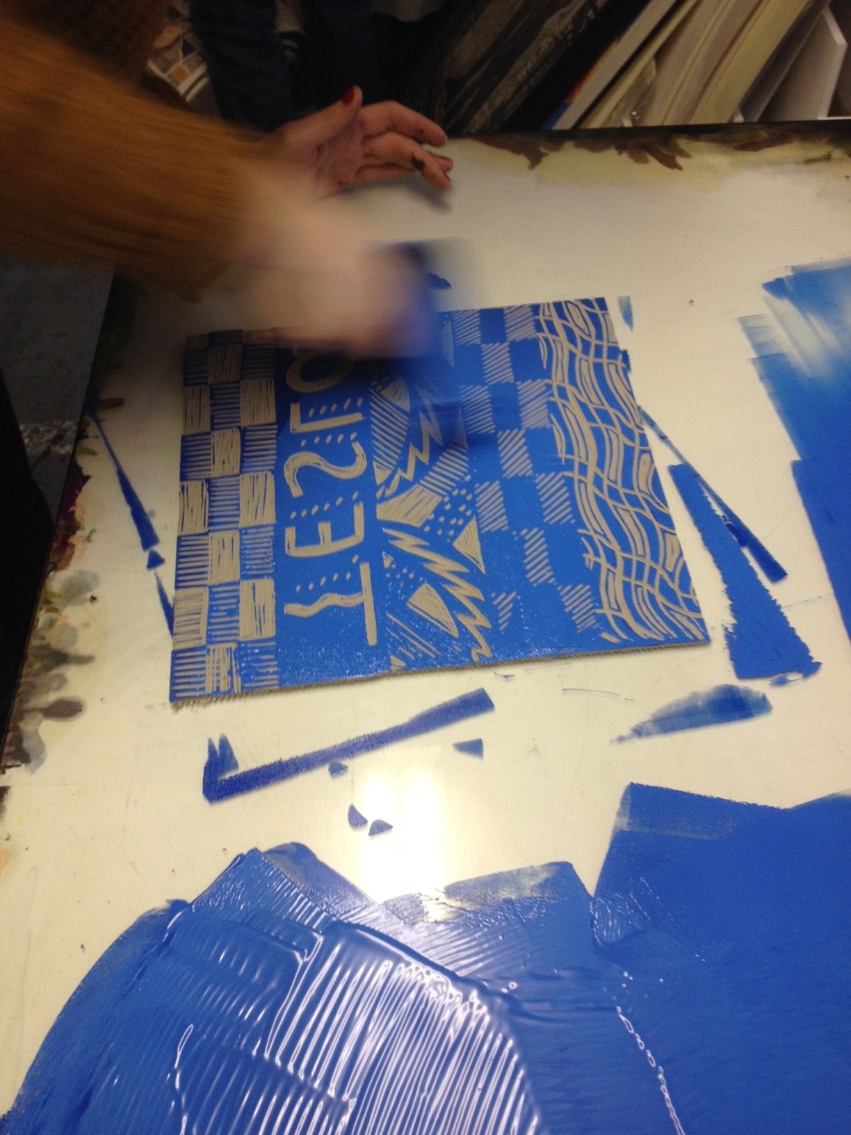
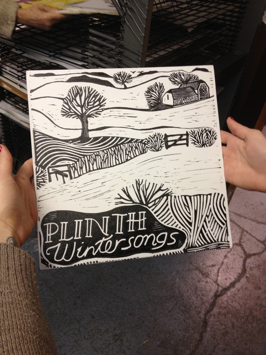
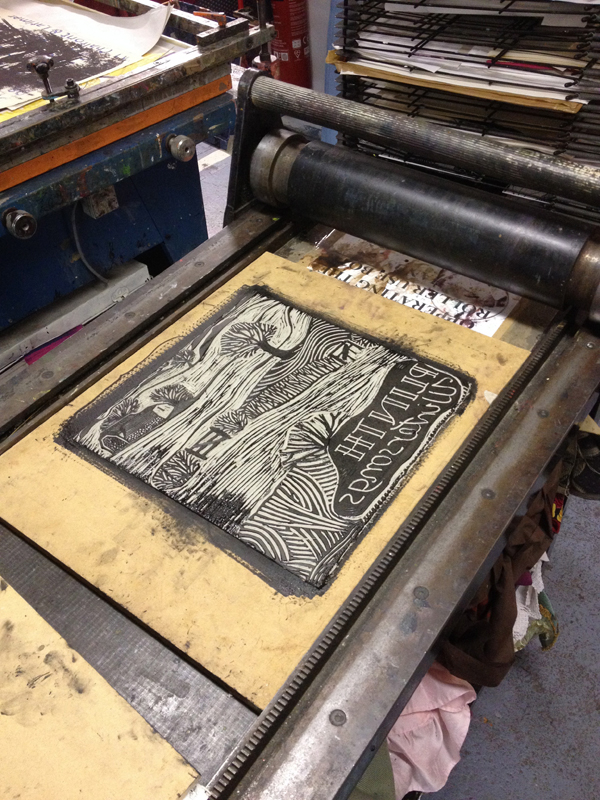
Music and design are equally important to us. Releasing records has given us the chance to explore different formats and printing techniques, from books of paintings to linocut vinyl sleeves and digital art. I think the website's analogue patterns and DIY spirit have spilled over into the album art. Our designs contain a lot of symbolism for each record, but also a bold, off-register continuity.
The album artwork often has quite a handmade aesthetic, diametrically opposite from major label slickness. Tell me a bit about this choice.
The slick, neat labels and music sites were certainly something for us to model against. I love music with imperfections and serendipity, so it makes sense that the artwork should mirror this. I think the handmade feel is also down to budget, and that we've been teaching ourselves new techniques as we go along.
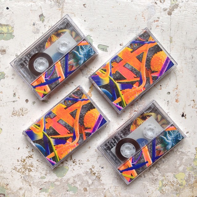
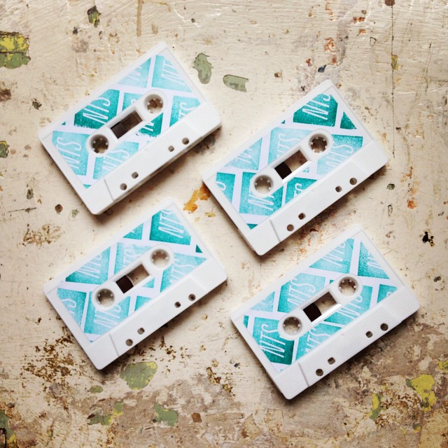
What was the idea behind the artwork for your latest release R. Karim’s Object of Unknown Provenance?
Rhodri is a scientist, and his music is an interesting collision of hyper-detailed and absurd, precise but psychedelic. I wanted to evoke that exploratory, fractal spirit – one of controlled chaos and a sort of disorientating ambiguity between the microscopic and the vast.
Talk us through the design process.
We created the inlay by layering up electron microscope photos of dust with images of paper marbling (which could easily pass for a lunar landscape). To make the colours even more outrageous, we went for risograph printing, substituting red for fluro pink. Luckily I was pointed in the direction of the excellent Hato Press, who kindly led me through the tricky colour separation process.
What’s next for Kit Records?
We want to release more music by people also involved in the visual arts. One forthcoming album is by Cosmic Neighbourhood, the band of Bristol-based artist Adam Higton. He makes amazing collages and drawings with a sort of 60s, Willo the Wisp vibe. We've been talking about maybe having a zine, or albums with interchangeable covers. Adam wanted to have each record delivered by an elf, who'd sing it to you on your doorstep, but I had to draw the line somewhere.
kitrecords.com

