Art director and designer Daniel Carlsten lets us in on his thoughts and aphorisms about logos, and why he will never pick up a book of nothing but logos when looking for inspiration.
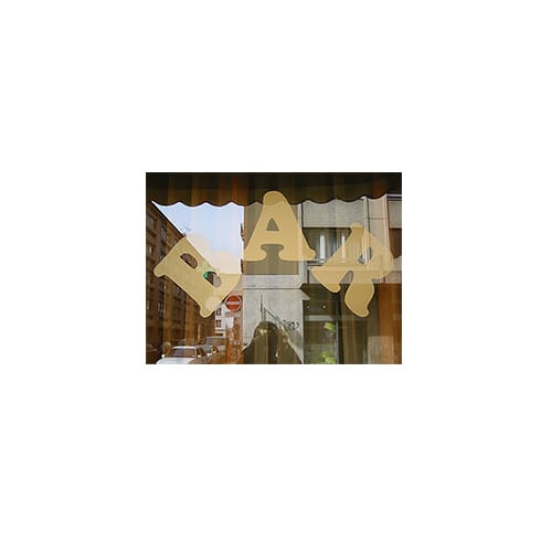
I love store signs that just says ‘Fruit’, ‘Bar’ or ‘Hairdresser’ in some generic typeface. Whenever I am asked to do a logo, I keep those store signs in the back of my mind.
I sometimes fantasise about a society where all logos are in the same typeface (preferably Helvetica or Times), with spacing, kerning, colour, sizing, application, implementation and location as sole means for separation between one company and the other.
I appreciate symbols, but I don’t like them to be too clever. A neon hamburger outside a hamburger restaurant, a giant pair of scissors on top of a hair salon, an apple to illustrate a company named Apple: perfect.
I don’t get books that present hundreds of logos. To me, these books lack the one fundamental thing that makes a logo interesting: how it is being used.
I find the rainbow flag a great example of a logo that wasn’t restrained by the ridiculous (but still surprisingly common) input that it won’t render well through a black and white copying machine, or, for that matter, a facsimile machine. Enough with that silliness.
I find poetry in a logo that doesn’t try to stand out, but rather tries to blend in. A logo that doesn’t appear to be a logo. An invisible logo. Clear, rational and to the point. A company name spelled out like a headline. Very uninventive.
I love New York. Now, that’s a logo.
danielcarlsten.com
Daniel Carlsten
… is an independent art director and designer, assigned by a wide and international group of people, agencies, magazines and brands. He has recently worked on the identities and branding for Bozarthfornell Architects and Ya-Sin Chahimi.
The rainbow flag
… was designed by San Francisco artist Gilbert Baker in 1978 and is a symbol of lesbian, gay, bisexual, and transgender (LGBT) pride and LGBT social movements. The design has undergone several revisions to remove and then re-add colours due to which fabrics are widely available. As of 2008, the most common variant consists of six stripes, with the colours red, orange, yellow, green, blue, and violet, although the original had eight stripes.

