
Ben Chatfield from London design studio Bravo Charlie Mike Hotel tells us about his long-term love of the logo for Italian airline Alitalia, and its wonderfully sensitive update.
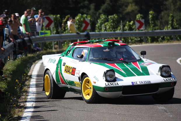
My first encounter with the Alitalia logo would have been from across the counter of a model shop – a nine year old boy goggling at Tamiya modelling kits of (amongst others) the Lancia Stratos Turbo and the Fiat 131 Abarth Rally. The endlessly fascinating illustrations on the boxes showed super-machines emblazoned in an aggressive go-faster Italian tricolour, formed of the Alitalia livery. At that time, I would have almost definitely been completely unaware of the skill with which the logo had been adapted, rotated and reflected to transform the car into a graphic assertion of the power under the bonnet.
But back to the logo itself. In 1967 Alitalia Airlines, the national airline of Italy, selected Walter Landor to create a new identity system for its aircraft. Landor’s realisation was that although Alitalia was an international carrier, air travellers thought of it as a small, domestic one. Alitalia’s image had to be modernised but in a way that spoke of the vibrant spirit and ‘Italian-ness’ of Italy – a country renowned and much celebrated for its design. The graphics had to be adaptable to a complex variety of aircraft, such as 747s and DC-10s, as well as flight uniforms, plane interiors, ticket counters, and printed materials.
There are two great things that spring to mind when looking at Landor’s logo and in particular the graphic ‘A’. Firstly it’s a gift of a letter and, secondly, it’s satisfying when things ‘just-fit’: I see the brilliance of the concept in the first place and then the skill with which it was realised, especially the radius corner at the apex of the ‘A’, which suggests the tail fin of the aircraft but also fits perfectly when placed on to a tail fin.

In 2005 the logo was very sensitively and successfully updated with a new italicised look and more detail introduced using the radius corners. Although the logo could be seen as having an aesthetic quality that takes you back to the 1960s, it undoubtedly has a timelessness, which is as good now as it was then.
bcmh.co.uk
Alitalia
…got a mention in the US diplomatic cables released in 2011 by Wikileaks which described how the company had been rescued from bankruptcy, stating "Under the guise of a rather quaint desire to maintain the Italian-ness of the company, a group of wealthy Berlusconi cronies was enticed into taking over the healthy portions of Alitalia, leaving its debts to the Italian taxpayers. … Berlusconi pulled this one off, but his involvement probably cost the Italian taxpayers a lot of money.”
BCMH
… Creates a broad range of work including brand identities, art direction, signage, wayfinding, print, editorial, publishing and websites. Recent works include art direction for Adidas Originals by Nigo campaign and their ongoing work for Design Junction.