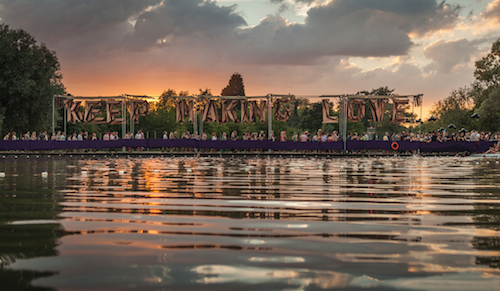
Imagination and unswerving focus define the output of this young graphic designer, whether he’s crafting typographic bridges for Cambridgeshire festival Secret Garden Party or working on more traditional print projects.
What are you working on at the moment?
I am freelancing at MadeThought at the moment, working on a top secret identity project. They make some really intelligent and beautiful work there. Aside from that, I’m working on an interactive window display with a couple of talented friends I met at LCC, Netta Peltola and Sine Ringgard. The three of us are trying to collaborate whenever we can – we all have different strengths and ways of thinking that somehow work well together.
What has been the defining moment of your career so far?
I wouldn’t call it a career, I’ve only just stopped interning. But I guess I’m happiest now I’m working within a studio. I’m really excited to be around such talented people who love what they do. Everybody feeds off each other and I feel that I’m learning a lot more now than I have anywhere else, although I do crap myself from time to time.
Do you prefer designing for environments or for the page?
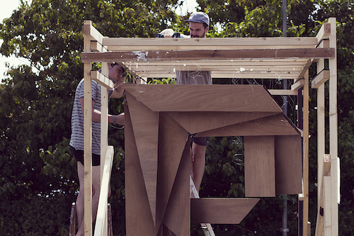
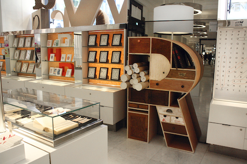
Both are attractive in different ways and cross over with each other a lot. Switching between the micro and macro has given me much more of a holistic view on design and I think it has helped influenced my design process a lot. With Installations once you settle on an idea there’s no changing your mind half way through, you have to trust it will work out. So far, these larger scale projects have been really short and intense – both the projects for SGP and Selfridges went from ideas to finished pieces in just a few weeks. I really love the instant feedback you get with installations, when you see and hear people interact with something you have made. However, my focus at the moment is to get damn good at the ‘graphic’ side of things, as that’s what I love doing. I see the installations as fun side projects for the moment and a good chance to step away from the computer and team up with friends.
Tell us a bit more about the Transparent Theatre project.
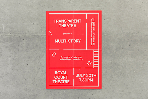
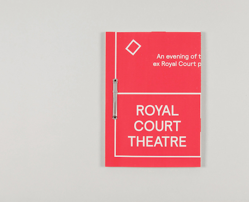
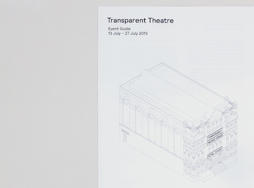
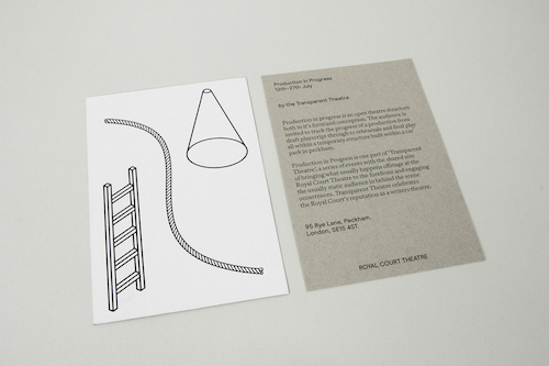
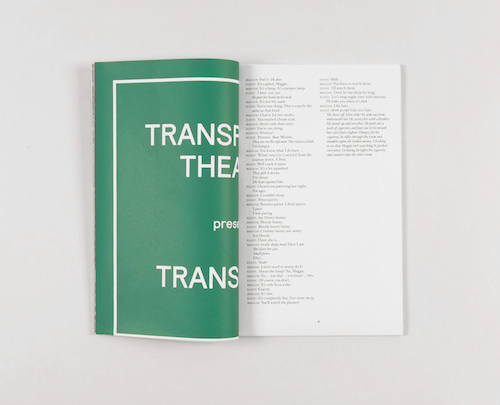
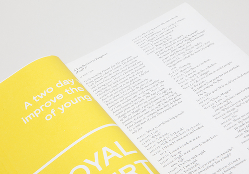
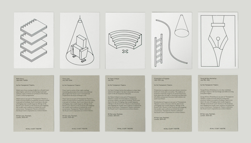
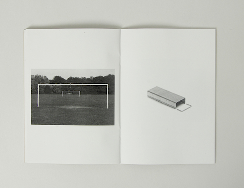
This was a response to a YCN competition brief set by the Royal Court Theatre. The theatre wanted people to know more about the work they do behind the scenes, including the thousands of playwrights that they work with, their relationship with the Royal Court, and the story of the plays before they are presented onstage. My proposal was to create a temporary scaffold theatre structure that would be home to a series of events run by the Royal Court. Each event would aim to bring what usually happens offstage to the forefront. The process of script writing, rehearsals and other offstage activities would be made visible to the audience and invite participation. I wanted each piece of the collateral to feel part of the same thing without actually having a visual identity as such. I also wanted to avoid the look you associate with theatre and kept everything quite pared back and at times abstract. The theme of audience involvement was important too and influenced the design, for example the posters tare down into scripts for the audience to take away with them.
Describe your style in three words.
Thoughtful, Collaborative, Informed.
jackgardiner.com

