This recent LCC graduate has just finished working on a project with MagCulture’s Jeremy Leslie for iconic furniture brand Vitsœ – we get the low-down on her portfolio.
Describe your style and approach.
My approach changes each time depending on the nature of the project, and for this reason I don’t have a style as such. It does typically begin with an intense research period (in a selection of south London coffee shops). My sketchbooks are hand-bound from sugar paper and discarded print proofs where most of my thoughts and tiny handwriting live. I am constantly inspired by conversations with people from different fields to gain a fresh perspective.
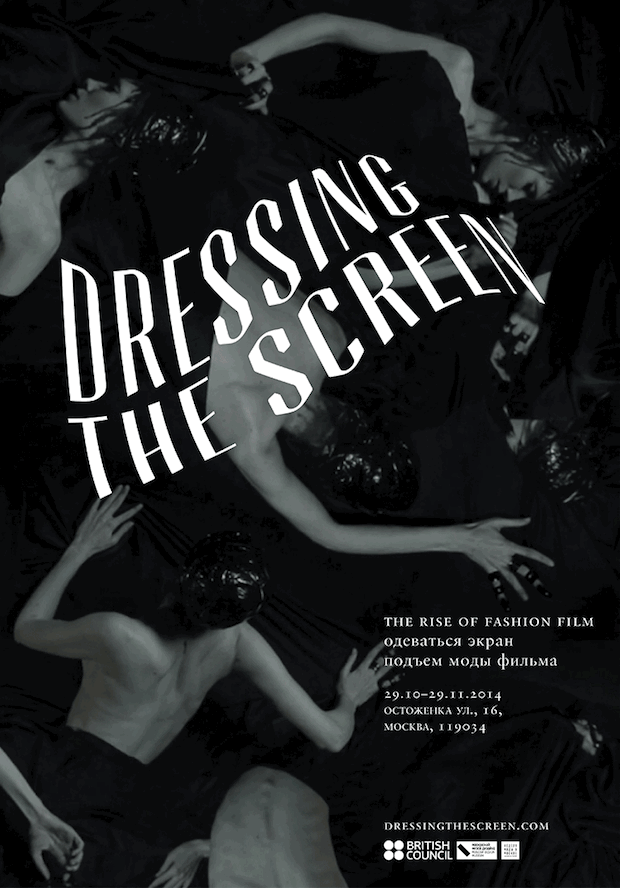
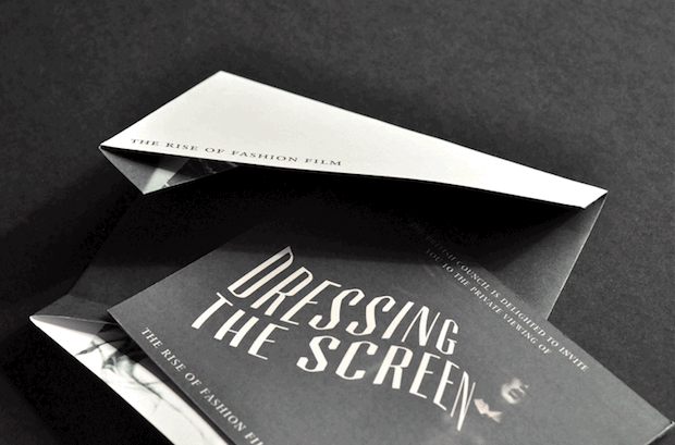
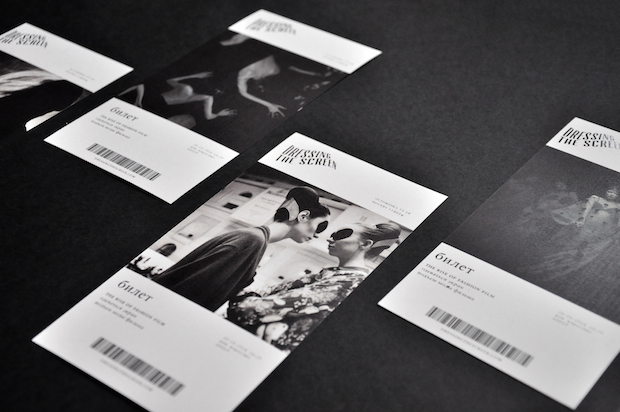
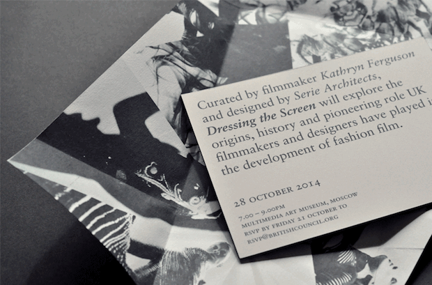
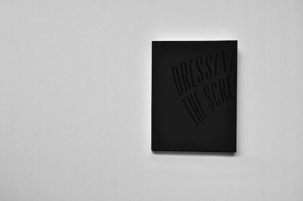
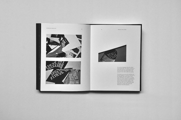
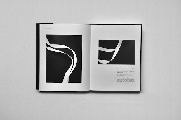
Talk us through the concept behind your Dressing the Screen project.
Dressing the Screen is a brief set by British Council to design an identity for its travelling exhibition featuring the work of fashion film artists, which is purely exhibited on high-definition projections and screens. The concept is inspired by the diffusion of analogue and digital elements – digital in terms of how fashion is mediated through film, and analogue, as the purpose of fashion film is still primarily to promote the physical items produced by fashion designers. The identity design was based around creating a tactile experience. It was influenced by research into the movement of fabric and creating letterforms by projecting onto different materials.
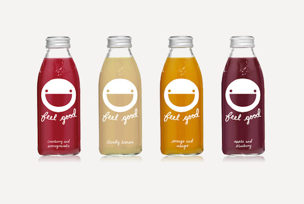
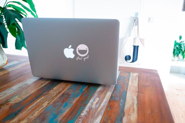
You won a YCN Award last year - what do you think appealed to the judges about your identity for Feel Good?
The solution considered an extended life for a two-dimensional drinks label after consumption and created the potential for it to be circulated on various social media platforms. The aesthetic of the graphic is very raw, a little imperfect and hopefully made them smile.
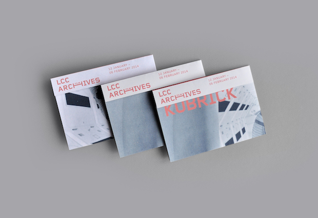
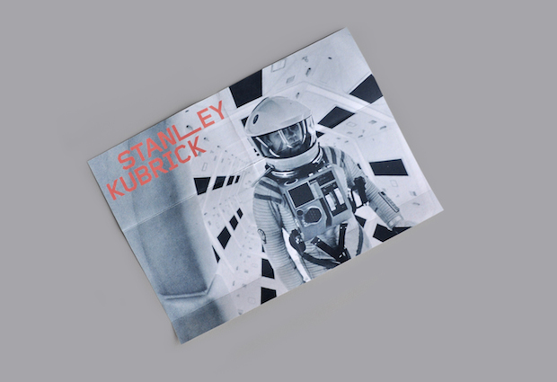
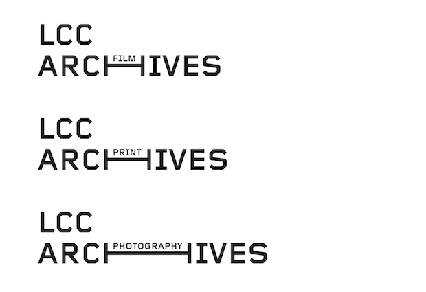
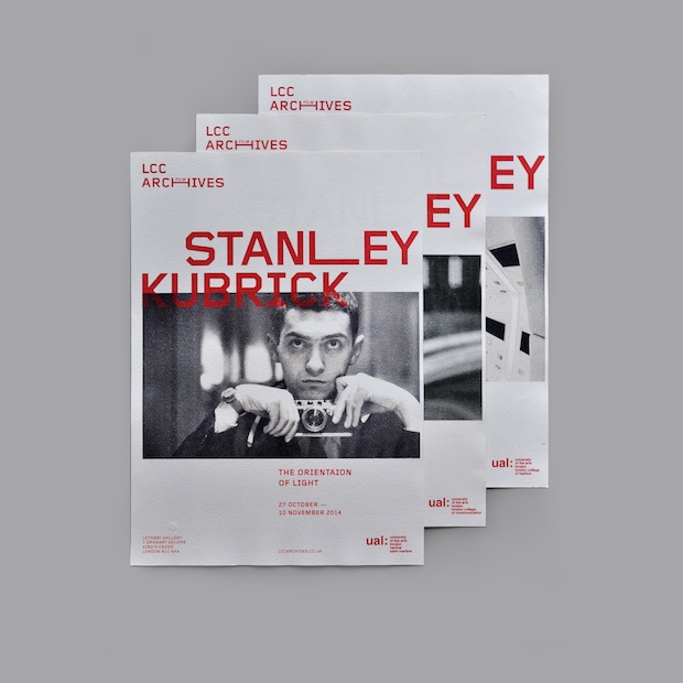
What was the thinking behind your LCC Archives project?
The identity reimagines the uppercase 'H' of Archives as an extendable shelf that can house the names of different departments or artwork collections inside the archives. The graphic device is applied across the identity via the extended letterform. Other than a more distinctive and functional rebrand, I proposed the idea of an LCC Archives Travelling Exhibition, which would display work from the archives curated for each of the UAL universities.
What would be a dream commission?
This is a very difficult question. I still haven’t got over working at magCulture on a collaboration project with Vitsœ for London Design Festival’s 620 Reading Room (both Jeremy Leslie and Dieter Rams are design heroes of mine). We designed a black and white magazine about twenty independent magazines, which I’m quite sure is a print designers’ dream. Otherwise perfect commissions would be to design the next Acne Paper, a branding project with Bibliothèque or an exhibition design with A Practice For Everyday Life.
jesesiu.co.uk