From a project inspired by neurological condition synaesthesia to a community-minded re-imagination of The Big Issue, the portfolio of this Chelsea College of Arts graduate is packed with finely tuned and innovative ideas.
What kind of brief particularly inspires you?
Something I came to realise recently was that the most creative briefs aren’t necessarily those that are simply the most open-ended. Having a few constraints and parameters can actually be helpful as they create a kind of wall you can throw ideas at. Being able to work against and question something feels productive to me. Plucking something from the air with no starting point can be quite daunting and it’s hard to genuinely gauge whether or not what you’ve plucked is worthwhile. I think those kind of ideas have to come naturally. A perfect brief for me would be something that is large in scope - working with someone who is willing to question what they feel they need.
How would you describe your approach?
My approach is probably similar to a lot of people’s in that it differs between projects. Sometimes the answer comes quick and you just have to run and do it, other times it takes rethinking many times to feel confident in your ideas. Normally though, there would always be an initial period of writing down questions and possible answers, over and over, which then turn into small ideas jotted around pages in a sketchbook. I then draw things really badly and quickly on scraps and redraw anything I think works in my sketchbook. Then I’ll hit the ol’ laptop and try some things out. I like to sit on buses a lot when I’m thinking of ideas. Also I find reading often unlocks whole new avenues that you’d never think of normally.
Tell us about a project that you’ve particularly enjoyed?
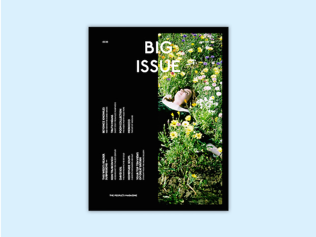
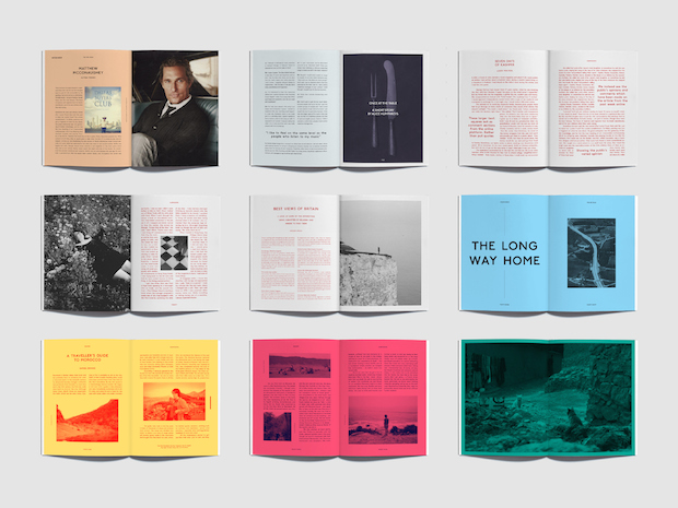
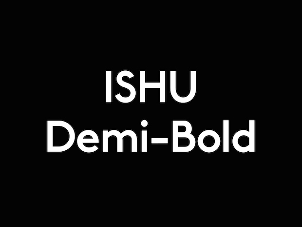
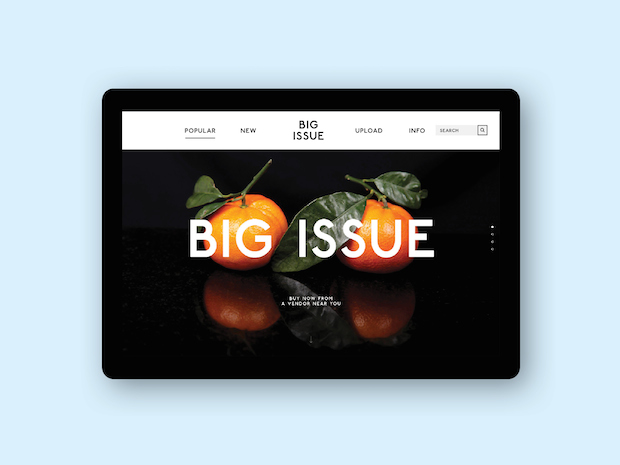
The Monotype brief for The D&AD New Blood Awards this year was probably my favourite project I’ve worked on so far. The brief was to try and enhance the relationship between the buyer and vendor of street newspaper The Big Issue. To do this, I decided to split the magazine in half. The first half being the usual commissioned editorial pieces, but the second, a platform for user-submitted content, attempting to create a more loyal reader community. Readers would be able to upload content to The Big Issue’s website, the best of which would be perpetuated through a voting and commenting system. Whatever were the most popular submissions by the end of the week would then be printed in the next week’s magazine. User’s comments would also enter the magazine in place of pull quotes, and popular subjects which had divided opinion would find themselves in a debate section. All of this would hopefully create a closer bond between readers and the publication, and in turn the people who sell it. To coincide with a redesign of the magazine and website, I created a bespoke typeface, Ishu Demi-Bold. Research showed that many vendors of The Big Issue situated themselves close to public transport, such as the tube. This meant I based my typeface on Johnston, the typeface of Transport for London.
Tell us a little bit about your Synaesthesia project and what inspired you about this condition?
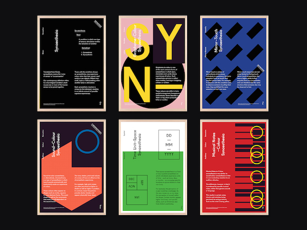
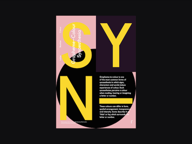
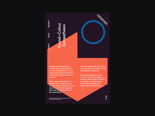
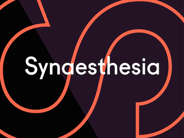
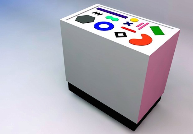
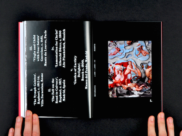
In simple terms, synaesthesia is a neurological condition in which a person’s senses are joined. To give an example, this could result in someone seeing colours when music is played, or associating certain colours with different letters and numbers. I’ve been interested in the subject for years as I’m quite musical, and the link between audio and visual always seemed so strong to me. It seemed like a solid area to explore during my final project at university. I was interested in creating an interactive experience, which people visiting an exhibition could engage with, which synaesthesia lends itself to very nicely. Under the direction of synaesthesia researchers, I created a set of animations, which could be triggered using a plinth connected to a computer. Alongside this I made a series of posters, which help define some of the most common types of synaesthesia.
What was the process behind the photography for your winning card for the GREAT Campaign?
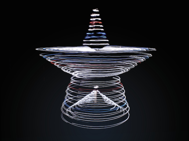
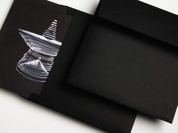
It was actually all created in my bedroom. I built a half-star shape out of wood with a longer baton in the middle going to the floor so it could all pivot. I then put the structure in the centre of a spool to keep it sturdy while still being able to turn. Next I attached fairy lights all the way along the structure - adding a few blue and red acetates to subtly hint towards Great Britain and the Union Jack. After it was all built, I took about fifty different long-exposure shots of me spinning the whole thing around untill I got what I wanted at this point I was really dizzy and staring at bright Christmas lights for that long was making me feel pretty sick, so luckily I had a shot that worked. With it being in my bedroom I had to photoshop out quite a lot of clothes, empty beer cans and a cat from the background, so it was all a far less elegant process that you’d probably imagine.
What have you been working on since you graduated?
I did a few months over at DesignStudio almost straight after I graduated which was great. They’re a really great team to work with and I got the chance to work on some really interesting projects. After that I went to Radley Yeldar as part of me winning the GREAT Britain competition, which is where I am right now. It’s been interesting to see how different scale agencies operate, as well as being a learning curve in terms of dealing with clients and not making compromises. In terms of personal projects I have about four things on at the moment and in the not too distant future, some of which are in too early a stage to mention, but one involves ice-cream.
joshduffy.co.uk
