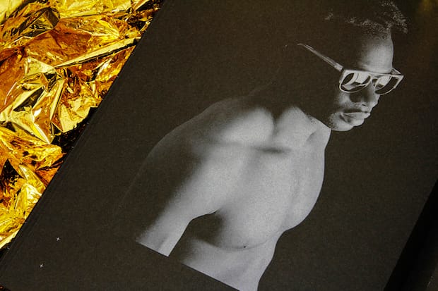
From a fashion lookbook inspired by the ESA Rosetta Space Mission to a typeface based on Buddhist Mandala, there’s a lot of intriguing projects in this LCC graduate’s portfolio.
How would you describe your approach to design?
Essentially I just try to make good work. If I can produce projects that are useful, evocative and interesting then I’m happy. Of course it’s an added bonus if they look good too. Every project starts with a comprehensive research process so I’ve got a strong foundation to build on and from there I try to be quite instinctual, finding what works as I go along.
Tell us a bit about Rosetta and how it came about?
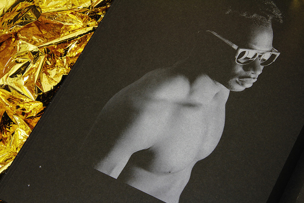
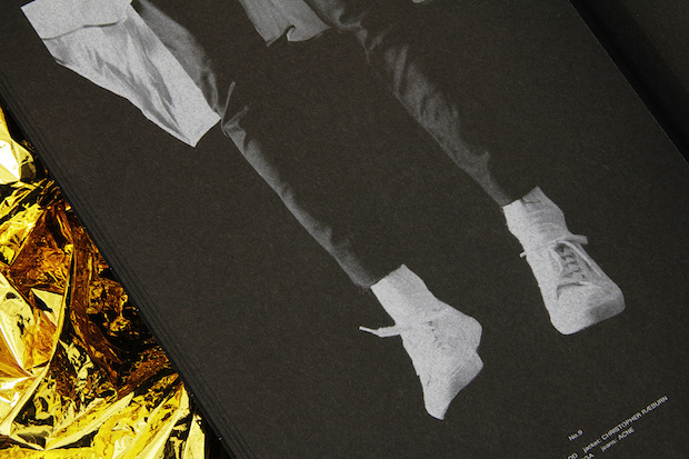
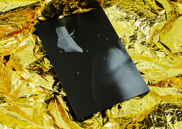
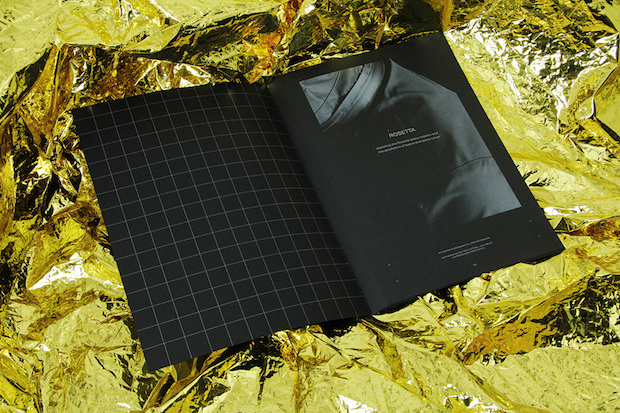
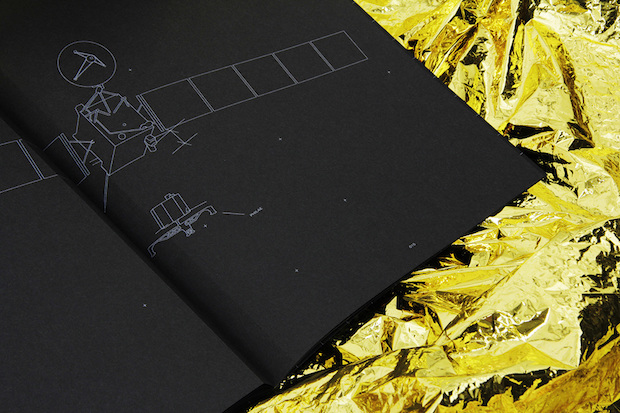
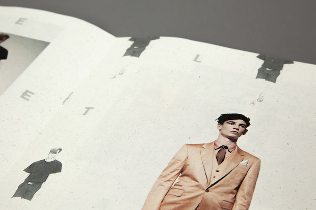
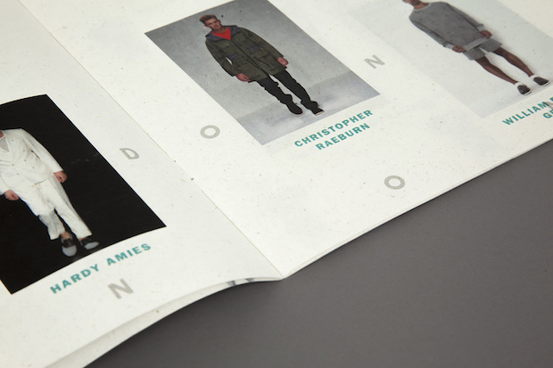
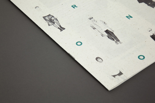
Rosetta is a fashion-focused publication that explores the ESA Rosetta Space Mission as well as the aesthetics of space and space-travel. It features a fashion shoot art-directed and shot by myself, alongside information and imagery that gives the reader a glimpse into the aims and achievements of ESA’s mission to study the comet 67P/Churyumov-Gerasimenko. I picked the brief from the choices we were given for our final major project on the BA GMD course at LCC. The title of the brief was Content Supplied which got forgotten along the way somehow.
What’s the best piece of advice you’ve ever been given?
I think it was in my first year on the FdA Design for Graphic Communication course at LCC (gone but not forgotten), one of the tutors told us it’s important to have interests outside of design. It’s something that has stuck with me ever since — design shouldn’t exist in a vacuum.
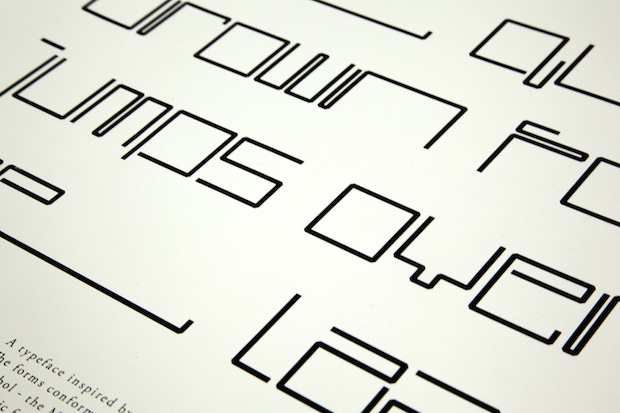
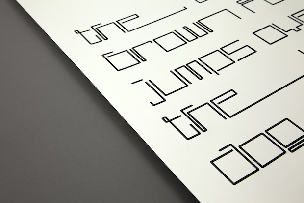
What inspired your Sacred Geometry typeface?
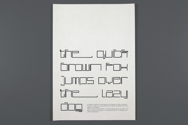
I was kind of aimlessly digging around in a dark corner of the LCC library when I came across an Islamic Art colouring book. It was full of these incredibly intricate geometric patterns which I really wanted to incorporate into a project in one way or another. At first I was using shapes from the patterns as the building blocks of the letterforms but that turned out to be a bit of a dead-end. I then dug a bit deeper into the basis of Islamic Art, sacred geometry, which led me to the Mandala. It’s a form that crops up a lot in Hindu and Buddhist imagery that’s composed of a square with four T-shaped gates that contains a circle with a centre point. I used the form of the Mandala as a grid to compose every letterform you see in the final typeface.
Where do you see yourself in ten years?
When I was little and people would ask what I wanted to be when I grew up I’d tell them that I’d like to be Keith from The Prodigy. Firestarter had just come out and I thought that that video was the coolest thing in the world. Obviously I kind of let that dream die. I’m not really a ‘ten year plan’ kind of person but as long as I’m still working on projects that interest me with people that I like then I’ll be quite happy.
joshgeoghegan.com

