This Chelsea College of Art and Design graduate has been keeping busy since graduation, gaining plenty of experience working with some of the best editorial designers and art directors in the business.
How would you describe your practice?
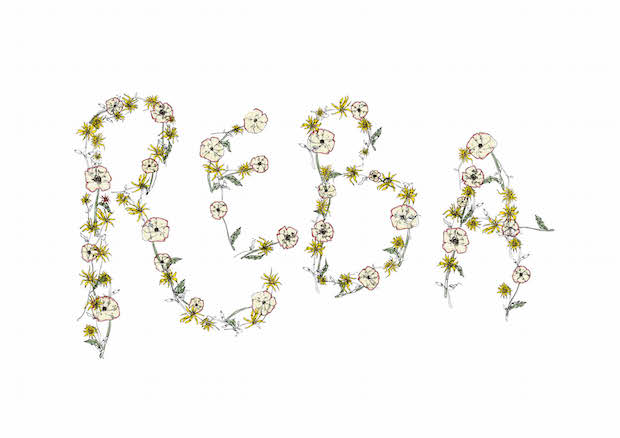
I work mainly in layout and typography, but also use a lot of illustration and hand rendered type. I’m often inspired by a breadth of historical design rather than current trends, from 19th century leather bound books to vintage playboy magazines. I enjoy the re-appropriation of ideas or motifs to work in a modern way of design. A lot of my ideas are based on breaking and bending previously established rules of layout and typography.
You've recently graduated from Chelsea College of Art and Design's Graphic Design degree. What was the course like and what have you taken from it?
We were taught a lot of different media, from 3D design to using a letterpress. It’s a small course (around fifty people) and we were never separated into specialities which meant you had to become confident in your chosen path and develop your own practice. By the end of the three years we had became like a large studio, using our specialities to help each other on projects. I feel that sort of teamwork is a great way to be in the professional world.
The alumni and the reputation of the course at Chelsea are both excellent; having been there has meant many doors and opportunities are open to me.
You've worked on quite a few fashion related projects – is this an area that particularly interests you?
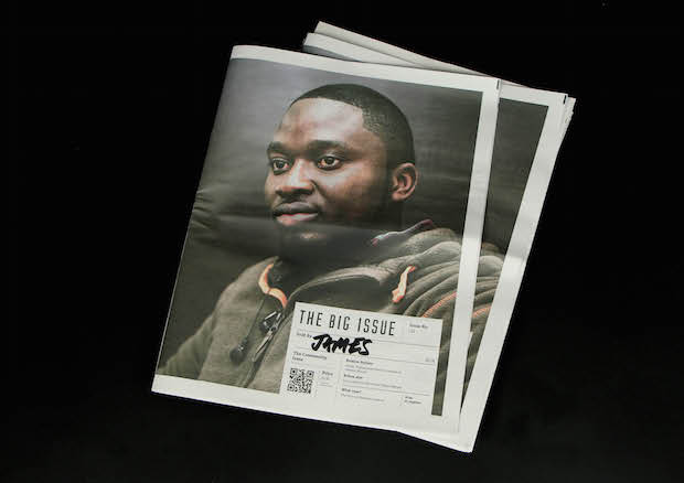
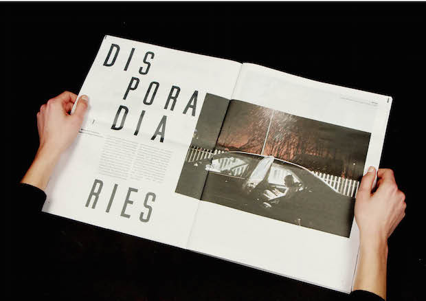
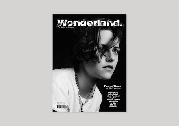
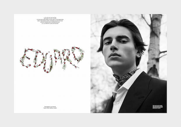
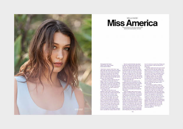
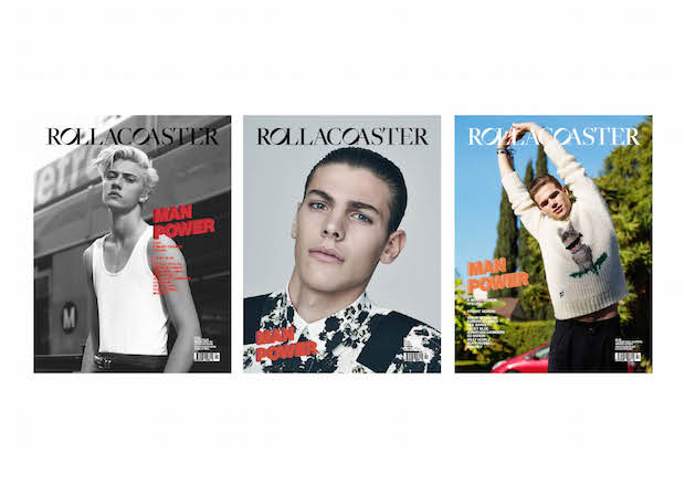
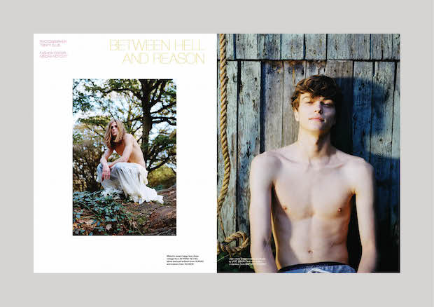
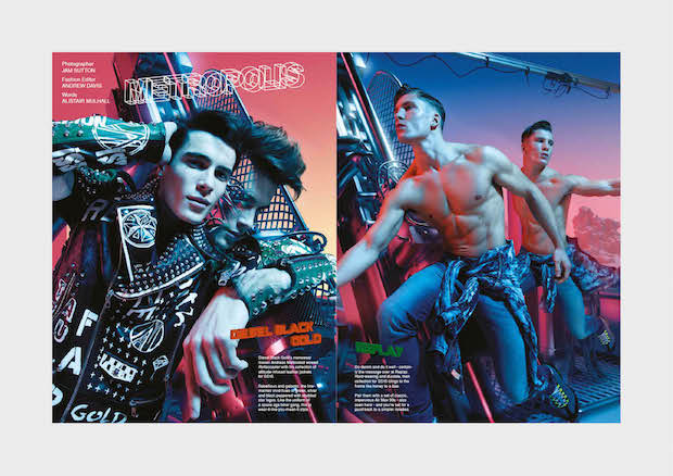
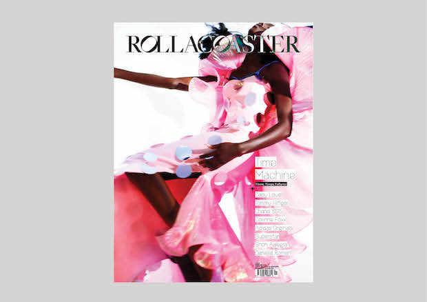
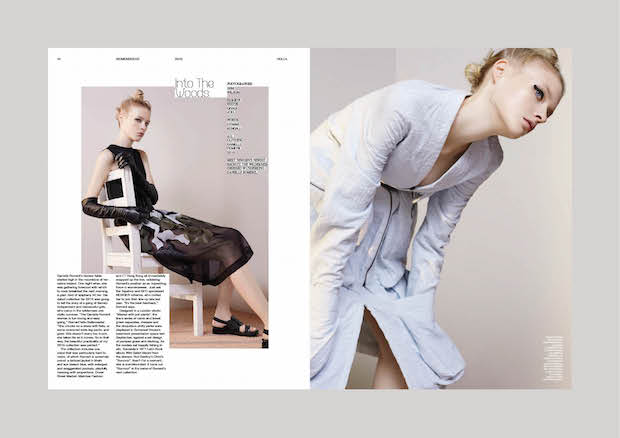
Fashion is a really exciting subject to work with as it requires me to be a versatile designer. Sometimes you will have a shoot or a collection which sits well with highly minimal typography, where something else will require a layout which is more outspoken and experimental. Sometimes shoots have references which you can expand on typographically. If this is for a magazine then the challenge is to make all of these different ideas become coherent in one final object. Working on Wonderland and Rollacoaster meant that I wasn’t working for other graphic designers, but stylists, writers and photographers, all with their own creative outlooks; the magazines are a reflection of all of their work. The teamwork produces something which you may never have imagined at the start.
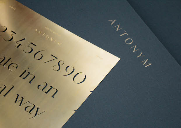
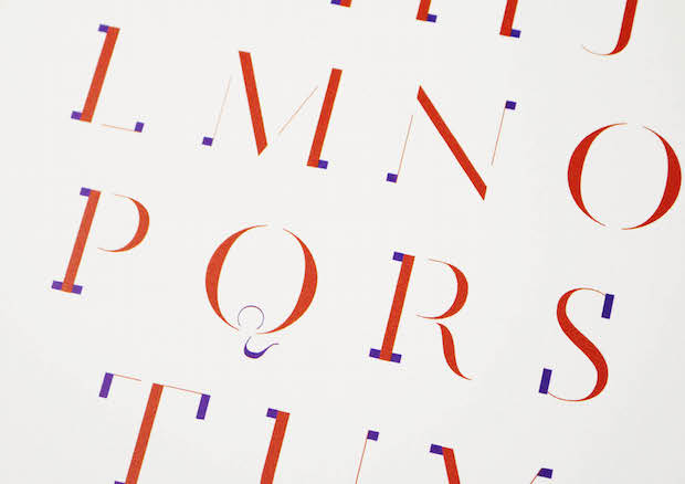
Your final project for your degree course was a typeface called Antonym. What was the inspiration behind it?
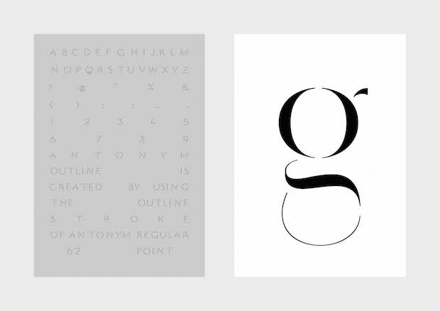
Antonym is a high-contrast stencil typeface, with ‘add on’ serifs. I was inspired by Matthew Carter’s 1995 Walker face, as well as the experimental typography of designers like LettError. I wrote about both during my dissertation, and I remember being excited about the way in which someone who was classically trained had broken the rules. Part of my interest in doing this project was that it afforded me three months in which to learn the craft of making a typeface. Whilst the typeface was in production, I contacted a few great type designers like Phil Garnham, Andreas Neophytou and Lee Fasciani, in order to help me to learn this craft.
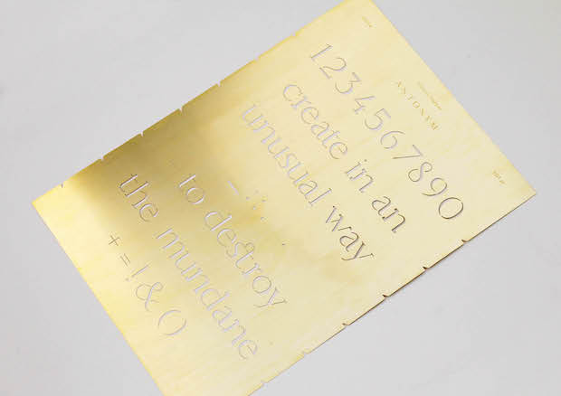
Creating a typeface can be quite solitary, often ending up on the internet and never getting any feedback. Antonym is both digital and physical, I made it in to three acid etched brass sheets, where you could draw in to the stencil and layer over the serifs with the others. Having something physical meant I could get immediate results. I worked with Anthony Burrill to create a one-off poster, and I felt honoured when he said he really liked it!
What are you working on now and what's next?
I’m currently assisting art director Charlotte Heal at her studio on numerous projects. She’s an amazing mentor and is teaching me a lot: from inDesign tricks to how to communicate professionally with clients. We’ve just finished working on the redesign of Town and Country magazine. It’s completely different from other projects I’ve worked on so has been a good learning curve. As well as working on a cookbook for Penguin Random House, I’m also working on a few personal projects, one being an art zine and also on a new typeface, which I have been pining to do since finishing Antonym.
k-rj.com