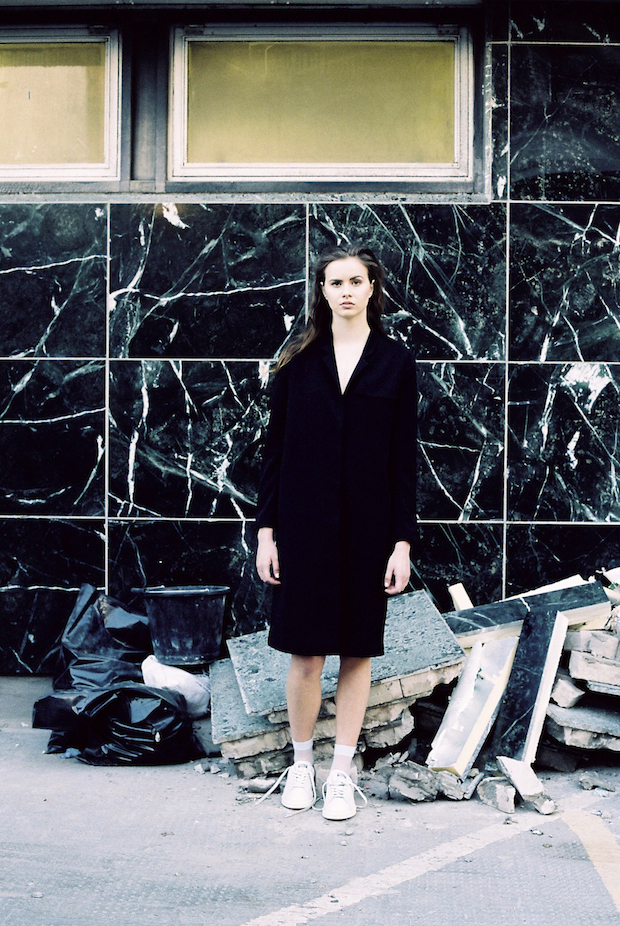
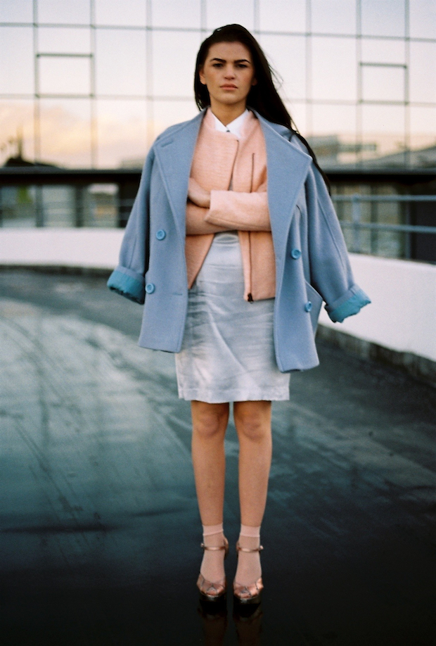
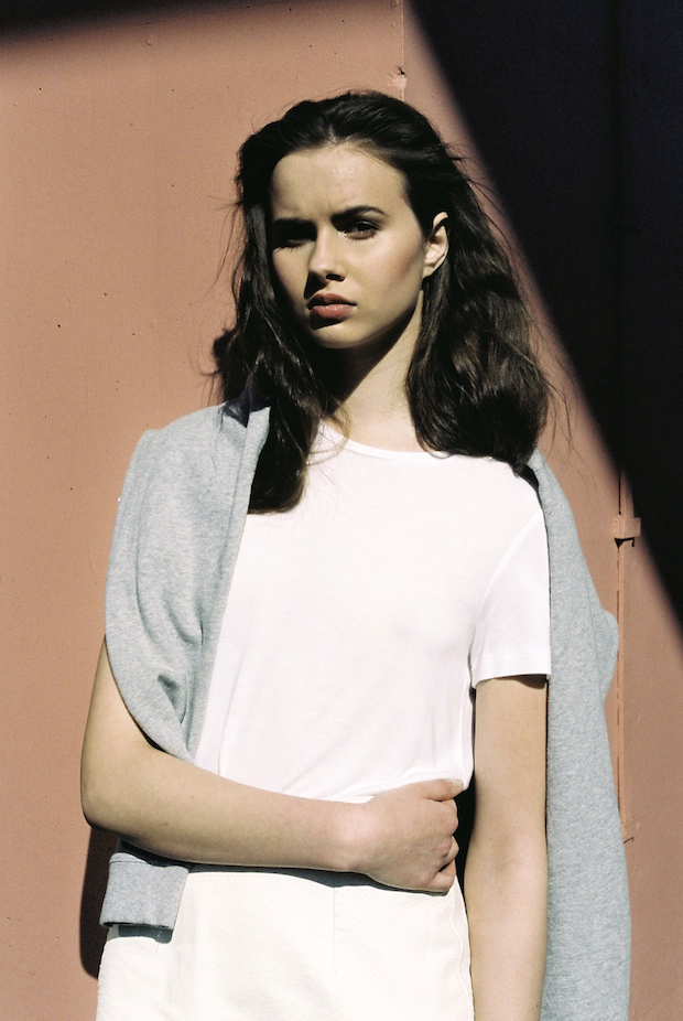
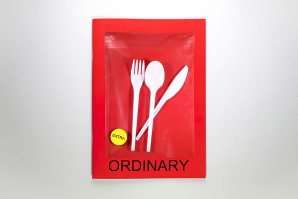
Geometry and urban architecture inspire the work of this recent Glasgow School of Art graduate, whose crisp aesthetic and spacious photography particularly lends itself to working in the fashion world.
Describe your style in three words.
Raw, geometric, transient.
What do you think makes an engaging image?
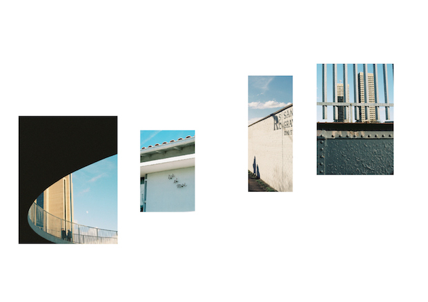
Anything that evokes a strong emotion, especially when the reasons why are hard to decipher. Failing that, my eye particularly likes geometric shapes, soft colours, empty space, strong light and something unexpected.
What do you enjoy working in the fashion world?
I am interested in what clothing can say about an individual, and so I suppose I like to try to interpret how fashion speaks through design or photography choices. The very nature of fashion is fleeting and sometimes the possibilities of development can seem limited. Creating look books and printed material for fashion allows for something a bit more permanent.
What are you trying to achieve when working on a look book?
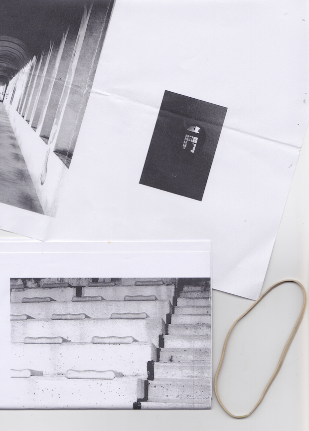
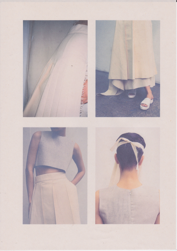
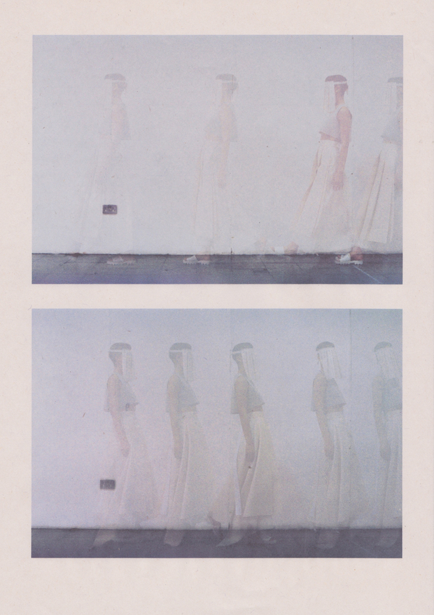
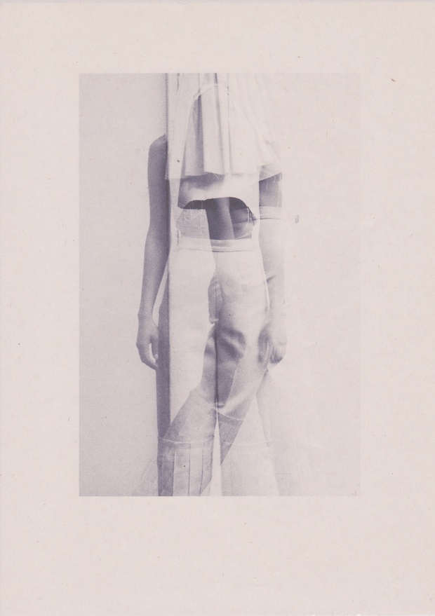
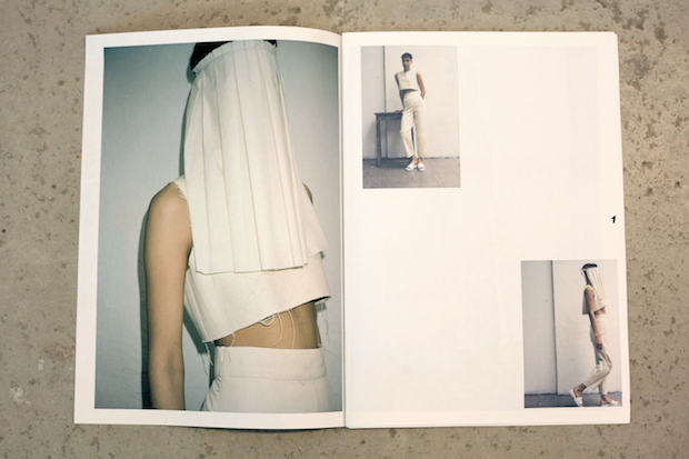
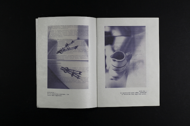
Printed look books appeal to me as they provide the ability to relate the context of the images to the design choices in order to enhance the features communicated, thus enhancing the concept. I think that given that the garments can easily be found online, brand look books should be separate from e-com photography and instead communicate the mood of a brand, or a specific feature of the collection. For example, the design for Tommy Zhong’s graduate collection was very much based on the way that the garments were constructed. The collection is mostly made from cream, inexpensive materials and so the paper choice reflected that. The layout was in relation to the succession of the garments. The photographs were about capturing the subtleties of the design of the garment, as well as the way that the pieces moved.
Tell us about your Object As Found project.
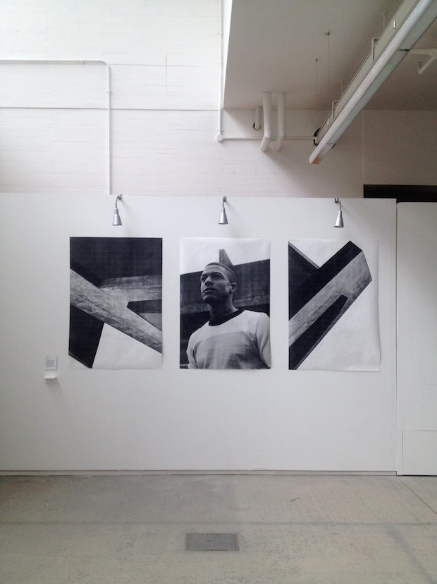
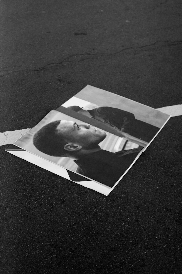
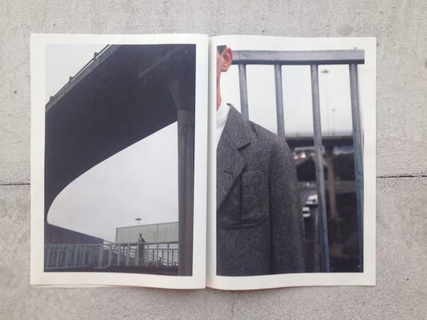
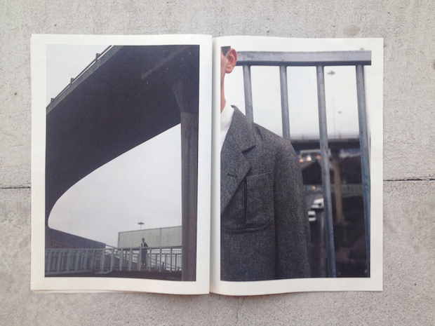
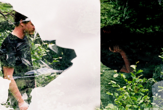
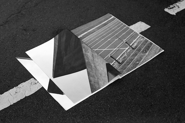
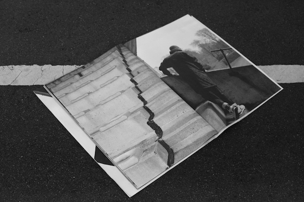
Object As Found was an editorial piece I collaborated with stylist and writer Calum Gordon on, originally conceived for a one-off world cup magazine called Mundial. Calum was writing a piece on the Brazil stadia, which had a number of problems in construction. We chose the location as the strong structures of Brutalist Stadia in contrast. To further add to the idea of fortitude, the model we chose was a boxer. The images were then printed on architectural plotters. I felt that this would be a good way to display the ‘object as found’ images since the images were based around the stadia and the model’s interaction to the building as a space, as well as the looming scale of brutalist architecture.
The urban environment is a recurring theme in your work. What appeals to you about the aesthetic of cities and how do you use its presence in your work?
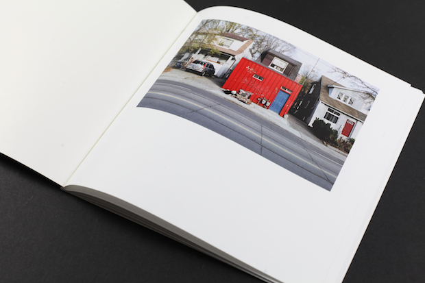
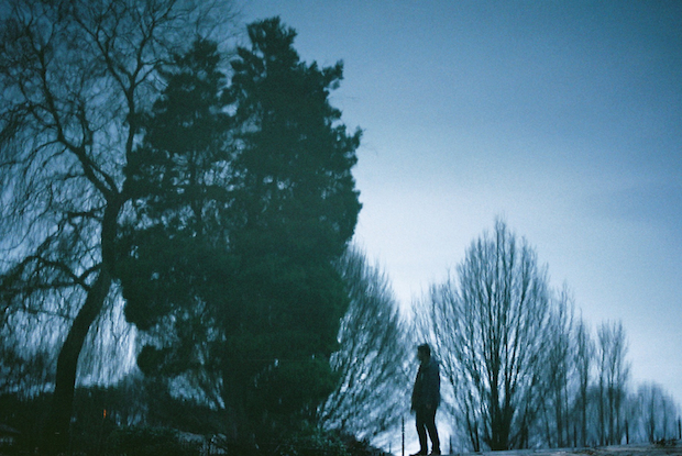
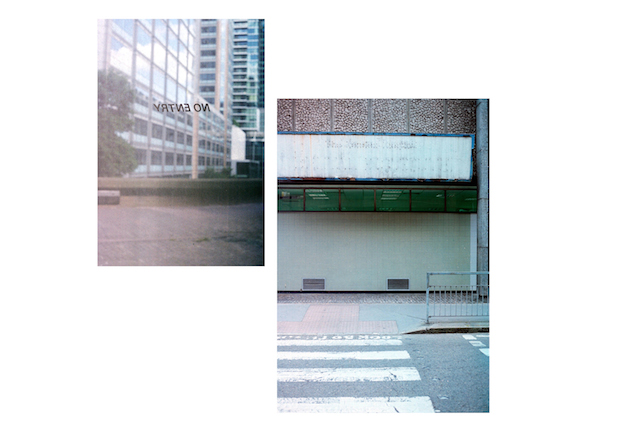
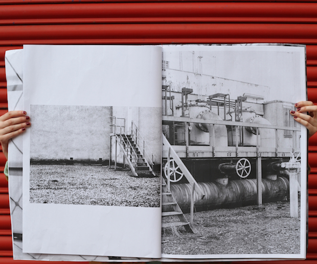
In dissecting my own images and creative practice, one aspect I have frequently returned to is the emotional connection to buildings and places. I have grouped photos as ‘emotional exteriors’ or ‘emotional interiors’ in a bid to understand the reasons for making them, as well as the feelings viewing them evokes. A lot of the images I make are about trying to understand these emotional and also physical connections to space and place. When making portraits, I am interested in how people fit in and respond to architectural space. In the case of fashion editorials, my main criteria for a location is often a structure or space that the models can interact with somehow. Instead of focusing on directing models I prefer to not to capture their movements, recording the nuances of a small journey or interaction with the given structure or space.
kirstinkerr.com
