In today's Letterform, David Osbaldestin looks at Ten Lines Sans-Surryphs Ornamented, a brazen condensed face by Blake and Stephenson, which is clearly taking no typographic prisoners. For a print historian, narrowing down a lifetime’s love of letters, to one letterform (from one typeface) is a task of Herculean proportions. Typography is one of the fundamental building blocks of graphic communication, literally language made visible across the printed page or screen. Type has the power to unlock distant voices and cultural stories from the past, and when seen as a lens that reflects cultural values, it presents us with new contexts to read the changing world around us. Printing type is a thing of great physical beauty, from its inception through the meticulous craft of hand and eye coordination from the punch cutter (or type designer), to its reproduced form in print and beyond. Each letterform can be viewed for its own individual personality based on its design merits, style and character. The reader holds type precious; the act of reading itself can be private and personal, holding meaning and value within a communication system, and good typography continues to inspire new generations every day.
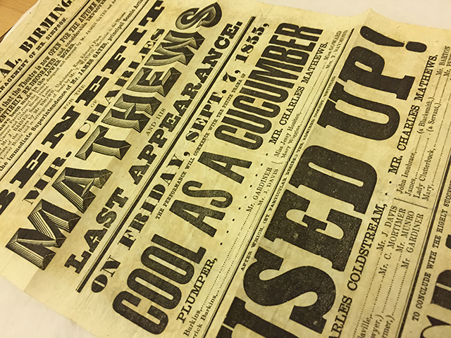
Browsing through the pages of the 1839 Specimen of Printing Types by Blake and Stephenson is a sublime act of typographic pleasure. The specimen book is a cabinet of textual curiosity. Reflecting the sporting events popular during the period, matching bare knuckle fighting to reading, a stage is set for a new spectacle in typographic entertainment. The radical and dissenting lead characters of the display faces stand proud, introducing their bold personalities and announcing their persuasive services to the world of advertising in the age of empire. The contenders step forward; competing against the voluptuous charms of fat face ‘Eight Lines, No.4’, and the muscular architectural slab serifs of ‘Eight Lines Condensed Antique’, charges a monumental heavy weight sanserif, ‘Ten Lines Sans-Surryphs Ornamented’. An upper case wooden type, weighing in on a metal body of 120 points tall (just shy of four centimetres), this ornamented colossus was intended for use in playbills and other advertising ephemera of the nineteenth century. A brazen condensed face with sculptural proportions, the letter ‘H’ has clout. It is a serious contender, occupying a balanced and majestic stance. As opposed to the primitive styles expressed by its sanserif contemporaries, its ornamented quality (built up through a series of concentric lines) creates the illusion and weight of a three dimensional form. Characteristics that resonate today, in twenty-first century type designs, such as Obsidian by Hoefler & Co.
In the nineteenth century, this letter ‘H’ shouted out from walls of printed media competing for attention, through the smog of polluted urban streets, and the visual pollution of mass communication. This explosion of print created a new need in society, a demand for visual systems in which readers of all levels of literacy could differentiate between information that was regarded as newsworthy, as opposed to advertising sales pitches. In fulfilling these needs, ‘Ten Lines Sans-Surryphs Ornamented’ has strength and boldness. Alongside the mixed styles of the display types, it commanded attention from the eye through its physical power within the visual hierarchy of print advertising; and in the process reflecting the values of power, iron and coal from the Industrial Revolution. This is the face of the future, yesterday.
osbaldestin.com
David Osbaldestin…
…is Deputy Course Director for the BA (Hons) Visual Communication at Birmingham City University and a PhD candidate with the Typographic Hub, investigating the Sanserif in Britain. A practicing typographer and graphic designer, David also manages the BCU live creative agency; a student led design studio and enterprise initiative. He was also the inspiration behind The Baskerville Project, an animated film which celebrates the life and work of Birmingham’s John Baskerville, who revolutionised print technology and typographic design in the 18th century.
Blake and Stephenson…
…was founded in 1918 in Sheffield by silversmith and mechanic William Garnett, toolmaker John Stephenson and money man James Blake. A year later the foundry acquired William Caslon IV's foundry and instantly became one of the country's leading type foundries. In operation as a foundry until 1990, the company now specialises in engineering and is known as Stephenson Blake