
The larger-than-life typographic style of Dutch designer René Knip is unmistakable. Robert Urquhart visited his rural studio and found a thoughtful, talkative designer poised between language and landscape.
René Knip is in full-flow, talking about his collection of visual influences: “I follow a lot of subjects, I follow trees, plants that survive when they grow in and between buildings, sleeping white animals, I follow stairs, just two or three step stairs, I follow old barns, the little barns where people do not live, I follow shadows, the black drawings of shadow lines...”.
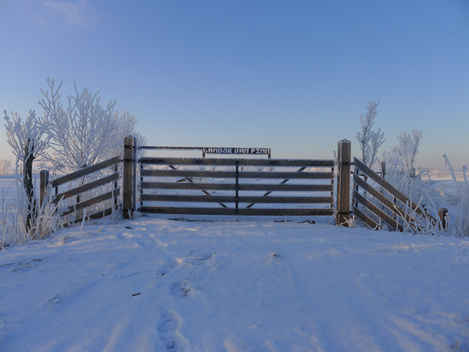
I'm in a car with Knip driving through the Dutch countryside, we're following the road that takes us past his restored farmhouse studio on our way to lunch in Harlingen, a seaside town an hour north east of Amsterdam. That’s the magic of typographic design — you can steer the emotion of the person that is reading. “No, I don't have a lot of heroes” he continues, “I'm influenced by everything I see, by walking, by architecture...” Distracted by an old man sitting by the side of the road, Knip gestures over approvingly, “look at that — disappearing life, just an old man living on a farm, just sits there all day, if a tile falls off the roof he puts another one on…”.
“I am a graphic designer but its good in life to have certain frustrations,” says Knip. “I wanted to become a singer, that's what I really like, but I'm not good enough. Here I insert my usual, now hackneyed, joke about graphic designers being failed pop stars.
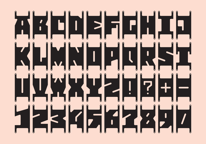
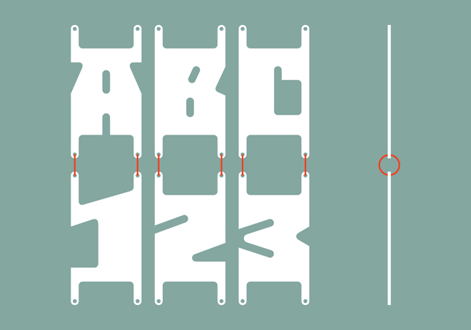
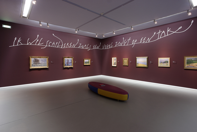
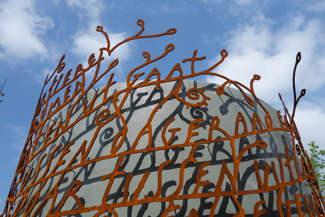
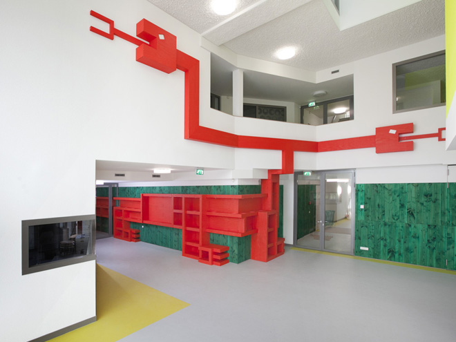
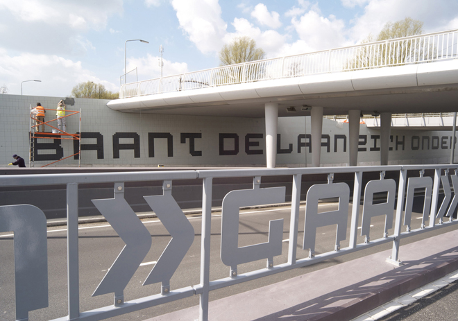
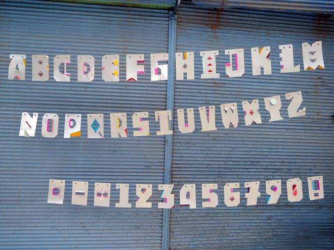
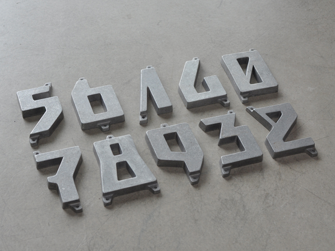
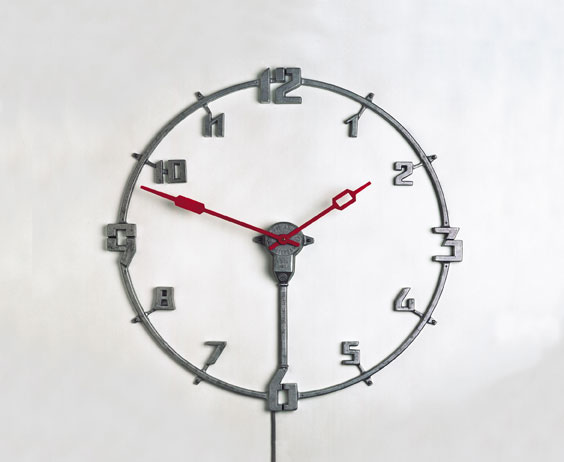
René isn't just a graphic designer though, he specialises in three-dimensional typography — lettering, products and large-scale works with type in the environment. “I like graphic design to touch the real world,” explains Knip. “So it’s not flat on the screen — that’s also why I'm not so much into book design or magazine design because its another thing — that's when you need type to be accessible and simply 'done well', but sometimes in my work the type has a bigger role, a bigger stage to sit on”.
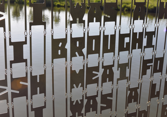
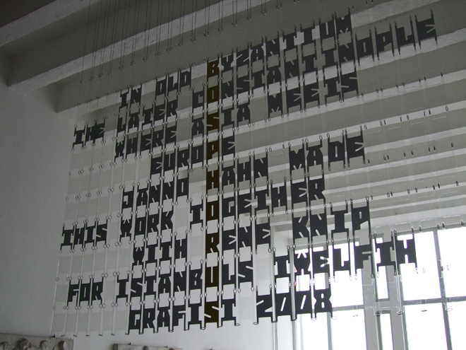
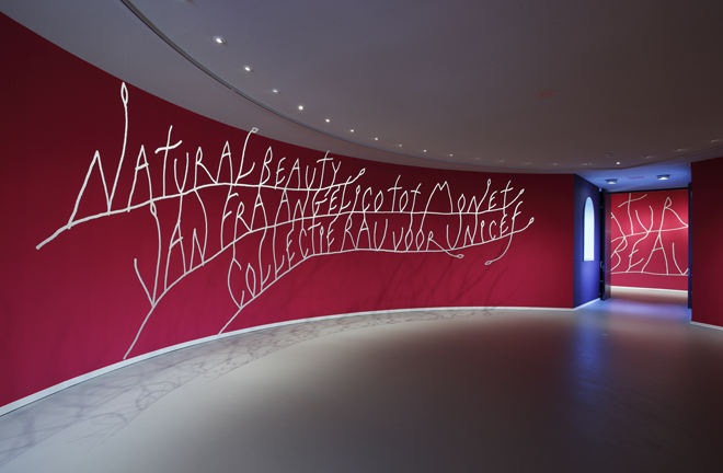
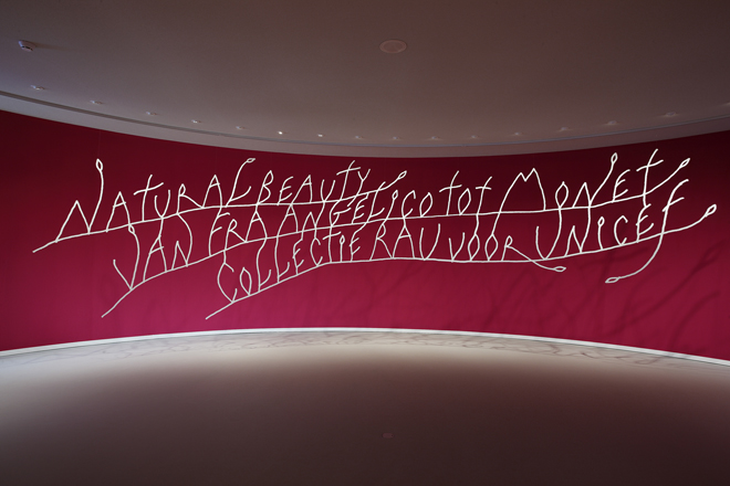
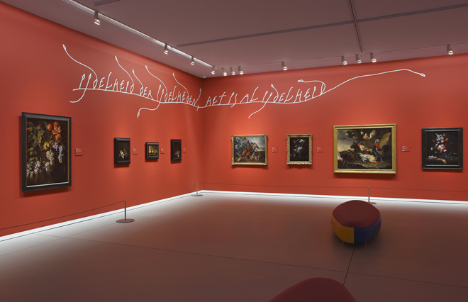
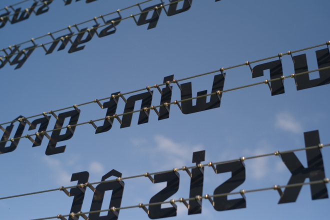
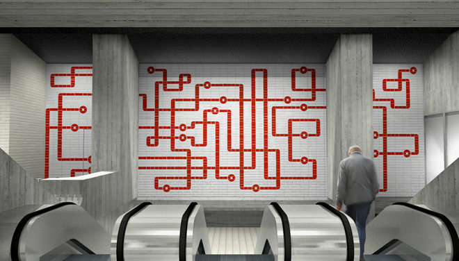
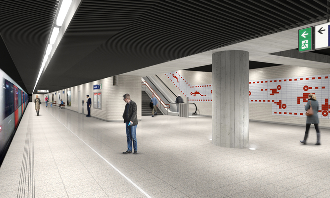
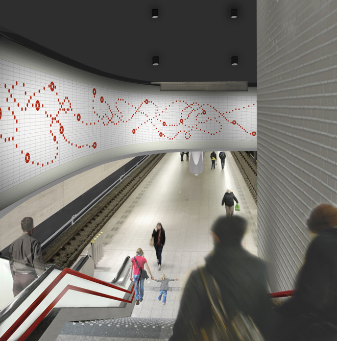
This 'bigger stage' not only includes the landscape around him but also type interventions in cultural institutions and public spaces. He’s currently working on tiling for the new extension of the eastern section of the Amsterdam metro and recently finished the exhibition signage for Natural Beauty – van Fra Angelico tot Monet, an impressive collection of Old Masters paintings currently on display at the Groninger Museum in Groningen.
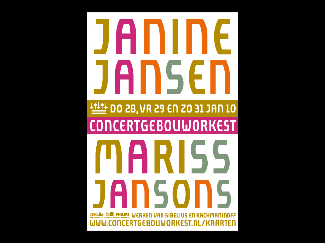
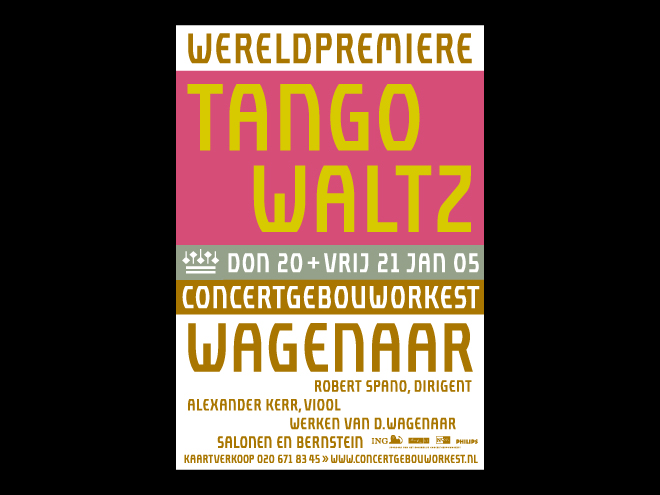
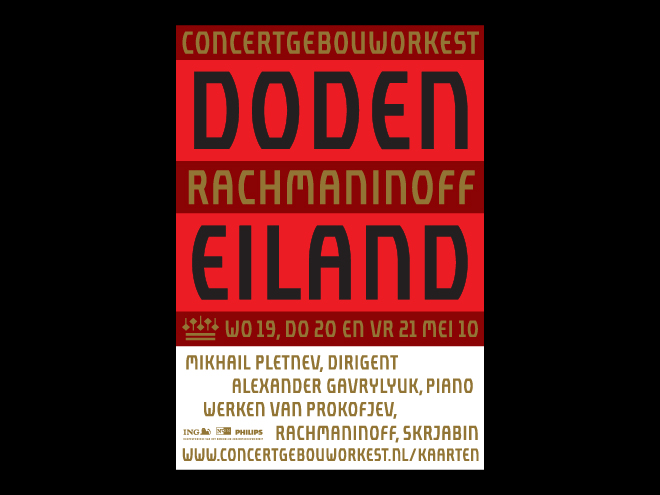
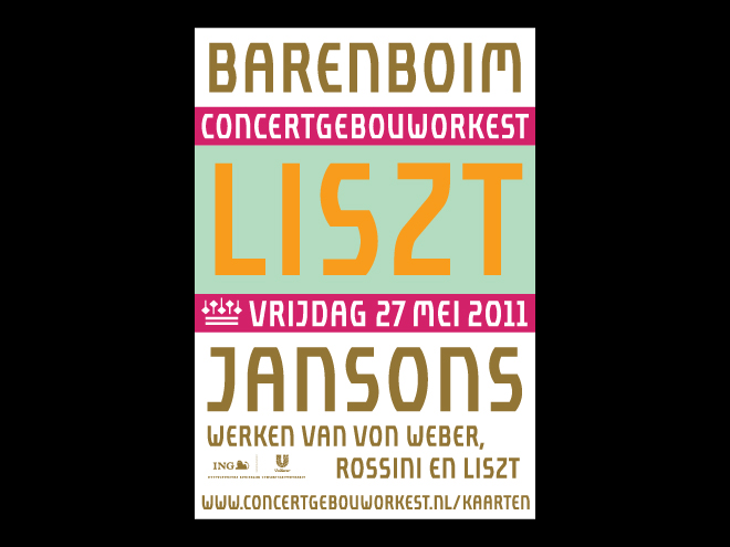
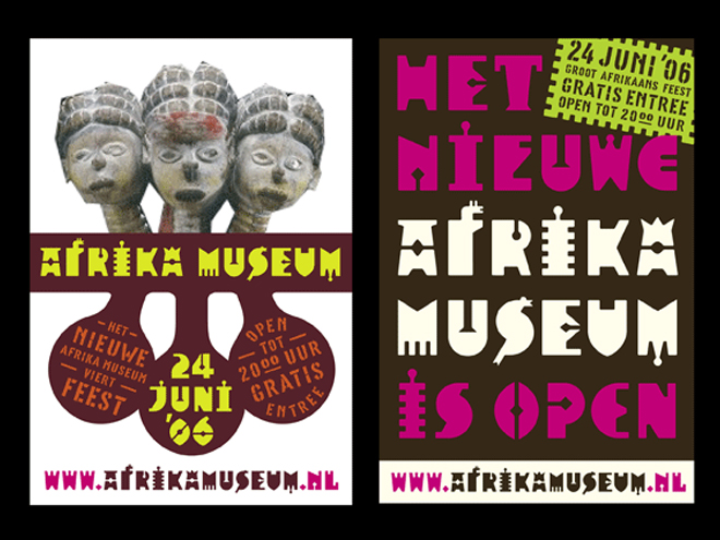
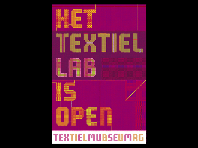
René started out studying law then switched to art, but an influential tutor at the Academy of Art and Design St. Joost in Breda saw his fascination for lettering, calligraphy, and typography and pushed him towards graphic design. Then, after three years as the assistant designer to Anthon Beeke, Knip founded Atelier René Knip in 1992 and produced acclaimed work, largely for the cultural sector, including Amsterdam’s Royal Concertgebouw Orchestra, the TextielMuseum in Amsterdam and the Afrika Museum in Berg en Dal amongst others.
“I've never wanted to become a type designer in a way,” says Knip, somewhat apologetically. “I understand type design, you can use it to illustrate. I use it as a tool, like philosophy or photography, or moving pictures. For me, forming the shapes of lettering can help to steer a certain message in a certain direction and of coursethat’s the magic of typographic design; you can steer the emotion of the person that is reading.”
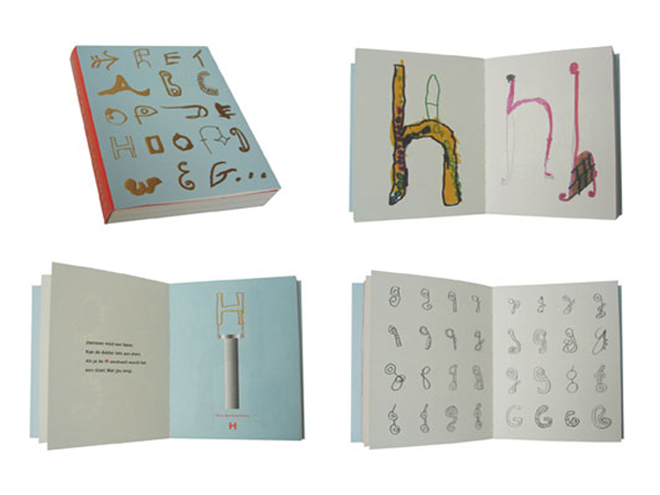
His tutor at St Joost, the late Chris Brand, had seen René's own self-confessed fascination and innate instinct for type. “I was always into etchings, drawings painting. Before I got into design I was making prints,” he explains. “I used to watch my older brothers learning how to write and I used to come up with these hieroglyphic stories based on letters.”
I give type the opportunity to mean something, I give the people visual material to build meaning, a visual story that is free to dive in... It's clear that Knip is by no means disappointed that he's ended up doing what he does, he's one of the most celebrated type designers in Holland, it's more the fact that he's constantly challenging the status quo and bringing graphic design out onto the streets.
Describing his practice now, Knip says “There are a few times in life where I still ask myself whether I would jump towards the autonomous idea of being an artist but I guess, if you are an artist you would be an artist. I'm a designer, influenced by certain fields which I find attractive but I'm also not an architect and I'm not a sculptor, I'm a graphic designer with a certain feel for environment, 3D objects, construction, colour and a feel for material the interest of material in graphic design.”
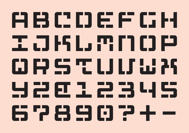
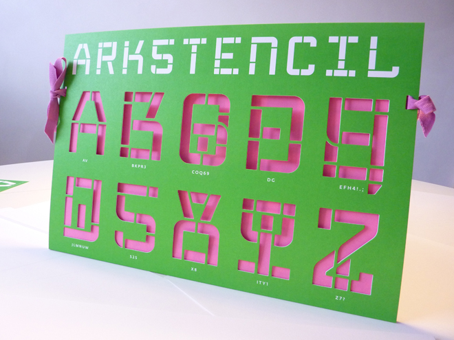
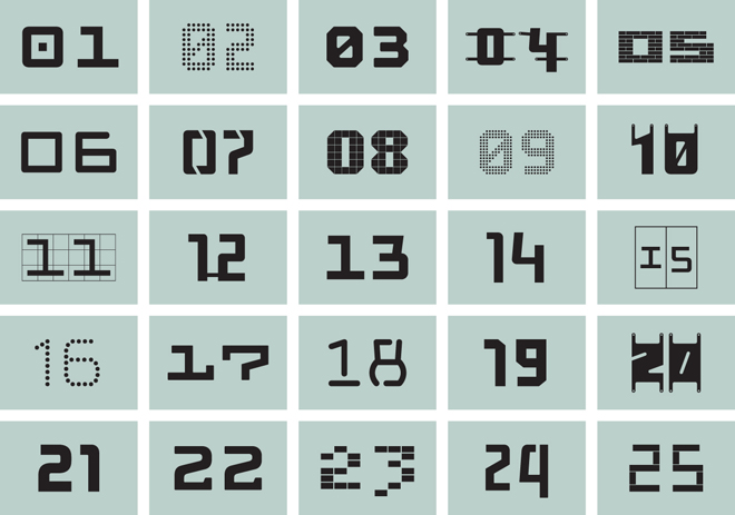
Knip goes out of his way to bring type to life. In 2012, he launched ARKTYPE.NL, an online type shop featuring twenty-five architectural type-related projects designed with Janno Hahn. By his own admission, Knip has not pushed the project commercially yet, but it's clear that the site is a great resource and noble gesture, typical of Atelier René Knip's view of 'design for the people'. The selection of off-the-peg type solutions range from a modest 300 euro down to an even more modest 100 euro. “If people are smart they'll see that for 100 euro they can get type stencilled onto a building,” notes Knip. “I like the idea of type that can replicate easily. The idea of Arktype is a simple website — it proposes twenty-five projects, we give them a name, it says why we did what we did and it gives a few examples of what you can do with it, and that's it.”
Over lunch, Knip and I discuss the environment, his love of sailing, family and his move from Amsterdam out to the countryside of Friesland. We head back to the studio and walk around the lake that Knip has built in his back garden, where he muses on life. “I'm almost 51 so sometimes I feel like I'm escaping from being too occupied” he says. “Then I go to my sailing boat or do things in the garden, I'm happy not to be stressed. Then I get into a situation where I say to myself 'hey, nobody needs you anymore,’ which is not true — I'm still working on six different projects at the moment, but this is a kind of feeling you know, I'm facing death, nobody needs me.” Spurred on by this troubling thought we both instinctively head back into the studio to have a look at some work.
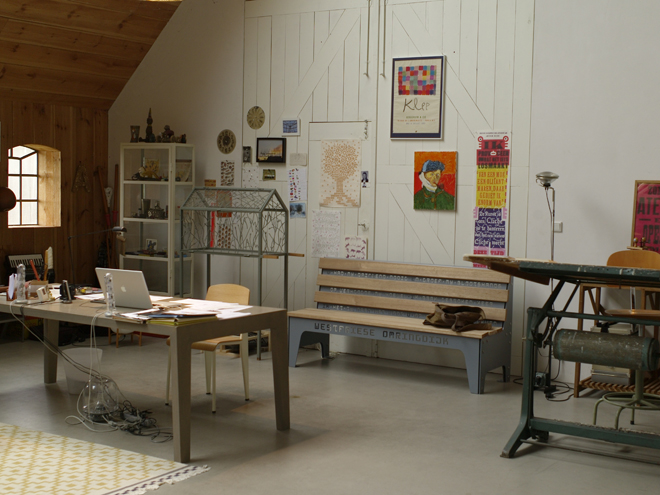
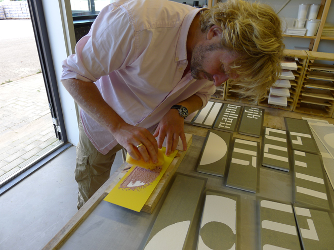
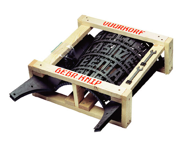
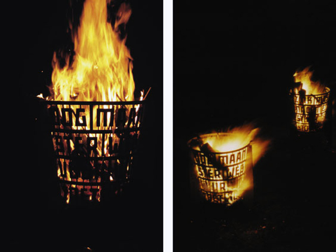
The studio spans several barns. Pieces of work, some large steel structures, others test pieces for the work that keeps Knip so busy, can be found dotted around the space. René talks about several pieces, including Fire Basket and a new chair that he's working on and I ask him if there will ever be a time when he drops type from his work, it seems that the language is more the chair itself, “There are not many projects where graphic design is a key thing [in furniture design]” says Knip, “Most of the time it goes wrong, its a niche it gives me a reason to focus on thing with a function that is in between language and landscape, its an interesting though because most graphic design doesn't touch this world of architecture and most architecture doesn't touch graphic design.”
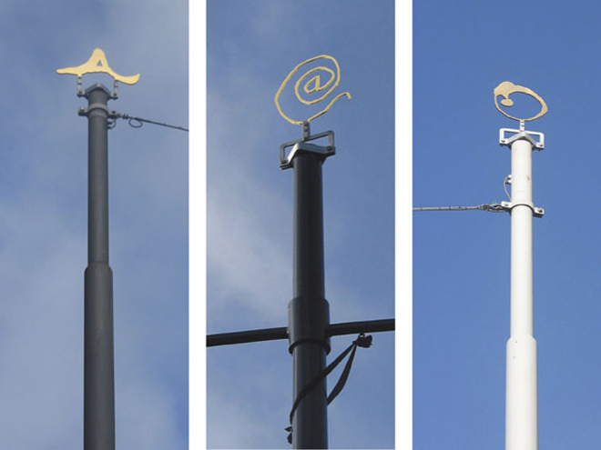
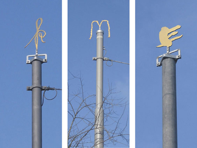
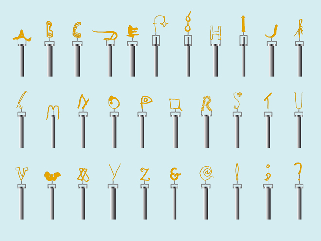
Talking about a project for the Amsterdam Metro, Knip shows me a series of beautiful sketches. Asked whether he sells his sketches he says, “a real sketch is a thought, not a product but a reminder to take the next step.” Explaining the project he says, “I'm taking the walls of stations and starting to tell things, I'm leaving it open — stories that are not understandable but everybody wants to read. I give type the opportunity to mean something, I give the people visual material to build meaning, a visual story that is free to dive in – the way they do it is their story.” The sketches for the metro draw comparisons to his early childhood experiments, hieroglyphics that long to be deciphered.
There is a synchronicity between the environment, graphic design and the life of René Knip — he questions everything and makes all he does fit for purpose. I ask what he feels his purpose is, moving forward. “What I hope to do in the future is to have a third of my time to design for clients, which makes enough money to survive, another third of my time to make things that are more art-related but as a designer with no function in a way, and a final third to do more product design, like typefaces for chairs and things because I've figured out it could be a pension, making money from items that can be repeated,” comes the pragmatic response.
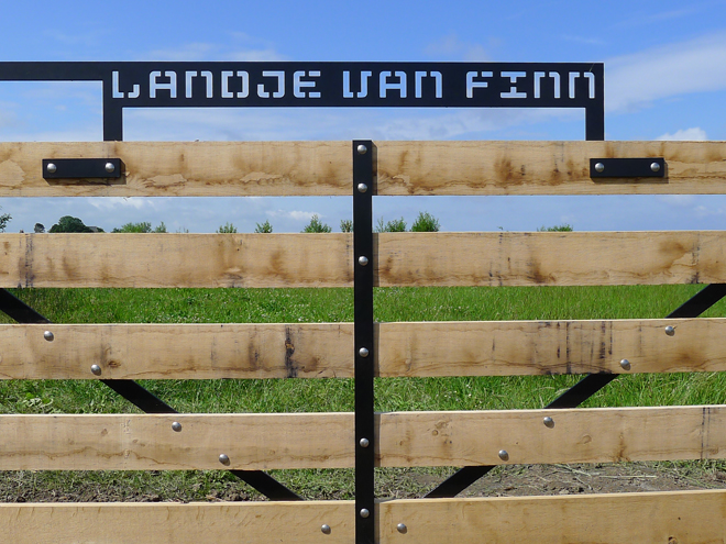
Before we leave for the station I ask Knip if he ever gets involved producing work for his neighbours in the surrounding countryside. “If I really like a project I do it for free,” he responds. “I do marriage and death for nothing. And also for the farmers here, I do name stones with inscriptions, simple things. They don't have a clue about prices, they would have a heart attack it I charged them 2,000 euro and I don't want to charge them 100”.
It's quite clear that a lot of people need Knip — each of his friends and colleagues I speak to remarks on his inspiring spirit. His pragmatism is mixed with a healthy dose of romantic ideal, his work, aside from his family and his environment is his life. He does not see design as separate entity, rather as a seamless stage.
Olga Scholten who works for Atelier René Knip says, “he was my tutor and now I work with him, but he is my friend most of all. He taught me that you can talk about design but it’s better to do it. He's a curious, honest free spirit and...” Olga says intriguingly, “he can sing really funny.”
Max Kisman, of kismanstudio, fellow participator with Knip in the 2010 book from Amsterdam based Khatt Foundation entitled Typographic Match-making in the City remarks upon their shared aesthetics, style and content but notes that their aims and goals are very different. Kisman talks of René's poetic nature and, when asked about the one piece that sums up René's character, offers up a piece that operates as an outdoor fire basket that when lit casts up words that dance and flicker “somehow it is the fire basket” says Kisman “it is inspiring to me as someone who really loves building fires, it makes me want to make a fire basket myself.”
Hans wolbers of lava design studio recalls of Knip, “we became close friends from the first minute we met during a conference in Ljubliana, Slovenia — not from talking about design, but talking about our lives brought us together.”
This reminds me of one of the last thing Knip said before he dropped me off at the station, remarking on our afternoon spent roaming the Dutch countryside, he turned to me and beamed, “I once spent five hours in a car with Erik Spiekermann, it was excellent, we talked about everything apart from design.” I can say the same for Knip.


