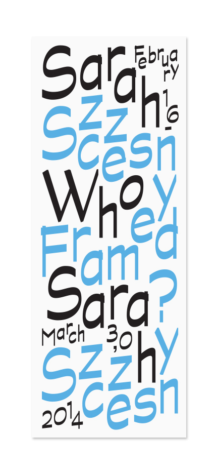
From Weird Al to rebranding culture, Brooklyn-based Other Means proves that humour, subversion and straight-up smart ideas are alive and kicking in graphic design. Robert Urquhart introduces the band...
Just over the Brooklyn Bridge from Manhattan sits the studio of Other Means, the design studio formed two years ago by a supergroup meeting of Gary Fogelson, Phil Lubliner, Ryan Waller and Vance Wellenstein.
Previously, Fogelson and Lubliner were in successful business as Fogelson – Lubliner; Waller achieved early success on the awards circuit with acknowledgment from Yale and ADC Young Guns; whilst Wellenstein is a former Walker Art Centre Design Fellow. In summary, all four have an equally impressive, and similar, client portfolio and past.
Phil Lubliner wasn't at the studio the day I visited, but Fogelson, Waller and Wellenstein were. As we sat round the table, the camaraderie between them evolved as a many-layered comedy of nervous energy. Asked the brash question of “who is good at what in the studio?” the response is about quality of sandwich making (Lubliner wins).
There is a certain protective layer to the group, they are unwilling to bend as a unit and talk about their individual lives. Other Means is tight-knit group, very much a band. I’m tempted to make my usual bad joke about famous designers often being failed musicians, or at least, harbouring ambitions more akin to rock than reprographics, but it would be lost in here, and for all the right reasons.

The group tend to let each other speak then follow on, leading in and out of conversations as only close friends or those of a very similar mind can do. Our opening conversation is a perfect illustration of pick-ups, segues and refrains as we discuss the reason they all decided to get together in the first place. It’s the difference between being a collective and business... we all work on everything together, we very much work as one entity Waller opens: “I think part of it comes from not wanting to participate in a lot of the design clubs that exist already. Reason being, that they tend to highlight and bring forward a type of work that we are sort of offended by in some way, because of a laziness in craft or idea. And so before we started the studio we thought that we could become a club”.
Fogelson picks up the thread: “But we ended up saying 'well lets not talk about it, let’s make that work, and have the dialogue in the studio and with our clients, and the people that see the work.’”.
Wellenstein segues with: “In a way, we started to do the exact opposite of the club – we formed a studio that is very reserved in a way, we're not very front-facing”.
“It’s the difference between being a collective and business, as well,” concludes Waller, “we all work on everything together, we very much work as one entity”. The conversation turns another corner and we spend an enjoyable ten minutes discussing the merits of pop parody maestro 'Weird Al' Yankovic.
Is there parody in graphic design? How do the members of Other Means relate the studio's output to that of the man that re-wrote the words to Micheal Jackson's Beat It as Eat It?
“A reference like Yankovic allows for deeper reading and an alternate reading in a lot of forms of creativity, and not necessarily in a subversive way,” replies Waller, “but just to say 'there is a job that this project is doing and then there's a completely alternative way of reading it on the second or third level’. I think that's something we really strive for,” says Waller. He is explaining how the studio comes across to an informed Yankovic audience, which gets the joke then realises that there's musical reference and, often, a wider, intelligent subtext to pop culture.

Speaking, later, to one of the studio's clients, David Shipley, Senior Executive Editor of Bloomberg View, I discover a continuation of the many-layered theme in Other Means’s practice. Shipley brought the group with him to art direct and illustrate the daily opinion section of the news when he moved from the New York Times to Bloomberg and has a clear handle on the use of subtext in editorial art direction and illustration. How does illustration and design interact with text? I ask Shipley. “For the kind of work that we are doing,” he says, “the illustration is meant to be a ‘third way’ or a ‘second way’ into the piece. [Illustration is] like a headline, or it serves the function of a headline in that it will say 'here's what this is about and here's a way to think about it'. It’s a delicate process because you never want to have art, in the same way you'd never want to have a headline, under-cut what the writer is trying to say. Other Means want to find the most effective way possible to get the article out to the world, to make someone see the illustration and think 'I absolutely have to read this piece’... that's an incredibly laudable trait and one of the reasons I adore working with them”.
The studio art directs the opinion section of Bloomberg View, published several times a day, in a constantly evolving digital environment. Shipley is attuned to the situation, “Here's one of the big challenges that they and I face, coming from opinion editorial, which was really one of the last venues for black and white illustration, and especially human-hand illustration — It doesn't work quite so well on the web, especially in terms of generating traffic — people like to go to pictures, or photographs. Was there a way to sort of fuse the two?” Continues Shipley. “Was there a way to produce a more photographic design element, or something that was more designed than illustrated? I think Other Means has been incredibly ingenious in coming up with visual solutions that work for us, that feel vaguely illustrated but are also photographic enough that they will be more viral on the web. Those are the kinds of problems that Other Means is remarkably adept at helping to solve in a constructive way”.


I think people that ask you for ‘a brand’ are asking for you to solve all their problems and they don't want to be involved... Aside from continued editorial work for New York Times, as well as Bloomberg, the group also often works in the arts cultural sector. The topic of 'branding' is met with derision. “Isn't branding just like when you are curating stock images of people on a road trip and you're like 'this is it'?” wise-cracks Wellenstein. “I think people that ask you for ‘a brand’ are asking for you to solve all their problems and they don't want to be involved,” adds Fogelson, “when you engage someone to work on a visual identity you are working with them to visually communicate what they do and what they know about an institution or an organisation. I thinking branding attempts to be like a cure-all and the people that want it are misguided and the people that offer it are misguided too”.
One recent piece of identity work was for a New York non-profit organisation, Artis, a place dedicated to supporting contemporary art and artists from Israel, internationally. The organisation had been struggling with a ten-year-old in-cohesive identity and needed to gather its presence together.
Persis Singh, Program Director of Artis explains the the brief that was set to Other Means: “The challenge has always been in communicating Artis to an audience that is demographically varied in terms of language, culture, religion, geography, age, profession and socioeconomic status,” he says. “We were seeking an identity that was approachable but could reinforce the organisation as the authority and key resource on Israeli art. It was also critical to convey Artis’s identity as an artist-centered, contemporary art organisation dedicated to cultural dialogue and exchange”.
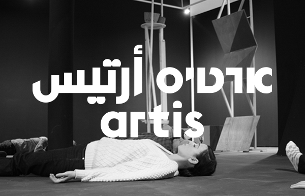
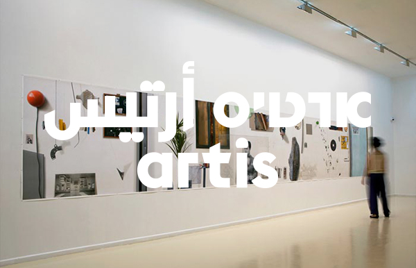
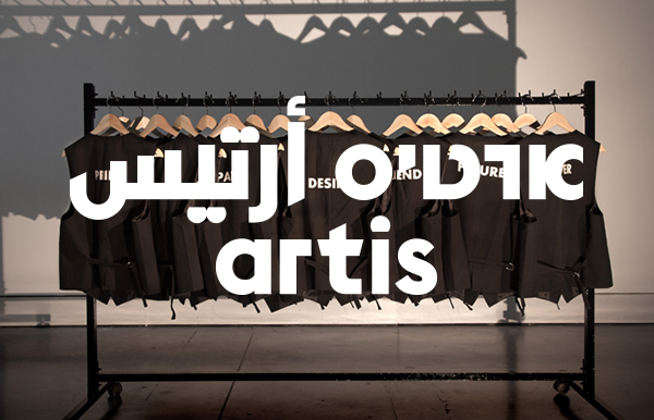
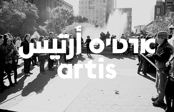
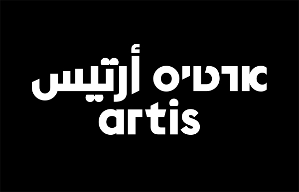
Other Means responded with a thoughtful and broad-minded approach, incorporating three languages into the final design. As Singh states, this proved a winning combination. “The response to our new identity has been overwhelmingly positive. The new logo is a nod to Israel's Bauhaus roots and the spread of European modernism in the 1920s-40s. We love that it highlights similarities between the languages, with English functioning as a 'bridge' between the two – the Phoenician aleph, the precursor to the Latin A, Arabic alif and Hebrew aleph, was an interesting and symbolic starting point for the logo's development.”
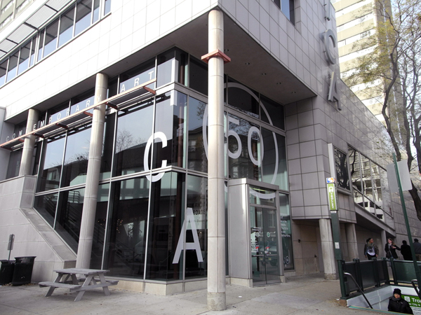
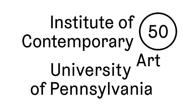
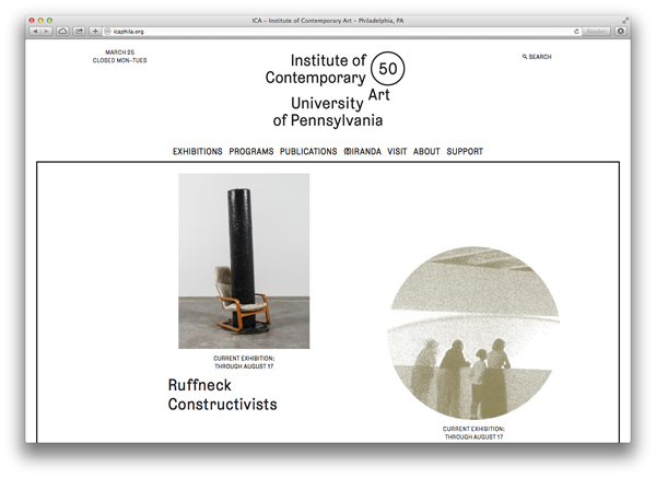
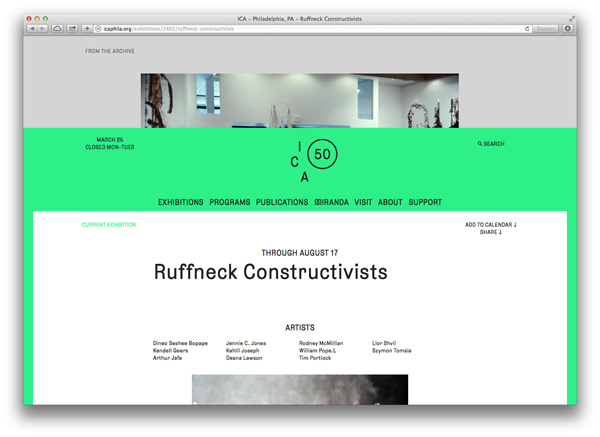
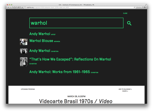
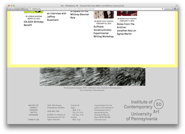
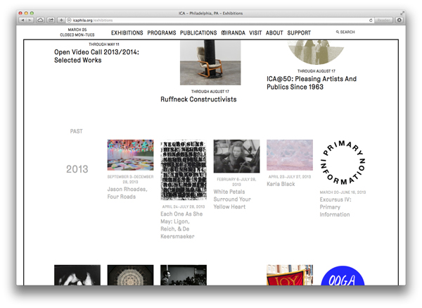
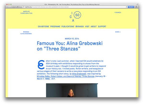
Another cultural sector client for the studio was the Institute of Contemporary Art at the University of Philadelphia. The group were charged to push the limits of what the ICA knew of as a website and to open up possibilities for the organisation with their archive material.
“The site nurtures connection and discovery, and nudges visitors to explore new ways of using a website,” enthuses ICA chief curator, Ingrid Schaffner. “For those needing key information, the site’s user-friendly, traditional navigation is always visible; intrepid visitors may scroll to reveal rich stores of interrelated content and click to uncover the stories behind ICA’s exhibitions through vivid, high-quality images foregrounded on each page. A unique algorithm brings to light relationships between notable projects and lesser-known programs; and ICA’s extensive community of artists, curators, and scholars.” This heartfelt flow of praise is topped off with a flourish from Schaffner, who adds “Inspired by ICA’s multifaceted exhibitions and programming, and chameleon-like space, the site’s flexible and responsive, front-end design and custom content management system make possible ever-changing configurations of media”.
My conversation with Other Means moves on to teaching. All four studio members teach regularly, or have in the past, and there is a strong bond between the studio and the Pratt Institute, with Fogelson, Lubliner and Waller all involved to some degree with either arts or design educational practice there.
One new educational focus that the entire studio shares is its involvement with Typography Summer School, an independent programme founded by Fraser Muggeridge in London in 2010. Typography Summer School New York was initiated in 2013 by Other Means, as Waller explains: “We wanted to do something similar here, but we realised it was close enough to Fraser’s Summer School so instead we approached him in the hope that he would be interested in expanding the school so we could bring it over here, and he invited us over to see how it works.” Fogelson made the trip to London, and was inspired to replicate it back home in new York: “Typography Summer School is so successful,” he says. “…all of the students have a mentality where they want to try everything out and want to mess around and see what happens”.
As a result, the Typography Summer School of 2014 will be held in New York, giving London a year off “like Glastonbury, to let the grass grow back”. It’s a testament to Other Means, perhaps, that they are already considered the other sacred place for the Summer School’s residence.
The conversation steers back to the design studio as playground and almost obligatory talk of commercial versus artistic ambition. I propose that perhaps the many-layered design output could be perceived, sometimes, an in-joke. So where does the client sit in that mix? We are a twisted format of what a design studio should be... Lack of humour in graphic design is definitely something that brought us together. “I think it goes back to our conversation about branding,” says Waller. "If design serves almost purely as a commodity broker, you're dumbing things down to the lowest common denominator, so that everybody understands, in order to sell more stuff. You are not challenging; that's where that client relationship becomes problematic, where there is no encouragement for experimentation, where the whole purpose of design is to sell. I think we [Other Means] have an opposite sort of approach to the people we work with and the reason we work with them".
This “opposite approach” is the meat in the sandwich for Other Means. Is its currency founded on the element of surprise? "The surprise with Other Means is that you are always surprised that they have managed to come up with something,” laughs David Shipley. They are this fantastic combination of being both inventive and unflappable and they are incredibly smart." Is the humour a foil for intelligence? "We agree with light-heartedness in graphic design,” says Wellenstein. “We are a twisted format of what a design studio should be. I think lack of humour in general [in graphic design] is definitely something that brought us together — Weird Al, The Far Side, these are things that we continue to be really excited about, it’s those layers…” .
For some reason, we finish off by talking about one hit wonder Tiny Tim. "He had a couple of hits,” corrects Waller when all I can recall is Tip Toe Through The Tulips. Upon leaving, as I tiptoe towards a bar down the street, all I can think about is making the perfect sandwich. By any other means this would be odd, but it fits, I'll eat it.