
In this Archive piece, type aficionado Paul Shaw celebrates this playful leftist 'Q', conditioned by circumstances and created in the Middle Ages by scribes and lettercarvers.
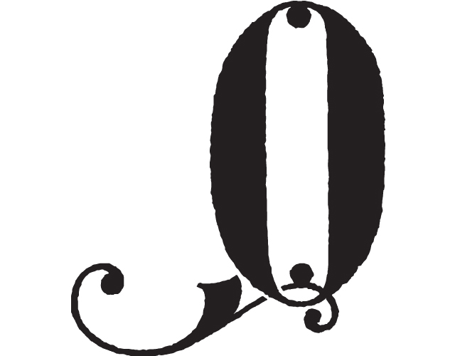
This ‘Q’ is not a mistake. It is not flopped. Its tail is intentionally placed on the left of the bowl rather than the right. We know that it was deliberate because it is from a scribal pattern book, a manuscript intended to provide exemplars to those learning to write. Furthermore, it is the leftmost of three ‘Q’s on f. 33v of the manuscript. The other two ‘Q’s have tails that protrude to the right. The tail of the middle one is stubby, since there is little room for it to extend itself. However, the tail of the rightmost is majestic as it unfurls into the right margin. The tail of the left ‘Q’ is equally long precisely because it, too, takes advantage of the margin – this time on the left. To do so, the tail must be on the left side of the bowl. This is a ‘Q’ conditioned by circumstances.
We are trained to believe that the tail of a ‘Q’ should be on the right side of the bowl because that is what we have seen in type for 500 years. And it is the position of the tail in Roman Imperial Capitals such as those of the fabled Trajan Inscription. But the tail is on the right only because the Roman alphabet is written from left to right. Strokes that run counter to that direction are more difficult to make and are rare. They involve movements across the body, which are not as easy to control, and they lead the hand in the wrong direction for the next letter. Thus, the tail on the right is physically natural – but it is not inviolate.
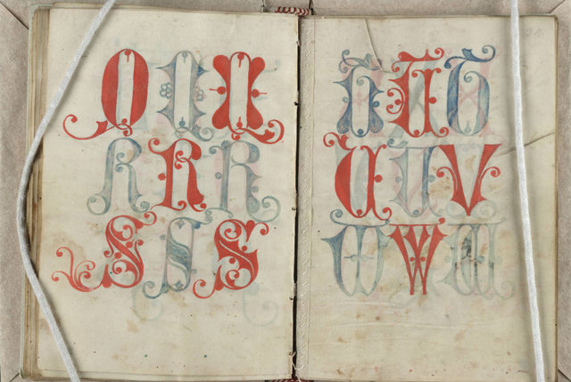
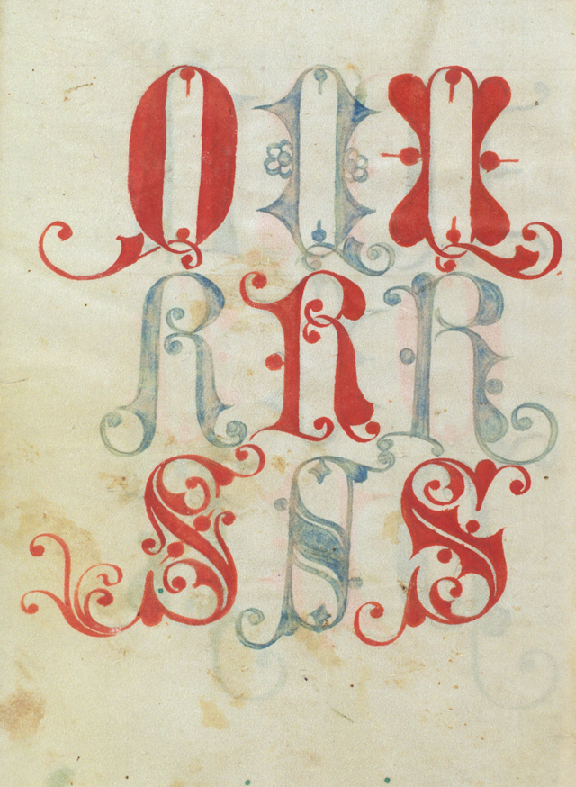
Letters that are drawn do not need to adhere to the convention of writing. The rules of calligraphy do not apply. In the Middle Ages scribes and lettercarvers realised this as they experimented with the forms of Roman letters, treating them as elements that could be manipulated in the service of a greater cause: the overall design of a text. Thus, letters were continuously modified from a base form. They were condensed, stacked on top of one another, compacted (with shrunken ascenders and descenders), tied together as ligatures, extended with swashes and flourished to fill empty spaces, and even omitted altogether with their absence noted by a mark.
This leftist ‘Q’ is indicative of the freedom in making letters that existed prior to Gutenberg. Today, we have the opportunity and the tools to recapture the spirit of the Middle Ages. Let’s make some wrong letters. To see the folio click here.
paulshawletterdesign.com