Vienna-based type designer and signage conservationist Roland Hörmann finds charm in the everyday lettering of the city, even a back-to-front ‘A’ – leading him to ponder typography’s right-handed bias.
As an enthusiastic collector of urban façade signs, my everyday approach to typography is mediated though the city. I cannot help scanning shop fronts for typographic treasures and vacant spaces, where unique signs need to be saved from being scrapped. Even now, Vienna is still rich in shop signage from the mid-Twentieth Century and, as a display type designer, you can learn a lot from it.
Where there is light, there is also shadow. It’s not always the skilful sign lettering from eras long past that grabs my attention – although I’d love it if it was. While the growing number of misused apostrophes in contemporary shop signs kind of disturbs me, I am happily amused by one particular faux pas every time I pass it, simply because it’s so innocent.
The example in question can be found at the showroom of a producer of chandeliers and lamps. A traditional company with 170 years of history, it was entrusted to manufacture lighting for the State Opera House, Vienna City Hall, and St. Stephen’s Cathedral. That should give you an idea of its calibre. The family company name spreads across the outside wall in a Baroque Antiqua, probably Baskerville. For the same company logo they are using Georgia on the shop window and Garamond on the website, but that’s a different story.
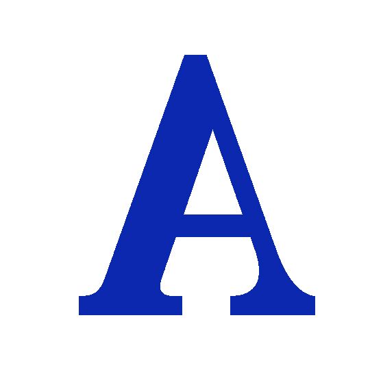
You see the letter shapes, cut out from brass sheet, and you soon notice there is something wrong with the ‘A’. It must have happened when the workers drilled the prefab shapes to the wall and accidentally flipped one over – or two, since there are two As in the company name. Maybe he or she planted a hidden urban typographic joke, how sweet.
I fantasise passing by at the moment they were mounting the brass letters, and shouting, “Hey, the A needs to be turned around!” (as I sometimes beg shop owners to fix their apostrophes). Would I have been prepared for the reasonable response, “Then it’s a ‘V’ with a bar, you idiot.”?
It's also a delectable thing to imagine how Roman typefaces would have evolved if the majority of masters of humanistic calligraphy in the Italian Renaissance were left-handed. The different angle of the broad nib would have had significant consequences. Thin diagonal stems would have turned out as thick stems and vice versa. And that Baskerville ‘A’ wouldn’t look strange to us today.
Roland Hörmann
…is a graphic and type designer based in Vienna, Austria. After graduating in 1999, he worked on projects for various Austrian agencies and is presently a freelance art director at Perndl+Co. He started releasing fonts in 2008 on his label Phospho Type Foundry, which specialises in display typefaces inspired by the typographical heritage of the city. In 2012, he co-founded Stadtschrift, an association for the collection, preservation and documentation of historic façade signs.

