
In this archive Logoform piece from Grafik 186, designer Wayne Daly considers one of the most distinctive and uncompromising music marques of the late 1970s...
Formed by John Lydon in 1978, mere months after his acrimonious split from the Sex Pistols, Public Image Limited was a very different prospect from the Pistols’ immediate surge of punk noise. With Lydon denouncing his former band as old-fashioned, rehashed rock-and-roll, PiL established itself almost immediately as one of the foremost acts to emerge in the post-punk landscape, incorporating influences as diverse as Krautrock, disco, African tribal music, dub reggae and ambient synth, to name just some.
Self-consciously pitching itself as a pseudo-corporation and multi-faceted communications company, PiL set out to demystify and subvert rock music industry tropes, and in doing so attempted (ultimately unsuccessfully) to operate as a manager-free, democratic unit, emphasising the role of not just the four band members, but also producers, engineers, video directors and numerous other associates.
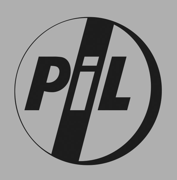
One of these PiL Corp members was Dennis Morris, a well-known music photographer and close friend of Lydon’s from his Pistols days. Morris’s activities in PiL rapidly extended beyond band photographer, and he became responsible for the band’s visual identity. Nowhere was this role more successfully realised than with Metal Box, the band’s much-lauded second album, released in 1979.
Innovatively packaged in a 12-inch film reel canister, the album saw the introduction of the company logo, designed by Morris in collaboration with Lydon. Ceremoniously stamped on the front of the off-the-shelf matt-grey canisters (at great cost to PiL’s label, Virgin, and to the band itself), the logo debuted as a stark, uncompromising statement of intent.
The band name as acronym also affirmed PiL’s then-defiance about doing the rock star thing, which Lydon derisively considered a “condescending attitude of playing for the kids”. Contrarily opaque and detached, this was unabashed branding (albeit tongue half in cheek), troubling to authenticity-obsessed punks and anti-capitalist hippies alike.
And while the aspirin motif might, at face value, seem like a poor pun, it perfectly articulated what was on offer, proposing the restorative properties of the band’s work, a cure to the perceived redundancy and burn-out routine of punk: PiL as remedy.
pilofficial.com
This article first appeared in Grafik 187, July 2010