This Gerrit Rietveld Academie graduate has a portfolio that reveals sophisticated art direction and an astute use of typography across self-publishing, digital and identity projects.
How would you describe your practice?
I often feel as if graphic design is basically a fine act of mounting various elements in perpetual motion, supervising a sum of details that present a larger narrative. I like the fact that graphic design is positioned between a kind of artistic practice and functional craft. Here arises a space to make a statement and to challenge the visual dissemination of specific content. In doing so, the graphic designer can affect a project in its DNA.
You studied in Amsterdam and are currently living in Copenhagen, have the strong Dutch and Danish design cultures directly influenced your work?
Well, I don’t really know if the culture per se influenced my work. But the mentality and methods of the Graphic Design department at the Rietveld Academie, definitely and completely had a strong impact on my way of working. With a combination of teachers like Linda van Deursen, Sam de Groot, Johannes Schwartz and fellow students of various nationality, Amsterdam was a fundamental inspiration to me.
Danish design has a great tradition of furniture and industrial design but when it comes to graphic design I feel it is rather malnourished.
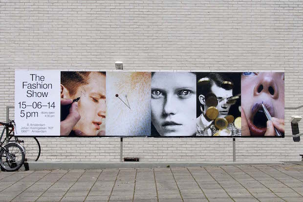
You were part of a group that did some brilliant visuals for the 2014 Fashion Graduation Show at the Gerrit Rietveld Academie, can you tell us a bit about this project.
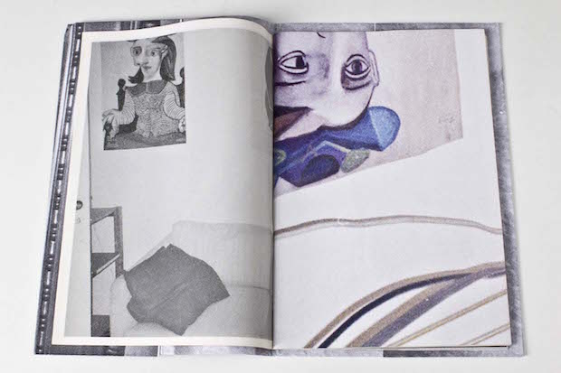
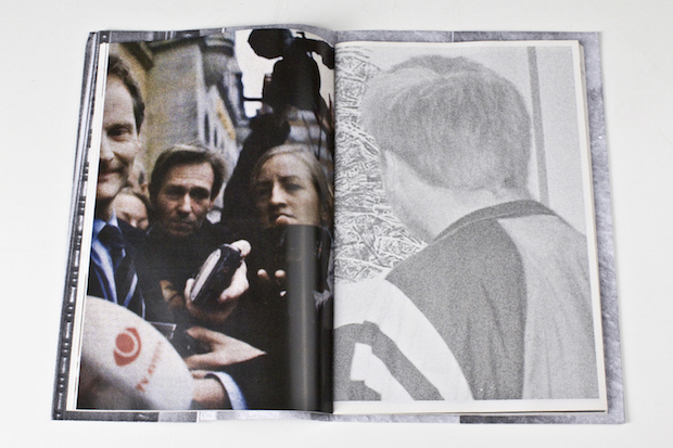
I worked together with the talented Severin Bunse and Niklaus Mettler, which turned out to be a great ménage-á-trois. In the fashion department of the Rietveld we noticed an interesting tension between experiment and product, different from our preconceptions of the aesthetic tendencies found in the fashion world. So we did a series of tests on the visual language from current fashion magazines, which in our view stands as a tangible representative for the general idea of fashion. The campaign displays our position towards the fashion world with the most immediate and simple tools we could get our hands on.
You reference the British art critic John Berger on your website, what is it about his writings that particularly interests you?
John Berger’s Ways of Seeing is a very good example of distributing content through form. I am especially interested in the fact that he positioned an attitude towards the basic act of looking, which argues that knowledge can be distributed by visual means. I also like that he borrows from the writings of Walter Benjamin without explaining them directly. He, alongside the designer of the book Richard Hollis, combines images and texts in a radical and simple way.
What are you working on at the moment and what’s next?
Denmark was fortunate to have a sort-of equivalent to John Berger; a poet and very productive bookmaker on art theory called R. Broby-Johansen, and currently I am working on a self-initiated book about his work. I invited a group of writers to contribute with texts on his montage-like method of book-making, and there is also going to be a photo-series depicting his huge personal archive of images and personal items. I have a bit of an education theme going on at the moment, as I’m also collaborating with graphic designer Anni’s on an art-education anthology, and will be giving a workshop at the photography school Fatamorgana on making photography publications. I will also be doing the graduation catalogue of The Jutland Art Academy… and then watching Ferris Bueller's Day Off as quickly as possible!