
Whatever its benefits for major organisations, globalisation poses a major branding headache: how to be two things at once, both internationally recognisable and locally attuned?
Can you begin by describing the project in basic terms?
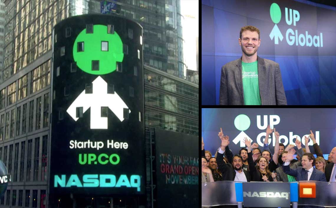
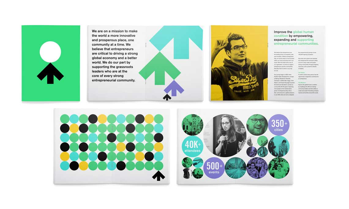
Up Global is a non-profit organisation based in Seattle, Washington, offering resources and support to entrepreneurs of all levels. The company was formed after a merger between Startup Weekend and Startup America, President Obama’s initiative to accelerate entrepreneurship throughout the US. Moniker worked closely with the Up Global team to create a visual identity system for the newly merged company.
How did the project originally come about?
After the merger, the Up Global team conducted extensive research and laid out the brand strategy. Rather than taking the project internally, the decision was made to hire an outside studio. Mike Mates, Creative Director at Up Global, approached Moniker to partner in developing the identity.
What was the original brief and did it change at all?
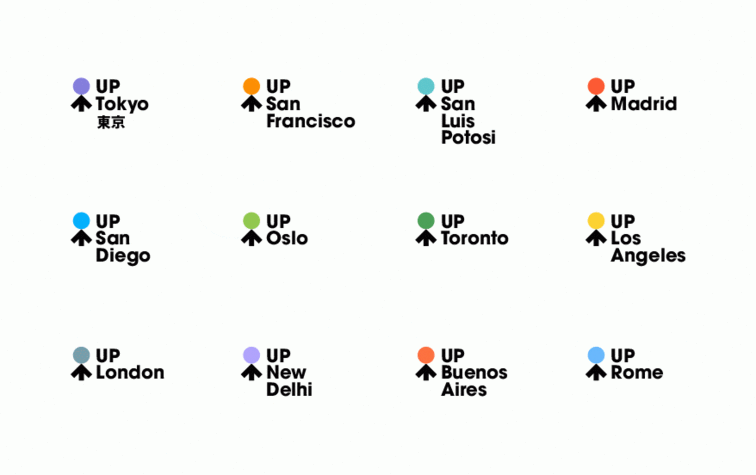
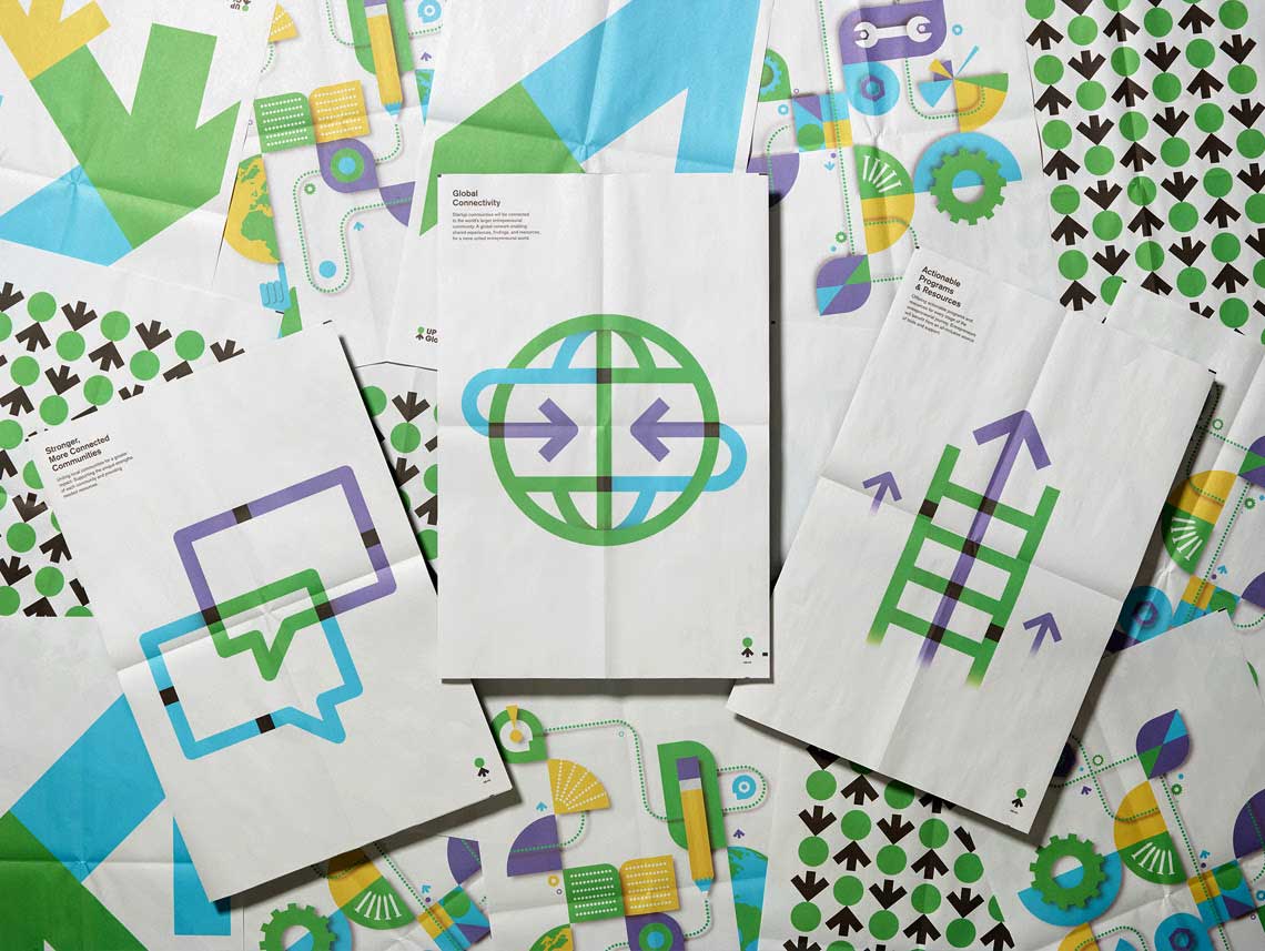
Up Global needed a dynamic identity that worked as an umbrella for the entire organisation and could also be localised for its numerous regional chapters. The brief was well-formed and did not change during the process.
Did this project present any particular challenges, and if so how were these overcome?
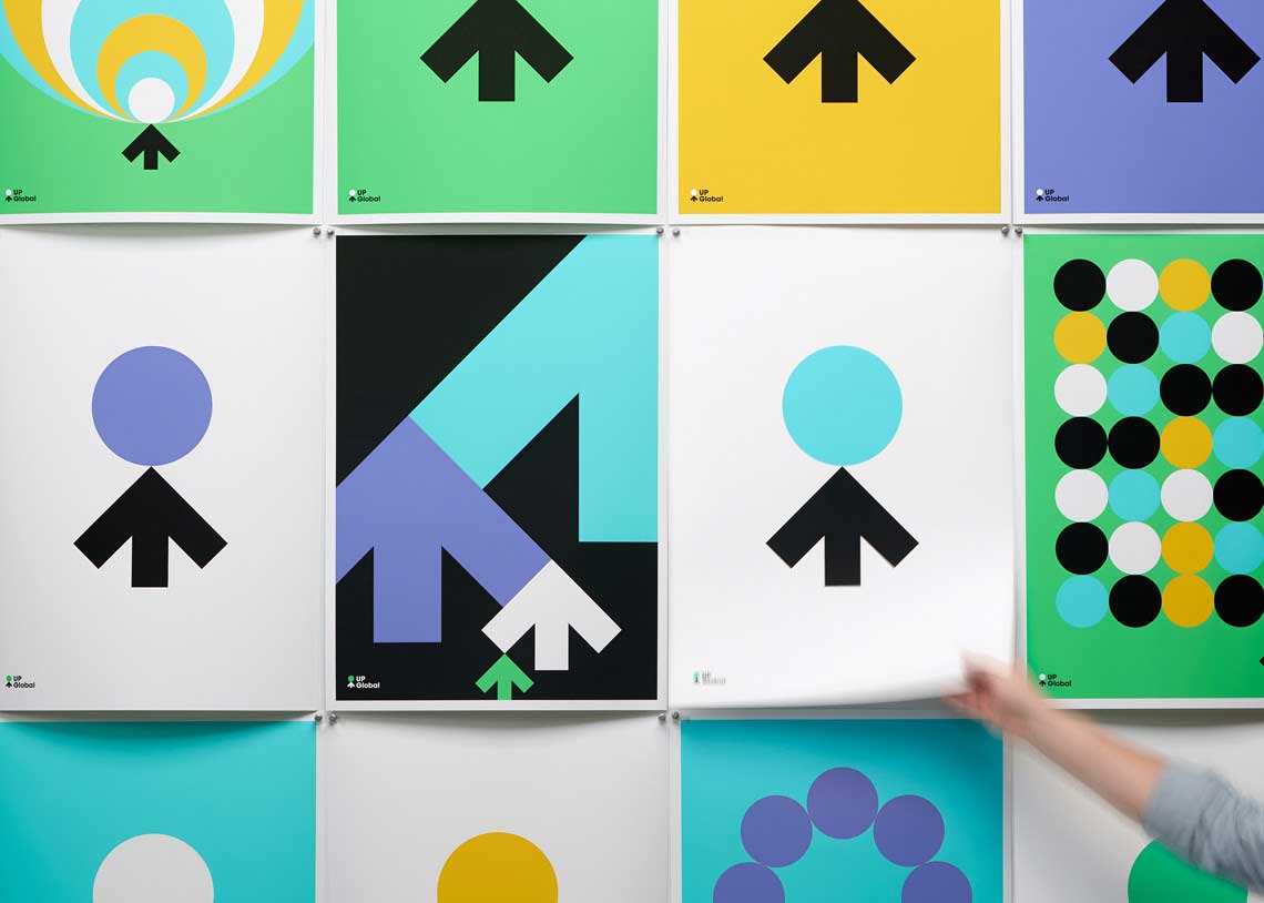
The biggest challenge was creating a system that was simple and easy to use, but was unique and visually impactful at the same time. With potentially hundreds of regional chapters, the identity couldn't be complex or difficult to implement.
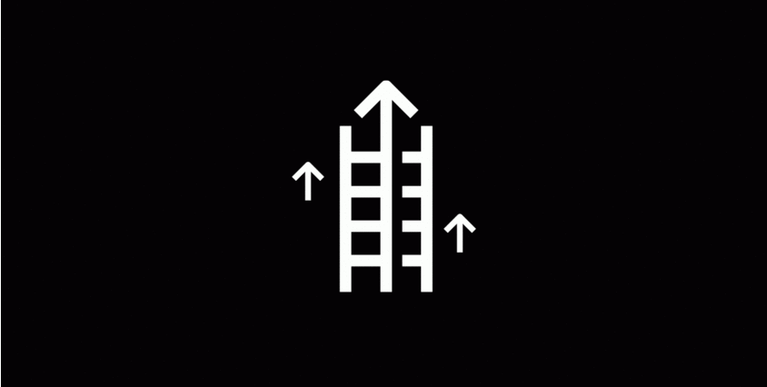
We overcame this by creating a system where each region could customise the logo with their own location and unique colour. Adding to the logo, we created a loose set of guidelines for creating graphics based on the individual pieces of the symbol. The simple guidelines made for an easy-to-use system that anyone involved with the brand could use.
What do you think has worked particularly well?
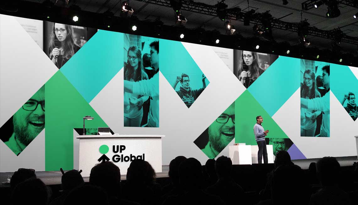
The symbol itself is iconic and bold, something the organisation can rally around. The use of colour and imagery is optimistic and reflects the company’s goals and core values. The system is simple and easy to use and flexible enough to allow for any organisational shift in the future.
What was the client's feedback?
Up Global's response was overwhelmingly positive. In their own words: "UP is currently being viewed as one of the key players in uniting and amplifying entrepreneurial ecosystems around the world. The brand has been celebrated by the organisation for its flexibility, extendibility, and dynamic context that has been providing maximum impact with its diverse and global audience. Within the next year, UP will be localised in over 500 communities and stewarded by more than 20,000 volunteers who believe in the brand. By this measure alone we believe the brand has been an overwhelming success, and will ultimately set the bar for identity in this burgeoning space."
monikersf.com


