
Last week it was revealed that Oslo-based design agency Snøhetta had jointly won a competition to redesign the Norwegian banknote. Here they share five of their inspirations.
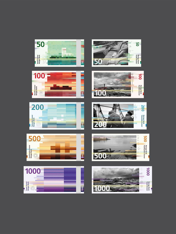
Earlier this year Snøhetta and seven other designers were asked to submit proposals for Norway’s new banknote design. The designs submitted by Snøhetta and that by compatriots The Metric System will each represent one side of the new banknotes – our design will be the foundation for the back, while The Metric System’s design will adorn the front. Firstly, it is important to say that the theme for the notes was defined by the Norwegian National Bank. The theme for the entire range was ‘the ocean’. Each note in the series also had a subtopic, for instance for the 50 NOK note (about 5 GBP) this was ‘The ocean that connects us’. The National Bank also defined Frutiger as the font to be used on all the notes and also imposed a continuation of the current colour scheme.
Our organic pattern abstracts the sea. Seen in connection with the rational cubical pattern (a reference to pixels, the dominant visual language of our era) it emphasises the differences between the soft and the hard. Both patterns follow the Beaufort scale, as an expression of wind force, affecting the waves of the sea. On the 50 NOK note the wind is gentle, represented by short, cubical shapes and long, tame waves in the organic pattern. On the 1000 NOK note the wind is strong, expressed through sharp long shapes on the cubes and short waves. These patterns and abstracted motives create a horizon. The horizon is perhaps the most commonly used device for expressing border crossings.
But while our proposal was heavily reliant on our country’s culture and topography for inspiration, these designs were not created in isolation from previous examples of the typology. Below we’ve shared five currency designs that influenced our work on the proposal for the bank note series. scheme.
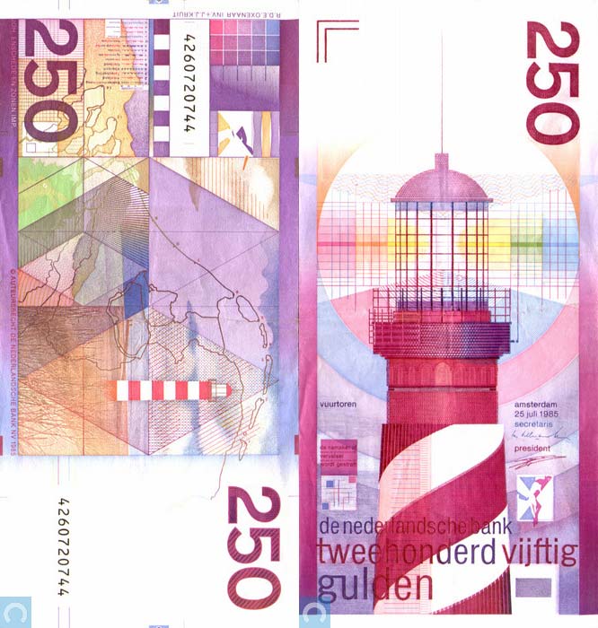
Dutch 250 Guilder, 1985-2002
We though this a very strong and refreshing design. It certainly showcases some bold decisions and helped give us the faith we needed to go with our gut feeling on crucial points in our creative process.
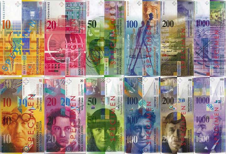
Swiss Franc, 1995 to present
A lot of tough choices must have been taken during the development of this series too, especially in reference to the striking portraits and powerful colour palette. The vertical orientation is also a differentiating factor and an admirable creative risk.
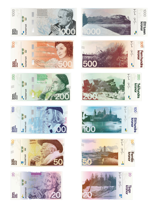
Proposal for new series of Swedish Krona, 2011/2012
Stockholm Design Lab created this modern proposal (with a Scandinavian flavour) a couple of years back. There is a nice contrast between the vertical and horizontal emphasis in the way imagery and typography are orientated. The Swedish flag is cleverly used as a watermark security element in different variations on all values.
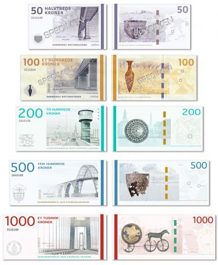
Danish Krona, 2009 to present
A very clean-cut and light series with strong links to the Danish graphic tradition.The front of the notes share a common theme of bridges while the reverse contains historical elements that are repeated on the front as small icons.
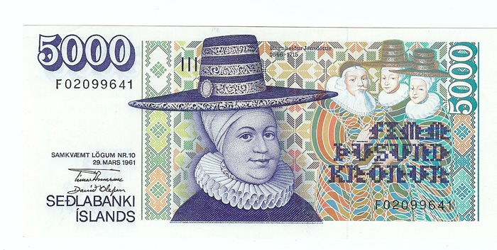
Icelandic Krona, 1981 to present
The Icelandic bank note series has a very intriguing colouristic relationship between the front and the reverse. The “white” area with the very stylish shadowed numbers also adds some much needed personality. In all a very expressionistic approach which we feel is a great fit with the ethos of the country itself.
snohetta.com