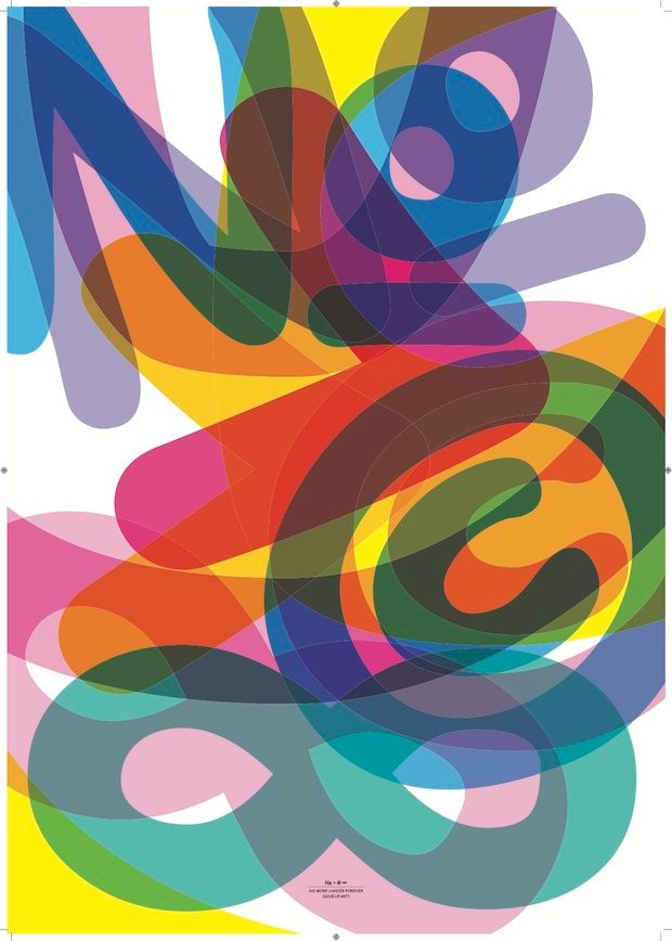
New exhibition Comic Sans For Cancer celebrates the twentieth anniversary of the much-maligned typeface while raising money for Cancer Research UK. Take a look at ten top posters exclusively at Grafik.

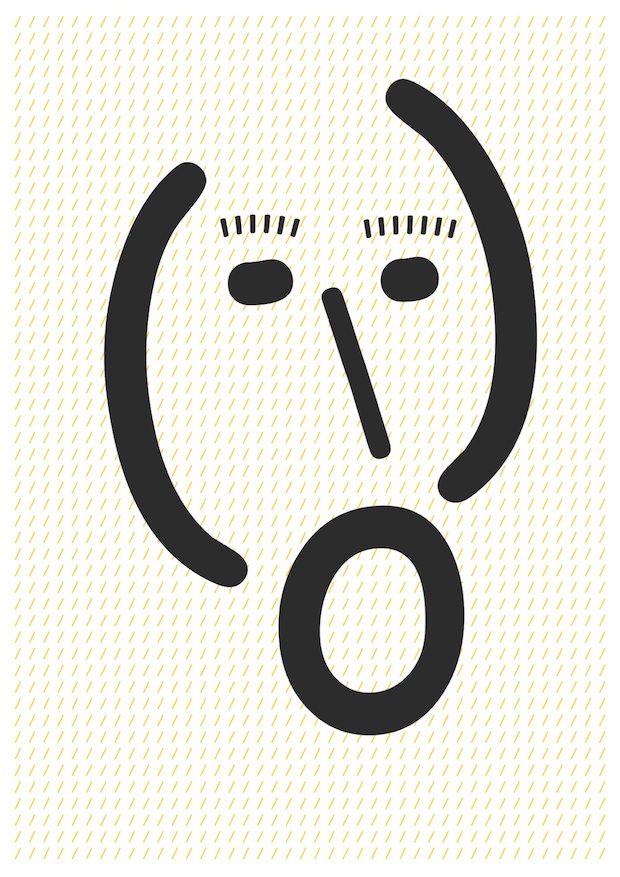
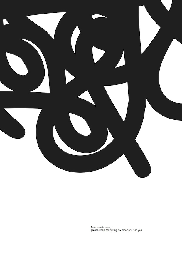
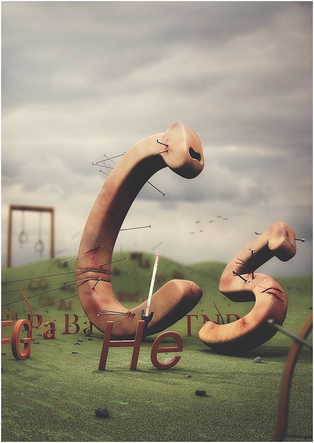
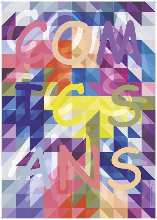
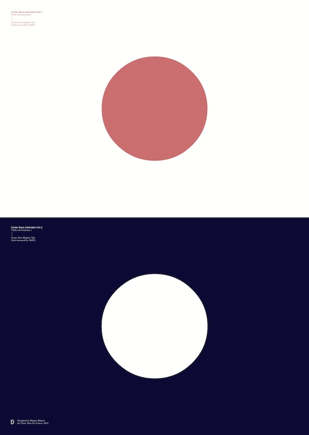
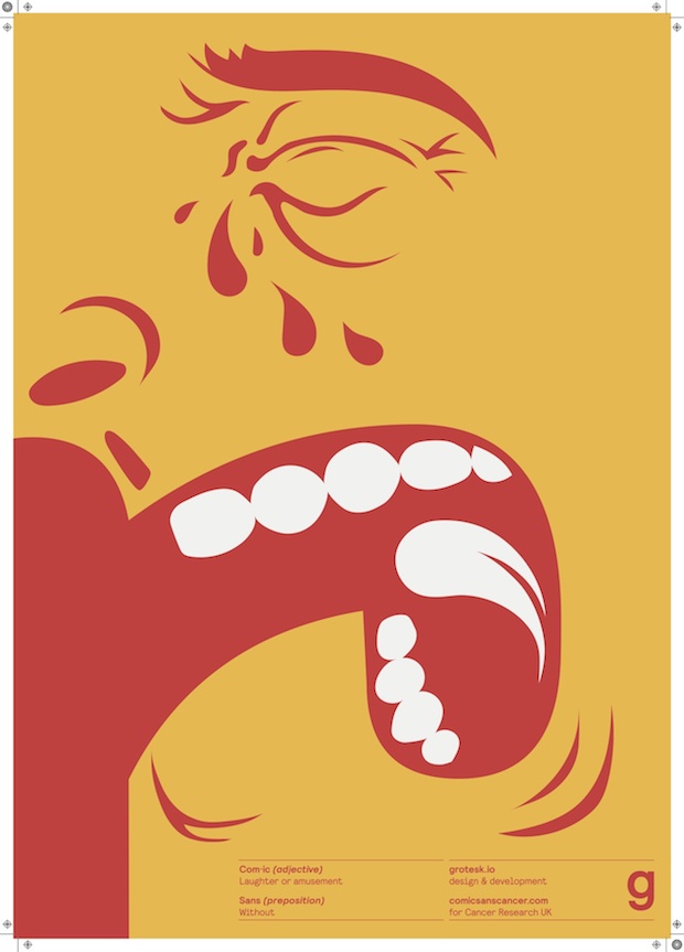
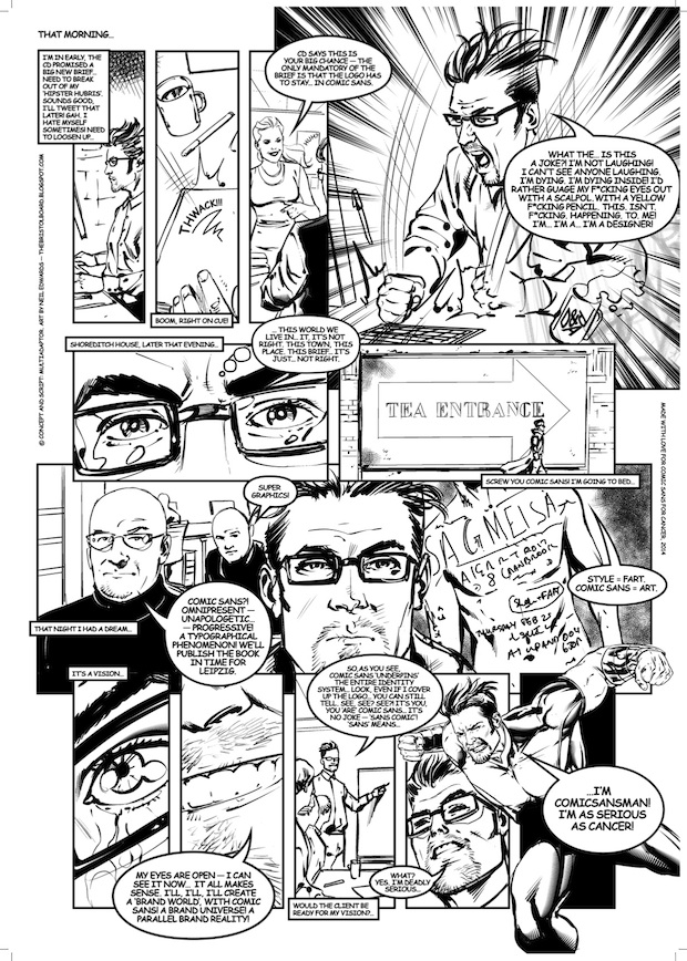
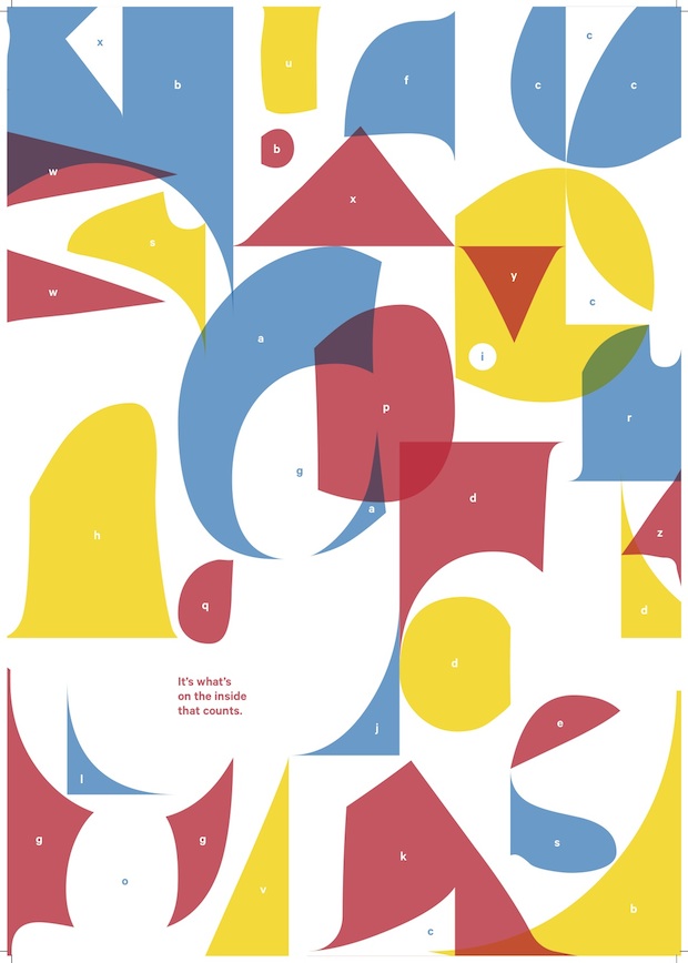
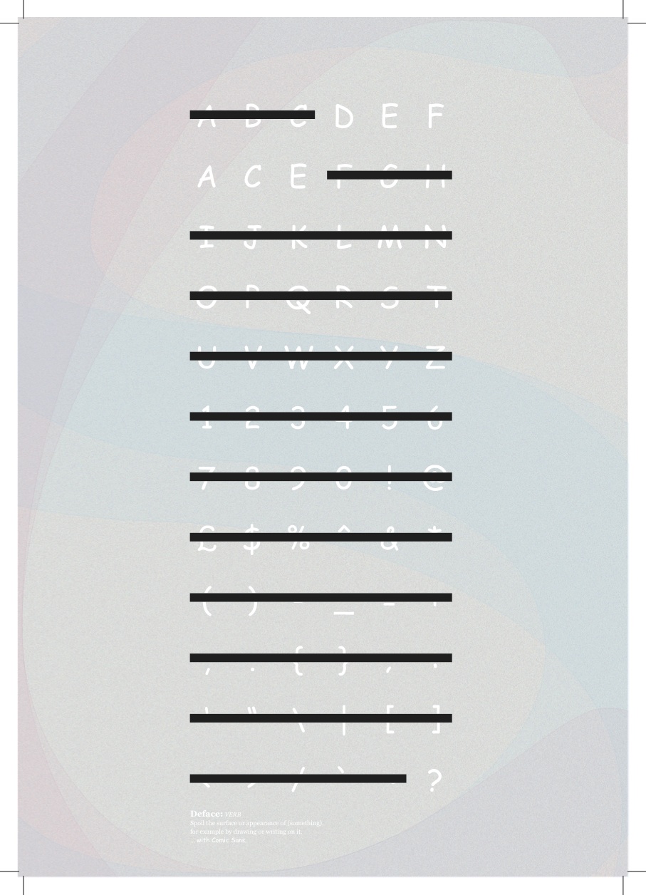
Comic Sans gets a bad rap. Designed by Vincent Connare for Microsoft and released in 1994, it was initially intended as a soft, accessible typeface to be used for Microsoft Bob, a user-friendly version of Windows 95. Although Connare finished it a little to late for Bob, it was later adopted into Microsoft 3D Movie Maker and the pop-up help sections found throughout the operating system. But, despite being perfectly designed for this task, Comic Sans generates more hatred than any other typeface. It’s misuse, in anything from passive-aggressive workplace notices to Chinese restaurant menus, has given it a smug reputation, and it is almost constantly vilified when, perhaps, the fault really lies with those that abuse it.
It’s this love/hate relationship with the much-maligned typeface that new exhibition Comic Sans for Cancer plays on. To celebrate twenty years since it was first in use and to raise money for Cancer Research UK, exhibition organisers Chris Flack, Renee Quigley and Jenny Theolin tasked two-hundred designers (including Connare) to create a poster that addressed how they felt about Comic Sans, or how the world would be without it. The results, including the ten posters shown exclusively here, will be shown at London venue The Proud Archivist from 20 August.Comic Sans for Cancer
The Proud Archivist, London
Wednesday 20 - Sunday 24 August 2014
comicsanscancer.com

