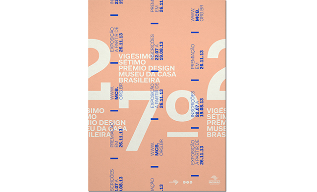
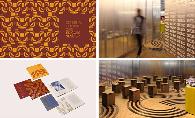
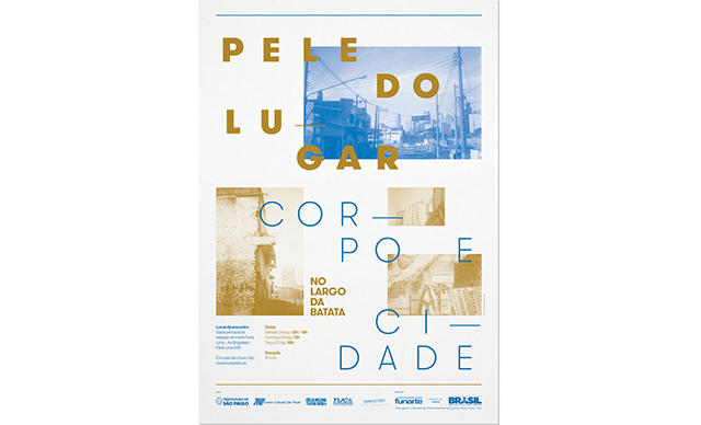
Influenced by the Brazilian concrete poetry movement, Luana Graciano's clean lines and considered typography see her moving effortlessly between two and three dimensional projects.
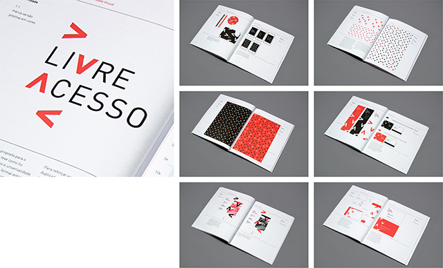
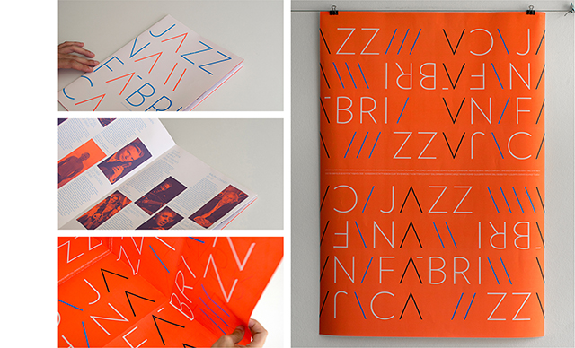
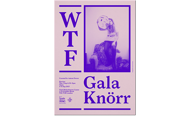
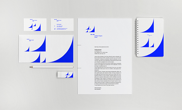
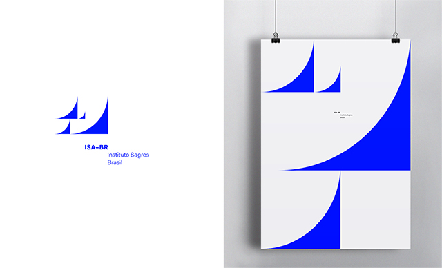
How would you describe your approach to design projects?In my work I develop an objective and straightforward interpretation of the main ideas that underline each project. My aim is to translate the essence of a concept by reducing it to the core elements and to look for a solution that explores the intrinsic qualities of the grid, the typography and the colours.
Which other designers do you really admire?Brazilian concrete poetry has always had a great influence over my procedural methods and personal development. I admire the critical awareness contained within the works aligned to this movement and, more specifically, the elementary and poetic way these artists raised their concerns. Décio Pignatari, Haroldo e Augusto de Campos, Julio Plaza and Ronaldo Azeredo might be great examples of this movement.
Tell us a bit about a project you’ve recently enjoyed?I was invited to send my contribution for the forthcoming publication The Multiple Lives of a Blank Book by Yvan Martinez and Joshua Trees. This project was a tough one mainly because all the aforementioned graphic elements that I usually base my work on were not allowed. As a result, I found myself in a position in which I had to open new paths of enquire that eventually led me to new ways of creating. My final proposal consisted on a short clip called How to silence a blank book; all the fore-edges of a blank book where sealed with perfect binding.
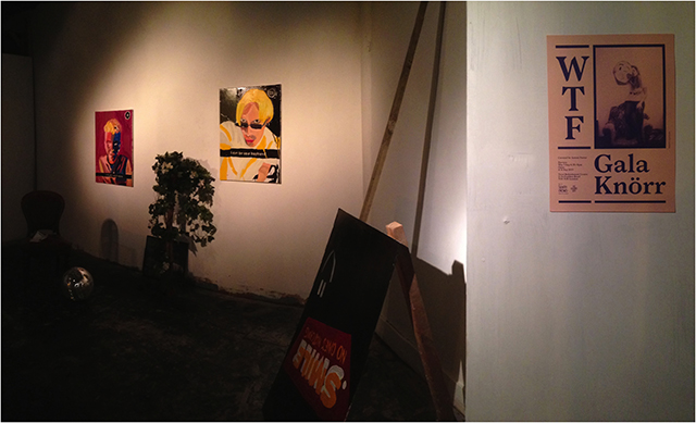
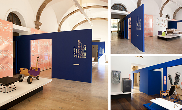
You have worked on several exhibition designs, what are the most important elements when taking brand identities into three dimensions?It’s quite challenging to work with graphic design applied to the exhibition medium. More specifically, it is hard to find the right resonance between a bi-dimensional element and a tri-dimensional space. There are two main elements that I keep in mind when I develop a specific exhibition design project. First of all, the materiality and the scale of the different mediums: I seek to connect the individual scale of the printed matter and the collective scale of the signage system. The second element to be considered is the temporary nature of an exhibition and to acknowledge the contingencies between the public and the private space.
What’s next?I am currently working in my own studio Margem, a Sao Paulo based graphic design studio that I co-founded three years ago with two other colleagues, Alexandre Lindenberg and Nathalia Cury. I believe the next step for me is to conciliate the studio work with self-initiated projects. Contrary to the client-professional logic, in which graphic design studios usually receive conceptually wrapped-up projects that await to be visually coded, now I feel like working horizontally alongside other professionals and disciplines. I would like to work transversally in order to learn from other approaches that might enrich my own practice.
luanagraciano.com