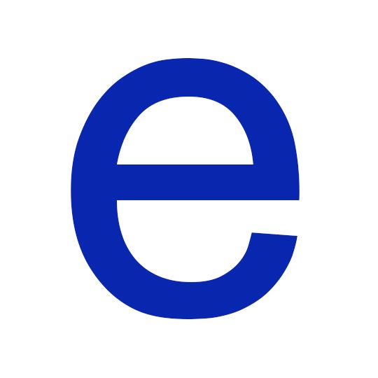
Oglivy & Mather art director Sue Murphy goes back to primary school to uncover her love for AG Schoolbook BQ’s Lowercase ‘e’. When I was home sick from school – you know those days where you're not really that sick, but you know you can get another day out of it – I used to love watching a TV show on the BBC called Look and Read. I must have been around four and rather devious, now that I think of it, if I was that small and conceiving some extra time on the couch. The show was a fun, educational programme for kids (not all that bad if I was learning anyway) and my absolute favourite part was called The Magic Pencil.
This was when a floating, thick tangerine-coloured pencil with a light at the bottom would appear on a black screen and begin to write letters with guidance from a very pleasant voiceover lady. She would enthusiastically sing, “All the way round, down and around,” or whatever the letterform called for.
These letters looked perfect to me. My handwriting was nothing in comparison.* How did they get the curves so smooth? In particular, I had a fond spot for the ‘e’. It was open and friendly and almost suggested that it would wink at me the minute I took my eye off of it. Little did I know back then at age four that the font the TV showed used was AG Schoolbook BQ, which is based upon Akzidenz-Grotesk. Not that anyone would know that at four, unless say your dad is Erik Spiekermann. Günter Gerhard Lange redrew it back in 1983 to be clearer, and it has alternative characters for a few letters.
Perhaps that had something to do with me getting into design, as in addition to learning words and letters, I was also learning about typography. Or at least that’s how I’m justifying that sick day from school.
*Sue would go on to win second place in the handwriting competition when she was five, and winning first place when she was nine.
howsueisnow.comLook and Read
Developed to improve the literacy of primary school children, the BBC’s Look and Read was broadcast between 1967 and 2004. As well as its motley crew of characters, including an orange blob called Wordy and his tracksuited friend Colin, the series was loved for its imaginative yet educational dramas and songs, developed to improve children’s spelling. Perhaps the most well-known was the song The Magic E, which was written in the late 70s to demonstrate how a silent ‘e’ at the end of a word affects its pronunciation. It quickly became a cult classic and, perhaps unsurprisingly, found favour again some fifteen years later with the emergence of rave and Acid House.
Akzidenz-Grotesk
The process of redesigning the Akzidenz-Grotesk series began in the late 50s, due in part to demand from proponents of the Swiss Style. Originally acquired by Berthold from Viennese foundry Pöpplbaum in 1896, the font family included a variety of fonts created by other foundries, often with dissimilar characteristics, so Günter Gerhard Lange was tasked with co-ordinating the different sizes as well as adding those that were missing. In total Gerhard Lange added thirty-three font styles to the Akzidenz-Grotesk family including the much-loved AG Super in 1968 and AG Schoolbook in 1983, which was based on the earlier Akzidenz-Grotesk Book.
March 21, 2014 2 minutes read
Magic 'e'
Oglivy & Mather art director Sue Murphy goes back to primary school to uncover her love for AG Schoolbook BQ’s Lowercase ‘e’.

