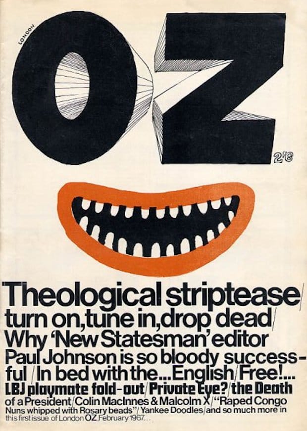
Crush Creative's Carl Rush celebrates the creativity and anarchy of OZ, the rebellious counter-culture magazine whose iconic co-editor Felix Dennis sadly past away last month. When I was first asked to write this article, I considered a number of magazines that inspired my studio’s work, from the German magazine Twen to the early editions of Graphis. I even dug out my first edition of i-D. However, I became most excited when I remembered my love for OZ magazine during my college years, an underground counter-culture mag from the late 1960s and early 1970s.
And then came a strange coincidence, a sign perhaps that Oz was indeed the magazine I should write about. I discovered that just one day earlier the maverick publishing millionaire, entrepreneur and former OZ co-editor Felix Dennis had died of throat cancer. Suddenly the web was alive with OZ stories and images.
I was a student in the late 1980s, way before graphic design was considered a cool career choice. Back then there were only a handful of designers producing stand-out work that could be considered alternative, mainly working in the music industry on record sleeves. It meant I often looked back in time for inspiration. When I discovered a copy of OZ magazine in Vin Mag London Soho, I immediately knew I was onto something seriously arresting. OK, some covers had a psychedelic, hippy aesthetic, but the graphic style was much more than Rick Griffin artwork.
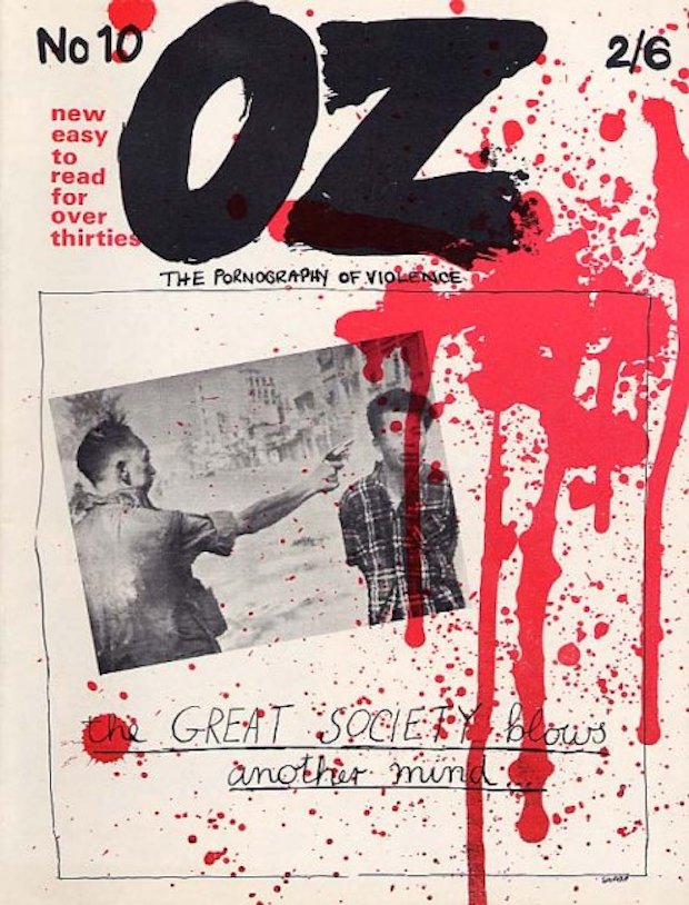
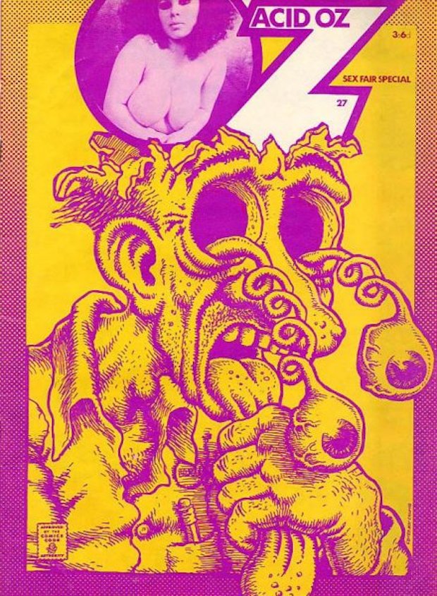
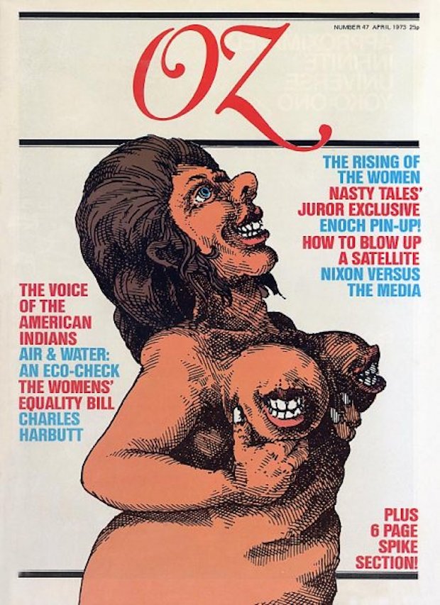
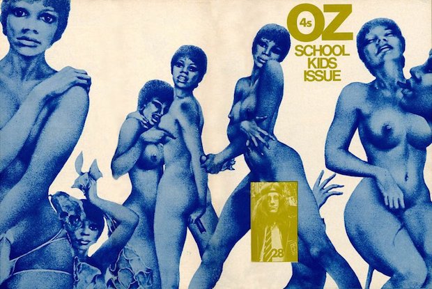
The covers were anarchic, Punk before Punk, political, magical, dangerous, sexy and twisted. There was no grid, no masthead and every issue looked completely different to the last. Photography, paint, collage, illustration, cartoons and typography - it really didn't matter how the cover was made because each and every one screamed creativity. Choosing one is just too difficult.
Headlines such as "Great Society blows another mind”, "Hippies gape as Hells Angels menace arts lab in drug, orgy, police, rape, loot, gang-bang shock!" and "Germaine Greer’s husband flashes cock" couldn’t help raise an eyebrow. Indeed, OZ was the subject of two celebrated obscenity trials in 1964 and 1971.
Unfortunately I seem to have misplaced my copies of OZ after moving house so many times in my twenties, but the impact those covers had on me as a designer has remained. Try something different, keep on changing and don’t be afraid of the new. Thank you Felix Dennis for being so bold.
Trouble in OZ
Founded in Sydney in 1963 but then rekindled in London in 1967, OZ was a magazine that relished pushing boundaries. Unsurprisingly then, the magazine and its staff got into a number of scrapes, including obscenity trials both in Australia and in the UK. Over here, the authorities took offence at the Schoolkids OZ, an issue of the magazine guest-edited by twenty school children (including design critic Deyan Sudjic). The misunderstanding that this issue was for, not by, children, plus a particularly graphic Rupert Bear parody, caught the attention of the Obscene Publications Squad, leading to the longest obscenity trial the UK has ever seen. Narrowly avoiding the ‘conspiracy to corrupt public morals’ charges, the editors were convicted of two lesser offences, which were later overturned due to public pressure and issues with the original trial.
Carl Rush
…runs Crush Creative, a Brighton-based studio whose output reaches from book cover design to branding, illustration and art direction. If you’ve been anywhere near a bookshop in the past few years, you’ll have struggled to miss their work for best-selling author China Mieville or Scholastic’s versions of Phillip Pullman’s Northern Lights trilogy. Other clients include Sony, Nokia, The Crafts Council, MTV and Disney.

