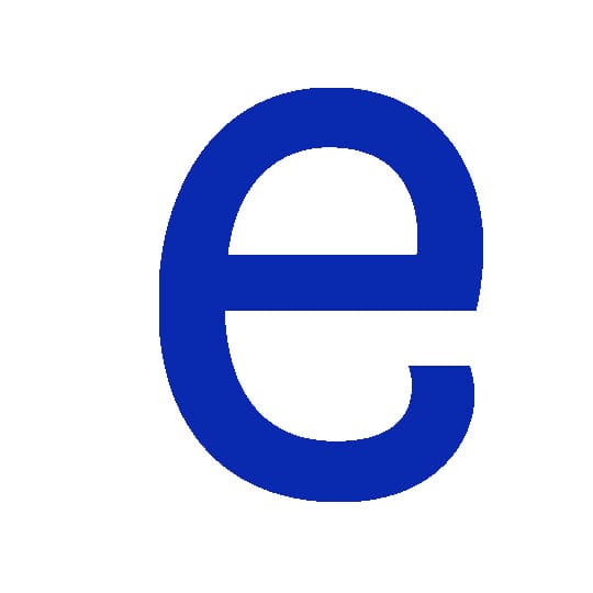
Inspired by Bavarian pretzels, typeface Brezel Grotesk immediately pleased designer Julia Castillo when she first saw it at a degree show years ago. Now available commercially, she explains its unique flavour.
Coming up with an original idea for a typeface isn’t easy; it seems everything has already been done. Not only is creating a new typeface difficult, sometimes it’s even more challenging to find an outstanding one in that vast array of existing typefaces. The range is endless – there are thousands of them – some are extraordinary, others quite funny.
The typographic market is growing and diversifying thanks to some wonderful, independent type foundries. These are where I usually find the most inspiring type families, but that’s not where I discovered the one that I want to write about now.
A couple of years ago, I went to the type design postgraduate class degree show at the Zurich University of the Arts. Every year, a handful of type designers present their work on large-scale posters. A select few of those typefaces will go on to get distributed by foundries. At this show, it happened that one of the exhibited typefaces grabbed me and didn’t seem to let go.
Brezel Grotesk just hit me, especially the lowercase ‘e’. The way it’s squeezed and bent makes me want to hug it. This wonderful, quirky little twist reappears in a few more letterforms and gives them an outstanding, unique personality. Moreover the letterform reunites two opposed qualities: simplicity and playfulness. When it comes to playful typefaces, the line between clever and ridiculous is very thin. That’s not the case here though; Brezel manages to appear both serious and cute at the same time. What a great mix.
Years later, I saw Stefanie Preis – the designer of this extraordinary typeface – speak at a type design conference. She explained that her intention was to create letterforms based on the shape of a Bavarian pretzel (or Brezel in German). Looking at it a bit closer, this makes perfect sense. I love the idea of a typeface looking like food, it’s food for my eyes.
It would have been a shame if this typeface missed the commercial market; luckily, Brezel Grotesk made it. Today, a small Swiss foundry, called Milieu Grotesque, distributes Brezel.
juliacastillo.com
Pretzels
It’s thought these salty bread snacks originated in Europe among monasteries in the Early Middle Ages. There’s debate whether they first came from Germany (the german name ‘brezel’ is closely linked to the Latin word for braclet) or Italy. Those faithful to the latter claim they were first invented by an Italian monk as a reward for children who said their prayers, calling the bakes goods ‘pretiola’ or little rewards.
Julia Castillo
…is a Zürich-based designer who works at swiss studio SchmauderRohr and specialises in typographic projects. After receiving an MA from Central Saint Martins College of Art and Design, she worked at Kerr Noble in London before moving to Zurich to work for Holzer Kobler Architects. Recent project have included work for Ikarus Records, a typeface for the Swiss Technical College Winterthur and a reinterpretation of an old American wooden letterpress font called Scripture for Zurich restaurant Viaduct.

