
Five juicy morsels from a collection of British Rail ephemera give us a taste of a crowd-funded project to re-publish the BR identity manual, a classic of British graphic design
Core identity elements
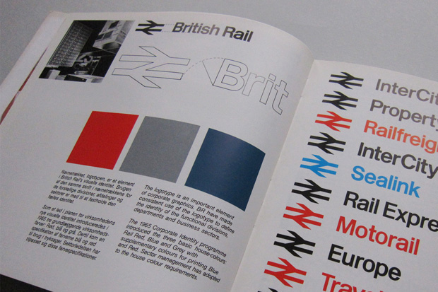
When the British Rail identity was introduced in 1965, although supported by an extensive manual, it only worked with a few core components: symbol, logotype, typeface and three house colours, not much more than that. It's a true testament to the work carried out by Design Research Unit, that they were able create a powerful monolithic identity that was still adaptable over many sub services.
British Rail symbol
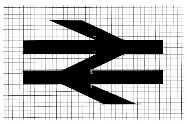
The brilliance of the British Rail Double Arrow isn’t just in its clever symbolism. Many people who have tried to reproduce the symbol over the years have mistakenly believed that it's a case of organising five lines in a basic geometric order.
Gerry Barney who designed the Double Arrow when working for Design Research Unit, introduced many tiny optical corrections. However, the real genius is how these refinements were systemised. Its one thing to create visually accurate marque but its quite another to design it in such away that it allowed other designers, sign painters or engineers to reproduce it perfectly. The symbol can be drawn from an eight by five base unit gird, with subdivisions of six which contain further divisions of four.
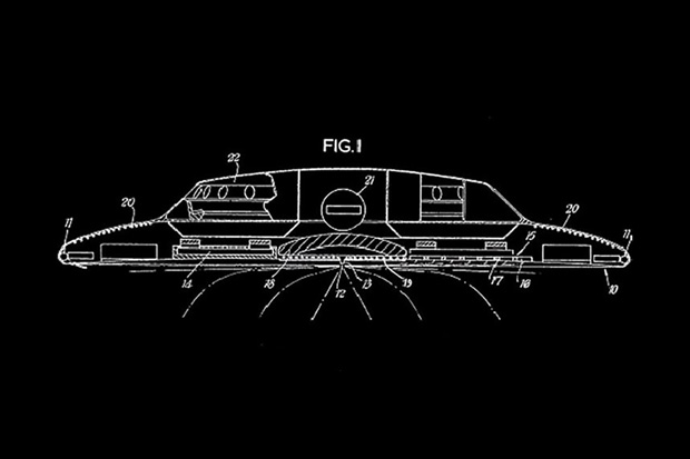
British Rail flying saucer
With maybe the exception of Virgin, when was the last time you were on a train and asked yourself if the company operating it was thinking about how they could transport you in a UFO type vehicle?
In 1970 British Rail filed a patent for a nuclear fusion powered flying saucer. This could been see as a tremendous waste of public funds, but for me it shows that British Rail truly was an organisation looking towards the future.
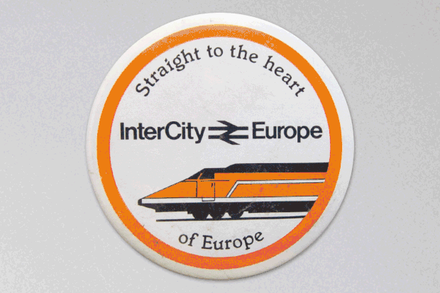
British Rail International
British Rail was of course predominantly known for its mainland services within Britain, however it did also have an international arm.
The beauty in these graphics are that they never highlighted international travel as being anything different than taking a train to Durham. Although possibly done unintentionally, the normalisation of the design portrayed a nonchalant notion that it was an everyday occurrence to take the night train to Paris.
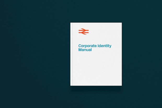
The British Rail Corporate Identity Manual
As designers, when we look at these manuals we sometimes forget to realise that it took many years create this identity with vast amounts of testing and refinement. We’re currently working in an era where everything is so fast past, clients are requiring their commissions with more immediacy. The British Rail Corporate Identity Manual take us back to a slower time.
Designers Wallace Henning and Darren Wall are working to create a reissue of the iconic and hard-to-find 1965 British Rail Corporate Identity Manual. The result will be a high specification, large format book, cataloguing each of the 240 pages of the original manual.