
Unit Editions has come up trumps again, with this stylish and substantial investigation into the world of corporate identity manuals. Ian McLaren is suitably impressed.
Well thank you, Unit Editions. Who would have guessed that it was Richard Nixon who is credited with saying “It is time that we cast aside the theory that excellence of design is a luxury. Let us see it instead as a necessity for answering real human needs. And let us also realise that good design can save money, time and maintenance.” This surprising advocacy of the benefits of design is to be found in Patricia Belen and Greg D’Onfrio’s section on the manual for US Department of Labor’s identity, included in this authoritative review of some exemplary design manuals. This nugget is typical of numerous others amongst the contributions, some of which are by practitioners involved with the examples.
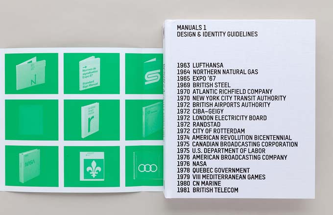
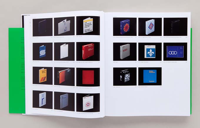
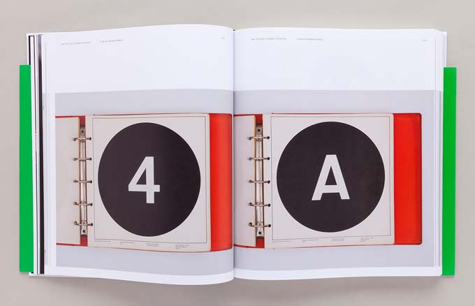
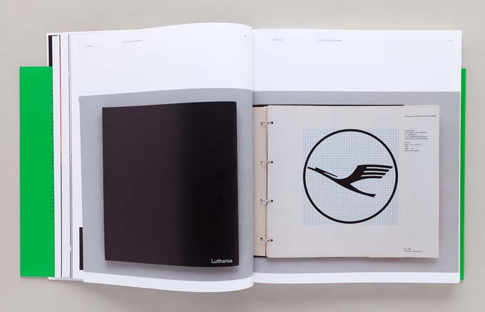
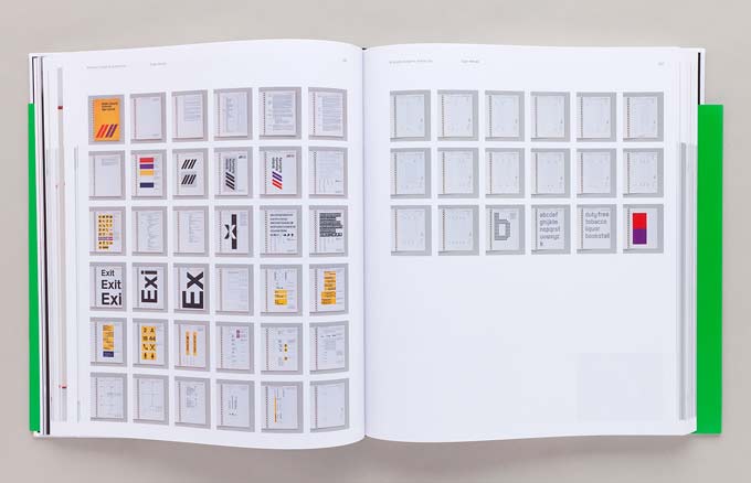
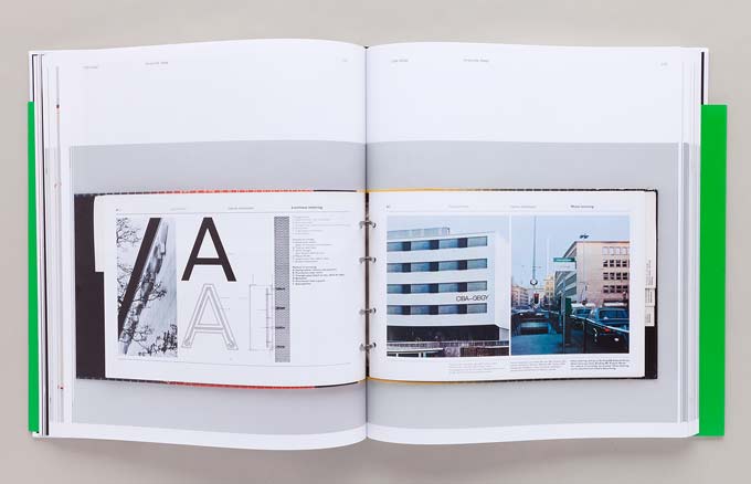
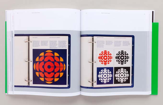
Manuals 1 is built upon twenty examples of design manuals from the period 1963 to 1981. Each includes a brief biography of the design team (where known) and the client organisation. These range from international corporations, to government departments, and for the signing of a single event (eg Expo ’67). The examples are all shown at the same scale, and include a complete set of thumbnails of the spreads in each publication. The introductory reference page for each manual frequently includes a choice quotation from the original. The book is a unique source of reference, with research equivalent to, or better than many academic studies.
The examples are dominated by those from the USA (with seven), and four each from the UK and Canada. The number of examples from Canada is surprising, particularly as some demonstrate what were at the time novel features, such as photographic demonstrations of how to execute correctly aspects of the implementation.
After a foreword by Massimo Vignelli, Adrian Shaughnessy provides an extended introduction. This includes a brief history and is followed by contributions by Patricia Belen and Greg D’Onfrio, and Richard Dane. Three interviews are added, with John Lloyd, Sean Perkins and Armin Vit. These provide first-hand accounts of their own experience; and include some interesting comparisons between their preferred methodologies.
Shaughnessy’s contribution describes the significance of the period covered, namely 1963 to 1981, which he applauds as the “golden era of identity design.” He goes on to discuss the difference between the examples and today’s branding guidelines; which he characterises as resulting from frequent “rebrandings and image revamps.”
Several of the contributors discuss the issue of whether manuals can inhibit creativity. Paul Rand is quoted as saying “Innovative solutions are more the product of restraints than of freedoms.” Sean Perkins refers to a manual creating “consistency and control yet also inspiring.”
John Lloyd refers to the IBM identity led by Eliot Noyes, who thought of himself as the “curator of corporate character.” Lloyd describes some of the benefits of an effective manual, such as encouraging a sense of common purpose following a merger, ‘raising and sharpening’ an organisation’s perception of itself, and effecting cost savings from rationalisation of items such as literature, products, signs, packaging, fleet identification, and environments. When describing the conception of a manual he refers to adopting a writing style which is positive and encouraging, rather than strict and authoritarian.
The issue of whether the manuals described (some of which are monumental tomes of over 300 pages) are more effective than today’s digital equivalents features in several of the contributions. These make the point that the technology of the time required such formats, and do provide a more permanent record of what is the agreed standard. They also observe that specification of colour and type size are inherently more problematic in digital form. Against this, they recognise that today’s requirements cover a far wider range of media than was current during the 60s, 70s and 80s. But while today one has to provide for online and video, these can also be used to advantage. More than one of the contributors advocates a mix of a concise printed overview, with comprehensive details provided in digital form.
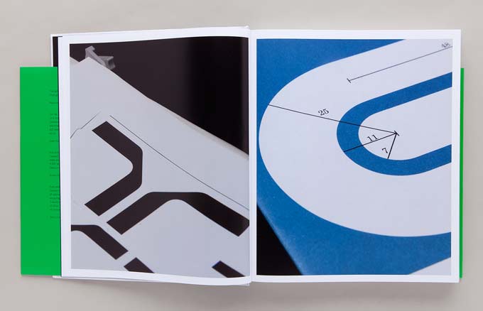
The nerds amongst us will be delighted by some juicy details, such as the design of the arrow for the New York Transit Authority; and the opportunity to make comparisons between the various pictogram sets designed for organisations such as the British Airports Authority, Expo ‘67, and CN Marine.
While the book does provide an excellent account of the subject the reason for the choice of these examples is not apparent. Also, there are some curious omissions, for example that of IBM. There are some irksome repetitions amongst the biographies, which could have been amplified and tailored to the examples. But this is a welcome and authoritative review of the subject. It should go some way to reducing the number of insipid examples which one meets every year in student graduation exhibitions. Let us hope also that it will inspire continued efforts by professionals to match the standards of the work included here.Manuals 1, Design & Identity Guidelines
Edited by Tony Brook, Adrian Shaughnessy and Sarah Schrauwen
Published by Unit Editions, £75
uniteditions.com