
North's Sean Perkins thought he knew his hero F.H.K Henrion until he dived into this 544-page monograph and found an undiscovered side to the corporate identity maestro...
It's like I have been waiting for this book but I didn't know it. Until now Henrion’s contribution to graphic design has gone relatively unrecognised, but on seeing this compendium it’s clear that his remarkable body of work will ensure a place amongst the corporate design Titans such as Wim Crouwel, Ben Bos (Total Design), Karl Gerstner and Otl Aicher — all of them legends in my opinion.
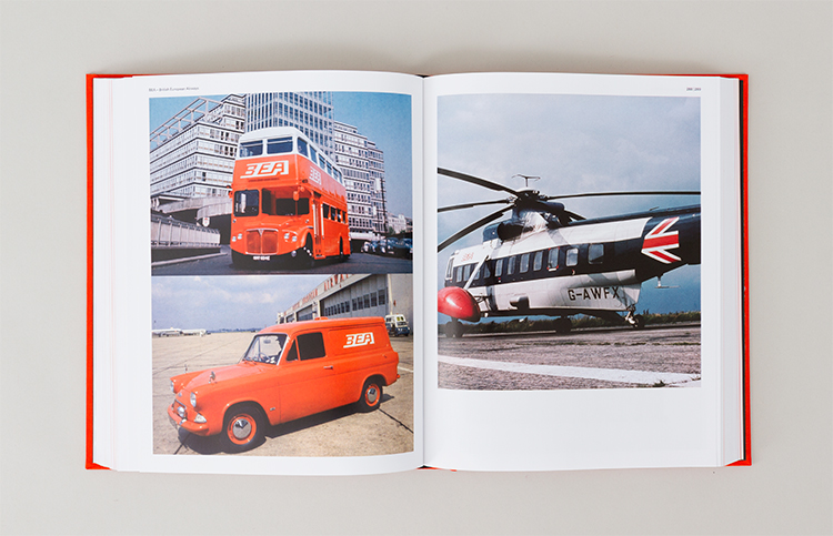
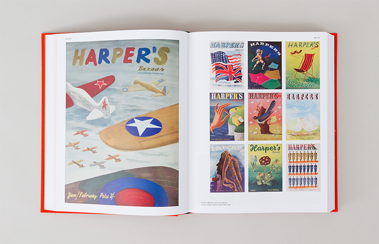
I met Henrion back in 1985 at LCP (UAL). Along with Gert Dumbar, Pierre Bernard and Keith Godard he was part of a small intimate international graphic design summer school that I was attending. Back then, he had been head of the course at LCP and had recently published Top Graphic Design, a book on the world’s best graphic designers. He was famous for the KLM and the National Theatre identities, which are enduring classics today. He could be happy with these achievements alone, but there is so much more to Henrion that I did not know. As someone who lives and breathes corporate identity I have learnt and realised that he created the model of the modern, British professionalised graphic designer.
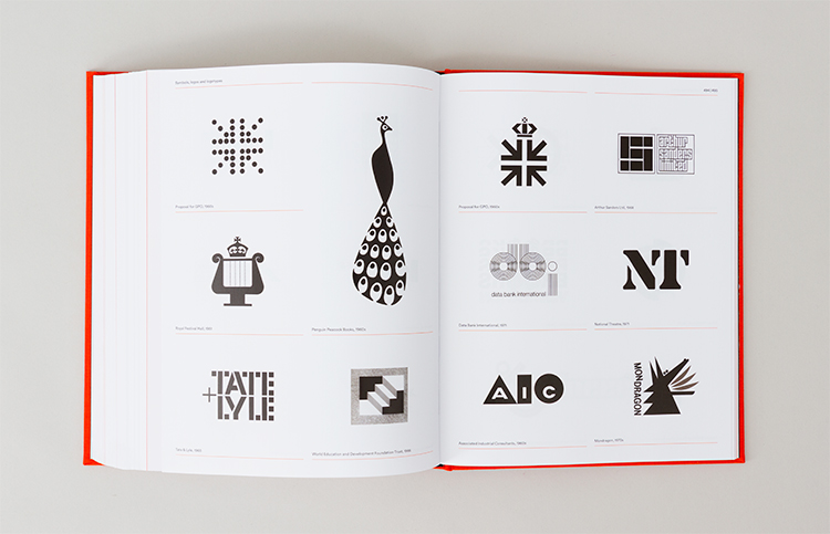
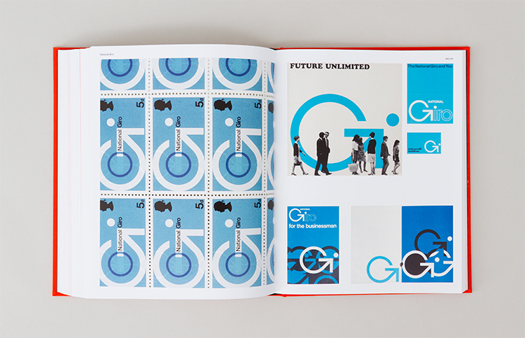
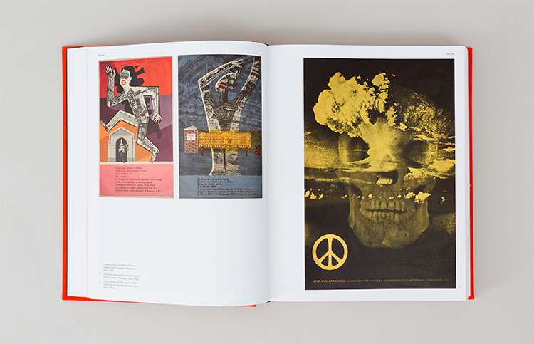
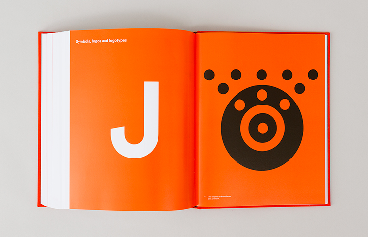
It's inspiring to see such a collection of remarkable logos in this book, but fascinating to find out about the ones that got away, such as the British Airways proposed identity and livery — so similar to today's BA tail fin design (but without the wobbly bits) and forty-three years ahead of the current look. His proposed identities for the UK Post Office, I believe, would have inspired a totally different modern 'positive' service and not the troubled national identity embarrassment we have today.
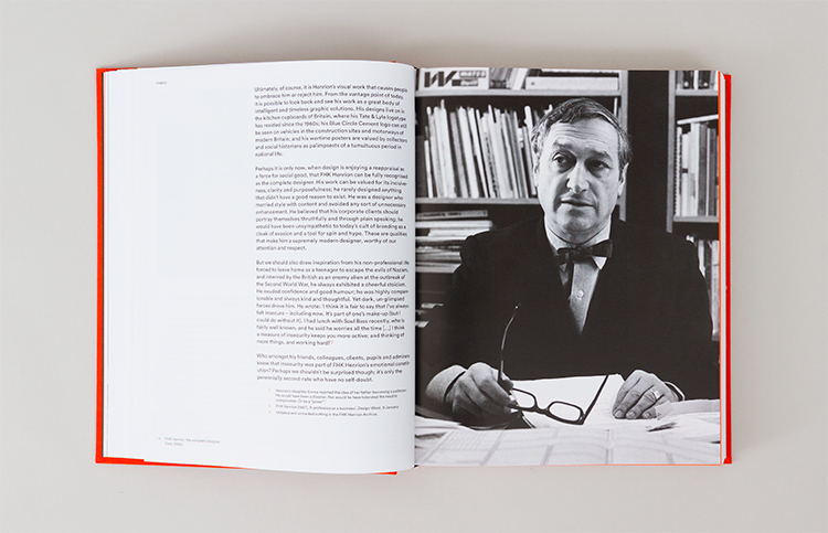
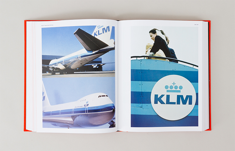
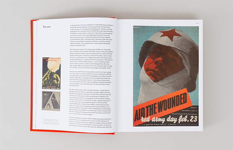
What I didn't know about Henrion is his early work on illustrative poster campaigns for the government and for the war effort. How did he go from Your Country Needs You posters to the enduring identity classics of Blue Circle and Tate+Lyle? There were two Henrions — the fair-minded champion of design as a force for social good and the hard-edged corporate designer. He even created himself as a brand (the clothes, his own name and the naming of the studio practice) in order to be convincing as a brand agent for others. His major success was formed on the launch of a new KLM identity in 1961, he then continued to produce killer logos for the next thirty years.
He was particularly famous for always wearing a bow tie, he was wearing it when I met him. Some years later, I sat next to Wally Olins for two years whilst at Wolff Olins. I had not put two and two together — Wally, too, wore a bow tie every day. Had that in itself been a corporate identity style he copied from Henrion? Apparently so, according to the book.
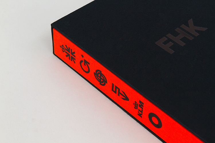
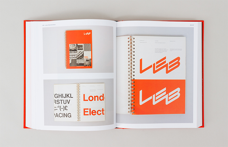
The book is a beautiful size. A designers’ book, modest and covetable. Not a coffee table format but something to cherish and read. It is crafted and written by designers, not by industry commentators or historians — it makes a difference. Shaughnessy relishes the work and understands his subject. You can feel the excitement as he pulls the historic threads together around our graphic design heritage and links to the work of other design greats including Ken Garland and Walter Landor. The design by Tony Brook shows an expert appreciation of the content and illustrates the timeless quality of the work. From the bold black letters of the title and cover design we are stylistically introduced to the power and simplicity of Henrion’s reductionist style. Following suit, the section dividers are intelligently used and exquisitely put together.
Thanks goes to those boys at Unit Editions for adding this essential title to their growing catalogue of graphic design books and in turn securing Henrion’s rightful place in design history. And giving us a new design hero.

FHK Henrion: The Complete Designer, ed. Tony Brook and Adrian Shaughnessy
Published by Unit Editions, £65.00
uniteditions.com