
Chrissie Abbott's hero was an accomplished illustrator, designer and art director as well as a consummate salesman. Whenever she's stuck for inspiration, she simply asks herself "What would Paul do..?"
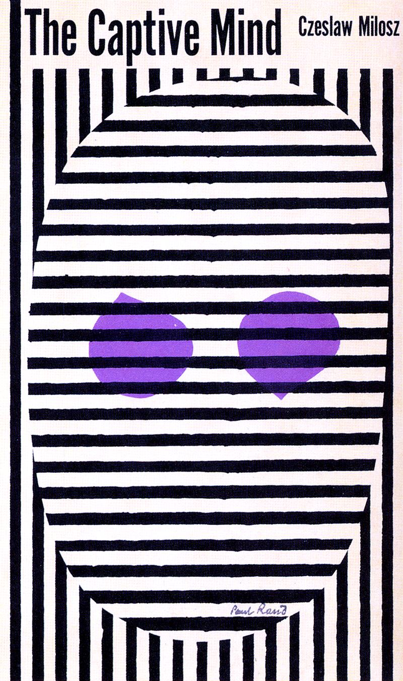
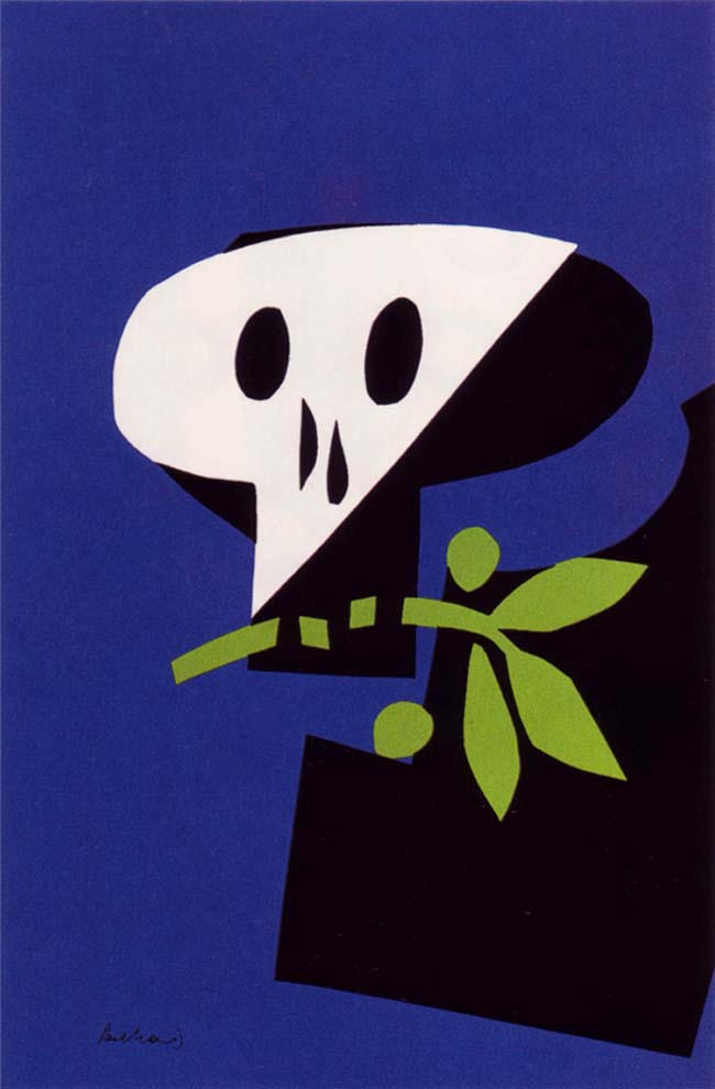
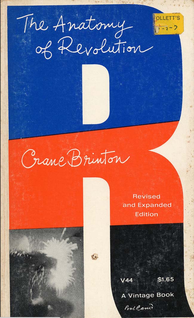
Paul Rand is my hero for many different reasons, but I think the number one factor is that he had a talent of such great expanse that, when you delve into the depths of what he has created, calling him a graphic designer almost seems feeble. Although he is technically a graphic designer, his work is so illustrative that I think he deserves to be noted under every moniker.
One of my favourite quotes of his (and there are many) is: “All art is relationships, all art. Design is relationships. Design in a relationship between form and content... Your glasses are round. Your collar is diagonal. These are relationships. Your mouth is an oval. Your nose is a triangle – this is what design is.”
I have been hugely influenced by the fact that he saw graphic design, typography and illustration all as art, and that they all are part of the same family.
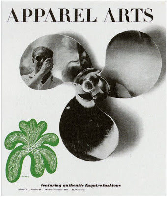
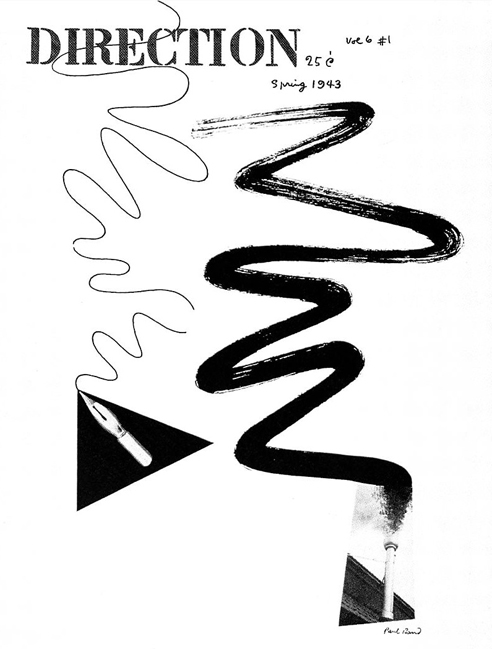
His career spanned nearly seven decades, starting In 1936, when Rand was given the job of setting the page layout for an Apparel Arts (now GQ) magazine's anniversary issue. His remarkable talent earned Rand a full-time job as well as an offer to take over as art director for the Esquire-Coronet magazines. Initially, Rand refused this offer, claiming that he was not yet at the level the job required, but a year later, at the young age of twenty-three he decided to accept and took over responsibility for Esquire's fashion pages, making great waves the field of editorial design whilst developing his own identifiable style of work.
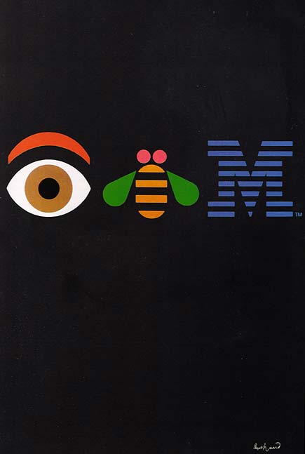
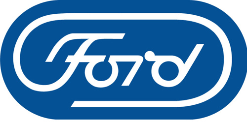
Corporate and logo design was the major aspect of his career, the IBM, UPS and Ford logos perhaps being some of the most iconic features of his portfolio (and logo design in general) but he approached every job with a sense of humour and personality whilst simultaneously embracing form and functionality.
Rand said that “a logo is more important in a certain sense than a painting because a zillion people see the logo and it affects what they do, it affects their taste, it affects the appearance of where they live, it affects everything.” He saw the power of the visual form in its purest sense. It made me realise that often the simplest things are the most effective, as he put it “a good designer can make things memorable, make them easy to recall, and improves the general quality of life,” as well as stating, “It's better for things to look good than look bad.” Who can argue with that?
Throughout his career Rand created not only a link between European modern art and American commercial art, he was also one of the pioneers in using a new formal language, that of technical equipment. Rand was gutsy enough to break with the traditions that preceded him and independent enough to be himself.
I think it’s that gutsiness and sense of self that contributes to make a great designer, particularly now in such digital times it is important to have that human aspect still involved. Rand had an unshakable integrity throughout everything he did. He also had a way with words – this made him well known for being an excellent salesperson, winning over clients with his eloquence and wit, and proving the worth and importance of good design.
In short, whenever I am in a conundrum with work I think: What would Paul do? He is my spirit guide...
chrissieabbott.co.uk/
paul-rand.com/