
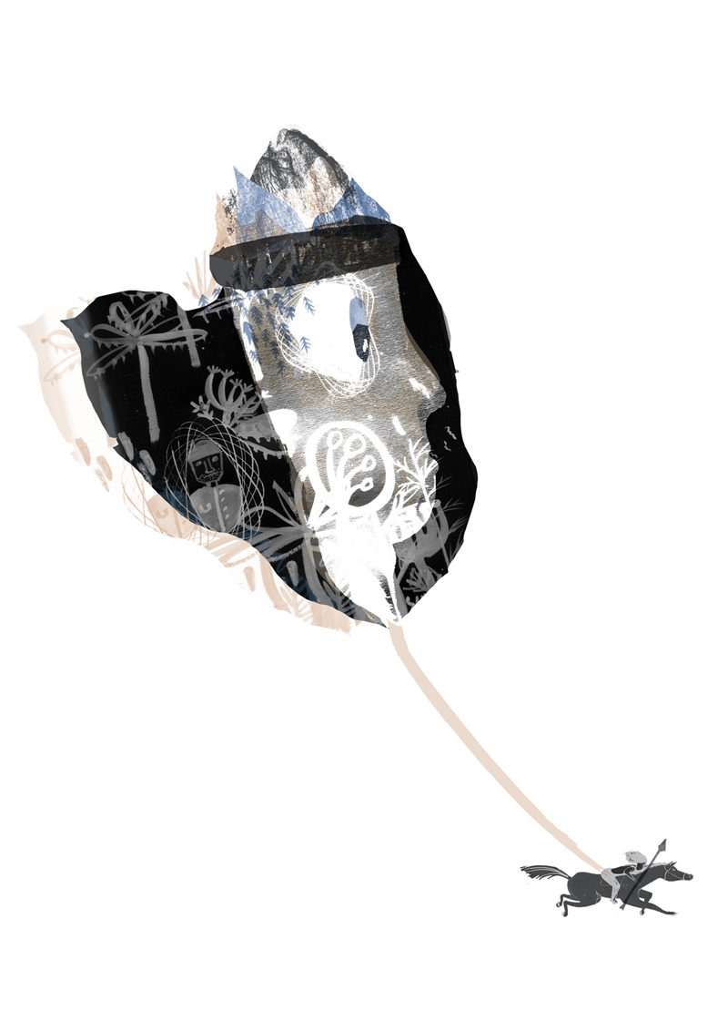
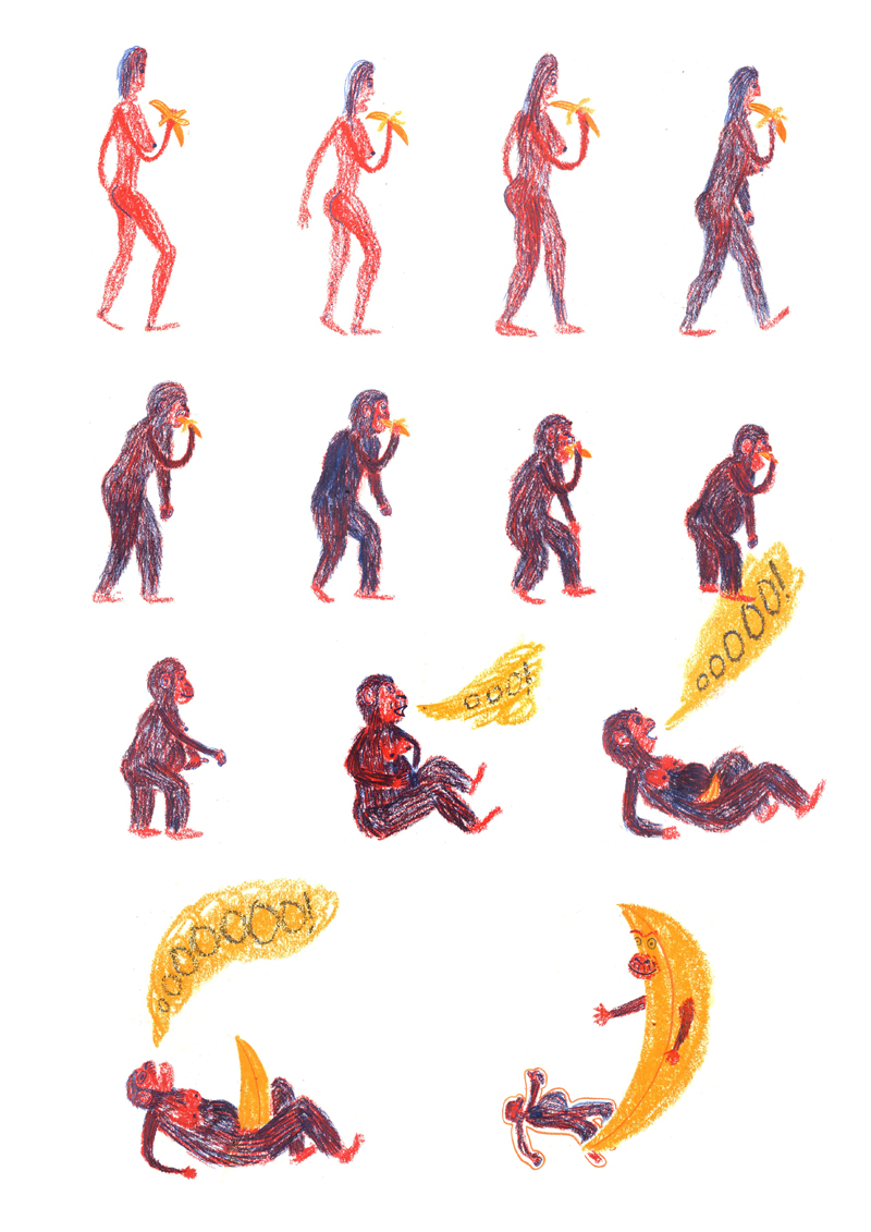
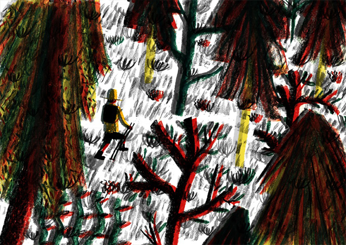
Drawing on his background in printmaking, illustrator Mat Waudby combines lively pen marks with digital composition, resulting in a dynamic body of work that’s bursting with energy. What has been the most exciting commission you've received recently?
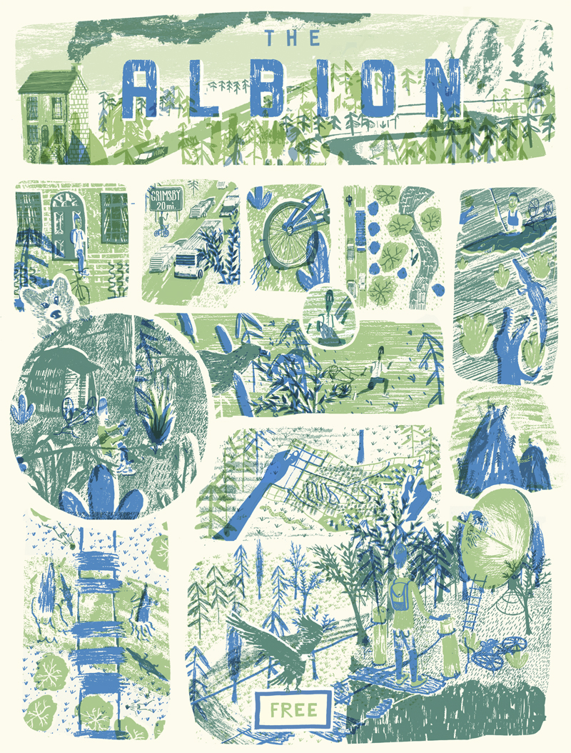
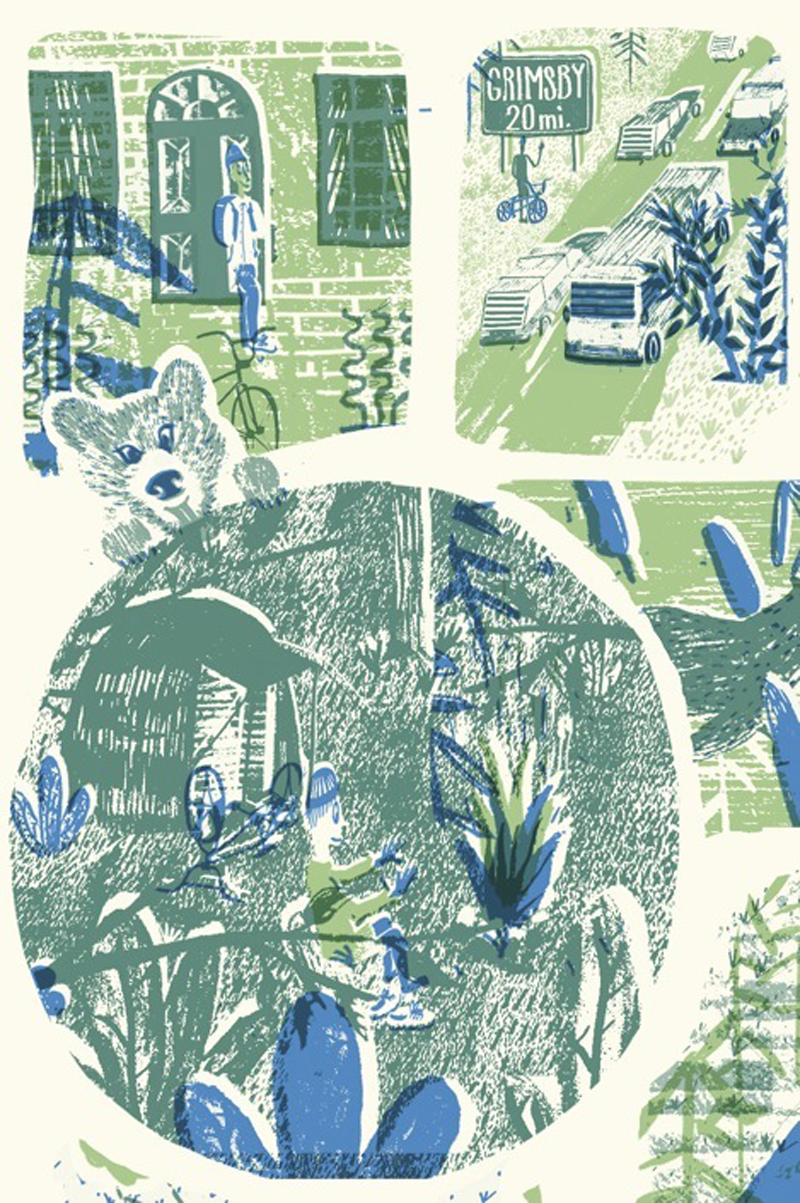
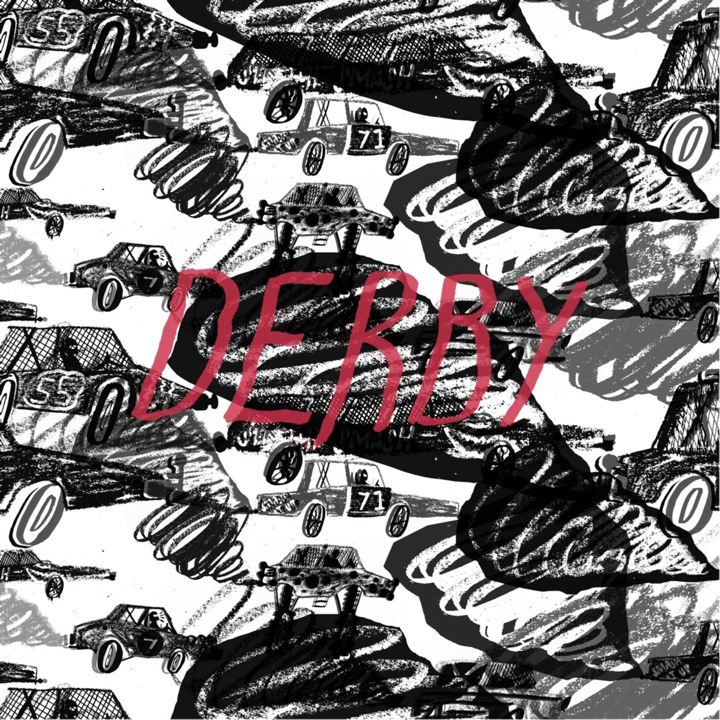
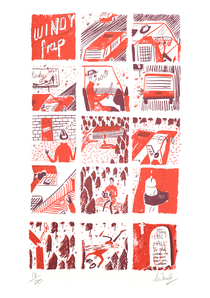
The cover I designed for The Albion magazine. It was pretty much an ideal brief as it combined two of my favourite things, illustration and bikes. I worked closely with the art director Rob Loeber to produce a narrative about a man overcoming various odds to ride his bike. The deadline wasn’t too tight so I had a lot of time to bounce ideas around with Rob. We wanted to do a comic-style cover but I didn’t want it to be too regimented as I really admire comics that play around with the traditional box format.
Talk us through your process.
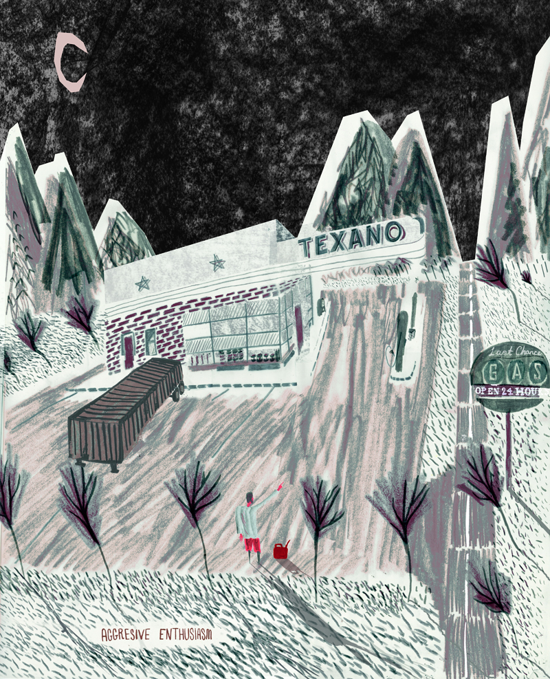
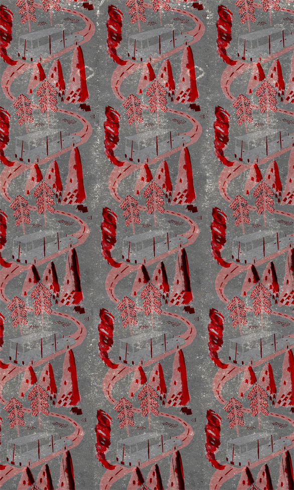
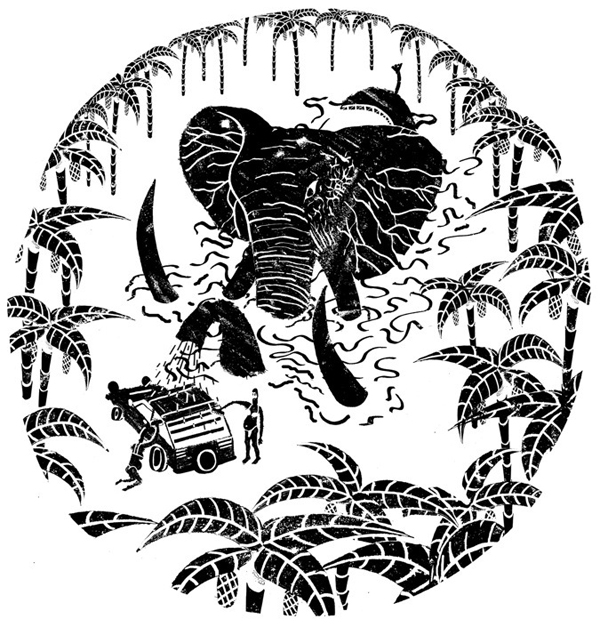
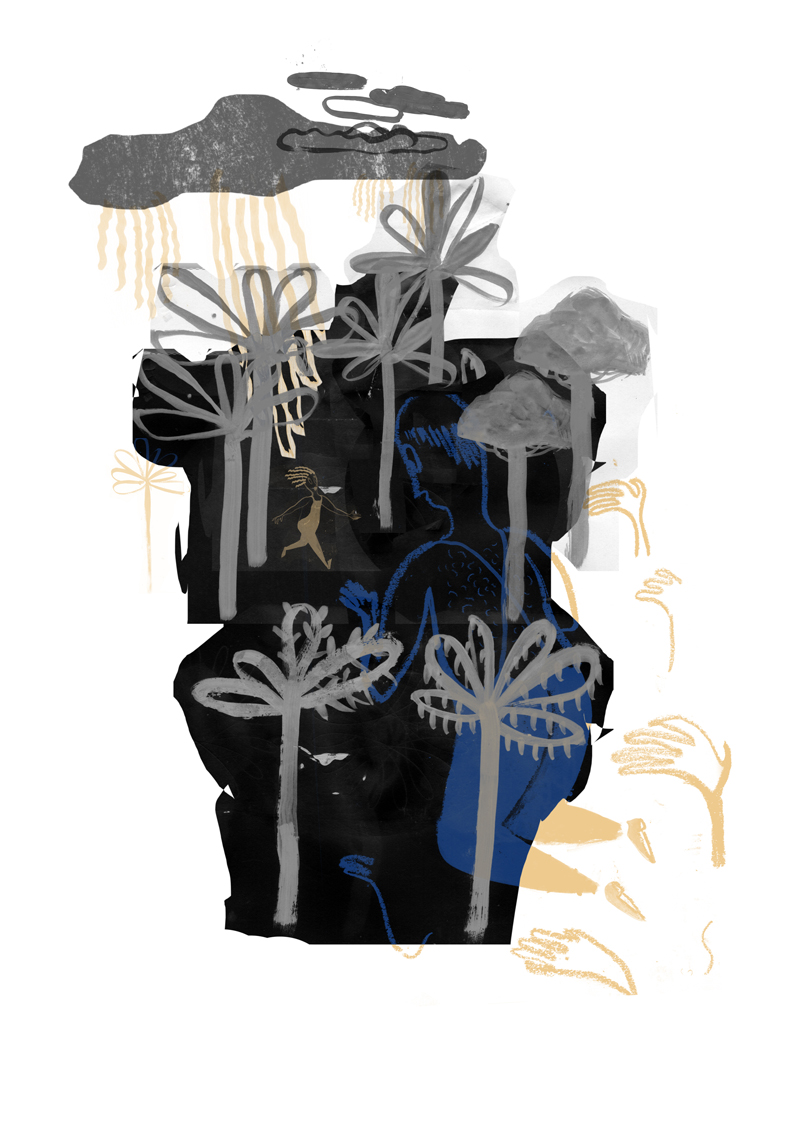
I come from a printmaking background and think it has translated into my work in various ways. First of all I draw out all the parts that I want in my image in my sketchbook, be that with ink, crayons, pens or pencils. I then scan all these in and start to assemble the composition using Photoshop my version of a printing press, Photoshop. I tend stick to pretty simple colour palettes, no more than three or four hues normally. That’s just something from printmaking that I really love – simple colours that don’t go overboard.
Analogue or Digital?
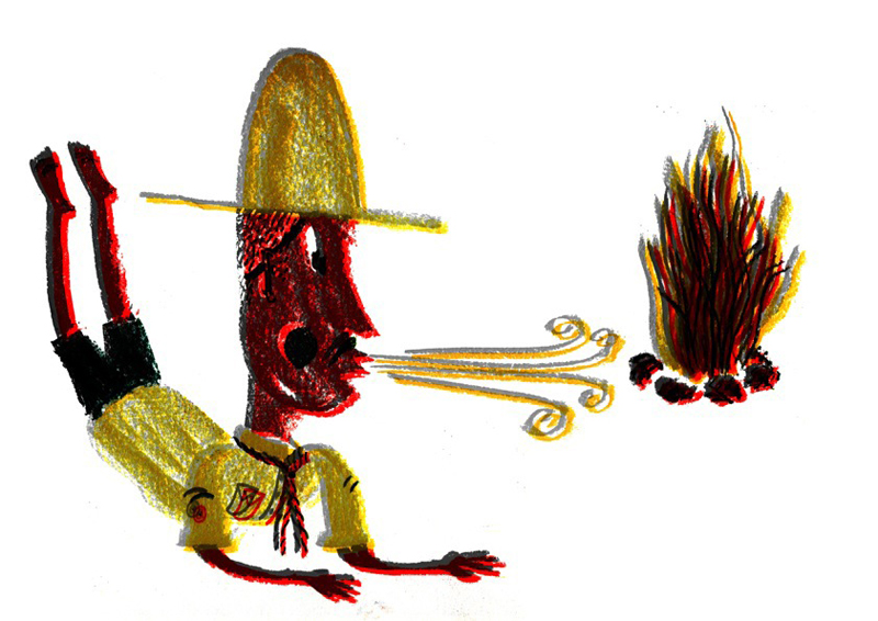
It’s a tough question. I believe it’s impossible to recreate a mark made by a brush on paper with a computer. You don’t get happy accidents like smudges of too much ink on the brush, things which I think add character to illustrations. For me, combining the two is utilising the best of both worlds as you can get the feeling of a hand-drawn piece with all the advantages of the command-Z key. I’m definitely in both camps; I see vector illustrations that I really love and hand-drawn pieces that blow me away. Outcome-wise, both have their place but I really like the availability of viewing digital work online. To quote Shepard Fairey (himself quoting Lenin), “Freedom of the press is guaranteed only to those who own one.” Now we all have printing presses through our computers.
How does your photo-blogging feed into your illustration work?
I mainly take photographs using my smartphone and although the camera’s not amazing on it, I like the idea that I can just snap something and build up my own library of images that inspire me and that I can draw from later. My Tumblr (matwaudby.tumblr.com) is more for myself than anyone else as I can just flick through it for original inspiration. It’s key not to just look at the same things as everyone else, otherwise your work may end up feeling contrived.
matwaudby.com