
This politically engaged young designer combines density of information and artful typography, to create work which is at once unique and compelling.


What are the best and worst aspects of being an early career graphic designer in 2014?
To start with the negatives, I imagine that the economic aspect is an important point to remember, looking at the poor social model on which the discipline is based. It’s an obvious hindrance to choosing graphic design as a vocation.
The good news is that the discipline is constantly evolving, partly due to recurrent questions about the role of the designer, who has become more influential in the development of editorial and informational concepts in general. Right now, it is also pretty exciting to be part of the generation attempting to work out how print and digital can be united.
What's more important in terms of a creative project, knowing how to start or when to stop?
For graphic design, it is pretty easy to know when to stop, in the sense that one of the most important things you learn while training is to work within the constraints of the project. From my point of view, it is often an aspect of rational logic that determines the process.
At the beginning of a project, I think it is important to pause for a moment to consider our object of work, the idea of seeking documentation… as well as starting to produce visuals directly, because I think both elements are obviously linked in design. The concept of production is important because I think it shapes the work, by making mistakes and starting over.
You express a particular interest in the relationship between graphic design and politics – where did this start and how has it guided your development and choice of projects?
I just find it important to have a critical perspective on the environment around us. From a personal point of view, I became interested in graphic design by chance at around seventeen years old, on discovery of the work of the French collective Grapus. What I found interesting was the way they politicised their images, combining a militant stance with their status as functional graphic studio who had a close working relationship to institutions. However, I think that their approach was particular to that era, and that this sort of “political” graphic design is no longer possible. Such strong connections between a graphic design studio and an institution are a thing of the past.
In general, I would say that politics matters for me in the way that graphic design is a service that often can’t help being politicised. Design need not only speak about official parties or elections in an overtly political manner, it can also invest its diffusions and processes in an attempt to bring ideas and ideals to the public consciousness, admitting the fact that all information is highly political. This is what motivates me to work with visual journalism in general, as it engages me in the paradoxes of working with the so called “neutrality” of the news.
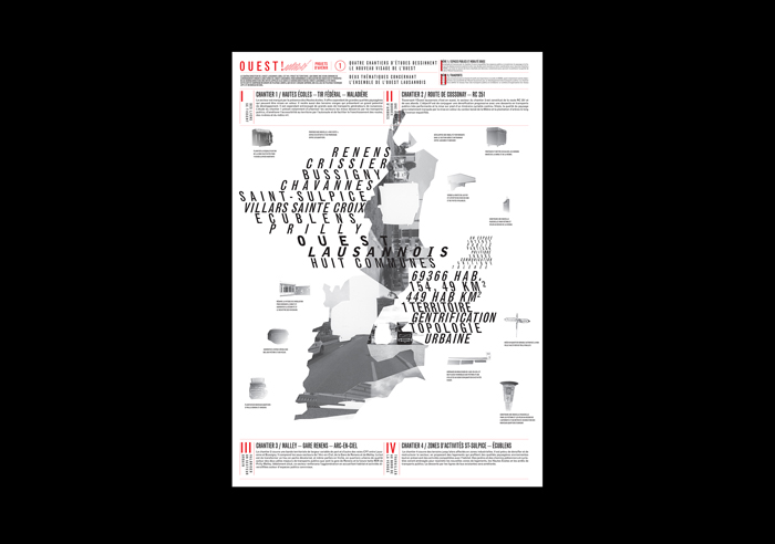
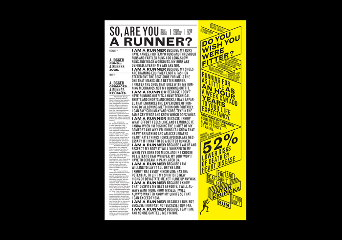
Your work, especially the editorial design, is characterised by a high level of density – what drives that approach? It feels like you are using white space more tactically than is presently common...that you're not afraid for the audience to be, at least initially, overwhelmed?
I find it interesting to work with density because it allows me to find graphic systems that fit with the content. It creates strong areas and others distinct within the white space. That can be a door to being immersed in the subject or even being… overwhelmed. I like the idea of somehow “extending” content through graphic design.
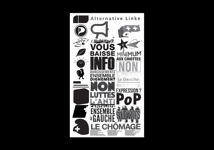
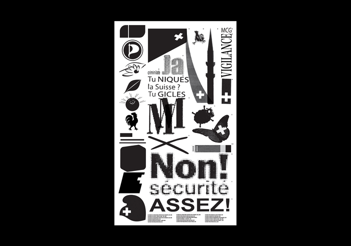
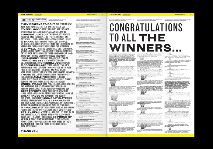
You're very particular about your use of colour – usually primaries, saturated, impactful but contained, always offset as accents against the weight of black type. Is there a particular historical inspiration for this?
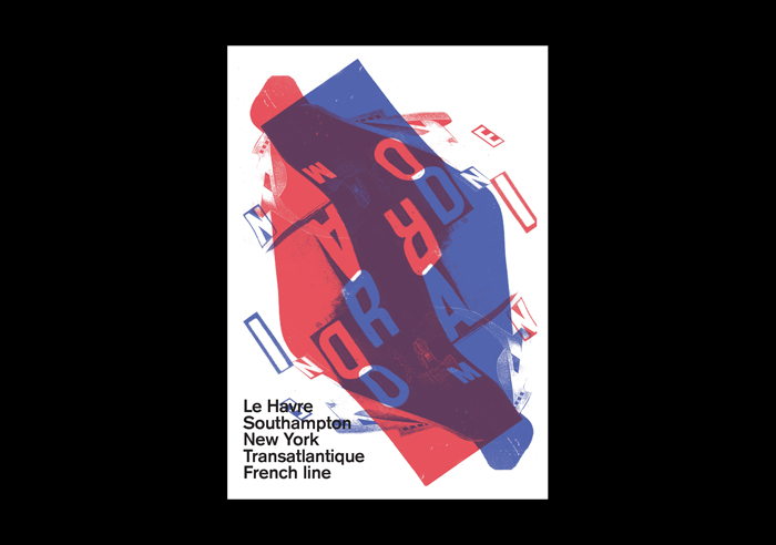
I always try to make images that can be interpreted in the first degree and the colour helps a lot with that. I want to avoid esoteric references between designers or use any insider jokes. I'm particularly inspired by the raw relationship between photography and typography that can be found in the poster design of the late 70s, the punk and post-punk movements as well as that associated with the New Wave.
Tell us about the piece of work you’re most proud of.
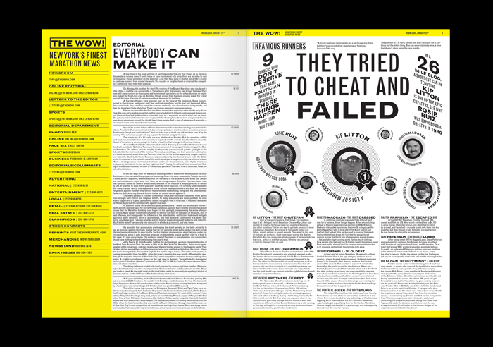
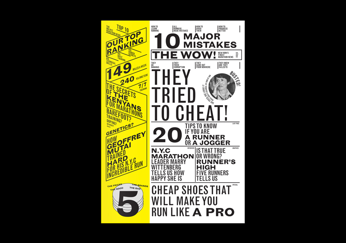
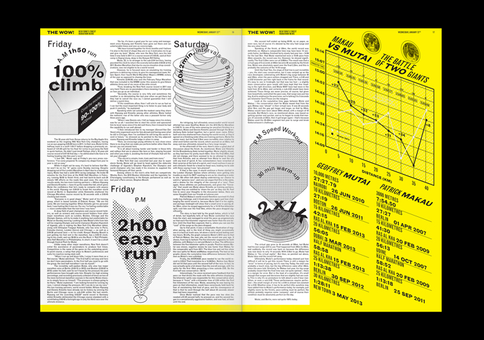
I enjoyed working on the project The WOW! because I found it interesting to compare a certain running subculture with a place – New York – in relation to typography and layout. I found it relevant to combine a certain density associated with the Big Apple with a rather aggressive typographic message.
If you could identify one irritating trend in contemporary graphic design and delete it from history, what would it be and why?
It's difficult to judge an entire trend but I think what irritates me the most is the deference to minimalism, which is often used more through fear of stepping out of line than because of thorough reasoning. It becomes a kind of automatic graphic design.
mateobroillet.ch