
Anthony Burrill gives us an exclusive guided tour of his new online archive of printed ephemera – a lifetime's worth of collecting that tells a story about his cues and qualities as a graphic artist...
The quickest way to find out what makes a designer tick, creatively, is a glimpse at their personal collection — whether that's record, books or something more obscure — it exposes obsessions and gives tantalising glimpses of how they've evolved as image-makers. At least, that's certainly the case for Anthony Burrill and his lifelong interest in printed ephemera and found graphic material, now archived and curated as an online database that he has shared with the world with characteristic generosity of spirit.
The material in the archive dates back to his earliest stirrings as a designer, and includes newspaper clippings, found letterforms and icons, type specimens and graphic details that reveal his forensic eye for the absurdist poetry of the everyday.
The Cumulus Clouds
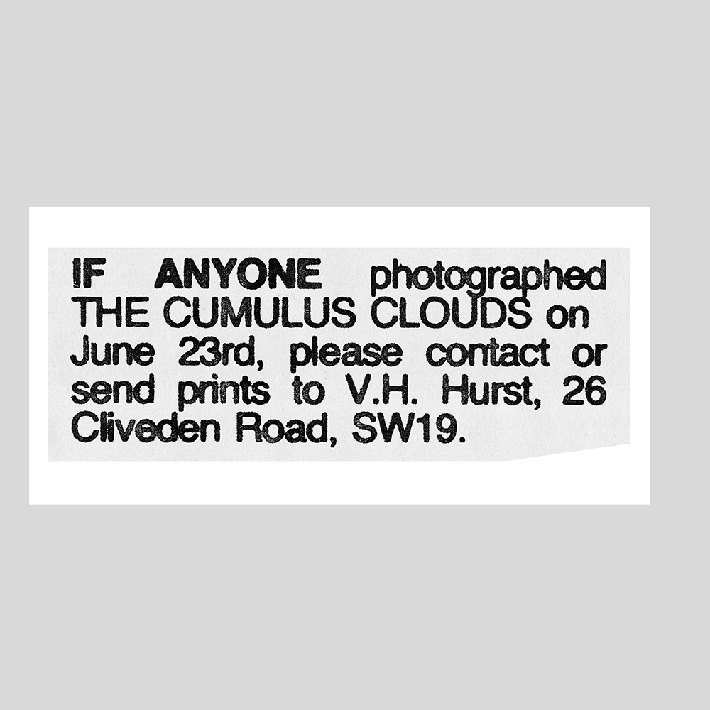
This is a press clipping taken from the local newspaper when I lived in South London in the 1990s. I came across it while browsing the small ads section and it struck me as odd and amusing, it felt like the start to a film, or a cryptic clue in a spy drama. I loved the thought of V.H. Hurst wanting photos of clouds so much that he placed a small ad in the hope that somebody might have them to hand. I’m not sure if V.H. Hurst ever got the photos, I hope he did.
35mm Exposure Guide
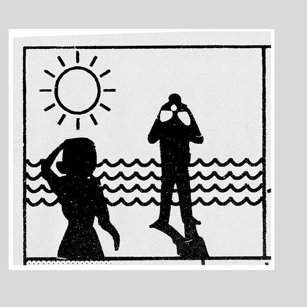
This peculiar illustration is a detail from a guide to photographic exposures found on the inside of a box containing a roll of 35mm film. Each ‘f-stop’ would be illustrated in a different lighting condition, full sun, semi shade and full shade. I was fascinated by these miniature scenes, designed primarily to aid successful photography, but suggesting to me an unfolding Hitchcockian psycho drama.
Wood Letter A-Z
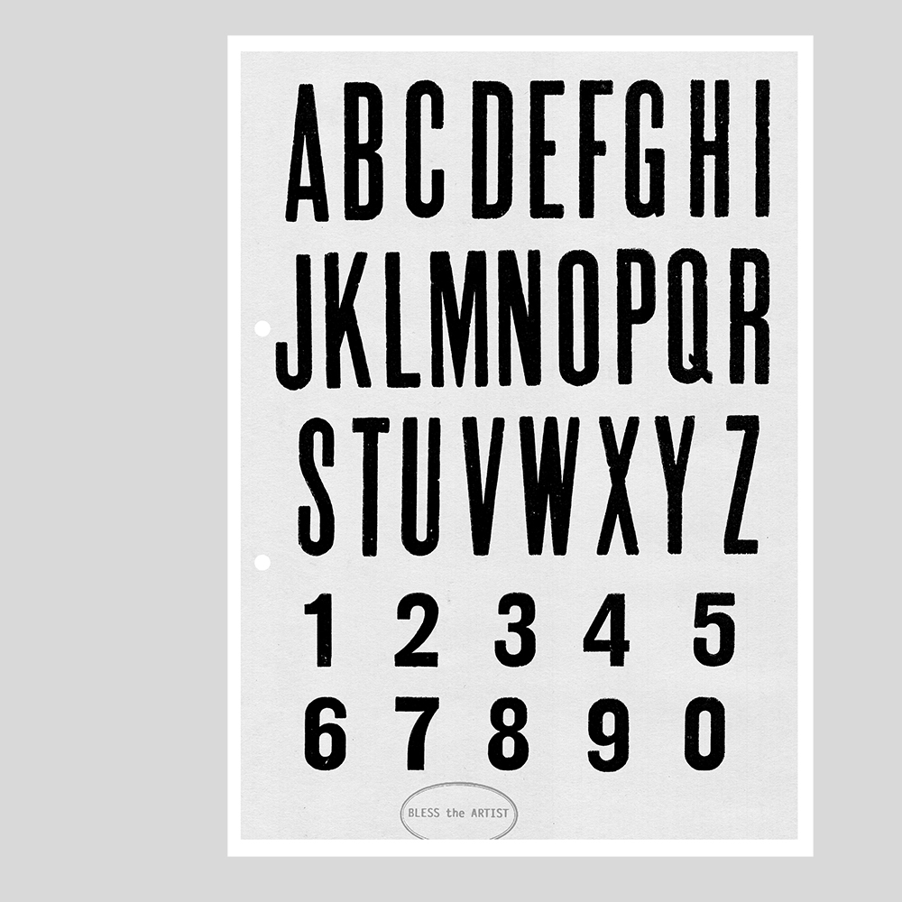
A type sample of a wood letter font found by my friend Tim Lewis while he was living and working in Jamaica. Tim and I studied graphic design at the Royal College of Art and soon after we graduated he took up a teaching job in Kingston, Jamaica. There he discovered a print shop that produced flyers for local party nights using a combination letterpress and screen print. Tim commissioned a series of posters from the printer and posted them back to friends in London.
Sweet Shop
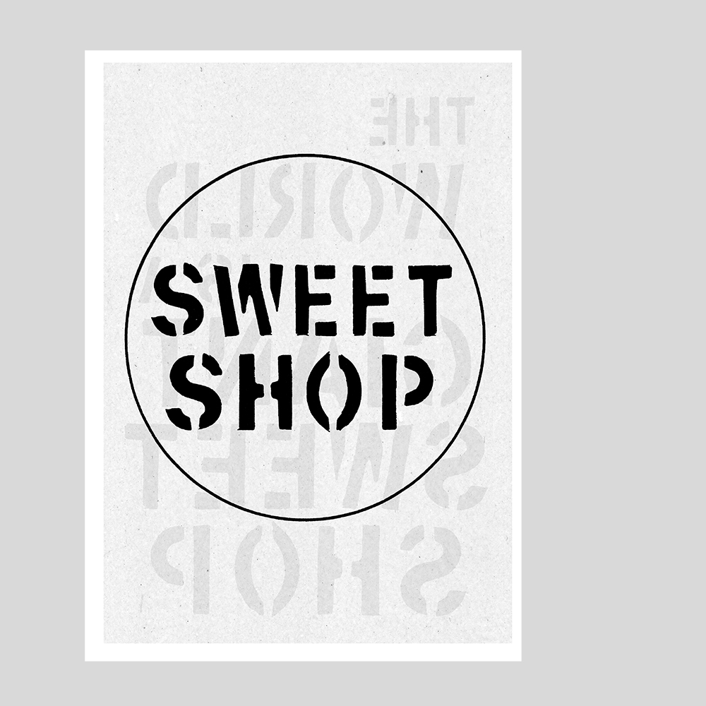
Sweet Shop is one of my self published photocopy publications from the 1990s. I would make lots of these little books, sending them out to friends and potential clients in the hope of getting work. They were produced on a photocopier in my local corner shop, hence the title. In them I would gather together found type, enlarged clip art and odd phrases. They were early explorations of what would later turn in to my typographic statement posters. The font I used here was found by my friend Paul Plowman while he was travelling in Mexico, I love the slightly irregular hand cut character of the stencil font.
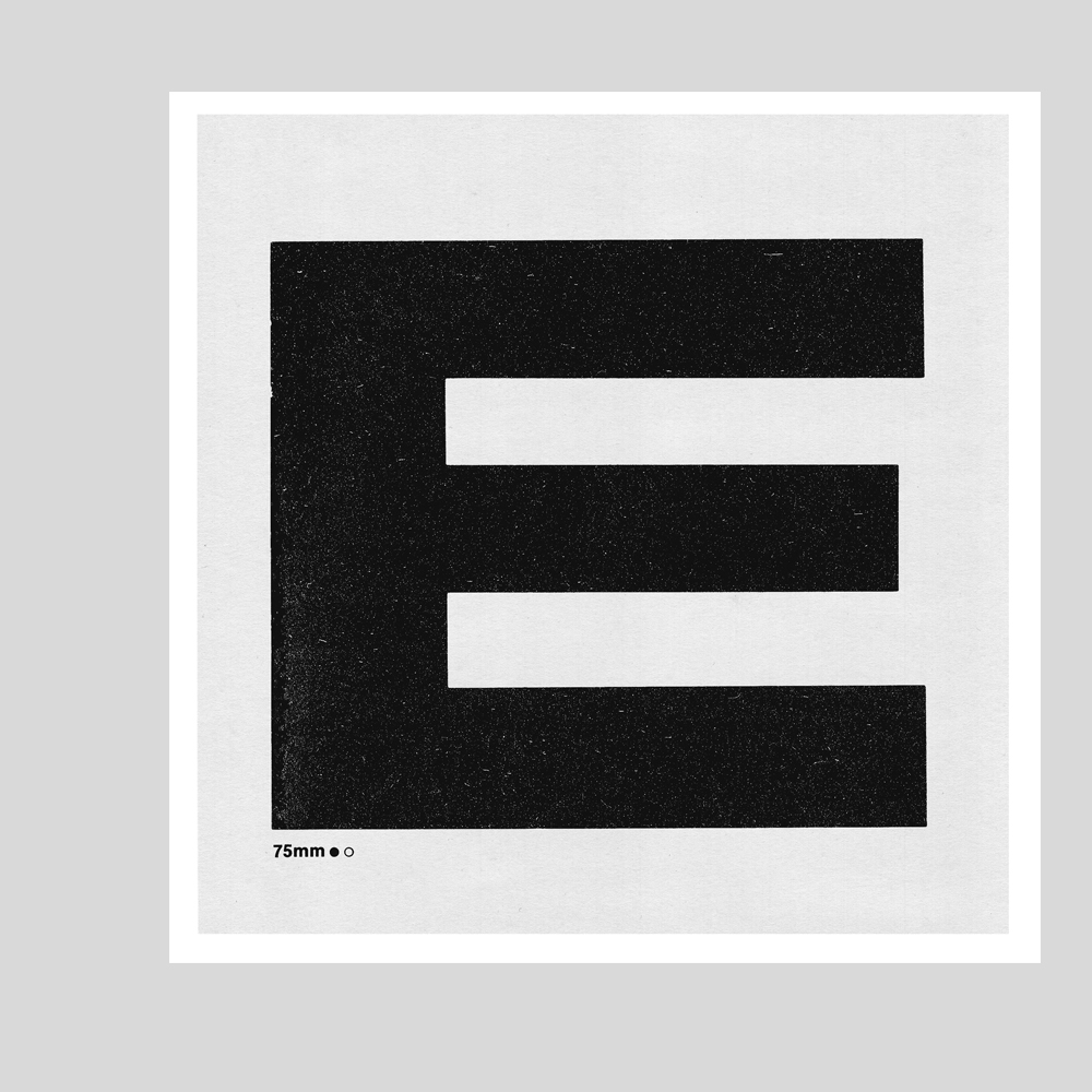
Extended E

A lovely upper case E from the Letraset catalogue I’ve had since I began studying graphic design back in the 1980s. I particularly like this letter E, it has a beautiful proportion, nicely extended. It’s the kind of E that you would see on the back of a Ford Capri.
Explore Anthony Burrill's archive here.
And find out more about his work here.