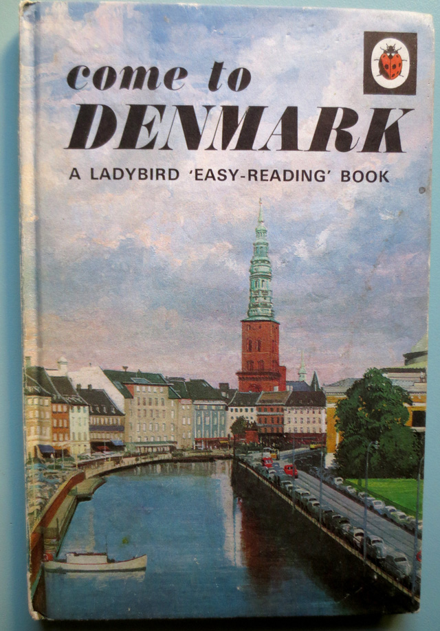
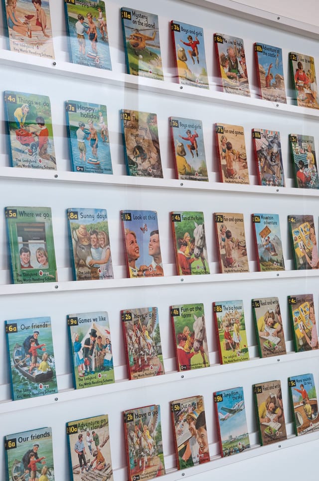
With more than 200 original illustrations dating from the Fifties to the Seventies, Ladybird by Design at the De La Warr Pavilion promises to be a nostalgia-fuelled trip into yesteryear. We sent designer and Ladybird enthusiast Richard Hogg to investigate.
A young woman stands admiring herself in a mirror. She is wearing a hideous outfit like something Abba would wear. It’s the 1970s. She is in a department store. We can see her face reflected in the mirror. It is contorted into an unflattering rictus of nervous glee. A face no professional model would pull; it says look at me, I’m in a photoshoot… I am going to be in a book... a Ladybird book… But we are not looking at a photograph. This is a small gouache painting, about A4. Painted by the slick, no nonsense hand of a craftsman, an illustrator. Not a trendy pissing-about on a Mac illustrator like we have these days (like me.) A real, sitting-at-an-art-board, smoking-a-pipe illustrator. Winter sunlight is streaming in through a patio door from a large surrey garden. Jimmy Young is on the radio. He can knock out two of these Ladybird illustrations a day, regular as clockwork, and they are all perfect. Just keep sending the cheques and the source photos.
And what of the source photographs? Well I have never seen one but they are not very good are they? Bad compositions, with harsh flash, glaring in people's faces. And what kinds of faces? Like the girl in the department store, these images are full of silly, nervous people; either awkward and fidgety; or rigid and stony-faced, stuck too hard in some over-stiff pose. Trying to look natural. Failing. Friends of the photographer no doubt, or hapless bystanders. Or perhaps they are the real deal? That milkman there, perhaps he is a real milkman, one of the best. It's just that doing his round at lunchtime instead of 4am so the man from Ladybird can take his picture, has sent him into a kerfuffle. He's done his tie up too tight and can't stop fidgeting with it, can't stop looking at the camera.

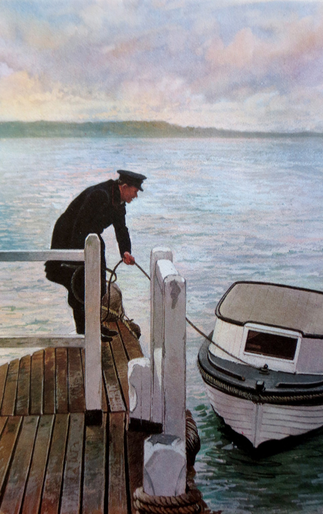
We are at the Ladybird By Design exhibition at the De La Warr Pavilion, Bexhill. A show that brings together hundreds of the original artwork from the heyday of Ladybird. While some of the pictures on show are works of fantasy and fairytale, I am glad to report that the vast majority are from the factual books that most people associate with Ladybird, and nearly all of them follow this formula of illustration, based closely on a photographic source.
I have lived with some of these illustrations for over thirty years and they are still some of the most compelling images I know. It’s the cocktail of bad photo and perfect illustration. And the illustrator, bless him, it's not like he is using his craft to fix some of problems with the photos. If anything, he draws our attention to it. His smart, clean, workmanlike photorealism brings out and polishes up the photographs flaws. Almost pedantically, almost like he is making some kind of point. So what we have is a strange, emergent art, a counterpoint between clumsy and precise. Magic.
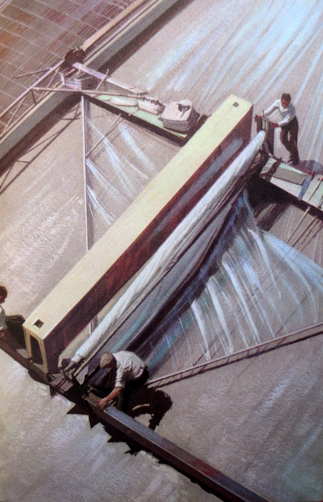
And I haven't even touched on the most common flaw that so many of these images share. It is that they are boring. They are exquisitely, breathtakingly dull, dull, dull. Look at this illustration from The Road Makers (above). It’s of some men laying a sheet of polythene onto some concrete hardstanding as part of the construction of a motorway. Look at it… I have had this book since I was a small boy and I can remember even way back then looking at this and thinking, “Why the fuck would a child be interested in that?” Can you imagine a kids’ book having pictures like that in it now?
These pictures are fascinating because they tell us so much about a particular time and a place. About the English sensibility during a fragile but optimistic time, the post war decades. I only caught the tail end of it. Children's culture for me was a mixture of this stuff and the crap that swept it away, such as Why Don't You? and Tiswas, twats in orange dungarees, Keith Chegwin, Usborne Books. But I grew up with the Ladybird books too, and their strange bland mystery always excited me. It is a million years away from the world kids inhabit now. If I showed one of these books to my nephew Freddy, well, I might as well be showing him some Gerhard Richter paintings. I wouldn't try making anyone under the age of thirty care about these books. They will only ever feel like sad relics of a crapper, duller world. Perhaps some hip twenty year-olds might find something to relate to in the aesthetic. I don't know, this exhibition feels like it is for people like me, people who grew up with these books.
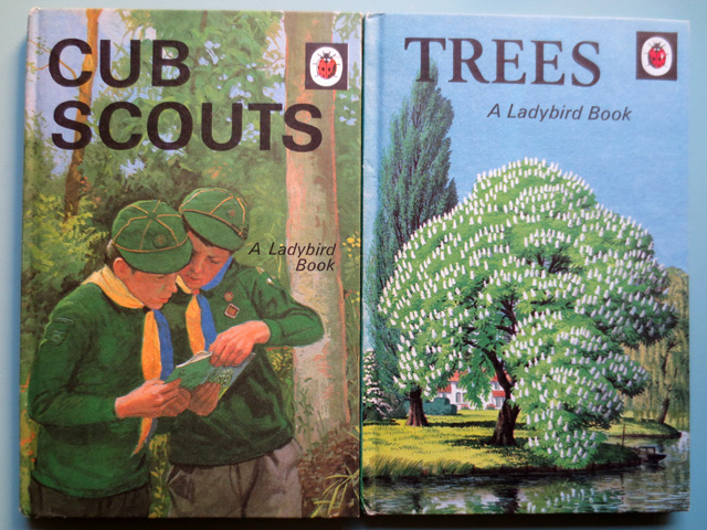
It doesn't offer much context or history. It doesn't tell you what these things are or why they are important. It is just a load of the original paintings and a load of books. Thousands of them. OK, so they have the first prototype Ladybird book under glass, and there is a film that I didn't watch. In his opening speech curator Lawrence Zeegen mentioned some “extraordinary artefacts” that he unearthed. I don't know what they are. They are not in the show. I think perhaps they might be in the accompanying book, although that wasn't available. What there definitely is not, is any of is the photography that forms the basis of so many of these paintings. I don't know how I feel about that. It would have been nice to have seen a few, but perhaps that would have somehow spoilt the illustrations for me. Taken the mystery out of them. Flattened the process into something that I can understand. I don't even know if they were black and white or colour. I guess mostly black and white. Perhaps there will be some in the book.
But that doesn't matter. The point is that if you are a middle aged British person you can walk round this show and I guarantee you will see paintings that will make the hairs on the back of your whole body stand up. You will see pictures that you know so well, that you examined endlessly in that way only kids can, but that you haven't seen or even thought about for over thirty years. And there they are, as familiar and as real as anything from your childhood; you will feel like fucking Marcel Proust when he sniffed the hawthorne blossom tea or whatever it was. But better than that because these are the original paintings. A little bigger, more vivid, brighter and fresher, but also a little scruffier than the reproductions you remember. Cherished images from your youth, but more real, more alive than they ever were then. I got a bit emotional.
h099.com
Ladybird by Design
Until 10 May 2015
De La Warr Pavilion, Bexhill on Sea
dlwp.com
